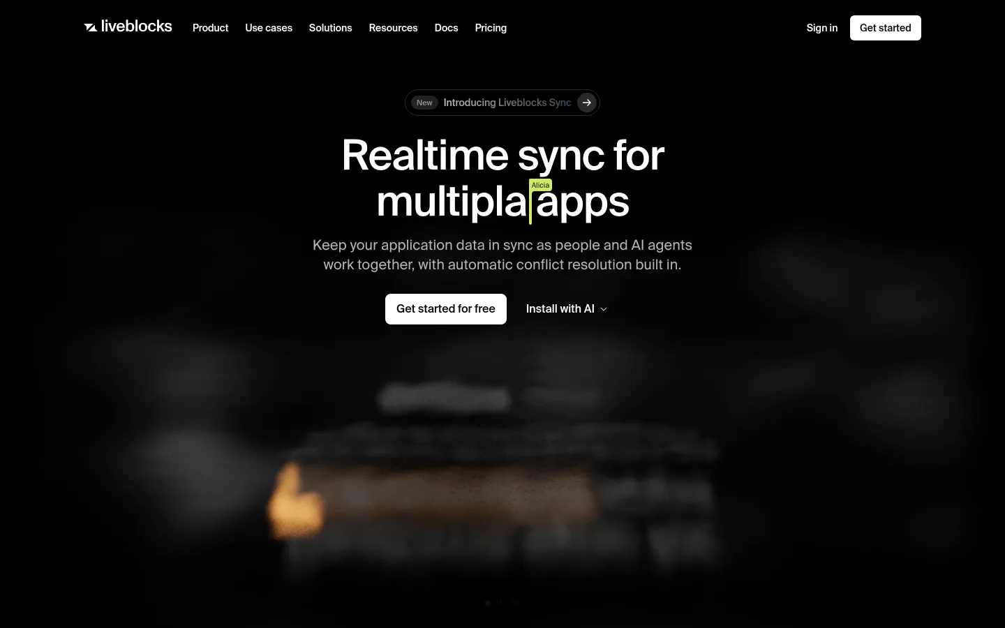
Liveblocks以近乎纯黑的画布、克制的字体和细腻的分隔线,呈现实时协作平台。产品示例、代码预览、客户背书与宽松的区块留白,让页面专业而不显拥挤。
North star · Keep the page quiet and black-led, letting white actions and real product interfaces provide the contrast and proof.
The page is built around an almost uninterrupted black canvas, with white type and restrained gray copy doing most of the visual work. White primary buttons stand out as the clearest calls to action; borders are subtle and cards largely remain dark, so content feels integrated rather than boxed in. The Suisse sans-serif family gives headings and body text a clean, contemporary voice, with medium-weight, tightly tracked display headlines and lighter supporting copy. JetBrains Mono is reserved for code-like content. A centered hero gives way to customer logos, a product-example strip, feature sections, a developer demo, trust proof, and a closing CTA. Broad vertical gaps keep this long page calm. Bright interface screenshots and small collaboration badges introduce color, but remain contained within product visuals rather than redefining the brand palette.
配色 点色块复制色值。用途说明来自对页面的实测位置(背景、文字、描边、按钮)与截图判读。
品牌色
Canvas Black
#000000
Dominant page canvas and the black text color on white primary buttons.
Signal White
#ffffff
Headings, primary body text, logos, and primary CTA surfaces.
强调色
Cursor Sand
#dfd28a
Small collaborator badge accent inside product-interface illustrations.
Cursor Blue
#86a9da
Small collaborator badge accent inside product-interface illustrations.
表层色
Panel Black
#161616
Occasional inset section and card surface against the black canvas.
Near Black
#010101
Subtle dark gradient and section-edge variation around black.
Gradient Graphite
#2e2e2e
Faint gradient transition in dark section treatments.
Cloud Gray
#ebecf0
Light product-card or badge surface within embedded interface examples.
Blue Charcoal
#21222b
Dark card surface inside interface mockups and product visuals.
Interface Gray
#e5e5e5
Light neutral surface appearing within product-card imagery.
Pale Interface
#f3f3f3
Light surface detail inside embedded product-interface examples.
Warm Interface
#f6ece2
Warm-tinted interface surface contained within product mockups.
中性色
Muted Ash
#918d8d
Secondary navigation, footer links, and subdued supporting text.
Hairline Charcoal
#292929
Fine borders and subtle outlines around dark controls and cards.
Smoky Gray
#635f5f
Low-emphasis text and headings; not a prominent page-wide color.
Soft Silver
#b7b4b4
Occasional secondary text against the black canvas.
文字 背景 对比度 WCAG #ffffff Signal White#000000 Canvas Black21:1 AAA #ffffff Signal White#ebecf0 Cloud Gray1.18:1 不达标 #ffffff Signal White#161616 Panel Black18.1:1 AAA #918d8d Muted Ash#000000 Canvas Black6.4:1 AA #918d8d Muted Ash#ffffff Signal White3.28:1 AA-large #918d8d Muted Ash#ebecf0 Cloud Gray2.78:1 不达标
字体 字号阶梯:Perfect Fourth(比例约 1.303,正文 16px)。示例用免费替代字体渲染,数值为实测。
Aa 设计
suisse 网络字体 · 字重 400 / 500 · 占比 98%
免费替代:Inter
Headings, body copy, navigation, buttons, and captions
Aa 设计
JetBrains Mono 网络字体 · 字重 400 · 占比 2%
免费替代:Roboto Mono
Code and developer-example content
角色 示例 字号 字重 行高 字距 特大标题 Large centered hero headline and high-impact campaign statements.
Liveblocks
60px 500 1.1 -0.02em 一级标题 Primary page headline and prominent section introductions.
Liveblocks
52px 500 1.1 -0.02em 二级标题 Major feature-section headings.
Liveblocks
48px 500 1.05 0 三级标题 Subsection headings and prominent feature labels.
Liveblocks
32px 500 1.2 -0.01em 四级标题 Smaller feature titles and card headings.
The quick brown fox 敏捷的狐狸
24px 400 1.38 0 正文 Explanatory paragraphs and feature descriptions.
The quick brown fox 敏捷的狐狸
16px 400 1.38 0.004em 辅助文字 Small labels, helper copy, and understated metadata.
The quick brown fox 敏捷的狐狸
14px 400 1 0 按钮 Primary and secondary CTA labels.
The quick brown fox 敏捷的狐狸
14px 500 1.43 0 导航 Header navigation links.
The quick brown fox 敏捷的狐狸
14px 400 1 0 代码 Code snippets and developer-demo content.
const style = 1;
14px 400 1.43 0
间距与布局 基准单位 8px · 密度:宽松
196px 版块间距
8px 元素间距
28px 卡片内边距
791px 内容最大宽度
4px
6px
8px
12px
14px
16px
28px
40px
The page uses a centered, relatively narrow content measure, with full-width black section bands and product media that can extend wider than the text. Sections align mostly to a consistent left edge for feature storytelling; the hero and closing CTA are centered. Two-column feature layouts and compact grids alternate with product demonstrations. Vertical spacing is generous and creates a deliberate, spacious rhythm across the long page, while borders divide dense card content without adding heavy containers.
圆角与层次 hairline · card
hairline · link, card
hairline · card
inset · section
The interface favors flat layers over cast shadows. Thin charcoal hairlines define card boundaries and separate grid cells against black; dark panels use restrained contrast. Small inset or radial gradient treatments add depth to selected media and CTA areas, while buttons rely on a solid white fill rather than prominent shadow.
组件 下面的预览按实测的按钮、输入框、徽标、卡片样式重建(字体用替代字体)。
Header navigation A compact horizontal row on black, with white brand and primary links, muted secondary links, and a white rounded Get started action.
Primary CTA White button with black Suisse text, moderate corner rounding, and horizontal padding; repeat it in the hero and closing CTA.
Customer logo cloud A low-key customer proof band with subdued brand marks arranged in two rows against the black canvas.
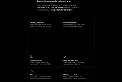
Feature card grid Dark or transparent cells with fine #292929 hairlines, white titles, and muted descriptions; keep the grid visually light.
Product example strip A horizontal collection of interface previews, some light and some dark, with their color contained within each mockup.
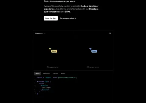
Developer demo A large dark framed collaboration preview paired with a monospace code area and small colored participant badges.
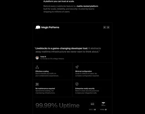
Trust testimonial panel Customer quote and proof details arranged in a dark card, divided into compact feature cells with understated borders.
Imagery · Product interfaces are the main visual evidence: bright collaboration tools, message panes, code previews, and customer-story panels appear within dark frames. The hero uses a blurred, low-contrast product scene that fades into the black canvas. Logo marks and small cursor or collaborator badges add detail. Keep imagery crisp enough to read as software, but avoid letting colorful mockups overwhelm the monochrome page.
页面版块 共 9 个版块,按页面从上到下排列,每个都标了类型、布局和交互套路。
该做与不该做 ✓ 该做 Use #000000 as the dominant canvas. Reserve white surfaces for the clearest primary actions. Keep supporting copy gray and visibly subordinate. Use thin #292929 hairlines instead of heavy card borders. Let product interfaces supply contained color and detail. Preserve broad vertical pauses between major sections. ✕ 不该做 Do not introduce a bright page-wide accent palette. Do not place every content block in a raised card. Do not use heavy shadows to create depth. Do not let product screenshots overpower the black canvas. Do not replace the concise sans-serif hierarchy with decorative type. Do not compress the long-page section rhythm. 给 AI 的提示词 想快速出一个同风格的新页面,把这段话连同 DESIGN.md 一起发给 AI。
复制 Build a new page in the Liveblocks visual style. Use Canvas Black (#000000) across the main canvas, white (#ffffff) for primary text and CTA surfaces, Muted Ash (#918d8d) for secondary copy, and Hairline Charcoal (#292929) for delicate dividers. Set headings and interface copy in Suisse or a close sans-serif such as Inter; reserve JetBrains Mono for code. Keep the main text measure narrow and centered where appropriate, then alternate left-aligned feature storytelling, compact grids, and framed product demonstrations. Use generous vertical gaps. Product screenshots may contain brighter interface colors, but keep them inside their frames. Favor flat dark surfaces, thin borders, and subtle gradients over pronounced shadows. Make the primary action immediately legible without adding decorative noise.
DESIGN.md Tailwind v4 CSS 变量 Design Tokens
---
title: "Liveblocks design system"
variant: extended
source: https://liveblocks.io/
captured_at: 2026-10-12
theme: dark
industry: devtools
generator: Design DNA (https://four.wiralomi.com/style/liveblocks-io)
ai_generated: true
ai_label: "本文件由 AI 辅助生成:数值取自公开网页的实测样式,命名、用途说明与建议为模型解读。商标归原所有者。 / AI-assisted content"
---
# Liveblocks · Design System
> Quiet monochrome, vivid collaboration
**Theme:** dark · **Industry:** devtools · **Source:** https://liveblocks.io/ · **Captured:** 2026-10-12 (1440×900 desktop)
_AI-assisted content: values are measured from the public page at capture time; names, roles and guidance are model-written interpretations. Trademarks belong to their owners._
Liveblocks uses a near-black canvas, restrained typography, and fine hairline borders to frame its realtime collaboration platform. Product examples, code previews, customer proof, and generous section spacing make the page feel technical without becoming visually dense.
## North star
Keep the page quiet and black-led, letting white actions and real product interfaces provide the contrast and proof.
## Overview
The page is built around an almost uninterrupted black canvas, with white type and restrained gray copy doing most of the visual work. White primary buttons stand out as the clearest calls to action; borders are subtle and cards largely remain dark, so content feels integrated rather than boxed in. The Suisse sans-serif family gives headings and body text a clean, contemporary voice, with medium-weight, tightly tracked display headlines and lighter supporting copy. JetBrains Mono is reserved for code-like content. A centered hero gives way to customer logos, a product-example strip, feature sections, a developer demo, trust proof, and a closing CTA. Broad vertical gaps keep this long page calm. Bright interface screenshots and small collaboration badges introduce color, but remain contained within product visuals rather than redefining the brand palette.
## Colors
| Name | Hex | Token | Group | Role |
|---|---|---|---|---|
| Canvas Black | ` | `--color-canvas-black` | brand | Dominant page canvas and the black text color on white primary buttons. |
| Muted Ash | ` | `--color-muted-ash` | neutral | Secondary navigation, footer links, and subdued supporting text. |
| Signal White | ` | `--color-signal-white` | brand | Headings, primary body text, logos, and primary CTA surfaces. |
| Hairline Charcoal | ` | `--color-hairline-charcoal` | neutral | Fine borders and subtle outlines around dark controls and cards. |
| Panel Black | ` | `--color-panel-black` | surface | Occasional inset section and card surface against the black canvas. |
| Cursor Sand | ` | `--color-cursor-sand` | accent | Small collaborator badge accent inside product-interface illustrations. |
| Cursor Blue | ` | `--color-cursor-blue` | accent | Small collaborator badge accent inside product-interface illustrations. |
| Smoky Gray | ` | `--color-smoky-gray` | neutral | Low-emphasis text and headings; not a prominent page-wide color. |
| Near Black | ` | `--color-near-black` | surface | Subtle dark gradient and section-edge variation around black. |
| Gradient Graphite | ` | `--color-gradient-graphite` | surface | Faint gradient transition in dark section treatments. |
| Soft Silver | ` | `--color-soft-silver` | neutral | Occasional secondary text against the black canvas. |
| Cloud Gray | ` | `--color-cloud-gray` | surface | Light product-card or badge surface within embedded interface examples. |
| Blue Charcoal | ` | `--color-blue-charcoal` | surface | Dark card surface inside interface mockups and product visuals. |
| Interface Gray | ` | `--color-interface-gray` | surface | Light neutral surface appearing within product-card imagery. |
| Pale Interface | ` | `--color-pale-interface` | surface | Light surface detail inside embedded product-interface examples. |
| Warm Interface | ` | `--color-warm-interface` | surface | Warm-tinted interface surface contained within product mockups. |
### Semantic aliases
`--color-canvas` → ` (Canvas Black) · `--color-surface` → ` (Signal White) · `--color-surface-2` → ` (Cloud Gray) · `--color-surface-3` → ` (Panel Black) · `--color-surface-4` → ` (Blue Charcoal) · `--color-text` → ` (Signal White) · `--color-text-muted` → ` (Muted Ash) · `--color-text-subtle` → ` (Canvas Black) · `--color-border` → ` (Hairline Charcoal)
### Contrast (WCAG 2.x)
| Text | Background | Ratio | Level |
|---|---|---|---|
| ` | ` | 21:1 | AAA |
| ` | ` | 1.18:1 | fail |
| ` | ` | 18.1:1 | AAA |
| ` | ` | 6.4:1 | AA |
| ` | ` | 3.28:1 | AA-large |
| ` | ` | 2.78:1 | fail |
| ` | ` | 5.51:1 | AA |
| ` | ` | 21:1 | AAA |
| ` | ` | 17.79:1 | AAA |
| ` | ` | 1.16:1 | fail |
### Gradients
- `radial-gradient(circle, rgba(0, 0, 0, 0) 0%, rgba(0, 0, 0, 0) 15%, rgb(0, 0, 0) 40%, rgb(0, 0, 0) 100%)`
- `radial-gradient(circle, rgba(0, 0, 0, 0) 0%, rgba(0, 0, 0, 0) 5%, rgb(0, 0, 0) 40%, rgb(0, 0, 0) 100%)`
- `radial-gradient(50% 50%, lab(0 0 0) 90%, oklch(0.07 0 0) 95%, oklch(0.2 0 0) 97%, oklch(0.3 0 0) 100%)`
- `linear-gradient(45deg, rgba(0, 0, 0, 0) 25%, rgba(255, 255, 255, 0.075) 50%, rgba(0, 0, 0, 0) 75%, rgba(0, 0, 0, 0) 100%)`
## Typography
| Family | Token | Source | Weights | Role | Free substitute |
|---|---|---|---|---|---|
| suisse | `--font-body` | webfont | 400, 500 | Headings, body copy, navigation, buttons, and captions | Inter |
| JetBrains Mono | `--font-mono` | webfont | 400 | Code and developer-example content | Roboto Mono |
- **suisse:** Use regular and medium weights; display headings are compact and slightly negatively tracked, with natural sentence case.
- **JetBrains Mono:** Regular monospace for code-like details; keep it functional and visually secondary to Suisse.
### Type scale — Perfect Fourth (ratio ≈ 1.303, base 16px)
| Role | Size | Weight | Line height | Letter spacing | Case | Family | Used for |
|---|---|---|---|---|---|---|---|
| display | 60px | 500 | 1.1 | -0.02em | — | suisse | Large centered hero headline and high-impact campaign statements. |
| h1 | 52px | 500 | 1.1 | -0.02em | — | suisse | Primary page headline and prominent section introductions. |
| h2 | 48px | 500 | 1.05 | 0 | — | suisse | Major feature-section headings. |
| h3 | 32px | 500 | 1.2 | -0.01em | — | suisse | Subsection headings and prominent feature labels. |
| h4 | 24px | 400 | 1.38 | 0 | — | suisse | Smaller feature titles and card headings. |
| body | 16px | 400 | 1.38 | 0.004em | — | suisse | Explanatory paragraphs and feature descriptions. |
| caption | 14px | 400 | 1 | 0 | — | suisse | Small labels, helper copy, and understated metadata. |
| button | 14px | 500 | 1.43 | 0 | — | suisse | Primary and secondary CTA labels. |
| nav | 14px | 400 | 1 | 0 | — | suisse | Header navigation links. |
| code | 14px | 400 | 1.43 | 0 | — | JetBrains Mono | Code snippets and developer-demo content. |
## Spacing & layout
- Base unit **8px**, density **spacious**.
- Scale (most used values): 4, 6, 8, 12, 14, 16, 28, 40 px.
- Section rhythm 196px · element gap 8px · card padding 28px · max content width 791px.
The page uses a centered, relatively narrow content measure, with full-width black section bands and product media that can extend wider than the text. Sections align mostly to a consistent left edge for feature storytelling; the hero and closing CTA are centered. Two-column feature layouts and compact grids alternate with product demonstrations. Vertical spacing is generous and creates a deliberate, spacious rhythm across the long page, while borders divide dense card content without adding heavy containers.
## Shape & elevation
- Radius: button `6px` · card `8px` · media `50%` · badge `8px` · nav `4px` · link `6px` · xs `4px` · sm `6px` · md `8px` · pill `9999px`
- Shadow `hairline` (card): `rgba(0, 0, 0, 0) 0px 0px 0px 0px, rgba(0, 0, 0, 0) 0px 0px 0px 0px, rgba(0, 0, 0, 0) 0px 0px 0px 0px, rgba(0, 0, 0, 0) 0px 0px 0px 0px, rgb(39, 38, 38) 0px 0px 0px 1px`
- Shadow `hairline-2` (link, card): `rgba(0, 0, 0, 0) 0px 0px 0px 0px, rgba(0, 0, 0, 0) 0px 0px 0px 0px, rgba(0, 0, 0, 0) 0px 0px 0px 0px, rgb(255, 255, 255) 0px 0px 0px 0px, rgba(0, 0, 0, 0) 0px 0px 0px 0px`
- Shadow `hairline-3` (card): `rgba(0, 0, 0, 0) 0px 0px 0px 0px, rgba(0, 0, 0, 0) 0px 0px 0px 0px, rgba(0, 0, 0, 0) 0px 0px 0px 0px, rgb(39, 38, 38) 0px 0px 0px 1px, rgba(0, 0, 0, 0) 0px 0px 0px 0px`
- Shadow `inset` (section): `rgba(255, 255, 255, 0.6) 0px 0px 86.4px 0px inset`
- Motion: standard transition `0.3s cubic-bezier(0, 0, 0.2, 1)` on interactive elements.
The interface favors flat layers over cast shadows. Thin charcoal hairlines define card boundaries and separate grid cells against black; dark panels use restrained contrast. Small inset or radial gradient treatments add depth to selected media and CTA areas, while buttons rely on a solid white fill rather than prominent shadow.
## Imagery
Product interfaces are the main visual evidence: bright collaboration tools, message panes, code previews, and customer-story panels appear within dark frames. The hero uses a blurred, low-contrast product scene that fades into the black canvas. Logo marks and small cursor or collaborator badges add detail. Keep imagery crisp enough to read as software, but avoid letting colorful mockups overwhelm the monochrome page.
## Components
### Header navigation
A compact horizontal row on black, with white brand and primary links, muted secondary links, and a white rounded Get started action.
### Primary CTA
White button with black Suisse text, moderate corner rounding, and horizontal padding; repeat it in the hero and closing CTA.
### Customer logo cloud
A low-key customer proof band with subdued brand marks arranged in two rows against the black canvas.
### Feature card grid
Dark or transparent cells with fine ### Product example strip
A horizontal collection of interface previews, some light and some dark, with their color contained within each mockup.
### Developer demo
A large dark framed collaboration preview paired with a monospace code area and small colored participant badges.
### Trust testimonial panel
Customer quote and proof details arranged in a dark card, divided into compact feature cells with understated borders.
### Measured component styles
- **Primary button** (“Get started for free”): background ## Do
- Use ## Don't
- Do not introduce a bright page-wide accent palette.
- Do not place every content block in a raised card.
- Do not use heavy shadows to create depth.
- Do not let product screenshots overpower the black canvas.
- Do not replace the concise sans-serif hierarchy with decorative type.
- Do not compress the long-page section rhythm.
## Agent prompt
Build a new page in the Liveblocks visual style. Use Canvas Black (## Page sections (top to bottom)
| # | Type | Layout | UX patterns | UI patterns |
|---|---|---|---|---|
| 1 | hero | Centered hero copy over a full-bleed, dark product scene. | Announcement link, Primary CTA, Secondary action | Black canvas, Blurred interface media, White CTA |
| 2 | logo-cloud | Centered introduction with customer logos arranged in two rows. | Customer proof, Meet our customers link | Muted logo marks, Black band, Compact rows |
| 3 | other | Single centered statement with generous black space around it. | Value proposition | Centered heading, White and gray text |
| 4 | gallery | Wide horizontal strip of multiple interface previews. | Browse product use cases | Mixed light and dark mockups, Horizontal cards |
| 5 | feature-grid | Left-aligned section introduction followed by a two-column feature grid. | Feature discovery, Capability scanning | Dark grid cells, Fine dividers, Small line icons |
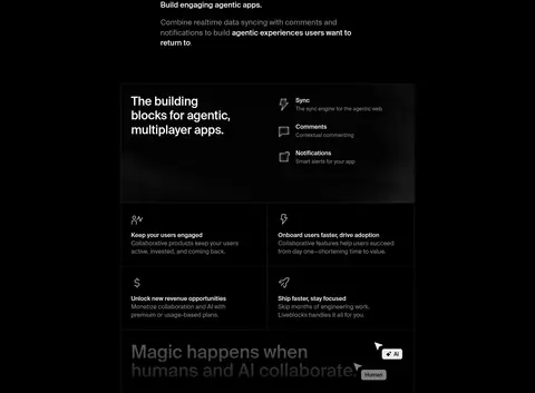
| 6 | feature-grid | Introductory copy above a wider feature panel and supporting grid cells. | Feature discovery, Capability grouping | Dark framed panel, Product interface imagery, Fine hairlines |
| 7 | product-showcase | Section copy and actions above a large two-part product demo. | Read the docs, Browse examples | Code pane, Live collaboration view, Participant badges |
| 8 | testimonials | Section introduction above a wide testimonial card with proof grids. | Customer quote, Previous and next controls, Trust proof | Dark testimonial panel, Feature grid, Uptime metric |
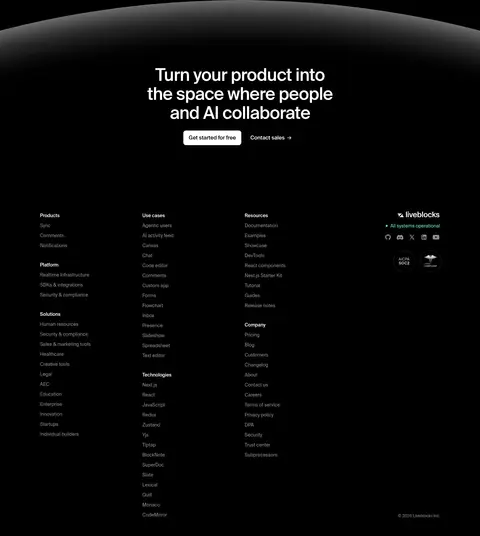
| 9 | footer | Centered closing CTA above a dense, multi-column footer. | Get started CTA, Contact sales link, Footer navigation | Soft radial glow, White CTA button, Muted link columns |
## Source CSS custom properties (selected)
```css
--lb-accent: #4af;
--lb-background: #222;
--lb-foreground: #fff;
--lb-accent-contrast: 16%;
--lb-foreground-contrast: 10%;
--lb-inset-shadow: inset 0 0 0 1px #ffffff0f;
--lb-highlight-shadow: inset 0 0 0 1px #ffffff1f;
--lb-elevation-shadow: 0 0 0 1px #0000000a, 0 2px 6px #00000014, 0 8px 26px #0000001f;
--lb-elevation-shadow-moderate: 0 0 0 1px #0000000a, 0 2px 6px #0000000d, 0 8px 26px #0000000f;
--lb-tooltip-shadow: 0 2px 4px #00000014, 0 4px 12px #0000001f;
--spacing-inner-gutter: calc(.25rem * 7);
--spacing-outer-gutter: calc(.25rem * 10);
--lb-color-text-code: