North star · Keep the page calm and spacious, using precise dark type and selective Todoist red to make product actions unmistakable.
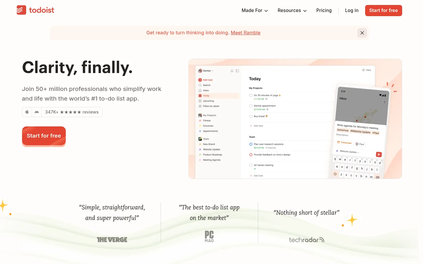
The page uses Gallery White (#fefdfc) as its dominant canvas, keeping the interface calm while warm cream sections and image backdrops add gentle variation. Ink (#25221e) gives headlines and navigation strong contrast; muted gray handles supporting copy. Signal Red (#e34432) is reserved for the logo, links, and primary “Start for free” actions, so it remains a clear focal point. Graphik headlines are bold and tightly tracked, balanced by Inter’s practical, readable interface text. The layout alternates a broad hero, press quotes, and spacious feature storytelling, with product screenshots and illustrations supplying color and detail. Cards and template examples use light borders and restrained shadows rather than heavy panels. Generous open space keeps long-page sections distinct, and the final pale footer band gathers dense navigation into a more compact, orderly grid.
配色
点色块复制色值。用途说明来自对页面的实测位置(背景、文字、描边、按钮)与截图判读。
品牌色
强调色
表层色
中性色
功能色
页面底色 · Gallery White表层 · Warm Cream主文字 · Soft Ink次要文字 · Quiet Gray描边 · Pale Graphite强调 · Todoist Red强调 2 · Task Blue强调 3 · Link Blue
Body copy, navigation, buttons, captions, and links.
Aa 设计
Graphik-1bbd4a4c7a2fb472
网络字体 · 字重 600 / 700 · 占比 14%
免费替代:DM Sans
Headlines and prominent card or navigation text.
Aa 设计
Caecilia-8d8a7c9be503e3f3
网络字体 · 字重 400 · 占比 3%
免费替代:Roboto Slab
Editorial serif accents, including press quotes.
Aa 设计
Shantell Sans-5a9740f6b2ed8488
网络字体 · 字重 400 · 占比 1%
免费替代:Comic Neue
Occasional handwritten annotations in product storytelling imagery.
角色
示例
字号
字重
行高
字距
一级标题
Hero headline and major page-opening statement.
Todoist
55px
600
1.15
-0.01em
二级标题
Large feature-section and conversion headlines.
Todoist
44px
600
1.15
-0.01em
三级标题
Feature and content-block headings.
Todoist
38px
700
1.28
-0.005em
四级标题
Smaller card and subsection headings.
The quick brown fox 敏捷的狐狸
22px
600
1.28
0
正文
Main explanatory copy and standard content.
The quick brown fox 敏捷的狐狸
15.5px
500
1.35
0.01em
辅助文字
Reviews, labels, image notes, and compact supporting details.
The quick brown fox 敏捷的狐狸
14.5px
500
1.5
0.013em
按钮
Primary CTA and other action labels.
The quick brown fox 敏捷的狐狸
15.5px
600
1.35
0.01em
导航
Header navigation and major site links.
The quick brown fox 敏捷的狐狸
15.5px
500
1.35
0.01em
链接
Inline calls to action and text links.
The quick brown fox 敏捷的狐狸
15.5px
600
1.35
0.01em
间距与布局
基准单位 4px · 密度:适中
48px版块间距
4px元素间距
—卡片内边距
—内容最大宽度
2px
4px
6px
8px
9px
10px
12px
14px
16px
20px
24px
32px
48px
The desktop page uses a broad centered content area, with the hero arranged as a left text column and a right product visual. Below, it alternates spacious split-feature blocks, wide media, template cards, proof points, and a closing CTA. Align text and media cleanly rather than enclosing every section in a box. Large vertical pauses separate major stories; dense template and footer navigation areas are deliberate exceptions. Keep the overall density comfortable and the visual rhythm open.
圆角与层次
按钮 · 15px
输入框 · 8px
卡片 · 10px
图片 · 15px
导航 · 8px
链接 · 8px
hairline · card
xl · button
The interface is mostly flat, using faint gray borders to define template cards and product examples. A very subtle hairline shadow can lift cards from the canvas, while stronger depth is reserved for prominent CTA treatment or layered product mockups. Avoid adding heavy shadows to ordinary content.
组件
下面的预览按实测的按钮、输入框、徽标、卡片样式重建(字体用替代字体)。
Primary CTA
Signal Red (#e34432) fill with white label, rounded corners, and a bold Inter treatment; used prominently in the hero and closing conversion area.
Header navigation
Compact horizontal navigation in Soft Ink (#25221e), with the Todoist mark at left and a red free-start action at right.
Announcement banner
A slim warm-tinted message strip above the hero, using muted red text, an inline link, and a discreet close control.
Feature split
Alternating text and product imagery with a small colored eyebrow, bold heading, concise supporting copy, and generous surrounding space.
Template cards
A horizontal set of light cards with fine gray borders, small illustrative thumbnails, dark titles, and compact descriptive text.
Press quote row
Three editorial testimonials arranged side by side, using restrained serif quote text, subtle separators, and publication marks.
Footer navigation
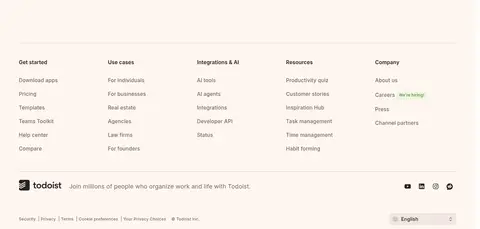
A warm cream footer with grouped link columns, a fine horizontal divider, brand note, social icons, and utility links.
Imagery · Product screenshots and device mockups are the main visual evidence, often framed against soft cream or blush backdrops. Supporting artwork includes playful task-related illustrations, small editorial flourishes, and occasional people imagery. Keep product UI legible and framed as an object within generous whitespace; imagery may carry extra colors that should not be promoted into the core site palette. Video is presented as a product-storytelling asset with a simple play affordance.
Use Gallery White (#fefdfc) as the primary canvas.
Reserve Todoist Red (#e34432) for clear actions and selective emphasis.
Set prominent headlines in Graphik-style bold sans-serif.
Use muted gray for secondary copy instead of competing dark tones.
Separate stories with generous whitespace and clear alignment.
Let product imagery provide detail without turning the page into a collage.
✕ 不该做
Do not fill every section with a colored panel.
Do not use red as a large continuous background.
Do not add heavy shadows to ordinary cards.
Do not crowd the hero with excessive copy or controls.
Do not treat illustration-only colors as core brand colors.
Do not use handwritten type for standard interface text.
给 AI 的提示词
想快速出一个同风格的新页面,把这段话连同 DESIGN.md 一起发给 AI。
Build a new page in Todoist’s calm, product-led visual style. Use Gallery White (#fefdfc) for the main canvas, Soft Ink (#25221e) for headlines and navigation, and Quiet Gray (#6e6c6a) for supporting copy. Apply Todoist Red (#e34432) selectively to the primary CTA and important links; use Warm Cream (#fff6f0) for a soft section or footer band. Pair bold Graphik-like headings with readable Inter-style body and interface text. Keep the layout broad, aligned, and spacious, with clear feature storytelling and framed product screenshots or restrained illustrations. Use thin Pale Graphite (#d7d5d4) borders and minimal elevation. Prioritize legibility and one unmistakable action per major section; avoid visual clutter, excessive color, and heavy card treatments.