North star · Let spacious white layouts and expressive serif headlines lead; use pink sparingly to direct attention to meaningful actions and ideas.
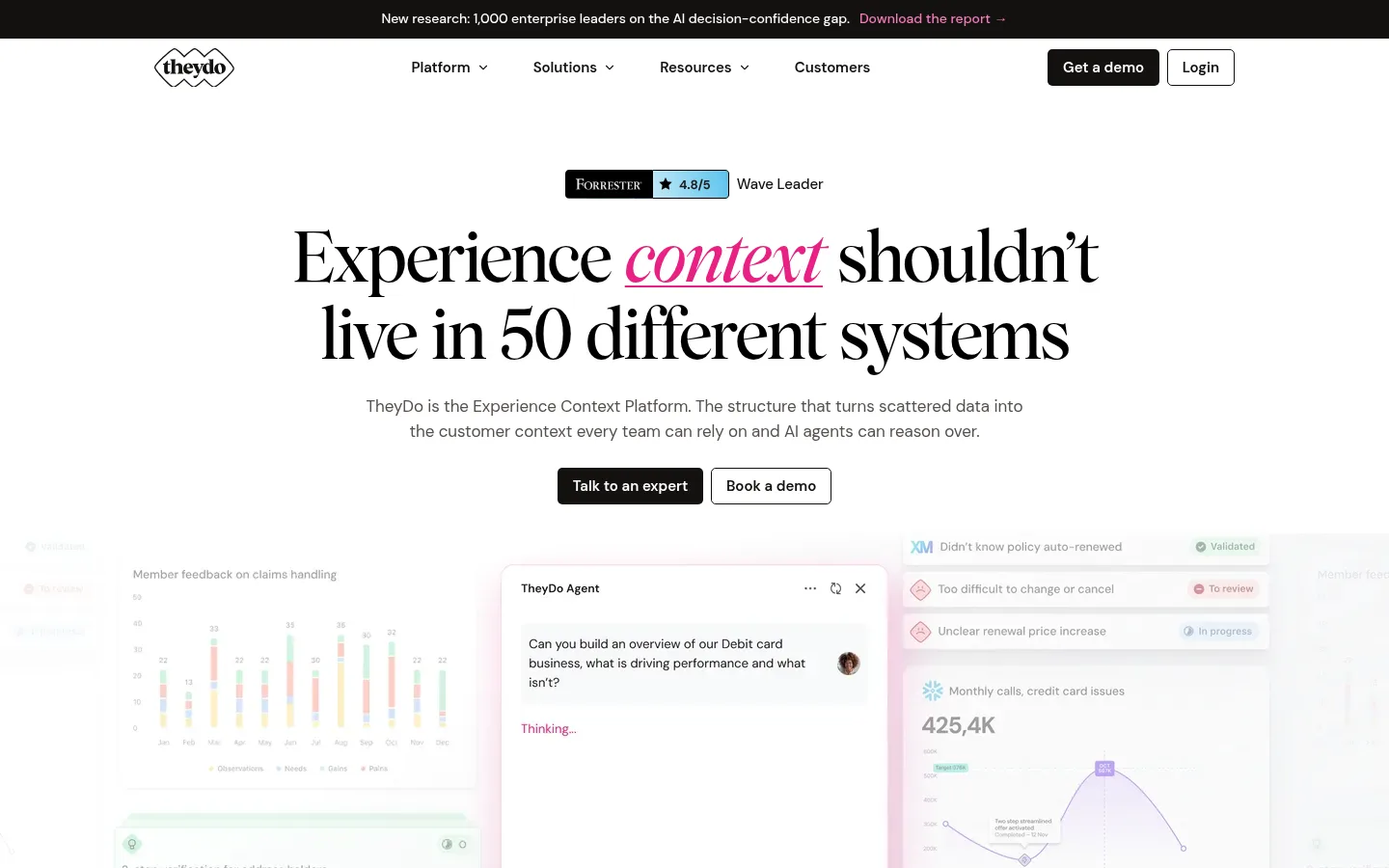
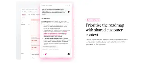
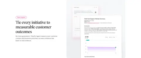
TheyDo’s homepage is built around a predominantly white canvas, with black and charcoal text providing clear contrast and vivid pink reserved for emphasis. Oversized, elegant serif headlines create an editorial voice, while DM Sans keeps navigation, body copy, and controls practical and legible. The first screen centers its message and paired calls to action; the rest of the page alternates centered introductions with broad product imagery and two-column feature storytelling. The product UI is shown in context rather than isolated as glossy device photography, often softened by pale backgrounds and pink-tinted glows. Light gray media panels and pale pink cards distinguish content without turning the page into a sequence of heavy color bands. Spacing feels generous and measured, with recurring sections given room to breathe. The dark footer provides a strong visual endpoint, while pink links, badges, and selected headline words act as a consistent navigational signal.
配色
点色块复制色值。用途说明来自对页面的实测位置(背景、文字、描边、按钮)与截图判读。
品牌色
强调色
表层色
中性色
功能色
页面底色 · Gallery White表层 · Soft Black表层 2 · Blush Card表层 3 · Pale Petal主文字 · Pure Ink次要文字 · Warm Graphite弱文字 · Footer Ash描边 · Signal Pink强调 · Signal Pink强调 2 · Petal Pink
Navigation, body copy, captions, links, and buttons.
Aa 设计
wulkan
网络字体 · 字重 400 / 500 · 占比 30%
免费替代:Cormorant Garamond
Display and heading typography, including the large editorial hero.
角色
示例
字号
字重
行高
字距
特大标题
Large editorial hero statement.
TheyDo
72px
400
1.11
-0.03em
一级标题
Primary page and major section headings.
TheyDo
40px
400
1.2
-0.022em
二级标题
Feature and subsection headings.
TheyDo
28px
400
1.29
-0.025em
三级标题
Smaller feature or card headings.
The quick brown fox 敏捷的狐狸
24px
400
1.25
-0.029em
正文
Explanatory paragraphs and standard supporting copy.
The quick brown fox 敏捷的狐狸
16px
400
1.44
-0.006em
辅助文字
Compact supporting labels and metadata.
The quick brown fox 敏捷的狐狸
14px
400
1.29
-0.014em
按钮
Calls to action and button labels.
The quick brown fox 敏捷的狐狸
16px
400
1.44
-0.006em
导航
Top navigation labels.
The quick brown fox 敏捷的狐狸
15px
600
1.5
0
链接
Inline and secondary action links.
The quick brown fox 敏捷的狐狸
14px
500
1.4
0
间距与布局
基准单位 1px · 密度:适中
80px版块间距
10px元素间距
15px卡片内边距
1120px内容最大宽度
1px
3px
5px
8px
10px
13px
15px
18px
20px
25px
30px
40px
50px
80px
The page uses a centered content frame with a measured maximum width of 1120px, opening with centered hero copy and a broad product visual. Long-form content alternates centered section introductions with split feature rows and a two-column use-case grid. A six-column logo row and four-column results band provide compact changes in rhythm. Sections have generous separation, with comfortable content density rather than tightly packed cards. Product screens and testimonial cards sit alongside copy, while the final dark footer spans the full width and organizes links into columns.
圆角与层次
按钮 · 5px
卡片 · 8px
图片 · 8px
徽标 · 9999px
导航 · 8px
链接 · 8px
没有测到阴影:页面是扁平的,层次靠底色和描边区分。
The visual system is mostly flat: no measured shadows define the interface. Cards and media use restrained borders or soft background contrast, with rounded corners rather than pronounced elevation. Pink glow around product imagery is part of the supplied visual treatment; keep it subtle and use layering only to distinguish interface panels.
组件
下面的预览按实测的按钮、输入框、徽标、卡片样式重建(字体用替代字体)。
Announcement bar
A narrow Soft Black strip above the white navigation, with centered small copy and a pink report link.
Primary CTA
Filled Soft Black button with white semibold DM Sans text and a compact rounded rectangle shape.
Secondary CTA
White or transparent button with a thin dark outline, paired next to the filled primary action.
Pink badge
Small outlined pill using Signal Pink text and border for labels such as feature stages.
Feature split
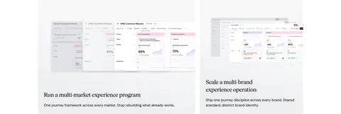
Alternating copy and product-interface media in a spacious two-column composition.
Testimonial card
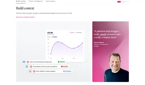
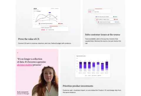
Pale pink or vivid pink portrait-backed card with an editorial quote and concise attribution.
Footer
Full-width Soft Black region with a serif brand statement and dense, muted multi-column link groups.
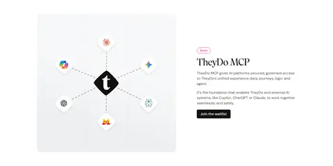
Imagery · Product-interface imagery is the dominant visual asset: dashboards, journey views, charts, and AI assistant panels appear in broad, softly framed compositions. Customer portraits are integrated into pink testimonial cards rather than presented as standalone photography. The MCP section uses a simple integration-style graphic. Interface screenshots often have pale gray surroundings and faint pink glow, creating depth without competing with the headline or body copy.
Do not replace the editorial serif with a generic display sans.
Do not make product screenshots look like unrelated stock imagery.
给 AI 的提示词
想快速出一个同风格的新页面,把这段话连同 DESIGN.md 一起发给 AI。
Build a new TheyDo-style SaaS page with a predominantly white Gallery White (#ffffff) canvas and spacious, centered sections. Use refined serif display headings, substituting Cormorant Garamond for wulkan, and DM Sans for navigation, controls, and body copy. Set text mainly in Pure Ink (#000000) or Soft Black (#131110), with Warm Graphite (#56504d) for quieter supporting copy. Use Signal Pink (#e82183) selectively for highlighted words, links, badges, and fine accents; keep pale pink surfaces such as Blush Card (#fce4f1) for testimonials or a closing CTA. Pair concise product storytelling with contextual dashboard and AI interface imagery in broad split layouts. Keep buttons compact and dark, secondary actions outlined, cards softly rounded, and elevation restrained. Finish with a full-width dark footer and organized muted link columns.