North star · Keep the canvas quiet and spacious so bold type, creator imagery, and yellow trial actions carry the page.
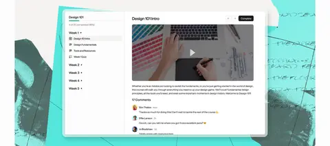
The page is built on a near-white canvas (#fdfdfc), with occasional warm-gray feature bands (#f4f3f1) to group product content without introducing heavy dividers. Near-black (#1b1a18) carries the headline, body copy, navigation, and footer, while golden yellow (#fdc837) marks the top navigation band and primary trial actions. GT Standard is used throughout: large, light-weight, tightly tracked headlines contrast with compact, readable supporting copy and restrained nav labels. The layout favors centered hero messaging, generous open space, and broad image-led sections, then shifts into a tidy two-column feature-card rhythm. Creator portraits and software screenshots are layered with colorful paper-like shapes in blue, teal, green, pink, and yellow; these hues enliven product imagery rather than replacing the core neutral brand palette. Cards remain mostly flat, with modest rounded corners and subtle shadow where screenshots need depth. The overall effect is friendly, editorial, and product-focused.
Used throughout for display headlines, body copy, navigation, buttons, and footer links.
角色
示例
字号
字重
行高
字距
特大标题
Oversized hero and key campaign headlines.
Podia
96px
400
0.95
-0.03em
一级标题
Main hero heading and major section titles.
Podia
72px
400
0.95
-0.025em
二级标题
Feature-group and secondary editorial headings.
Podia
52px
400
1
-0.02em
三级标题
Product-card and smaller feature headings.
Podia
36px
400
1.05
-0.02em
正文
Introductory descriptions, feature explanations, and testimonial copy.
The quick brown fox 敏捷的狐狸
18px
400
1.35
0.01em
辅助文字
Compact supporting labels and small contextual text.
The quick brown fox 敏捷的狐狸
14px
500
1
0.015em
按钮
Primary trial actions and product-card actions.
The quick brown fox 敏捷的狐狸
16px
400
1.6
0
导航
Header navigation and compact footer navigation.
The quick brown fox 敏捷的狐狸
14px
500
1
0.015em
间距与布局
基准单位 4px · 密度:适中
64px版块间距
24px元素间距
—卡片内边距
1312px内容最大宽度
4px
8px
11px
12px
16px
24px
28px
32px
36px
40px
64px
72px
Use a centered content area capped at the measured 1312px maximum width, with broad margins and a comfortable density. The hero is centered and spacious; feature content alternates between text-led splits and large product previews, then settles into paired cards and a wide community showcase. Section spacing follows the measured 64px rhythm, with 24px element gaps. Keep the footer as a dark, full-width band with four content columns.
圆角与层次
按钮 · 8px
卡片 · 8px
lg · card
md · card
Favor flat surfaces and clear whitespace over borders. Cards use the measured 8px radius; interface previews can sit above collage backdrops with restrained soft shadows. Keep outlines and hairlines sparse, and let the near-black footer create the strongest surface contrast.
组件
下面的预览按实测的按钮、输入框、徽标、卡片样式重建(字体用替代字体)。
Navigation
A full-width golden-yellow top band with the Podia wordmark, compact dark nav links, and a near-black rounded trial button.
Hero
Centered oversized headline, short proof statement, yellow trial CTA, and a large collage-style creator image below.
Feature card
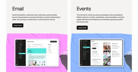
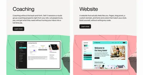
Warm-gray cards with concise product copy, dark Learn more action, and colorful screenshot backdrops.
Feature showcase
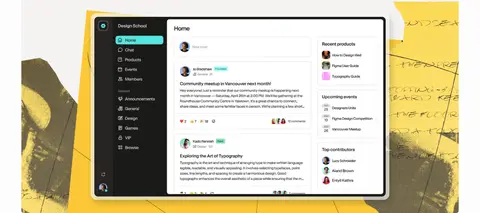
Wide product section combining a heading and description with a large software-interface image or collage.
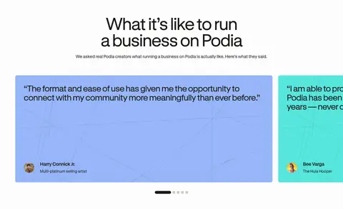
Testimonial carousel
Broad colored quote cards with creator attribution and small pagination indicators beneath.
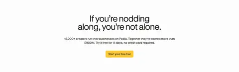
Closing CTA
Centered reassurance and creator-proof copy followed by a yellow free-trial button.
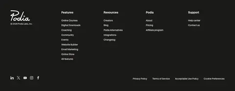
Footer
Near-black full-width surface with light logo and links arranged across four columns, plus a compact lower utility row.
Imagery · Use real creator portraits and workspace photography as the emotional anchor, paired with crisp product-interface screenshots. Frame images with irregular, paper-like color panels and crop them boldly, allowing the portrait or interface to overlap its background. The measured accent colors chiefly appear inside these collages and product cards, not as broad branded section fills.
Use the near-white canvas as the dominant page surface.
Set major headings large, regular-weight, and tightly tracked.
Reserve yellow for the navigation band and primary trial actions.
Separate feature groups with warm-gray bands rather than heavy rules.
Layer creator photography and product screenshots over collage-like color panels.
Keep text groups concise and leave generous space around them.
✕ 不该做
Do not turn the page into a dense dashboard layout.
Do not use bright collage colors as broad page backgrounds.
Do not add gradients; none are measured.
Do not decorate every card with borders or strong shadows.
Do not make every CTA yellow; secondary actions are near-black.
Do not crowd the hero with secondary content.
给 AI 的提示词
想快速出一个同风格的新页面,把这段话连同 DESIGN.md 一起发给 AI。
Build a new Podia-style SaaS page with a calm editorial feel. Use Gallery White (#fdfdfc) as the main canvas and Soft Ink (#1b1a18) for type; reserve Creator Gold (#fdc837) for the top navigation and primary trial actions. Use GT Standard or a close sans-serif substitute, with large regular-weight, tightly tracked headings and readable body copy. Keep the layout centered within the measured 1312px maximum width, with generous section breathing room and clear alignment. Group features on Warm Fog (#f4f3f1) panels, mixing concise descriptions with product-interface previews. Add creator photography and screenshot collages with restrained Creator Blue (#97b6f9), Studio Teal (#57e6dd), Mint Green (#9de0b7), and Petal Pink (#fad1fd) backdrops; keep these accents within imagery. Use modest rounded corners, subtle screenshot depth, and a near-black footer.