North star · Keep the canvas expansive and let one small, playful focal point contrast with a very faint oversized mark.
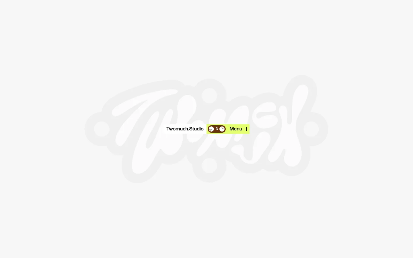
The page is built around a near-white canvas (#f7f7f7) and a deliberately sparse composition. Black (#000000) supplies the compact navigation text and the strongest typographic contrast, while white (#ffffff) and light gray (#e6e6e6) appear as restrained surface tones rather than competing brand colours. The screenshot’s fluorescent lime menu and oversized pale hand-drawn wordmark are visual details within the page imagery; they are not present in the measured palette, so treat them as artwork rather than a broader colour system. ABCMonumentGrotesk is used at a consistent medium weight, with tight negative tracking that keeps small labels crisp. The first viewport has no conventional hero copy or visible content grid: a small navigation group sits around the center of a large field of empty space, layered over the faint wordmark. The overall effect is playful but quiet, with scale contrast and whitespace doing most of the work.
配色
点色块复制色值。用途说明来自对页面的实测位置(背景、文字、描边、按钮)与截图判读。
表层色
中性色
页面底色 · Soft Canvas表层 · Studio Ink表层 2 · Quiet Gray表层 3 · Paper White主文字 · Studio Ink
Navigation, links, body copy, captions, and button labels
角色
示例
字号
字重
行高
字距
正文
Studio description and general page copy.
The quick brown fox 敏捷的狐狸
18px
500
1
-0.027em
辅助文字
Small navigation labels and secondary metadata.
The quick brown fox 敏捷的狐狸
14px
500
1
-0.034em
按钮
Compact menu and action labels.
The quick brown fox 敏捷的狐狸
14px
500
1
-0.03em
间距与布局
基准单位 8px · 密度:适中
—版块间距
6px元素间距
—卡片内边距
—内容最大宽度
2px
4px
6px
8px
The first viewport is a single sparse field rather than a visible multi-column grid. Keep the navigation cluster centered in the expansive canvas, with the studio-name link beside a compact menu control. The oversized wordmark sits behind it as a low-contrast graphic. No maximum content width or section gap is measured, so preserve the open proportions qualitatively instead of imposing a rigid spacing system. Content density is intentionally very low.
圆角与层次
卡片 · 4px
没有测到阴影:页面是扁平的,层次靠底色和描边区分。
The interface is predominantly flat, with no measured shadows or visible border system. The navigation feels layered over the faint wordmark through contrast and placement, not card elevation. Keep surfaces simple and avoid adding outlines or depth effects; measured cards use subtle flat fills and a small radius where applicable.
组件
下面的预览按实测的按钮、输入框、徽标、卡片样式重建(字体用替代字体)。
Centered studio navigation
A compact cluster pairing the black studio-name link with a bright menu control; keep it visually small against the wide canvas.
Wordmark artwork
An oversized, faint hand-drawn lettering mark sits behind the navigation as a graphic backdrop, not as readable content.
Menu control
A short, high-contrast label and overflow icon sit within a vivid lime block in the screenshot; the lime is artwork detail, not a measured palette token.
Studio-name link
Use black ABCMonumentGrotesk medium text as a restrained navigation anchor, with the measured link role at 18px.
Imagery · The defining visual is an oversized, pale, hand-drawn studio wordmark centered behind the navigation. It reads as graphic artwork, not photography or a conventional illustration panel. Keep it soft and low contrast against the canvas, with irregular lettering and a playful silhouette. The screenshot provides no evidence of photography, 3D scenes, or video; do not introduce those as defining elements.
该做与不该做
✓ 该做
Preserve a broad #f7f7f7 canvas.
Keep navigation compact and visually centered.
Use #000000 for crisp text and links.
Treat the faint wordmark as artwork, not a text heading.
Use generous empty space as a core compositional feature.
Keep interface surfaces flat and understated.
✕ 不该做
Do not fill the canvas with extra sections or copy.
Do not make the background wordmark high contrast.
Do not introduce unmeasured palette colours as brand tokens.
Do not add shadows, gradients, or heavy borders.
Do not enlarge navigation until it competes with the artwork.
Do not impose a conventional hero headline on this sparse opening.
给 AI 的提示词
想快速出一个同风格的新页面,把这段话连同 DESIGN.md 一起发给 AI。
Build a new page in the TWOMUCH.STUDIO visual style. Use Soft Canvas (#f7f7f7) as the dominant background and Studio Ink (#000000) for compact links and interface text; reserve Quiet Gray (#e6e6e6) and Paper White (#ffffff) for understated surfaces. Set text in ABCMonumentGrotesk or a close DM Sans substitute, medium weight, with tight tracking. Favor a sparse, spacious composition and a small centered navigation group, with an oversized pale hand-drawn wordmark treated as background artwork. The screenshot includes a vivid lime menu block, but that colour is not in the measured palette: if recreating that detail, keep it isolated to the control. Avoid heavy panels, shadows, gradients, dense copy, and decorative borders.