North star · Let a quiet white-and-gray canvas make black typography and reusable interface examples the primary visual signals.
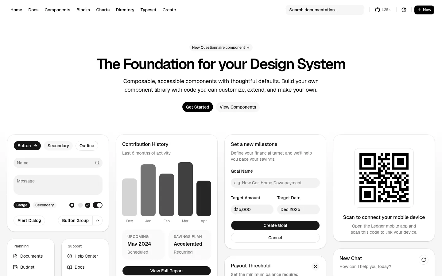
The visual strategy is built around a white canvas, black typography, and pale neutral surfaces rather than a bright brand accent. The hero is deliberately quiet: a small muted announcement leads into a large, tightly tracked heading, a short centered explanation, and compact pill-shaped actions. Below it, a four-column field of rounded cards makes the component library tangible through forms, charts, navigation, and financial dashboard examples. These mock interfaces use restrained gray fills and hairline borders, while occasional dark buttons provide the strongest contrast and focus. Geist carries the entire hierarchy, with a heavy, compact display heading offset by smaller, readable supporting text. Generous separation around the introduction gives way to a much denser showcase. The cards sit on the same pale background as the gallery, using subtle outlines and soft shadows for separation rather than dramatic elevation. Product mock-up colors remain neutral and serve the component demonstrations, not a separate brand palette.
All page typography, from navigation and hero heading to component labels and controls.
角色
示例
字号
字重
行高
字距
一级标题
Centered hero headline; large, bold, and tightly tracked.
shadcn/ui
48px
600
1.1
-0.05em
二级标题
Section-level headings where present; medium-weight and prominent.
shadcn/ui
36px
500
1.11
0
三级标题
Card or subsection titles within interface examples.
shadcn/ui
30px
600
1.2
0
四级标题
Short supporting headings and compact content labels.
The quick brown fox 敏捷的狐狸
18px
400
1.56
0
正文
Hero description and readable component or dashboard copy.
The quick brown fox 敏捷的狐狸
14px
400
1.43
0
辅助文字
Small labels, helper text, and card metadata.
The quick brown fox 敏捷的狐狸
12px
500
1.33
0
按钮
Compact action labels in dark and secondary pill controls.
The quick brown fox 敏捷的狐狸
14px
400
1.43
0
导航
Top navigation links and documentation navigation.
The quick brown fox 敏捷的狐狸
14px
500
1.43
0
链接
Small uppercase links and utility actions.
The quick brown fox 敏捷的狐狸
12px
500
1.33
0.05em
眉题
Announcement-style label above the hero heading.
The quick brown fox 敏捷的狐狸
12px
500
1.33
0.05em
间距与布局
基准单位 4px · 密度:适中
48px版块间距
8px元素间距
10px卡片内边距
1400px内容最大宽度
4px
6px
8px
10px
12px
14px
16px
20px
24px
The measured page uses a centered hero followed by a broad, four-column component showcase. The available page maximum is 1400px, with 48px section separation and a comfortable overall density. The hero heading, supporting copy, and actions are centered; the gallery switches to aligned card columns with varied card content. Use the measured 4px-based spacing scale for rhythm, keeping the introduction visibly open before the denser examples. The top navigation remains a compact horizontal strip.
圆角与层次
按钮 · 9999px
输入框 · 9999px
卡片 · 24px
徽标 · 9999px
导航 · 8px
链接 · 18px
sm · card
hairline · button, nav
hairline · input
sm · other
Keep the interface mostly flat. Separate cards with white surfaces, subtle gray borders, and a restrained soft shadow where needed; avoid dramatic depth or colored glow. Pill controls are distinguished chiefly by fill and outline, while darker primary actions create clear visual hierarchy.
组件
下面的预览按实测的按钮、输入框、徽标、卡片样式重建(字体用替代字体)。
Top navigation
A compact horizontal row of black Geist links with a documentation search field and small utility controls.
Centered hero
A muted announcement pill sits above the large black headline, centered supporting copy, and two compact actions.
Primary pill action
Use a dark filled, rounded control with light text; the measured primary button radius is 18px.
Secondary pill action
A pale gray or white control with dark text; outlined variants use the measured #e5e5e5 border.
Showcase card
Rounded white cards with a 24px measured radius contain realistic component and dashboard demonstrations.
Component controls
Inputs use pale gray fills and rounded ends; badges and button examples contrast dark and soft-gray treatments.
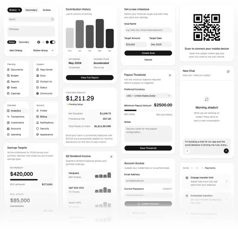
Imagery · There is no photographic brand imagery. The visual content is made from interface mock-ups: form controls, chart bars, dashboard cards, menus, a chat panel, and a QR-code example. Frame these as crisp, rounded white cards with restrained gray content and small black accents. Treat the QR code and chart graphics as product-demo details, not as standalone brand illustrations.
Keep the page canvas white and the palette monochrome.
Center the hero headline and its supporting copy.
Use Geist or a close sans-serif substitute throughout.
Reserve dark filled controls for prominent actions.
Show components inside rounded, clearly separated cards.
Use muted gray for secondary copy and helper text.
✕ 不该做
Do not introduce bright accent colors.
Do not add photographic or decorative hero imagery.
Do not make every section equally dense.
Do not use heavy shadows or dramatic gradients.
Do not use decorative typefaces or all-caps headings.
Do not turn dashboard mock-up colors into brand colors.
给 AI 的提示词
想快速出一个同风格的新页面,把这段话连同 DESIGN.md 一起发给 AI。
Build a new page in the shadcn/ui visual style: a white, restrained canvas with black Geist typography and soft-gray interface surfaces. Use Gallery White (#ffffff) for the page and card backgrounds, Soft Mist (#f5f5f5) for quiet secondary controls, Quiet Gray (#737373) for supporting copy, Fine Rule (#e5e5e5) for hairline outlines, and Button Charcoal (#171717) for high-contrast actions. Start with compact horizontal navigation, then a spacious centered hero with a small announcement, tightly tracked headline, brief description, and pill actions. Follow with a denser showcase of rounded component cards arranged in aligned columns. Demonstrate real interface patterns rather than decorative artwork. Keep elevation subtle, hierarchy clear, and spacing comfortable; avoid bright accents, photography, and ornamental gradients.