North star · Let expressive light serif headlines lead, then use disciplined sans-serif detail and alternating dark and light bands to make complex enterprise workflows feel clear.
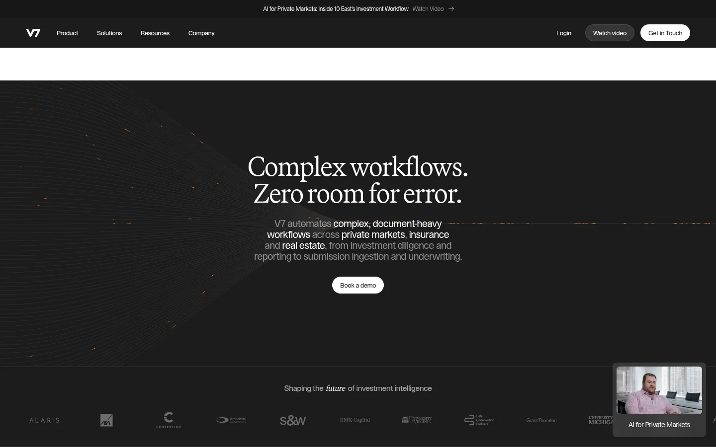
The homepage is built around a dramatic near-black opening, using soft white serif typography for the central promise and small sans-serif copy for supporting detail. Dark sections carry the brand narrative, industry cards and closing footer; bright white and warm off-white panels provide contrast for workflow explanations, testimonials, metrics and security content. Orange appears sparingly in the measured palette and in fine visual accents, not as a broad CTA fill. Headings use a light editorial serif with tight negative tracking, while compact sans-serif text handles navigation, labels and dense enterprise information. Content is organized in broad, clearly separated bands, with centered hero messaging followed by structured card grids and image-led proof. Customer videos and subdued interface imagery supply evidence without turning the page into a product screenshot collage. Hairline dividers and restrained shadows keep cards crisp but largely flat.
配色
点色块复制色值。用途说明来自对页面的实测位置(背景、文字、描边、按钮)与截图判读。
品牌色
强调色
表层色
中性色
功能色
页面底色 · Gallery White表层 · Midnight Panel表层 2 · Warm Porcelain主文字 · Graphite Ink次要文字 · Gallery White弱文字 · Deep Charcoal描边 · Slate Hairline强调 · Signal Orange强调 2 · Burnt Signal
Body copy, captions, badges, and compact content labels.
Aa 设计
Martina Plantijn Light
网络字体 · 字重 300 · 占比 30%
免费替代:Cormorant Garamond
Large editorial headlines and section titles.
Aa 设计
STK Bureau STK Bureau
网络字体 · 字重 430 · 占比 13%
免费替代:Inter
Navigation and compact interface labels.
角色
示例
字号
字重
行高
字距
一级标题
Central hero promise, set as a large light serif headline.
V7
54px
300
1
-0.03em
二级标题
Major section headings introducing product and proof content.
V7
48px
300
1
-0.03em
三级标题
Subsection headings for industry and workflow areas.
V7
40px
300
1
-0.03em
四级标题
Smaller card and feature titles.
V7
30px
300
1
-0.03em
正文
Supporting descriptions, customer quotes, and explanatory copy.
The quick brown fox 敏捷的狐狸
14px
400
1.4
-0.04em
辅助文字
Compact labels, testimonial metadata, and fine print.
The quick brown fox 敏捷的狐狸
12px
400
1.4
-0.04em
导航
Top navigation and concise interface labels.
The quick brown fox 敏捷的狐狸
13px
430
1.4
-0.04em
间距与布局
基准单位 4px · 密度:适中
60px版块间距
4px元素间距
24px卡片内边距
1336px内容最大宽度
2px
3px
4px
6px
8px
9px
10px
12px
15px
16px
20px
24px
30px
32px
39px
40px
The page uses a broad centered content frame, measured at a maximum width of 1336px, with comfortable density and generous section separation. The hero centers its headline and supporting copy within a full-width dark field; later content alternates full-width dark and light bands. Industry cards and workflow content use aligned columns, while testimonials and proof points form structured grids. Keep text blocks narrow relative to the canvas and use the measured spacing scale to maintain clear grouping without crowding.
圆角与层次
按钮 · 9999px
卡片 · 10px
图片 · 50%
徽标 · 6px
导航 · 9999px
链接 · 9999px
sm · other, card
inset · badge
hairline · card
hairline · other
The system is mostly flat: strong surface changes and thin dividers establish hierarchy instead of heavy shadows. Cards can use the measured subtle shadow treatment, while badges use a fine outline and inset edge. Keep layering restrained, with rounded pill controls and softly rounded cards rather than elevated, floating panels.
组件
下面的预览按实测的按钮、输入框、徽标、卡片样式重建(字体用替代字体)。
Dark hero
Full-width near-black field with centered light serif headline, compact supporting copy, a white pill CTA, and subdued abstract visual texture.
Pill actions
Rounded CTA and navigation controls; use white surfaces against dark bands and restrained text contrast.
Industry cards
Three-column dark cards with concise industry descriptions, outlined category badges, and low-key text links.
Workflow grid
Light section with aligned feature cells, compact headings, product/interface imagery, and subtle separators.
Customer proof
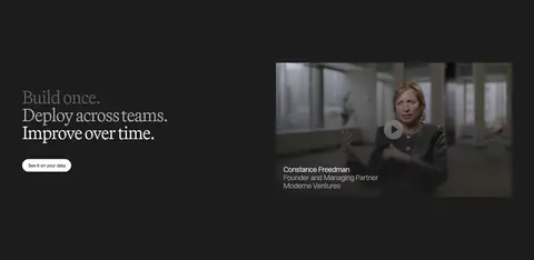
Video-led testimonials with darkened rectangular thumbnails, speaker labels, metrics, and readable quote text.
Trust strip
Compact security and customer proof marks set in subdued tones within a spacious light content area.
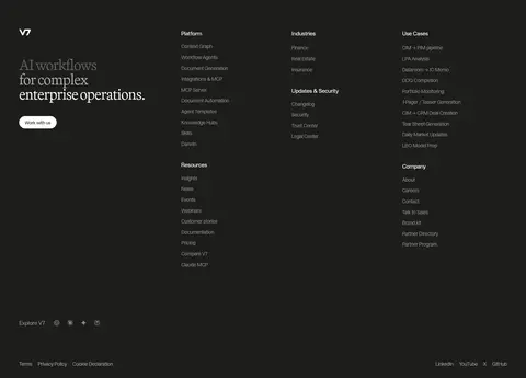
Dark footer
Near-black closing band with a serif positioning statement and multiple compact link columns separated from the bottom utility row.
Imagery · Imagery combines subdued interface and workflow visuals with customer interview videos. Video thumbnails are framed as rectangular panels with darkened overlays and concise speaker captions. The hero uses an abstract, low-contrast dark visual with fine orange traces rather than prominent product photography. Keep imagery restrained, legible, and supportive of the enterprise narrative.
Use near-black bands to anchor the hero and closing content.
Set major headlines in a light editorial serif.
Keep supporting copy compact and sans-serif.
Alternate dark narrative sections with bright product sections.
Reserve orange for sparse accents and fine visual details.
Use thin dividers and subtle card shadows.
Give product and proof content clear, aligned grids.
✕ 不该做
Do not fill large areas with orange.
Do not use heavy shadows to create card hierarchy.
Do not crowd the hero with extra controls or copy.
Do not use oversized sans-serif headlines in place of the editorial serif.
Do not make every section share the same background tone.
Do not treat illustrative orange traces as a standalone brand gradient across the page.
给 AI 的提示词
想快速出一个同风格的新页面,把这段话连同 DESIGN.md 一起发给 AI。
Build a new enterprise AI page in V7’s restrained editorial style. Use Midnight Panel (#1c1c1c) for the hero and selected narrative bands, with Gallery White (#ffffff) for content surfaces and Warm Porcelain (#f7f6f5) as a gentle section variation. Set prominent headings in a light, tightly tracked editorial serif; use compact sans-serif for body copy, labels, and navigation. Keep Signal Orange (#ff6300) and Burnt Signal (#ec580a) sparse, as small accents rather than broad fills. Organize content in a wide centered frame with clear section bands, aligned grids, and comfortable spacing. Favor customer video and muted workflow imagery, crisp dividers, lightly rounded cards, and subtle shadows. Keep CTAs simple white pills on dark fields and avoid unnecessary visual ornament.