North star · Keep the page warm and quiet, letting editorial serif headlines and vivid product imagery carry emphasis while controls stay crisp and functional.
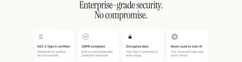
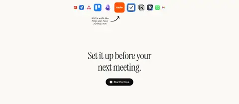
The page is built on a consistent warm ivory canvas (#faf9f5), with near-black text and generous open areas that keep its long sales story calm rather than busy. Instrument Serif supplies the large editorial headlines, while Inter handles navigation, explanatory copy, labels, and buttons with a compact, legible rhythm. The layout alternates centered feature introductions with carefully aligned image-and-copy compositions, then moves through security proof, testimonials, and a final setup CTA. Product imagery is the main source of visual color: vivid meeting artwork and interface mockups sit inside rounded frames, while the surrounding interface stays restrained. Black pill-shaped CTAs create clear action contrast; fine gray borders and white cards organize proof and product details without making the page feel heavily boxed. Spacing is roomy between major sections but compact within cards and supporting copy.
Body copy, navigation, captions, and most interface labels.
Aa 设计
Inter SemiBold
网络字体 · 字重 400 · 占比 10%
免费替代:Inter
Emphasized navigation and button labels.
Aa 设计
Inter Medium
网络字体 · 字重 400 · 占比 5%
免费替代:Inter
Links and button labels.
Aa 设计
InstrumentSerif-Regular
网络字体 · 字重 400 · 占比 2%
免费替代:Instrument Serif
Large display headlines, especially the hero and centered section titles.
Aa 设计
-apple-system
系统字体 · 字重 400 / 500 · 占比 1%
免费替代:Inter
System-font fallback for minor interface or platform-rendered text.
角色
示例
字号
字重
行高
字距
特大标题
Large serif hero headline and editorial section headings.
Voicenotes
60px
400
1
-0.02em
一级标题
Small supporting hero and primary explanatory copy.
The quick brown fox 敏捷的狐狸
18px
400
1.56
0
正文
Feature descriptions, testimonials, and general page copy.
The quick brown fox 敏捷的狐狸
14px
400
1.43
0
辅助文字
Compact helper text, metadata, and card details.
The quick brown fox 敏捷的狐狸
12px
400
1.33
0
按钮
Primary and secondary CTA labels.
The quick brown fox 敏捷的狐狸
16px
400
1.31
0
链接
Navigation links and inline text links.
The quick brown fox 敏捷的狐狸
14px
400
1.71
0
间距与布局
基准单位 4px · 密度:紧凑
40px版块间距
8px元素间距
16px卡片内边距
1240px内容最大宽度
4px
6px
8px
10px
12px
16px
20px
24px
32px
40px
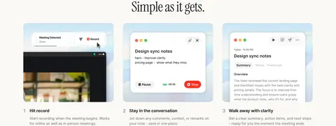
Use a centered content area capped at the measured 1240px maximum, with two-column hero composition and centered section titles. The page alternates feature demonstrations, security proof, testimonial cards, a final CTA, and a multi-column footer. Major sections have generous vertical separation; within cards, supporting copy and controls stay compact. Feature content shifts between three-column steps and image-led split layouts, while the trust and testimonial areas use denser grids.
圆角与层次
按钮 · 9999px
卡片 · 12px
图片 · 50%
sm · media
sm · other
xl · card
lg · other
The interface is mostly flat, with thin stone-gray card outlines doing much of the separation work. White cards sit quietly against the ivory canvas, and rounded corners soften product and testimonial panels. Use subtle shadows only to lift media or selected layered mockups; avoid broad, dark shadows on ordinary content.
组件
下面的预览按实测的按钮、输入框、徽标、卡片样式重建(字体用替代字体)。
Primary CTA
Near-black pill button with white Inter label; used for Book a demo and Start for free actions.
Secondary CTA
Light canvas or white pill with a fine dark outline and dark text, paired beside the filled primary action.
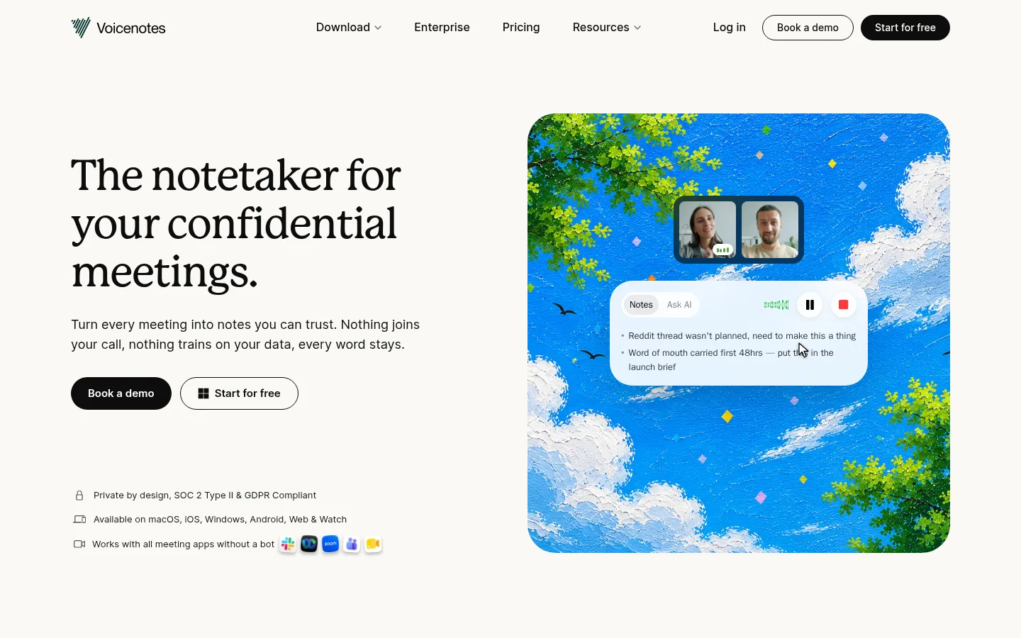
Hero media panel
Large rounded product illustration or interface composition opposite the hero copy; its saturated artwork supplies color.
Feature card
Rounded screenshot or demonstration surface with concise title and supporting copy, arranged in three-step or split-section layouts.
Proof card
White testimonial card with a thin #cbcac7 outline, rounded corners, compact quote text, and author details.
Trust row
Small icon-led reassurance statements beneath the hero CTA, covering privacy, supported platforms, and meeting-app compatibility.
Footer link columns
Four compact groups of text links above a fine footer divider, with copyright and social icons along the bottom.
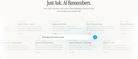
Imagery · Use product interface mockups and colorful meeting-related artwork as the primary visual storytelling. The hero places a large rounded media panel beside copy; later feature sections show screenshots in framed compositions. Bright blues and greens belong mainly to illustrations and mockups, not the core UI palette. Keep media sharp and colorful against the muted canvas.
Use Inter for navigation, body copy, labels, and controls.
Reserve #0d0d0d-filled pills for high-priority actions.
Let colorful product mockups provide most visual variety.
Use fine #cbcac7 outlines to define cards without heavy framing.
✕ 不该做
Do not turn illustration colors into the primary UI palette.
Do not use heavy shadows on every card.
Do not replace the editorial serif display voice with generic bold sans-serif.
Do not crowd major sections together.
Do not make every section a bordered card grid.
Do not use all-caps styling for headlines or navigation.
给 AI 的提示词
想快速出一个同风格的新页面,把这段话连同 DESIGN.md 一起发给 AI。
Build a new Voicenotes-style page on a warm, quiet canvas using Warm Canvas (#faf9f5) as the dominant background and Soft Ink (#0d0d0d) for primary text and filled CTAs. Set editorial headlines in Instrument Serif with tight tracking; use Inter for navigation, body copy, labels, and buttons. Create a clear content hierarchy with open section spacing, centered introductions, and selective two-column or card-grid compositions. Use Paper White (#ffffff) surfaces and Stone Hairline (#cbcac7) outlines to organize cards without heavy borders or shadows. Keep interface colors restrained; put vivid blues and greens inside product illustrations and mockups. Make rounded pill buttons the clearest actions, balance them with outlined secondary actions, and keep supporting labels and footer links compact and legible.