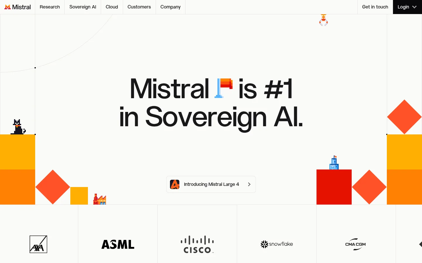
Mistral 首页以温润的浅色底和醒目的字体搭配鲜明几何插画,呈现开放 AI 品牌气质。页面通过模块化产品介绍、客户案例和深色内容区,将复杂的 AI 产品组织成清晰易读的浏览路径。
North star · Keep the interface quiet and spacious, and reserve vivid color for purposeful illustration and key moments.
The page is anchored by a warm off-white canvas (#fbfbf8), with dark ink typography and fine grey rules providing structure without visual heaviness. Bright orange and red hues are used as small, high-impact accents, especially in the hero’s geometric pixel-art scene; they are not the general surface palette. ALTMistral gives display and heading text a distinctive, compact editorial voice, while Inter keeps body copy and interface labels practical and readable. The opening hero uses generous negative space around a centered headline, then hands off to a horizontally segmented customer-logo strip. Subsequent sections alternate restrained warm-neutral storytelling with tightly organized product panels and colorful illustrative media. A nearly black (#151524) resource band creates a deliberate late-page contrast before the light footer returns. Borders and square-edged panel divisions do most of the component work; avoid relying on shadows or decorative gradients.
Oversized brand or campaign statements where present.
Mistral
96px
500
1
-0.02em
一级标题
Primary hero headline and major page-level title.
Mistral
56px
500
1.07
-0.01em
二级标题
Large section headings and prominent narrative statements.
Mistral
44px
500
1.18
-0.01em
三级标题
Feature-panel and resource-card titles.
Mistral
32px
500
1.25
0
四级标题
Smaller content-group headings and supporting feature titles.
The quick brown fox 敏捷的狐狸
24px
500
1.33
0
正文
Descriptions, customer stories, and explanatory copy.
The quick brown fox 敏捷的狐狸
16px
400
1.5
0
辅助文字
Eyebrows, compact metadata, and small labels.
The quick brown fox 敏捷的狐狸
14px
500
1.43
0.02em
导航
Primary header links and navigation controls.
The quick brown fox 敏捷的狐狸
16px
500
1.5
0
间距与布局
基准单位 8px · 密度:适中
40px版块间距
16px元素间距
—卡片内边距
1360px内容最大宽度
4px
8px
12px
16px
24px
40px
128px
Use a centered content frame with a measured maximum width of 1360px and a comfortable density. The hero is a broad single-column stage with centered type and substantial breathing room; its logo strip divides into repeated bordered cells. Content below shifts between full-width section bands, a two-column product-story area, and multi-column resources and footer navigation. Maintain a clear vertical rhythm using the measured 8px base spacing scale, with larger section separation than within-card gaps.
圆角与层次
按钮 · 6px
卡片 · 12px
导航 · 6px
链接 · 6px
没有测到阴影:页面是扁平的,层次靠底色和描边区分。
The visual system is mostly flat. Thin #e4e3de rules separate navigation cells, cards, and content blocks, while background bands distinguish sections. Use little or no shadow; let contrast, illustration, and crisp panel boundaries create hierarchy. The dark resource band is a deliberate surface change, not a floating overlay.
组件
下面的预览按实测的按钮、输入框、徽标、卡片样式重建(字体用替代字体)。
Header navigation
A compact light header with dark Inter links, fine cell dividers, and a near-black login control.
Hero statement
Large centered ALTMistral headline on warm off-white, framed by vivid geometric pixel-art details and generous empty space.
Customer logo strip
A horizontal row of evenly divided light cells with monochrome customer marks and subtle hairline borders.
Feature story panels
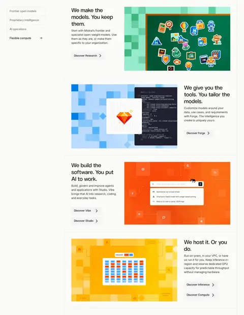
Product narratives arranged in a two-column editorial grid, pairing concise text and links with bold colorful artwork.
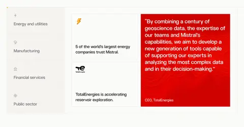
Customer proof card
A bordered case-study layout with category navigation, concise customer evidence, and a high-contrast quote panel.
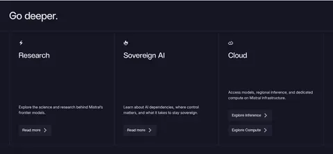
Resource cards
Three columns on a midnight surface, using light titles and copy, subtle borders, and compact read-more actions.
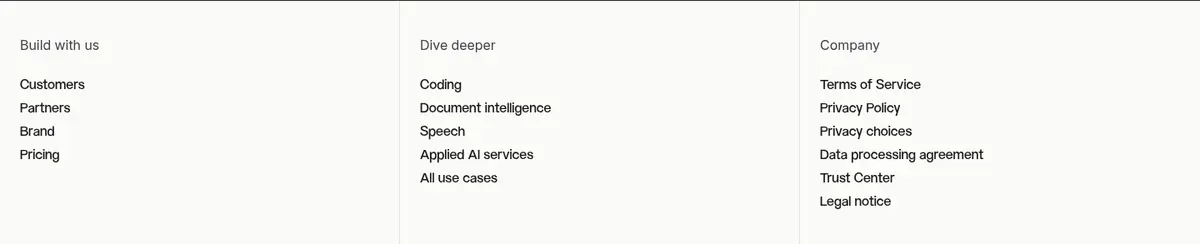
Footer navigation
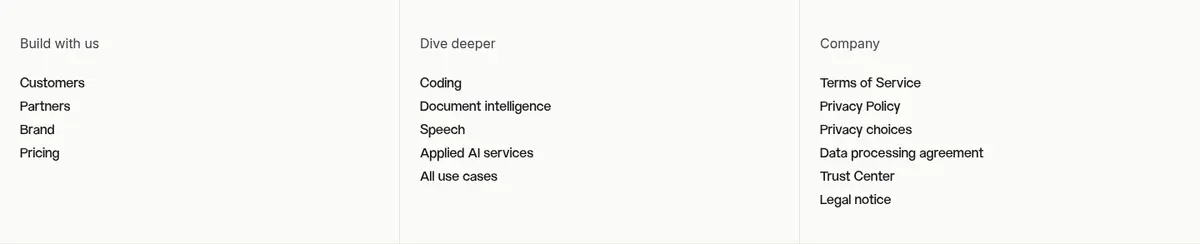
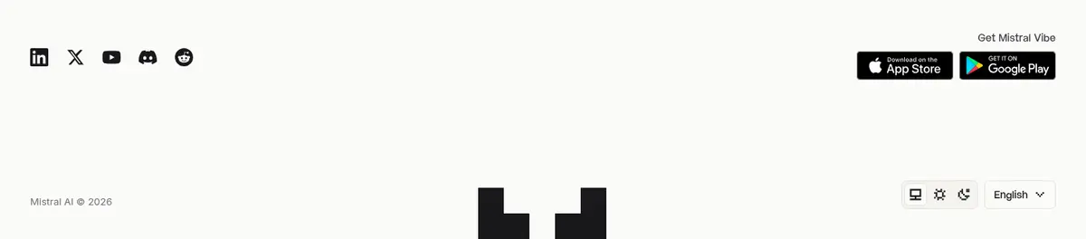
Light, rule-separated columns for grouped links, followed by social, app, locale, and brand details.
Imagery · Illustration, rather than photography, defines the page: the hero uses vivid geometric blocks and small pixel-art details, while product panels show colorful, block-based visualizations and interface imagery. Keep these images contained within their grid cells and let the surrounding warm canvas remain quiet. Customer logos are monochrome and evenly presented; avoid adding photographic treatments that compete with the brand artwork.
Set major headings in ALTMistral or a close substitute.
Keep large headline blocks surrounded by open space.
Use thin #e4e3de rules to define grid cells.
Reserve vivid reds and oranges for selected artwork.
Alternate light content with a purposeful midnight resource band.
✕ 不该做
Do not turn the page into a saturated orange interface.
Do not add heavy shadows to flat editorial panels.
Do not make every section a rounded card.
Do not crowd the hero with supporting copy or controls.
Do not use colorful customer logos when monochrome marks suit the strip.
Do not replace the warm off-white canvas with stark white.
给 AI 的提示词
想快速出一个同风格的新页面,把这段话连同 DESIGN.md 一起发给 AI。
Build a new Mistral-style AI page with a warm #fbfbf8 canvas, Ink Black #18181b typography, and restrained Soft Rule #e4e3de dividers. Use a distinctive display sans for headlines and Inter for readable body copy. Give the hero generous whitespace and a centered, confident statement; use vivid Signal Vermilion #ff5229, Ember Orange #ff8204, and Cinder Red #e51300 as controlled illustration accents, not as broad interface fills. Organize the page in clear modular bands: customer proof, editorial product features, and a contrasting Midnight Panel #151524 for deeper resources. Prefer crisp grid edges, light surfaces, and simple links over shadows, gradients, or pill-heavy UI. Keep copy concise, align media deliberately with its text, and preserve a clear rhythm between sections.