North star · Pair oversized, tightly tracked editorial headlines and generous white space with cinematic real-world truck imagery, reserving vivid pink for decisive accents.
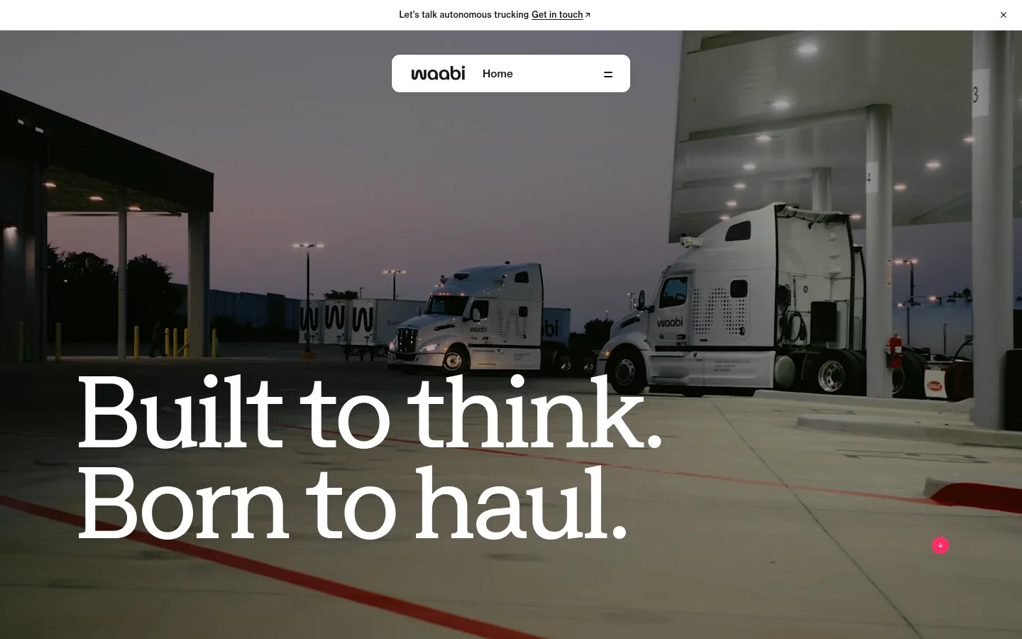
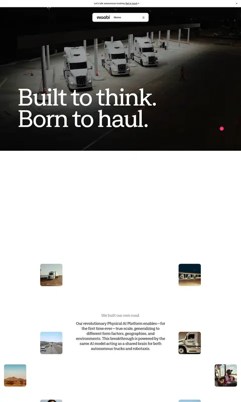
The page balances a quiet white canvas with cinematic, full-bleed truck footage. The first view uses a darkened operational scene as a backdrop for enormous white headline lettering, while most following content returns to white and lets imagery and large areas of negative space carry the rhythm. Warm gray-beige appears in selected content bands and cards; the saturated pink accent is reserved for small, high-visibility calls to action and occasional graphic emphasis. Zagma supplies the page’s distinctive display and interface voice: oversized headlines have tight tracking and compact line spacing, while navigation and body copy remain restrained. NeueHaas is used sparingly for small captions. Content alternates between open editorial compositions, image-led feature panels, compact card groups, and dark testimonial overlays. Fine gray borders and softly rounded cards define edges without introducing heavy shadows. Photography, video, and layered image compositions are central; colors found within truck imagery should not be mistaken for brand colors.
Display, headings, body copy, navigation, and most interface text
Aa 设计
NeueHaas
网络字体 · 字重 500 / 400 · 占比 28%
免费替代:Inter
Small captions and supporting metadata
角色
示例
字号
字重
行高
字距
特大标题
Oversized hero and campaign-style display headlines.
Waabi
150px
400
0.85
-0.048em
一级标题
Primary page headline and major statements.
Waabi
129.5px
400
0.9
-0.04em
二级标题
Large section headlines, such as trust and hiring content.
Waabi
80px
400
0.9
-0.04em
三级标题
Secondary editorial section headings and feature statements.
Waabi
60px
400
0.9
-0.03em
四级标题
Smaller card and feature headings.
Waabi
40px
400
1.1
-0.03em
正文
Explanatory paragraphs, card copy, and general content.
The quick brown fox 敏捷的狐狸
16px
400
1.4
-0.02em
辅助文字
Compact image labels, dates, and metadata.
The quick brown fox 敏捷的狐狸
12px
500
1.4
0.02em
导航
Main navigation labels.
The quick brown fox 敏捷的狐狸
20px
400
1.2
-0.03em
间距与布局
基准单位 4px · 密度:宽松
103px版块间距
16px元素间距
48px卡片内边距
1234px内容最大宽度
1px
4px
6px
8px
10px
11px
12px
16px
20px
24px
32px
36px
48px
90px
96px
103px
The measured content max width is 1234px, with a spacious density and a 103px section-gap reference. Keep the page predominantly single-column and editorial, varying it with image cards, side-by-side feature content, and three-column groupings. Major statements align to a clear content edge rather than being centered by default. Broad white intervals separate the hero, narrative, feature, and content-feed zones. Use the warm-gray editorial band as a deliberate change of pace before returning to white. Avoid compressing the long-form scroll into a tight dashboard grid.
圆角与层次
按钮 · 50%
卡片 · 12px
导航 · 12px
没有测到阴影:页面是扁平的,层次靠底色和描边区分。
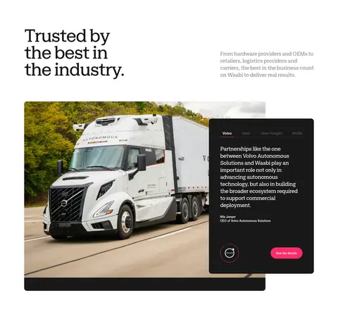
The interface is mostly flat, with no measured shadow system. Separate content through large whitespace, pale hairlines, warm-gray bands, and image cropping. Cards use a measured 12px radius; the testimonial presentation layers a dark text panel over truck photography. Buttons are pill-shaped, with pink fill for primary actions.
组件
下面的预览按实测的按钮、输入框、徽标、卡片样式重建(字体用替代字体)。
Announcement bar
A slim white top strip with centered contact prompt and an understated close control.
Floating navigation
White rounded navigation panel over the hero image, with Waabi mark, Home label, and compact menu control.
Primary CTA
Pink #ff2c6b pill button with white text; use sparingly for key actions such as exploring technology or viewing details.
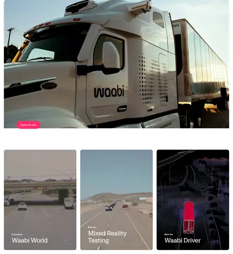
Editorial image card
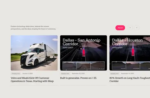
Rounded image-led card; use photography, subtle overlaid labels, and restrained supporting copy.
Testimonial overlay
A #191818 rounded panel layered over a large truck image, with compact partner labels, quote, attribution, and pink action.
Section band
Broad #e8e6e3 background break used to distinguish editorial or insight content from white sections.
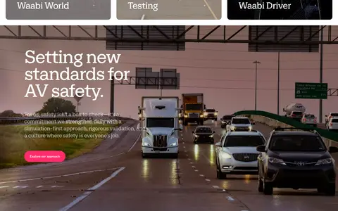
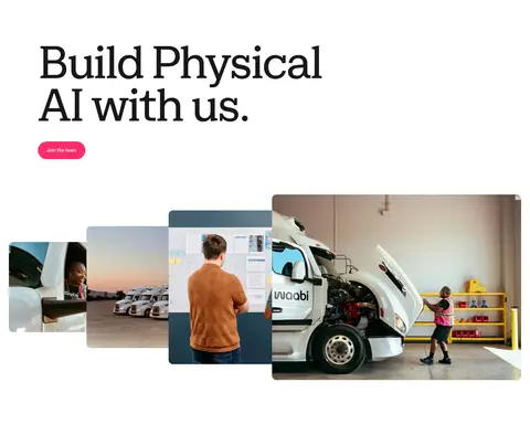
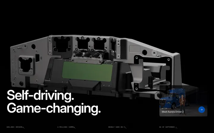
Imagery · Use real-world truck photography and video as the primary storytelling material: fleet yards, highways, vehicles, and operational settings. The hero is full-bleed and darkened enough for white headline contrast. Later media appears in large rounded panels, small floating image tiles, and editorial cards. Keep crops cinematic and grounded; avoid treating colors sampled from photos as interface palette.
Set major headlines in Zagma with tight tracking and compact lines.
Use #ff2c6b for primary actions, not broad page backgrounds.
Let real truck imagery anchor major storytelling sections.
Preserve generous space between editorial blocks.
Use #e8e6e3 for occasional warm section contrast.
✕ 不该做
Do not introduce unmeasured brand colors.
Do not turn the page into a dense dashboard layout.
Do not apply pink to large content surfaces.
Do not add heavy drop shadows to cards.
Do not mistake photo or video colors for interface colors.
Do not use all-caps as the default headline treatment.
给 AI 的提示词
想快速出一个同风格的新页面,把这段话连同 DESIGN.md 一起发给 AI。
Build a new Waabi page as a spacious editorial experience, not a conventional SaaS dashboard. Use Gallery White (#ffffff) for the main canvas, Soft Ink (#191818) for text, Oat Surface (#e8e6e3) for occasional section bands, and Waabi Pink (#ff2c6b) only for primary actions and small accents. Set large, naturally cased headlines in a Zagma-like sans with tight tracking and compact line spacing; use a restrained NeueHaas-like face for captions. Create a strong image-led opening with real autonomous-truck photography or video and white headline text over a darkened image. Alternate open white content, broad image panels, and editorial cards, preserving generous whitespace. Keep borders subtle, surfaces flat, and cards softly rounded. Do not add decorative shadows or invent colors from the photography.