North star · Keep the interface nearly monochrome and let one cinematic green image carry the visual drama.
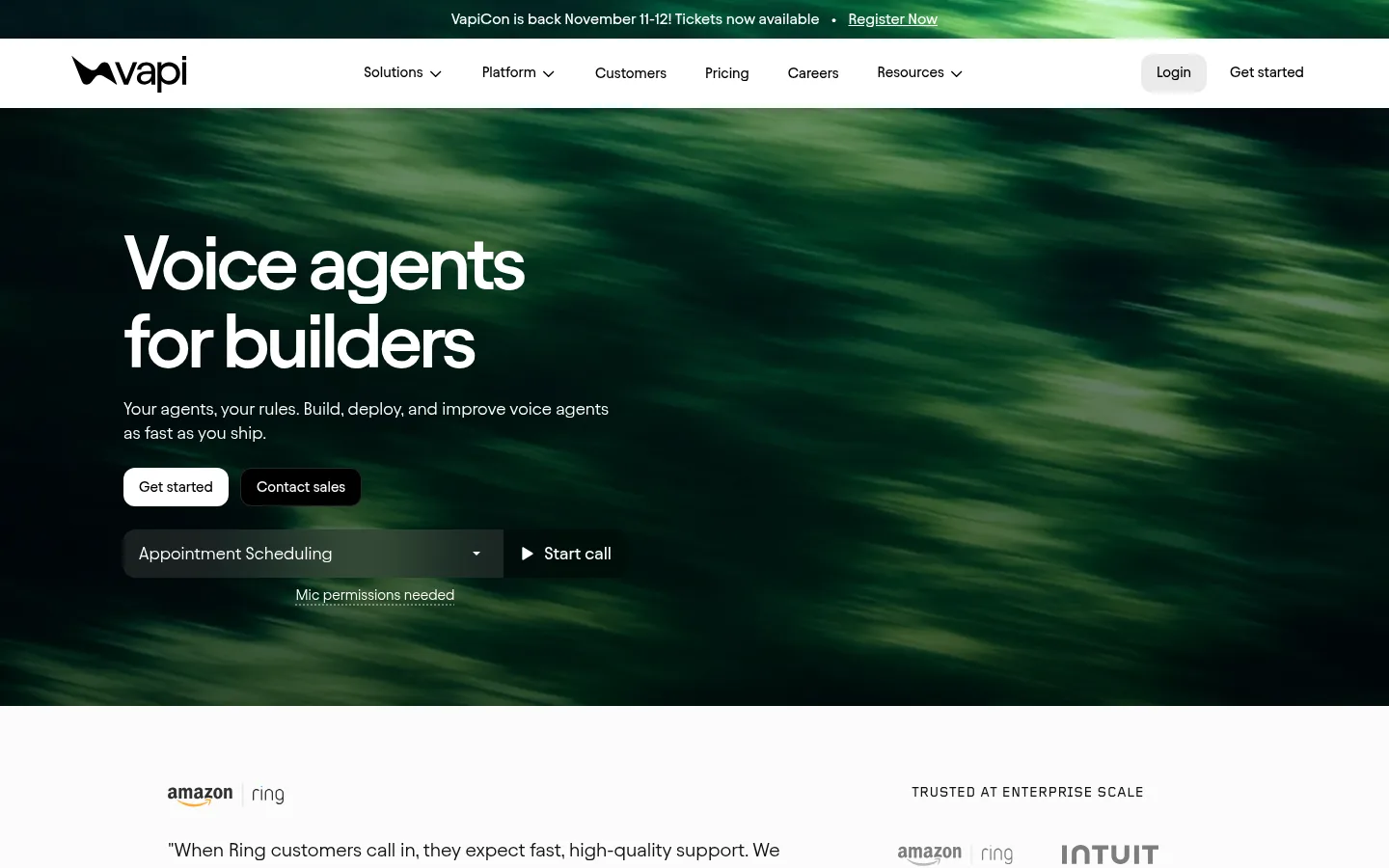
The page builds its identity from a near-monochrome interface interrupted by a vivid green, motion-blurred hero image. White and near-white sections carry most of the product narrative, while black bands mark the hero, integrations strip, and footer. The mint accent is sparing in interface chrome; the dominant green in the opening view belongs to imagery, not a general-purpose UI fill. Avantt supplies compact, contemporary headings and readable body copy, with close tracking on large display text. Foundry Gridnik is reserved for uppercase eyebrow labels and badges. A centered announcement and navigation lead into a left-aligned hero with strong type and a live call-demo control. Below, alternating media-and-copy features, logo proof, enterprise capabilities, customer stories, and a five-column metrics row create a steady, comfortable rhythm. Product imagery is framed as evidence, while flat surfaces and restrained separators keep attention on content.
配色
点色块复制色值。用途说明来自对页面的实测位置(背景、文字、描边、按钮)与截图判读。
强调色
表层色
中性色
功能色
页面底色 · Gallery White表层 · Night Slate表层 2 · Pure Ink表层 3 · Graphite Panel表层 4 · Soft Black主文字 · Pure Ink次要文字 · Night Slate弱文字 · Gallery White描边 · Forest Slate强调 · Signal Mint
Major section titles and prominent feature headings.
Vapi
36px
600
1.04
-0.039em
三级标题
Supporting feature titles and secondary content headings.
The quick brown fox 敏捷的狐狸
24px
400
1.2
-0.02em
四级标题
Compact capability or card headings.
The quick brown fox 敏捷的狐狸
20px
400
1.3
0
正文
Descriptions, customer quotations, and explanatory copy.
The quick brown fox 敏捷的狐狸
15px
400
1.43
0
辅助文字
Small supporting notes and secondary labels.
The quick brown fox 敏捷的狐狸
14px
400
1.3
0
按钮
Primary and secondary CTA labels.
The quick brown fox 敏捷的狐狸
15px
500
1.43
0
导航
Main navigation items and utility links.
The quick brown fox 敏捷的狐狸
15px
500
1.43
0
链接
Case study and inline action links.
The quick brown fox 敏捷的狐狸
16px
500
1.4
0
眉题
Uppercase section labels such as integrations and enterprise.
The quick brown fox 敏捷的狐狸
14px
500
1
0.079em
间距与布局
基准单位 8px · 密度:适中
72px版块间距
16px元素间距
—卡片内边距
1152px内容最大宽度
4px
8px
10px
12px
16px
24px
32px
40px
48px
72px
80px
96px
Use a centered content frame with a measured maximum width of 1152px and comfortable density. The page alternates full-width dark bands with white content areas. The hero is left aligned beneath centered announcement and navigation bars; later feature content alternates text and media, with a two-column enterprise block and five-column statistics row. Keep section transitions generous, using the measured 72px section rhythm and 16px element rhythm where applicable. Avoid compressing the customer proof and product demonstrations into dense cards.
圆角与层次
按钮 · 12px
徽标 · 6px
导航 · 12px
链接 · 50%
没有测到阴影:页面是扁平的,层次靠底色和描边区分。
The design is predominantly flat, with no measured shadow system. Separate sections through black and white surface changes, whitespace, and subtle borders rather than floating cards. Product media and case-study panels provide the main visual depth; use the measured 12px button radius and 6px badge radius where those components appear.
组件
下面的预览按实测的按钮、输入框、徽标、卡片样式重建(字体用替代字体)。
Announcement bar
Centered event message and registration link in a slim, dark green-toned strip above the white navigation.
Primary navigation
White horizontal bar with Vapi mark, centered product links, and right-side login and Get started actions.
Hero and call demo
Full-bleed dark green motion imagery, left-aligned headline and copy, contrasting CTAs, and an inline voice-agent selector with start-call control.
Alternating feature showcase
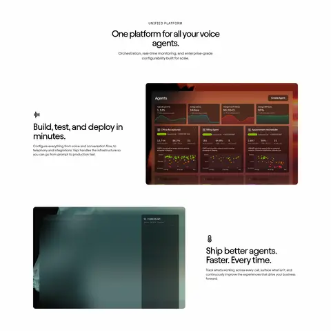
White canvas with centered section introduction followed by alternating copy and product screenshots; media is framed rather than card-heavy.
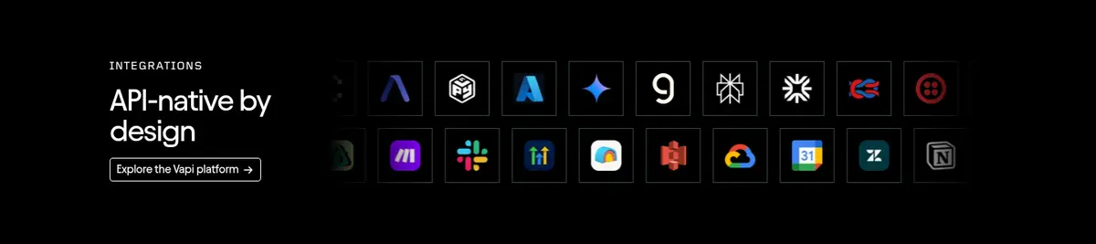
Integration strip
Black band with uppercase eyebrow, short heading, compact platform link, and a dense grid of integration icons.
Customer case study
Two-column customer quotation and brand information paired with wide video or image media and a dark caption overlay.
Metrics and footer
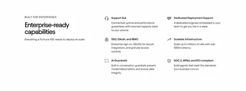
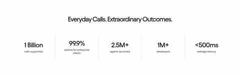
Centered heading above five evenly distributed proof metrics, followed by a black footer with event feature and grouped navigation links.
Imagery · The hero is a full-bleed, motion-blurred green photographic or video-like scene, darkened enough for white copy. Product screenshots appear inside rounded image frames as evidence of the platform; customer case studies use real-world imagery with dark overlays and readable captions. Integration marks and customer logos remain small and secondary. Green screenshot pixels are illustrative content, not a reason to introduce broad green interface panels.
Keep the main interface black, white, and near-white.
Reserve vivid green for imagery and rare accent details.
Use Avantt-style clean sans-serif typography with tight display tracking.
Set eyebrow labels in tracked uppercase mono-inspired type.
Alternate broad light sections with selective full-width black bands.
Show product screenshots and customer evidence as content, not decoration.
✕ 不该做
Do not turn the whole interface green.
Do not add heavy shadows or layered floating-card effects.
Do not crowd the page with dense text blocks.
Do not use oversized decorative typography in every section.
Do not treat illustration colors as brand UI colors.
Do not replace the strong section rhythm with uniform card grids.
给 AI 的提示词
想快速出一个同风格的新页面,把这段话连同 DESIGN.md 一起发给 AI。
Build a new Vapi-style page with a clean developer-platform feel. Use Gallery White (#fefefe) for the main canvas, Pure Ink (#000000) for text and selective dark bands, and Night Slate (#0e0e13) or Graphite Panel (#2a2a2a) for restrained inverse surfaces. Signal Mint (#62f6b5) is a rare accent, not a page-wide fill; let any cinematic green atmosphere come from imagery. Use an Avantt-like sans serif for compact headings and readable body copy, with tightly tracked display headings and a tracked uppercase mono-style eyebrow. Center content within the measured 1152px maximum width. Create an announcement and navigation, a left-aligned media-led hero, alternating feature demonstrations, proof sections, and a structured footer. Favor flat surfaces, whitespace, clear contrast, and real product evidence over shadows or decorative cards.