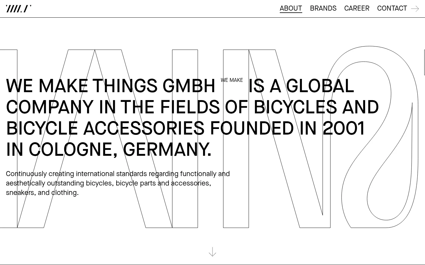
这是 WE MAKE THINGS 的黑白企业首页,介绍公司及其自行车品牌组合。超大字体、编号品牌索引和克制的细线,让页面呈现出杂志编辑版面的气质。
North star · Build every section from black typography, white space, oversized type, and precise hairline rules—not colour or decoration.
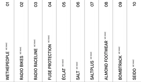
The page uses a strictly monochrome palette: white is the continuous canvas, while black carries headlines, navigation, body copy, links, and fine outlines. There are no accent colours or coloured section bands; contrast comes from scale, weight, and linework. Maison Neue supplies the functional typographic voice, with uppercase display copy and compact supporting text. An extremely large, thin outlined word sits behind the hero statement, creating depth without colour or shadow. The main headline is uppercase and left aligned, while the brand portfolio becomes a sequence of tall, narrow numbered columns with vertical names and sparse dividers. A spacious careers section follows, then a compact information grid forms the footer. Sections remain flat and largely full-width, with generous vertical breathing room and restrained borders. The visual identity is defined by type, whitespace, and modular structure rather than photography or decorative UI.
配色
点色块复制色值。用途说明来自对页面的实测位置(背景、文字、描边、按钮)与截图判读。
表层色
中性色
页面底色 · Gallery White主文字 · Print Black描边 · Print Black
Navigation, headings, body copy, brand labels, and links
角色
示例
字号
字重
行高
字距
特大标题
Oversized outlined background word behind the hero statement.
WE MAKE THINGS
864px
400
0.83
0
一级标题
Large uppercase hero introduction and primary statements.
WE MAKE THINGS
65px
500
1.11
0
二级标题
Secondary display-style headline treatment.
WE MAKE THINGS
57.5px
400
normal
0
三级标题
Uppercase section or brand headings.
WE MAKE THINGS
43px
500
normal
0
四级标题
Supporting subheadings and compact informational headings.
The quick brown fox 敏捷的狐狸
24px
400
1.33
0
正文
Company descriptions and supporting paragraphs, often uppercase.
The quick brown fox 敏捷的狐狸
17.5px
400
normal
0
导航
Top navigation links and prominent navigation labels.
The quick brown fox 敏捷的狐狸
24px
400
2.5
0
链接
Brand destinations and footer links.
The quick brown fox 敏捷的狐狸
24px
400
2.5
0
间距与布局
基准单位 4px · 密度:适中
80px版块间距
—元素间距
—卡片内边距
864px内容最大宽度
14px
16px
20px
32px
40px
80px
The page is organized as broad horizontal sections on a white canvas, with the measured page max width at 864px and a comfortable density. The hero aligns its large statement and supporting paragraph to the left, layered over the oversized outlined display word. A ten-column brand index divides the portfolio into narrow vertical cells, with numbered labels above vertically oriented brand names. Careers returns to a single left-aligned text block; the footer uses a compact multi-column information grid. Section rhythm is open, with measured section gaps of 80px.
圆角与层次
没有测到阴影:页面是扁平的,层次靠底色和描边区分。
The interface is flat, with no measured shadows, gradients, or rounded corners. Thin black rules separate navigation, brand-index columns, and footer cells; the hero's outlined display lettering provides the main layered effect. Preserve crisp edges and use whitespace rather than cards or elevation to distinguish content.
组件
下面的预览按实测的按钮、输入框、徽标、卡片样式重建(字体用替代字体)。
Top navigation
A slim header with a small logo at left and uppercase About, Brands, Career, and Contact links aligned to the right; a fine rule runs beneath it.
Hero statement
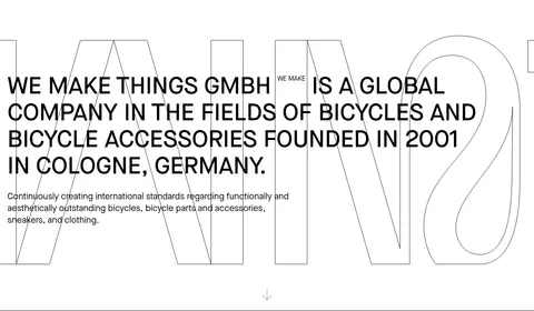
A large uppercase company introduction aligned left, layered over an oversized outlined display word, with a smaller supporting paragraph and a subtle downward cue.
Brand index
Ten narrow numbered columns separated by thin vertical rules; brand names are displayed vertically with small WE MAKE labels.
Careers callout
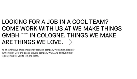
A prominent uppercase invitation and inline arrow lead into a short supporting paragraph, all on the white canvas.
Information footer
A compact grid combines the logo, company and address details, contact information, social links, and legal links using black text and fine dividers.
Imagery · The first viewport and the scaled full-page reference are driven by typography and layout rather than photography. The hero's giant outlined lettering is a typographic graphic, not a photographic backdrop. The brand index uses names and numerals instead of product images. A small logo appears in the footer; keep any marks monochrome, restrained, and subordinate to the text.
Keep the page canvas white and the primary ink black.
Use typography as the main visual asset.
Set major statements in uppercase Maison Neue-style sans serif.
Make display lettering oversized and outlined rather than filled.
Use thin rules to organize columns and footer information.
Leave generous open space between major content blocks.
✕ 不该做
Do not introduce accent colours, gradients, or tinted section bands.
Do not add shadows, rounded cards, or elevated surfaces.
Do not replace the brand index with image-heavy product cards.
Do not center every text block; preserve the left-aligned editorial voice.
Do not use decorative imagery that competes with the hero typography.
Do not make dividers heavy or visually dominant.
给 AI 的提示词
想快速出一个同风格的新页面,把这段话连同 DESIGN.md 一起发给 AI。
Build a new page in the WE MAKE THINGS visual style. Use Gallery White (#ffffff) as the uninterrupted canvas and Print Black (#000000) for copy, navigation, links, and rules. Keep the design editorial and flat: no shadows, gradients, rounded cards, or extra colours. Use a clean sans-serif similar to Maison Neue, with uppercase, left-aligned statements and clear differences in type scale. Create one oversized outlined display word as a background layer where useful, ensuring foreground copy stays legible. Organize content with open vertical spacing, narrow modular columns, and thin black dividers. Use a compact top navigation and a structured footer; let typography and whitespace do the visual work. Avoid decorative photography unless the content specifically requires it.