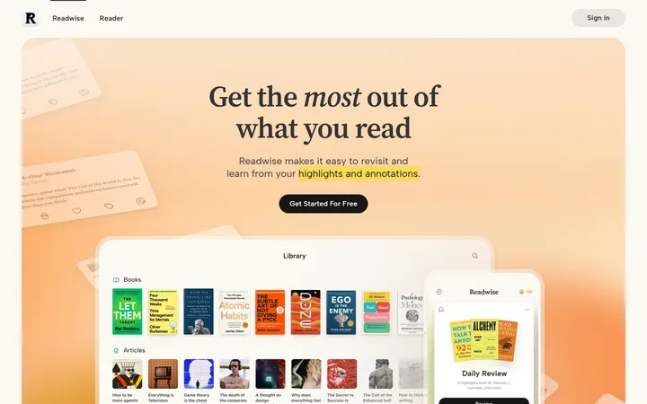
North star · Let expressive serif headlines and warm, spacious sections humanize a crisp SaaS interface, with indigo reserved for decisive actions.
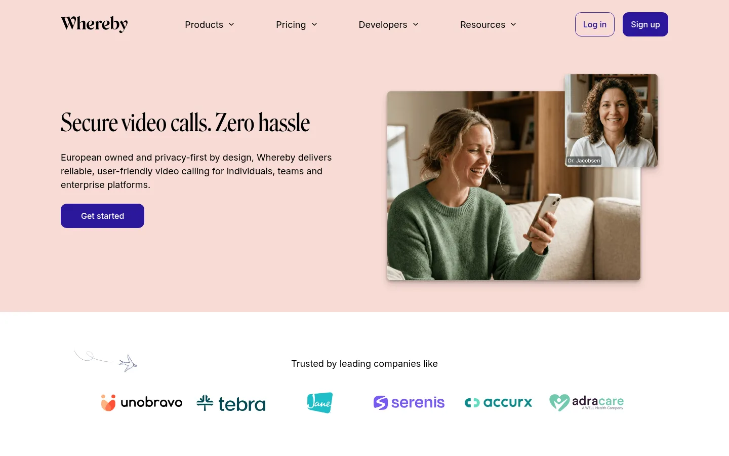
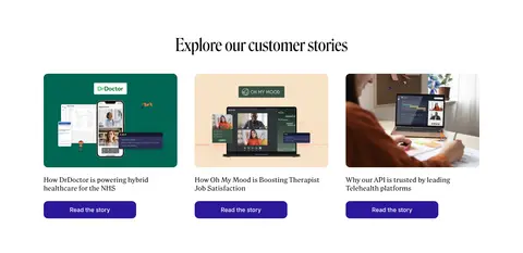
The page balances a bright white canvas with broad blush and pale apricot bands, using colour sparingly so each tinted section feels intentional. Near-black text anchors the interface; saturated indigo is reserved for primary actions and selected links. Large, condensed Roslindale display headlines provide a distinctive editorial voice, while Inter keeps navigation, body copy and controls practical and legible. A centered, constrained content area organizes mixed two-column hero and product sections, logo rows, cards and editorial blocks. Generous whitespace separates these modules, but the overall system remains compact and easy to scan. Photography shows real people in video-call contexts, especially telehealth, and is complemented by colorful customer logos and occasional playful illustrations. Rounded cards and pill-like buttons soften the product presentation; restrained shadows add depth to media rather than turning the page into a layered dashboard.
Body copy, navigation, captions and interface labels.
Aa 设计
Whereby Roslindale Display Condensed Regular
网络字体 · 字重 400 · 占比 17%
免费替代:Bodoni Moda
Display headlines and major section headings.
Aa 设计
Whereby Roslindale Text Regular
网络字体 · 字重 400 · 占比 12%
免费替代:Lora
Smaller editorial headings and text-led display accents.
Aa 设计
Inter-Medium
系统字体 · 字重 500 · 占比 6%
免费替代:Inter
Medium-weight interface text where a stronger label is needed.
角色
示例
字号
字重
行高
字距
特大标题
Oversized editorial display headline treatment.
Whereby
120px
400
1.15
0
一级标题
Main hero headline and prominent page-level heading.
Whereby
80px
400
1.15
0
二级标题
Major section titles such as customer stories and FAQ.
Whereby
48px
400
1.25
0
三级标题
Feature, use-case and subsection headings.
Whereby
40px
400
1.25
0
四级标题
Smaller editorial card and section headings.
Whereby
28px
400
1.25
0
正文
Hero descriptions, explanatory copy and card content.
The quick brown fox 敏捷的狐狸
18px
400
1.5
0
辅助文字
Supporting metadata, testimonials and secondary labels.
The quick brown fox 敏捷的狐狸
16px
400
1.5
-0.016em
导航
Primary navigation and top-level header links.
The quick brown fox 敏捷的狐狸
16px
400
1.5
-0.016em
间距与布局
基准单位 8px · 密度:紧凑
40px版块间距
8px元素间距
48px卡片内边距
1200px内容最大宽度
4px
8px
10px
16px
20px
24px
32px
40px
48px
64px
80px
90px
96px
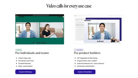
Use a centered content frame capped at the measured 1200px maximum, with broad white or tinted full-width section bands. The hero is a two-column composition: text on the left, call imagery on the right. Follow with centered logo proof, paired use-case cards, a wide testimonial, an explanatory split section, feature and story grids, a narrow FAQ list, a centered CTA, then a multi-column footer. The measured spacing scale ranges from 4px to 96px; keep card and section gaps deliberate, with an overall compact density softened by generous whitespace.
圆角与层次
按钮 · 50%
卡片 · 12px
导航 · 12px
链接 · 12px
hairline · other
sm · other
The page is primarily flat: white and pastel bands define structure more than borders or shadows. Cards use measured rounded treatments, with 12px and 20px radii represented in the component data. Apply only restrained soft shadowing to layered call imagery or media; avoid heavy elevation and decorative outlines.
组件
下面的预览按实测的按钮、输入框、徽标、卡片样式重建(字体用替代字体)。
Primary CTA
Indigo-filled, white-label action such as “Get started”; the screenshot presents it as a rounded pill with compact text.
Header navigation
Brand wordmark at left, four central navigation groups with dropdown cues, and outlined login plus filled signup actions at right.
Use-case cards
Two side-by-side product paths with screenshot imagery, small category labels, serif titles, short bullet lists and indigo action buttons.
Testimonial panel
Wide blush card with centered oversized serif quotation, compact attribution and small decorative illustrations.
Feature grid
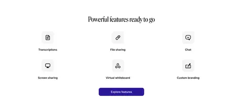
Centered section heading above a three-column set of simple monochrome feature icons and labels, followed by a centered CTA.
FAQ rows
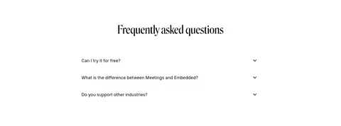
Centered heading and stacked question rows separated by fine horizontal rules, each ending with a small disclosure chevron.
Footer
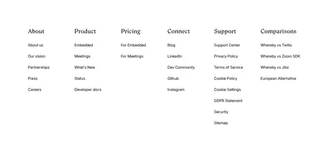
White background with six aligned link columns, serif column headings and compact Inter links.
Imagery · Use warm, natural photography of people in video calls, with telehealth and real practitioner-patient contexts as the strongest fit. The hero image is a large rectangular call scene with a smaller participant view layered over it. Product screenshots sit in simple cards; customer logos retain their own brand colours. Small decorative illustrations add personality around testimonial and CTA sections, but should remain secondary to content.
Use blush and apricot as broad section backgrounds, not noisy decoration.
Set large headings in an elegant condensed serif.
Keep body copy and navigation clear in Inter.
Reserve Signal Indigo (#2b189b) for key actions and selective emphasis.
Use real human video-call imagery with natural, warm lighting.
Maintain a centered content frame and generous separation between sections.
✕ 不该做
Do not turn the page into a dark or gradient-heavy interface.
Do not use indigo for large background areas.
Do not replace the editorial serif headings with generic geometric sans.
Do not add heavy borders or prominent card shadows.
Do not let decorative illustrations overpower product content.
Do not crowd the hero or collapse the varied section rhythm.
给 AI 的提示词
想快速出一个同风格的新页面,把这段话连同 DESIGN.md 一起发给 AI。
Build a new SaaS page in Whereby’s warm editorial style. Use Gallery White (#ffffff) as the main canvas, Soft Ink (#000000) for text, and broad Blush Band (#f8dbd5) or Apricot Band (#f8e3c8) panels to mark selected sections. Keep Signal Indigo (#2b189b) for primary CTAs and restrained emphasis; use Quiet Gray (#f4f4f4) for neutral cards. Pair large condensed serif headlines with readable Inter body text and navigation. Use a centered content frame, airy section transitions, rounded media cards, and a clear mix of split layouts and centered grids. Prefer warm, natural video-call photography and keep illustrations secondary. Use subtle depth only where imagery overlaps; keep the rest flat and uncluttered.