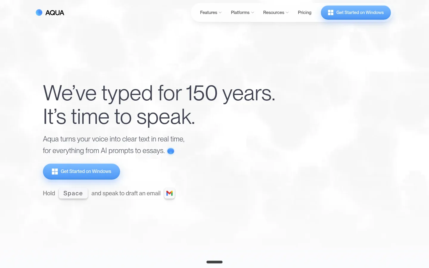
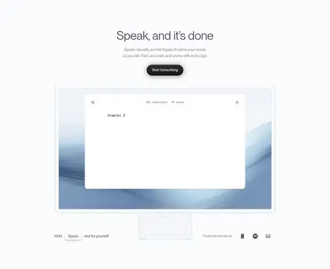
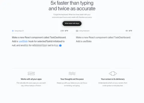
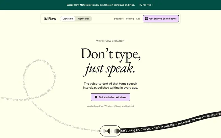
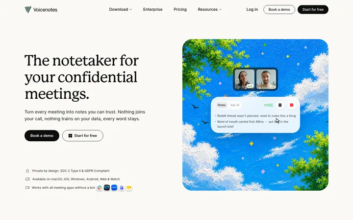
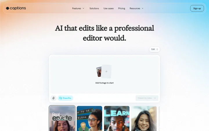
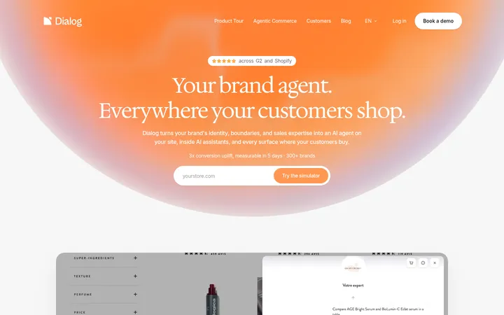
Aqua Voice 以清淡克制的浅色画布搭配深色编程章节,并用明亮蓝色渐变按钮突出行动入口。宽松的大字排版与产品界面图像,展示语音输入在写作和开发场景中的应用。
North star · Let open, quiet space and clear product evidence lead, reserving saturated blue for the most important action.
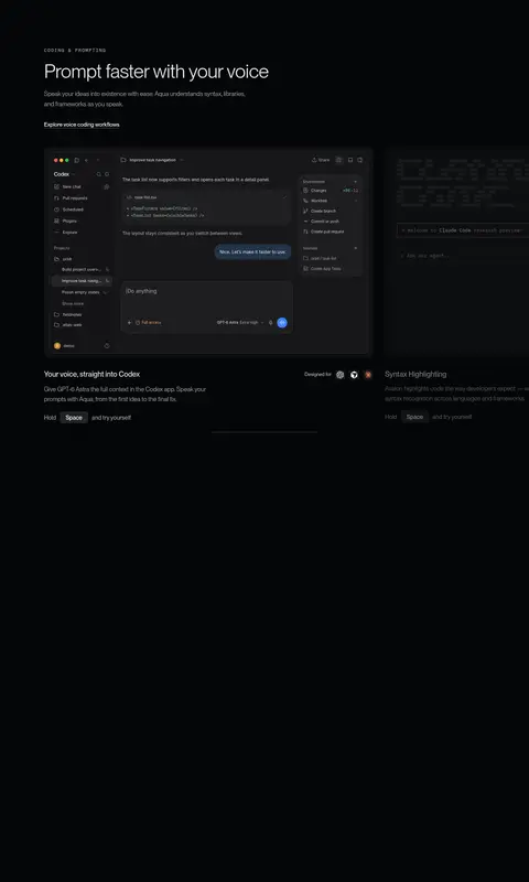
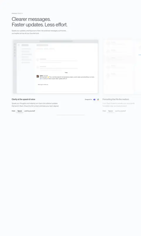
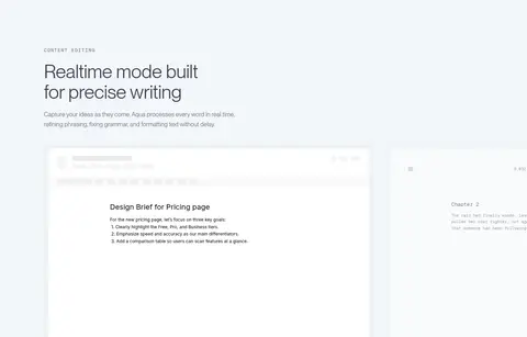
The page moves between near-white sections and a long, near-black coding chapter, making contrast the main organizing device rather than a large range of brand colours. #fafbfc anchors most content; dark surfaces concentrate developer examples, while the pale blue-gray band marks the real-time editing feature. Blue appears primarily as a gradient CTA and small brand signal, not as a broad section fill. PP Neue Montreal Book supplies spacious, finely weighted headlines and body copy, with restrained mono captions giving technical labels a deliberate feel. The layout alternates centered product demonstrations with left-aligned feature storytelling and paired metric callouts. Screenshots and interface mockups carry the explanation; they sit within ample open space and are treated as product evidence rather than decorative illustration. Rounded pill actions, soft shadows, and subtle hairlines keep the polished UI approachable without making the page feel card-heavy.
Display headlines, section headings, body copy, and general interface text.
Aa 设计
Inter
网络字体 · 字重 400 / 500 / 600 · 占比 28%
免费替代:Inter
Small badges and supporting interface labels.
Aa 设计
PP Neue Montreal Medium
网络字体 · 字重 400 / 500 · 占比 13%
免费替代:Inter
Buttons, navigation, and emphasized links.
Aa 设计
IBM Plex Mono
网络字体 · 字重 400 · 占比 10%
免费替代:IBM Plex Mono
Captions and code-like microcopy.
Aa 设计
Geist Mono
网络字体 · 字重 400 / 500 · 占比 7%
免费替代:IBM Plex Mono
Uppercase eyebrow labels.
角色
示例
字号
字重
行高
字距
特大标题
Oversized opening statement and high-emphasis headline moments.
Aqua Voice
72px
400
1.1
0
一级标题
Primary hero headline and major section titles.
Aqua Voice
52px
400
1.08
-0.01em
二级标题
Feature and product-story section headings.
Aqua Voice
40px
400
1.1
-0.01em
三级标题
Supporting feature titles and smaller content headings.
The quick brown fox 敏捷的狐狸
24px
200
1.65
0
正文
Explanatory copy, descriptions, and supporting paragraphs.
The quick brown fox 敏捷的狐狸
17px
400
1.6
0
辅助文字
Tiny product metadata and compact annotations.
The quick brown fox 敏捷的狐狸
10px
400
1.2
0
按钮
Primary action labels and compact calls to action.
The quick brown fox 敏捷的狐狸
15px
400
1.2
0
导航
Top-level navigation labels and menu items.
The quick brown fox 敏捷的狐狸
15px
400
1.5
0
链接
Text links and secondary action labels.
The quick brown fox 敏捷的狐狸
15px
400
1.5
0
眉题
Uppercase category labels above feature headings.
The quick brown fox 敏捷的狐狸
13px
400
1.4
0.12em
代码
Technical snippets and monospaced interface text.
const style = 1;
10px
400
1.2
0
间距与布局
基准单位 4px · 密度:紧凑
40px版块间距
10px元素间距
12px卡片内边距
1200px内容最大宽度
4px
6px
8px
10px
12px
14px
16px
20px
24px
30px
32px
40px
A centered, wide desktop composition uses a measured maximum content width of 1200px. The hero is a single-column, left-aligned statement with open space around it; later light sections alternate centered product demonstrations with three-column benefits and multi-column feature stories. A long dark chapter groups coding examples and metrics, then returns to pale productivity and editing bands. Section spacing is generous relative to the compact internal controls. Keep the page rhythm calm, with aligned content edges and occasional full-bleed media.
圆角与层次
按钮 · 9999px
卡片 · 12px
图片 · 4px
徽标 · 50%
导航 · 9999px
链接 · 9999px
lg · other
inset · other, text
lg · card
lg · card
Keep most sections visually flat, using pale hairlines and restrained, diffuse shadows to separate floating product windows and controls. Interface mockups can layer over soft media backdrops, while dark cards nest into the coding surface. Avoid heavy outlines or deep, dramatic shadows; rounded surfaces and subtle depth should preserve the clean product-demo feel.
组件
下面的预览按实测的按钮、输入框、徽标、卡片样式重建(字体用替代字体)。
Pill CTA
Rounded capsule action with white text; primary Windows actions use a vivid blue vertical gradient and soft blue shadow.
Top navigation
Light, low-profile nav with compact text links and a right-aligned pill CTA; keep the hero canvas visually dominant.
Product window
Large app-interface mockup presented as the focal evidence in feature sections, with a restrained frame and soft elevation.
Feature trio
Three aligned benefit items with small line illustrations, short headings, and quiet explanatory copy.
Dark coding panel
Near-black full-width chapter containing layered dark editor mockups and understated technical labels.
Metric pair
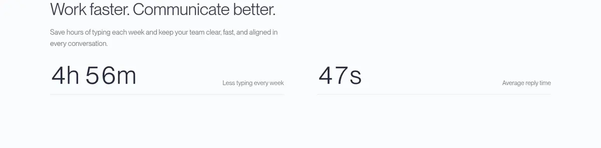
Two side-by-side outcome figures with concise labels, set directly on the section background with a subtle separator.
Imagery · Use product-interface screenshots and mockups as the principal visual evidence: dictation editor, coding tools, messages, and document editing. Frame them as large, clean windows on pale backgrounds or as dark panels within the coding chapter. The hero relies on open space and a soft atmospheric background rather than a dominant photo. Small blue identity marks and gradients are accents; unrelated colours inside app screenshots should remain contained within those images.
Reserve #050608 for the coding-focused dark chapter.
Use blue gradients sparingly on primary actions and small identity cues.
Give product mockups generous surrounding whitespace.
Use monospaced type for compact technical labels.
Keep supporting copy muted and visually secondary.
✕ 不该做
Do not fill broad sections with saturated blue.
Do not let colors inside product screenshots redefine the brand palette.
Do not crowd the hero with multiple competing actions.
Do not use heavy borders or dramatic shadows across every card.
Do not make all sections the same background tone.
Do not use dense, decorative typography for technical labels.
给 AI 的提示词
想快速出一个同风格的新页面,把这段话连同 DESIGN.md 一起发给 AI。
Build a new Aqua Voice page with a quiet, product-led visual system. Use Cloud Canvas (#fafbfc) for the primary light surfaces and Midnight Ink (#050608) for a focused dark workflow section; use Ice Blue Band (#f2f6fa) only for a subtle transition band. Set headlines and body in a clean Neue Montreal-like sans, with compact monospaced uppercase eyebrows. Structure the page as spacious, aligned content blocks with selective multi-column features and large product-interface mockups. Keep body copy muted, use Soft Hairline (#f0f0f0) for delicate separation, and reserve blue gradient treatment for the main pill CTA. Layer mockups with soft, restrained shadows, not heavy card framing. Treat embedded app content as illustrative evidence and keep its colours contained within the mockup.