North star · Keep the interface quiet and spacious so editorial headlines and vivid video demonstrations carry the story.
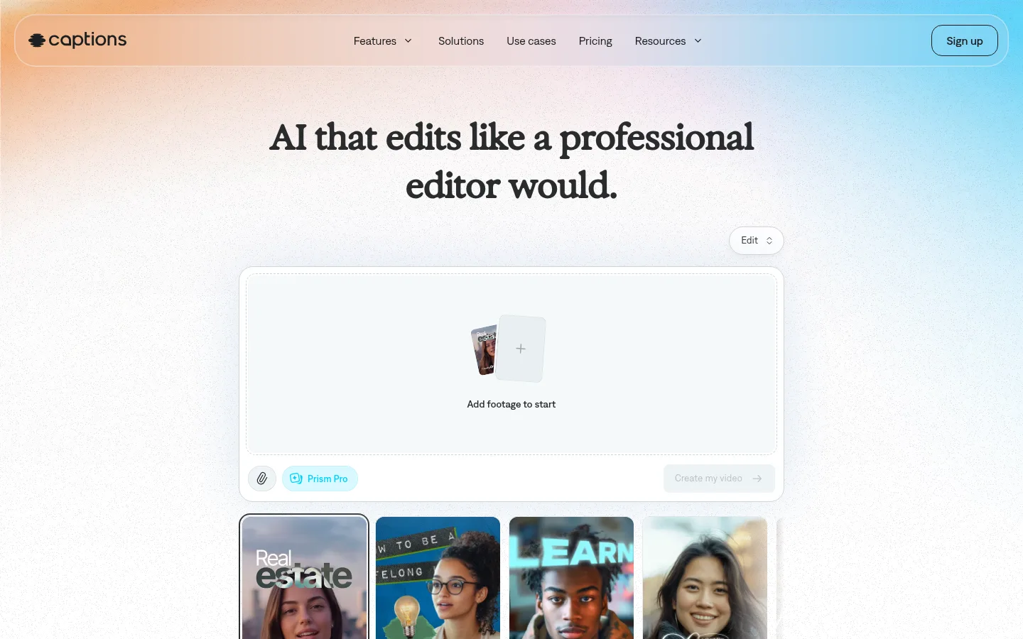
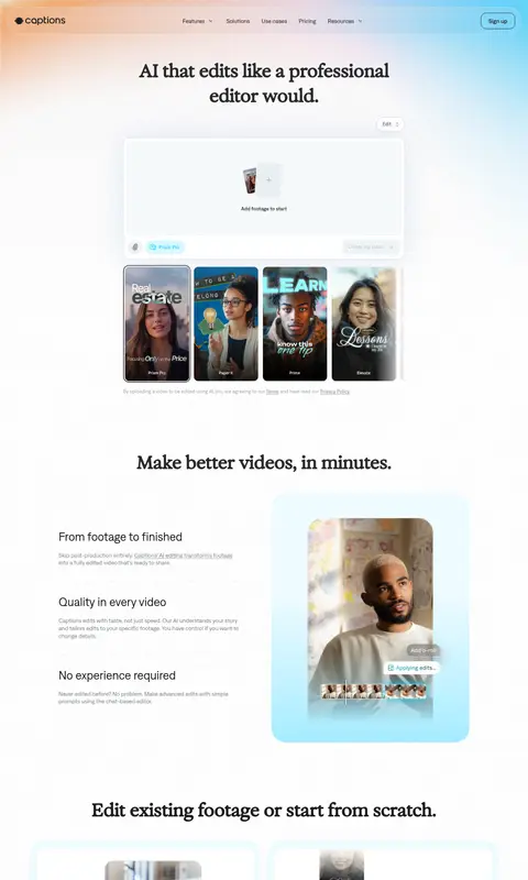
The page is built on a white canvas, with pale blue surfaces and a restrained cyan accent providing the brand’s main colour cues. A soft orange-to-cyan atmospheric gradient appears around the top navigation and lower FAQ area; keep this as background atmosphere rather than turning it into a dominant interface colour. Large, dark editorial serif headlines contrast with DenimINK sans-serif navigation, body copy, and controls. The hero centers its message above a product-like editing panel and a row of portrait video examples. Below, wide margins and generous vertical gaps create a calm sequence of feature splits, paired cards, capability lists, media examples, social proof, CTA, FAQ, and footer. Rounded cards and compact pill controls soften the otherwise clean geometry. Video stills carry varied colours and people, but the UI chrome stays quiet, allowing the product demonstrations to lead.
Navigation, body copy, feature headings, controls, captions, and links.
Aa 设计
Exposure-09cb373df0d2138c
网络字体 · 字重 400 · 占比 4%
免费替代:DM Serif Display
Large hero headline and prominent editorial section titles.
角色
示例
字号
字重
行高
字距
一级标题
Centered hero statement in expressive editorial serif.
Captions
48px
400
1
-0.01em
二级标题
Major section headings in the clean sans-serif face.
Captions
32px
400
1
0
三级标题
Feature and sub-section headings.
The quick brown fox 敏捷的狐狸
24px
400
1
-0.01em
正文
Supporting feature descriptions and explanatory copy.
The quick brown fox 敏捷的狐狸
16px
400
normal
0
辅助文字
Fine print, media captions, and compact supporting labels.
The quick brown fox 敏捷的狐狸
14px
400
1.3
0
按钮
Primary and secondary CTA labels.
The quick brown fox 敏捷的狐狸
16px
500
normal
0
导航
Top navigation and footer navigation links.
The quick brown fox 敏捷的狐狸
16px
400
normal
0
链接
Inline links and repeated feature links.
The quick brown fox 敏捷的狐狸
16px
400
normal
0
眉题
Small uppercase section labels with measured tracking.
The quick brown fox 敏捷的狐狸
14px
500
1.3
0.05em
间距与布局
基准单位 4px · 密度:适中
60px版块间距
24px元素间距
25px卡片内边距
1280px内容最大宽度
1px
4px
6px
8px
10px
12px
14px
16px
18px
20px
22px
24px
32px
40px
44px
52px
Use a centered content area capped at the measured 1280px maximum, with a comfortable density and a 4px base spacing system. The hero is centered and vertically open, while feature content alternates between left-aligned copy and right-side media or uses paired cards. Follow the measured 60px section gap and 24px element gap as rhythm references; card padding is measured at 25px. The page moves through feature explanations, examples, proof, CTA, FAQ, and footer without heavy section bands.
圆角与层次
按钮 · 12px
卡片 · 30px
导航 · 30px
inset · button
inset · nav
md · button
xl · card
Most sections sit flat on the white canvas. Separate cards with pale fills, fine borders, and large rounded corners rather than strong drop shadows. Reserve the measured soft blue halo for a featured product card, and use restrained inset or subtle button shadow treatment for controls.
组件
下面的预览按实测的按钮、输入框、徽标、卡片样式重建(字体用替代字体)。
Floating navigation
A rounded, lightly outlined horizontal navigation bar over the atmospheric hero background, with dark links and a bordered Sign up control.
Hero editor preview
Centered product mockup with a pale upload area, compact controls, and a row of portrait video examples beneath.
Feature split
Pair explanatory copy with a large rounded product or video preview; alternate visual alignment to sustain the long-page rhythm.
Pale feature cards
Use #effbff card surfaces, Slate Text copy, generous internal breathing room, and the measured 30px card radius.
Prism Pro pill
Compact cyan-tinted pill with bright cyan label and a fully rounded silhouette, used as a product capability marker.
FAQ rows
Simple question rows with ample vertical separation, light dividers, and a small plus control aligned to the right.
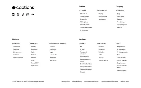
Footer directory
Dense multi-column link directory on white, with compact headings and a separate lower legal-link row.
Imagery · Use portrait-oriented video stills and product interface previews as the main imagery. The hero combines an editing panel with a row of sample clips; later sections show people, captions, and editing controls in rounded media frames. Images are colourful and human, but the surrounding UI remains pale and minimal. Avoid adding decorative illustration that competes with the real product examples.
Use sans-serif typography for controls and supporting copy.
Let video demonstrations provide most of the colour.
Apply pale blue surfaces selectively to product cards.
Use rounded cards and quiet, fine borders.
Keep cyan accents small and purposeful.
✕ 不该做
Do not make the gradient a solid page background.
Do not add saturated colour to ordinary UI controls.
Do not crowd the hero with extra navigation or copy.
Do not replace real video examples with generic decoration.
Do not use heavy shadows across every card.
Do not use the display serif for dense body copy.
给 AI 的提示词
想快速出一个同风格的新页面,把这段话连同 DESIGN.md 一起发给 AI。
Build a new Captions-style page with a bright, open canvas and an editorial product-story flow. Use Gallery White (#ffffff) as the dominant background, Ice Veil (#effbff) for selected product surfaces, and Prism Cyan (#a6ecff) only as a restrained accent or gradient endpoint. Set major display statements in a high-contrast serif and use a clean sans-serif for navigation, controls, and copy. Center the hero, then sequence generous feature splits, rounded video previews, capability content, proof, CTA, FAQ, and a directory-style footer. Keep media human and portrait-led, with visible editing UI where relevant. Use fine Cloud Edge (#d0d6d7) borders and Mist Line (#e8eff2) separators instead of heavy elevation. Preserve wide margins, calm spacing, and clear text hierarchy.