North star · Keep the interface quiet and spacious so colorful 3D product imagery—not decoration—sets the visual energy.
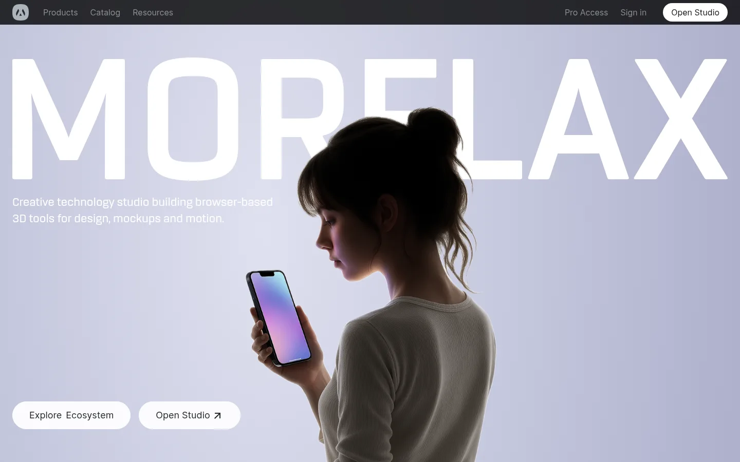
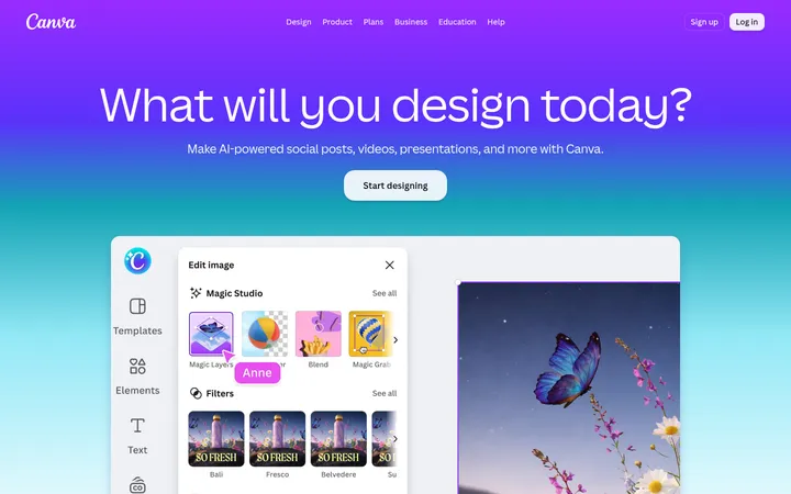
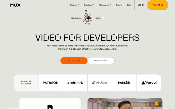
The page uses a white canvas as the default frame, punctuated by a near-black promotional band and footer. Its palette stays deliberately restrained: charcoal text and muted gray navigation keep attention on the media, while a vivid blue appears as a selective link or embedded template call-to-action rather than a broad interface color. Inter carries the interface with compact, confident headings and readable body copy; the display scale is large, but the surrounding layout remains open and uncluttered. A photographic lavender-toned hero makes the strongest first impression, followed by rounded product panels, colorful 3D tool artwork, and video-led demos. Sections alternate between centered editorial messaging and horizontally browsable card rows, with generous white intervals separating them. Rounded pills and media corners soften the otherwise crisp, minimal structure. Subtle borders and layered imagery support clarity without making the page feel heavily boxed or shadow-driven.
配色
点色块复制色值。用途说明来自对页面的实测位置(背景、文字、描边、按钮)与截图判读。
强调色
表层色
中性色
功能色
页面底色 · Gallery White表层 · Studio Black表层 2 · Soft Alloy主文字 · Carbon Ink次要文字 · Gallery White弱文字 · Quiet Graphite描边 · Hairline Frost强调 · Signal Blue
Primary interface and editorial type across headings, body copy, navigation, links, and buttons.
Aa 设计
rogan
网络字体 · 字重 500 · 占比 7%
免费替代:Inter
Small uppercase eyebrow labels that introduce or categorize content.
角色
示例
字号
字重
行高
字距
特大标题
Large hero wordmark-scale headline over the opening image.
Morflax
60px
600
1
-0.01em
一级标题
Primary section or feature headline.
Morflax
48px
600
1
0
二级标题
Major section titles such as tool and motion showcases.
Morflax
36px
600
1.11
-0.01em
三级标题
Feature-card titles and secondary product messaging.
The quick brown fox 敏捷的狐狸
24px
500
1.33
-0.01em
四级标题
Compact subheadings and card-level labels.
The quick brown fox 敏捷的狐狸
20px
500
1.4
-0.01em
正文
Product descriptions and explanatory copy.
The quick brown fox 敏捷的狐狸
16px
500
1.5
-0.01em
按钮
Text inside pill-shaped calls to action.
The quick brown fox 敏捷的狐狸
18px
400
1.56
0
导航
Header navigation and studio-access link.
The quick brown fox 敏捷的狐狸
18px
400
1.56
0
链接
Catalog, product, and supporting action links.
The quick brown fox 敏捷的狐狸
16px
500
1.5
0
眉题
Uppercase category labels above content or media.
The quick brown fox 敏捷的狐狸
16px
500
1.5
0.05em
间距与布局
基准单位 8px · 密度:适中
80px版块间距
24px元素间距
—卡片内边距
1360px内容最大宽度
2px
4px
8px
12px
16px
20px
24px
32px
40px
48px
80px
112px
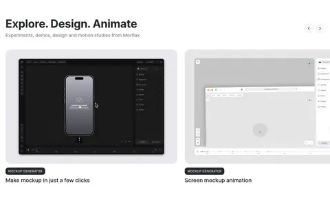
A centered, responsive composition uses a measured page maximum width of 1360px, with a comfortable density and generous section spacing. The opening hero is full-bleed, while subsequent white sections alternate centered editorial copy with left-aligned headings and horizontal card rails. Product and tool areas use multi-column groupings, including a compact featured-tools strip and a wider motion gallery. The template and catalog promotion interrupt the white rhythm with gray and black bands. Keep the content edges aligned and allow media rows to feel browsable rather than tightly packed.
圆角与层次
按钮 · 9999px
卡片 · 24px
图片 · 24px
徽标 · 12px
链接 · 9999px
xl · card, link
md · link, button
The interface favors flat white space and clean boundaries over heavy card chrome. Media panels use generous rounded corners, with selected artwork layered or overlapping to create depth. Measured shadows are available for elevated links and cards, but keep them subtle and limited; faint hairlines separate elements where needed rather than outlining every section.
组件
下面的预览按实测的按钮、输入框、徽标、卡片样式重建(字体用替代字体)。
Pill navigation actions
Use capsule-shaped actions for studio access and key links. The header pairs muted navigation text with a light Open Studio pill.
Hero media
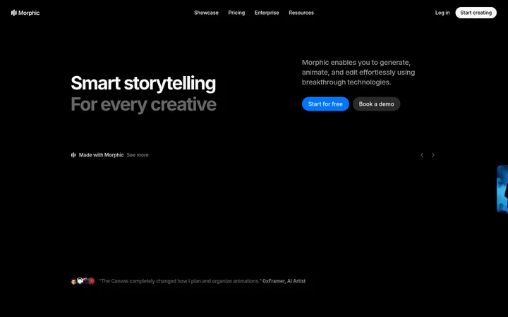
Full-width photographic opening with an oversized white wordmark, concise supporting copy, and two pale pill CTAs anchored over the image.
Feature showcase cards
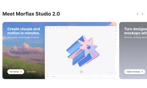
Rounded product panels pair short headings and actions with browser previews or atmospheric visual backgrounds.
Featured tool rail
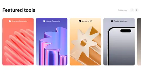
A horizontal row of tall, rounded cards uses distinct colorful 3D imagery and compact category labels.
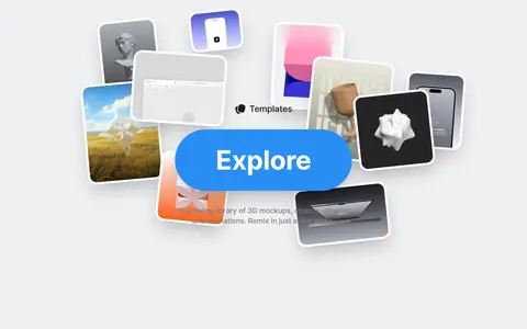
Template collage
Layered mockup thumbnails sit on the #eff0f2 band around a prominent blue Explore action.
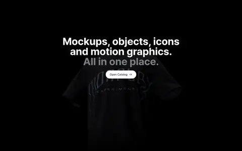
Dark promotional band
A black full-width section centers light headline copy and a small pale catalog CTA over subdued media.
Dark link footer
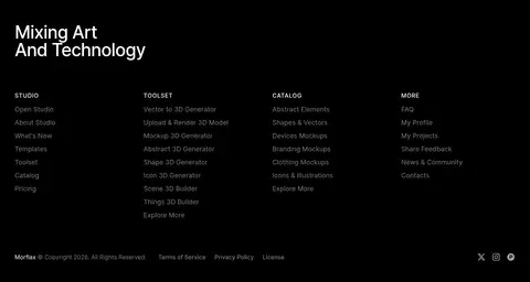
Black footer groups small muted links into columns beneath a light two-line brand statement.
Imagery · Media is the main expressive layer: the hero uses a photographic subject against a pale lavender backdrop, while product panels show browser interfaces, mockups, and colorful dimensional 3D forms. Template previews overlap in a collage, and later demos use video frames. Keep imagery large, rounded, and cleanly framed; preserve the contrast between polished media and the restrained surrounding UI.
Keep the core interface monochrome and let media carry color.
Use spacious transitions between major content sections.
Frame product previews with generous rounded corners.
Use pill shapes for prominent actions and studio access.
Alternate centered messaging with left-aligned showcase headings.
Reserve blue for selective links and standout media CTAs.
✕ 不该做
Do not turn every section into a bordered card grid.
Do not spread the blue accent across the full interface.
Do not crowd headings, copy, and media together.
Do not flatten the distinctive layered template collage.
Do not use bright colors as large UI backgrounds outside media.
Do not make the dark sections compete with product imagery.
给 AI 的提示词
想快速出一个同风格的新页面,把这段话连同 DESIGN.md 一起发给 AI。
Build a new creative-tools page in the Morflax visual style. Use Gallery White (#ffffff) as the main canvas, Carbon Ink (#171718) for primary text, Quiet Graphite (#7c7e83) for secondary navigation, and Studio Black (#000000) for a focused promotional band or footer. Apply Signal Blue (#298ef5) sparingly, chiefly to a standout action. Use Inter throughout, with small uppercase, tracked eyebrow labels. Create spacious editorial sections, rounded media panels, and browsable horizontal product rows; give photography, browser previews, 3D artwork, and video the strongest visual presence. A pale gray band such as Soft Alloy (#eff0f2) can distinguish a template or resource area. Keep actions pill-shaped, typography clean and confident, and surrounding UI restrained. Avoid dense grids, decorative borders, or broad color fills that distract from product visuals.