North star · Let oversized white typography dominate a black field, using red only as a precise functional accent.
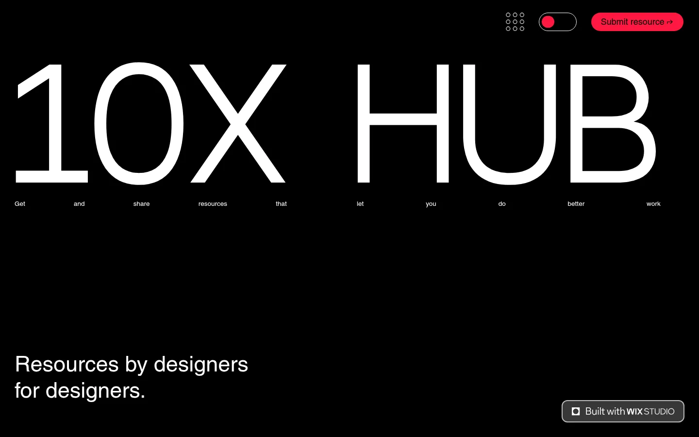
The page builds its identity from a near-black canvas, broad white typography and a single vivid red control. White is reserved for the oversized “10X HUB” wordmark and supporting copy; red marks the primary resource-submission action and small selection details. The composition is unusually open: a compact utility navigation sits at the top, the wordmark spans nearly the full viewport, and a short supporting statement rests far below it. Most of the page remains empty, making the typography itself function as the hero artwork. Text uses clean, regular-weight sans serif forms, with an oversized display treatment contrasted against small, widely distributed labels. There is no prominent photography or decorative illustration in the visible design. Hairline borders and restrained outlined controls provide just enough structure without softening the stark, editorial feel. Keep the layout flat, high-contrast and deliberately sparse.
配色
点色块复制色值。用途说明来自对页面的实测位置(背景、文字、描边、按钮)与截图判读。
品牌色
强调色
表层色
中性色
功能色
页面底色 · Pitch Black表层 · Charcoal Panel表层 2 · Gallery White主文字 · Gallery White次要文字 · Pitch Black描边 · Signal Red
Main body copy, navigation labels, and smaller supporting text.
Aa 设计
wfont_9aea05_daebdda91ced4d119f7837b7bae26e19
系统字体 · 字重 400 · 占比 7%
免费替代:Space Grotesk
Display wordmark and selected section headings.
角色
示例
字号
字重
行高
字距
特大标题
Oversized 10X HUB wordmark spanning the hero.
10X HUB
300px
400
1
0
一级标题
Primary page heading or prominent supporting headline.
10X HUB
45px
400
1.2
0
二级标题
Secondary section heading.
The quick brown fox 敏捷的狐狸
24.5px
400
1
0
三级标题
Compact subheadings and resource labels.
The quick brown fox 敏捷的狐狸
18px
400
1
0
正文
Short explanatory copy and resource descriptions.
The quick brown fox 敏捷的狐狸
13.5px
400
1.6
0
导航
Header navigation and utility labels.
The quick brown fox 敏捷的狐狸
18px
400
1.4
0
间距与布局
基准单位 2px · 密度:适中
40px版块间距
30px元素间距
—卡片内边距
—内容最大宽度
2px
10px
12px
15px
20px
30px
40px
50px
60px
70px
90px
Use a full-bleed black canvas and a wide, open composition rather than a constrained card grid. Align the hero wordmark close to the viewport edges and place small utility controls in a compact top row. Leave substantial vertical separation between the wordmark, its distributed microcopy, and the supporting statement. The page is intentionally low-density, with a thin horizontal divider around the sorting controls lower down. Preserve the quiet expanses of empty space instead of filling them with extra modules.
圆角与层次
按钮 · 2px
导航 · 9999px
链接 · 12px
sm · button
The interface is predominantly flat, with no meaningful card-shadow system. Use fine outlines and hairline separators to define controls and sorting areas, and reserve filled contrast for the red submission pill. Avoid stacked panels or raised surfaces that interrupt the uninterrupted dark canvas.
组件
下面的预览按实测的按钮、输入框、徽标、卡片样式重建(字体用替代字体)。
Utility header
A compact top-right utility row with a small icon cluster, outlined dark-mode toggle, and red rounded submission control.
Display wordmark
Oversized white “10X HUB” typography dominates the hero and stretches across nearly the full viewport width.
Distributed microcopy
Short supporting words sit in a low, widely spaced row beneath the wordmark, functioning as a delicate typographic detail.
Supporting statement
A short, left-aligned white headline sits well below the hero with generous empty space around it.
Resource sorting bar
A dark, thinly ruled horizontal control divides sorting options into segments and marks the active choice in red.
Footer credit
A minimal centered maker credit sits near the bottom, in small white text on the black canvas.
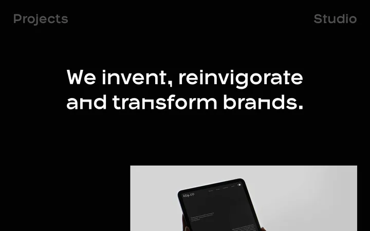
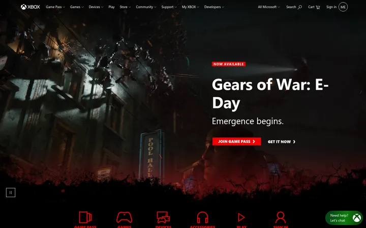
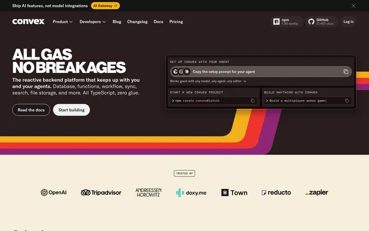
Imagery · The visible first screen is driven by typography, not photography, illustration, or 3D. Treat the wordmark as the hero visual: large, white, and nearly edge-to-edge on the black field. Keep any resource imagery elsewhere secondary and sharply framed rather than layering decorative visuals into the sparse hero.
Make the hero wordmark dramatically larger than surrounding text.
Keep supporting copy white, concise, and regular-weight.
Reserve red for submission and active-state signals.
Leave broad, intentional areas of empty space.
Use thin gray outlines for quiet controls and separators.
✕ 不该做
Do not add bright colors beyond the measured palette.
Do not fill the hero with cards or decorative imagery.
Do not crowd the header with large navigation labels.
Do not turn every interface element into a red button.
Do not introduce gradients, heavy shadows, or layered panels.
Do not center all copy; preserve the left-aligned supporting statement.
给 AI 的提示词
想快速出一个同风格的新页面,把这段话连同 DESIGN.md 一起发给 AI。
Build a new page in the 10X HUB visual style: use Pitch Black (#000000) as the dominant full-bleed canvas and Gallery White (#ffffff) for high-contrast typography. Make a very large, clean sans-serif headline the primary visual, with compact utility navigation above and a substantial field of negative space around the content. Use Signal Red (#ff1841) sparingly for the main action and active states; use Soft Steel (#bebcbc) only for subdued outlines. Keep the layout flat and editorial, with thin rules instead of raised cards. Use regular-weight sans-serif text, small quiet labels, and clear left alignment for supporting copy. Avoid decorative imagery, gradients, excess color, and dense content clusters. The page should feel stark, spacious, and deliberately typography-led.