11x 将开阔、富有人情味的风景影像,与克制的界面配色和醒目的无衬线大标题结合。圆角行动按钮、产品演示、客户案例和明暗交替的版块,引导访客从品牌故事逐步走向转化。
North star · Let cinematic human imagery create atmosphere, then keep the product story and conversion path crisp, spacious, and highly legible.
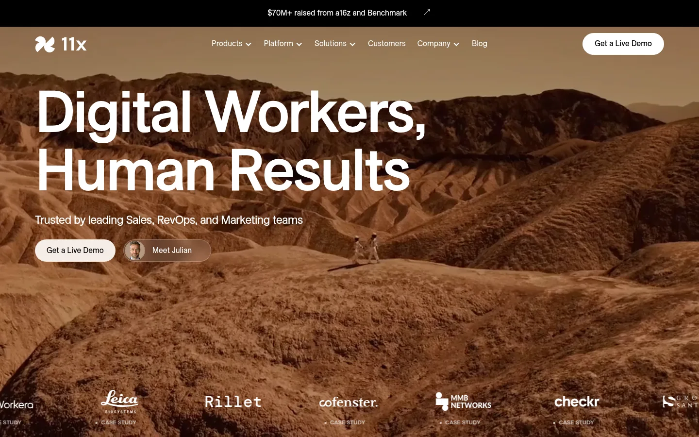
The page balances a clean interface palette with cinematic, earth-toned imagery. White canvas and black text provide a quiet foundation; warm gray-beige bands and a deep teal section create strong changes in pace. The hero’s landscape video brings rust and brown tones, while white typography and controls remain legible over the image. ES Allianz supplies rounded, contemporary sans-serif letterforms: large headlines are medium weight, tightly tracked, and set with compact line height; body copy is smaller and calmer. A spacious, centered rhythm gives way to a broad four-column platform showcase and a three-column impact section. Repeated pill-shaped buttons and large rounded media panels soften the otherwise crisp grid. Product UI, customer marks, and testimonial cards provide evidence without competing with the headline. Thin borders and restrained layering keep the page from feeling ornamental.
配色 点色块复制色值。用途说明来自对页面的实测位置(背景、文字、描边、按钮)与截图判读。
品牌色
Deep Teal
#0b252a
Dark growth section and adjacent platform showcase background.
Teal Slate
#233a3f
Supporting dark teal tone used in secondary visual elements.
强调色
Umber Black
#171009
Very dark tone sampled from imagery or card content, not a core UI surface.
表层色
Warm Stone
#d7cecc
Warm-gray feature band and lower call-to-action/footer backdrop.
Mist White
#f8f9f7
Pale end of the measured warm feature-band gradient; subtle card and section fill.
Oat Cream
#f5ece5
Warm platform section background and pale filled product controls.
Cloud Gray
#cccccc
Secondary navigation surface in measured styles.
Paper Gray
#f2f2f2
Subtle pale supporting surface in measured page elements.
中性色
Gallery White
#ffffff
Primary canvas, light cards, and reversed text over dark imagery or teal.
Pure Ink
#000000
Primary headings, body text, navigation, and black primary action buttons.
Soft Graphite
#7f7f7f
Appears in measured navigation gradient data; not a defining visible brand color.
Fine Silver
#d6d6d6
Hairline button border and subtle interface separators.
Muted Charcoal
#555555
Secondary text in supporting copy.
文字 背景 对比度 WCAG #000000 Pure Ink#ffffff Gallery White21:1 AAA #000000 Pure Ink#d7cecc Warm Stone13.59:1 AAA #000000 Pure Ink#0b252a Deep Teal1.31:1 不达标 #000000 Pure Ink#f5ece5 Oat Cream18.01:1 AAA #ffffff Gallery White#d7cecc Warm Stone1.55:1 不达标 #ffffff Gallery White#0b252a Deep Teal16:1 AAA
字体 字号阶梯:Perfect Fourth(比例约 1.32,正文 16px)。示例用免费替代字体渲染,数值为实测。
Aa 设计
ES Allianz 网络字体 · 字重 400 / 500 / 300 / 700 · 占比 100%
免费替代:Inter
All measured text roles, from display headlines and navigation to body copy and buttons.
角色 示例 字号 字重 行高 字距 特大标题 Oversized hero or campaign headline.
11x
64px 500 1 -0.04em 一级标题 Primary page and section headline.
11x
56px 500 1 -0.04em 二级标题 Major feature, platform, and impact headings.
11x
46px 500 1 -0.04em 三级标题 Feature-card and supporting section headings.
11x
32px 500 1.2 -0.02em 四级标题 Smaller card or subsection headings.
11x
28px 500 1.2 -0.02em 正文 Paragraphs, descriptions, and testimonial copy.
The quick brown fox 敏捷的狐狸
16px 400 1.3 0 辅助文字 Compact uppercase labels and eyebrow text.
The quick brown fox 敏捷的狐狸
12px 700 1.4 0 按钮 CTA and compact control labels.
The quick brown fox 敏捷的狐狸
13.5px 400 1.4 0 导航 Header navigation links.
The quick brown fox 敏捷的狐狸
16px 400 1.4 0
间距与布局 基准单位 8px · 密度:宽松
128px 版块间距
8px 元素间距
— 卡片内边距
1296px 内容最大宽度
4px
6px
8px
12px
15px
16px
24px
44px
A spacious, vertically sequenced landing page uses a centered content frame measured at a 1296px maximum width, with full-bleed hero imagery and selected broad section bands. The hero aligns its headline and supporting copy to the left; product and workforce sections center their introductions, while the platform story spreads across four columns. The impact area uses three columns for proof. Generous section gaps separate substantial content blocks, balanced by compact spacing inside controls and cards. Keep the footer denser and more utility-focused.
圆角与层次 The page is mostly flat: section backgrounds and contrast establish hierarchy rather than heavy shadow. Use thin borders for controls and fine separators, with large rounded corners on cards and product media. White cards and controls sit clearly against warm or dark bands; imagery supplies most of the depth and layering.
组件 下面的预览按实测的按钮、输入框、徽标、卡片样式重建(字体用替代字体)。
Primary CTA Black pill-shaped button with white ES Allianz text; repeated for live-demo conversion.
Header navigation Compact links over the hero image, paired with the white 11x mark and a light pill CTA.
Hero case-study action Secondary rounded action with a small portrait, placed beside the primary demo button.
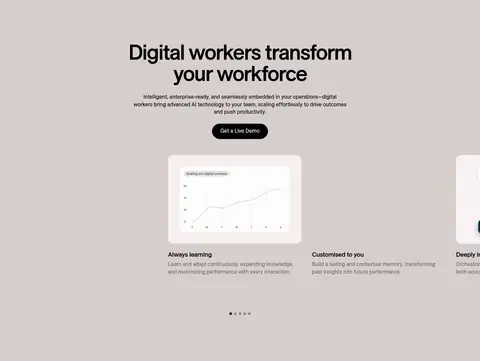
Feature cards Rounded media panels with concise headings and copy, set into the warm-gray workforce band.
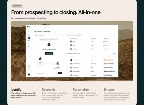
Platform showcase Large pale rounded panel on deep teal, led by product UI media and supported by four workflow columns.
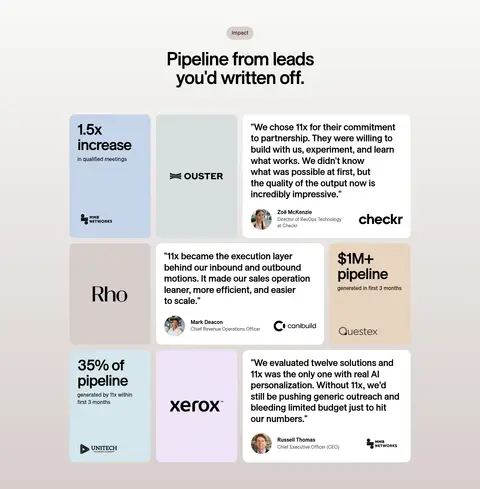
Customer proof cards Three-column impact layout combining metrics, customer logos, portraits, and testimonial text.
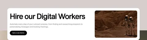
Footer CTA panel Wide white rounded panel with a hiring message, black CTA, and landscape image above the footer links.
Imagery · Lead with cinematic live-action landscape footage: broad, warm, rocky terrain and small human figures create scale and an approachable science-fiction mood. Product sections use interface screenshots and demonstration media rather than decorative illustration. Customer logos and portraits appear as proof within cards. Preserve the natural brown palette in photography; avoid treating its sampled rust tones as interface colors.
页面版块 共 10 个版块,按页面从上到下排列,每个都标了类型、布局和交互套路。
首页
首屏 品牌主视觉
Full-width cinematic landscape with left-aligned headline, header navigation, CTAs, and customer marks along the bottom.
产品展示 体验电话代理
Centered two-column interactive product experience with agent information, phone interface, and input controls.
产品展示 认识外呼代理
Centered two-column introduction to Alice, paired with product demonstration media.
功能网格 数字员工优势
Warm-gray band with centered introduction and a horizontal set of media-backed capability cards.
行动号召 增长行动号召
Centered headline, eyebrow, supporting text, and CTA on a deep teal band.
其他 运营价值滚动带
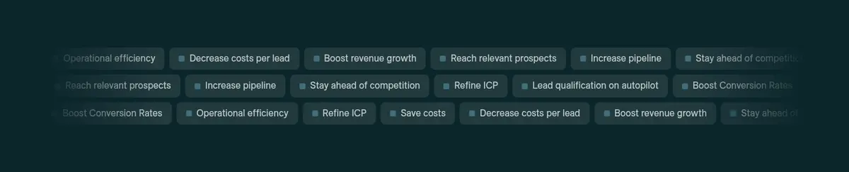
Full-width deep teal continuation with a horizontally repeated field of short outcome labels.
产品展示 平台工作流程
Four-column full-bleed warm section with a large rounded product panel and workflow steps.
用户评价 客户成果案例
Centered headline above a three-column mosaic of metrics, logos, and customer testimonials.
行动号召 聘用数字员工
Wide rounded white CTA card over a warm-gray transition into the footer.
页脚 页脚导航
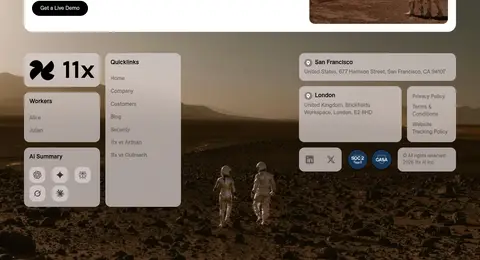
Three-column utility footer with brand and worker links, quicklinks, contact details, and legal information over imagery.
该做与不该做 ✓ 该做 Use cinematic landscape imagery as the hero’s defining visual. Keep display headlines large, medium-weight, and tightly tracked. Alternate white, Warm Stone, Oat Cream, and Deep Teal section fields. Use black pill-shaped primary actions with white labels. Build proof from real-looking product UI, customer marks, and testimonials. Leave generous breathing room around section introductions. ✕ 不该做 Do not use sampled photo browns as core interface colors. Do not crowd the hero with extra copy or controls. Do not replace the restrained palette with bright decorative accents. Do not add heavy shadows to otherwise flat panels. Do not use sharp, square corners for prominent controls or media cards. Do not make every section a dense grid. 给 AI 的提示词 想快速出一个同风格的新页面,把这段话连同 DESIGN.md 一起发给 AI。
复制 Build a new 11x-style AI SaaS page with a spacious editorial rhythm and a cinematic, human-scale hero image. Use Gallery White (#ffffff) and Pure Ink (#000000) as the clean interface foundation; reserve Warm Stone (#d7cecc), Oat Cream (#f5ece5), and Deep Teal (#0b252a) for distinct section bands. Keep image-derived browns in photography rather than UI. Set headlines in ES Allianz or Inter, medium weight, tightly tracked, and compact; keep body copy regular and readable. Use pill-shaped black-and-white CTAs, generous section spacing, and rounded product media. Organize product evidence into clear feature layouts, customer proof into metric and testimonial cards, and finish with a conversion panel and utility-rich footer. Favor flat surfaces, hairline borders, and image-led depth over shadows.
DESIGN.md Tailwind v4 CSS 变量 Design Tokens
---
title: "11x design system"
variant: extended
source: https://www.11x.ai/
captured_at: 2026-10-12
theme: light
industry: ai
generator: Design DNA (https://four.wiralomi.com/style/11x-ai)
ai_generated: true
ai_label: "本文件由 AI 辅助生成:数值取自公开网页的实测样式,命名、用途说明与建议为模型解读。商标归原所有者。 / AI-assisted content"
---
# 11x · Design System
> Cinematic landscapes meet clear, confident product design
**Theme:** light · **Industry:** ai · **Source:** https://www.11x.ai/ · **Captured:** 2026-10-12 (1440×900 desktop)
_AI-assisted content: values are measured from the public page at capture time; names, roles and guidance are model-written interpretations. Trademarks belong to their owners._
11x pairs expansive, human-scale landscape imagery with a restrained interface palette and oversized sans-serif headlines. Rounded calls to action, product demonstrations, customer proof, and contrasting section bands lead visitors from brand story to conversion.
## North star
Let cinematic human imagery create atmosphere, then keep the product story and conversion path crisp, spacious, and highly legible.
## Overview
The page balances a clean interface palette with cinematic, earth-toned imagery. White canvas and black text provide a quiet foundation; warm gray-beige bands and a deep teal section create strong changes in pace. The hero’s landscape video brings rust and brown tones, while white typography and controls remain legible over the image. ES Allianz supplies rounded, contemporary sans-serif letterforms: large headlines are medium weight, tightly tracked, and set with compact line height; body copy is smaller and calmer. A spacious, centered rhythm gives way to a broad four-column platform showcase and a three-column impact section. Repeated pill-shaped buttons and large rounded media panels soften the otherwise crisp grid. Product UI, customer marks, and testimonial cards provide evidence without competing with the headline. Thin borders and restrained layering keep the page from feeling ornamental.
## Colors
| Name | Hex | Token | Group | Role |
|---|---|---|---|---|
| Gallery White | ` | `--color-gallery-white` | neutral | Primary canvas, light cards, and reversed text over dark imagery or teal. |
| Warm Stone | ` | `--color-warm-stone` | surface | Warm-gray feature band and lower call-to-action/footer backdrop. |
| Pure Ink | ` | `--color-pure-ink` | neutral | Primary headings, body text, navigation, and black primary action buttons. |
| Deep Teal | ` | `--color-deep-teal` | brand | Dark growth section and adjacent platform showcase background. |
| Mist White | ` | `--color-mist-white` | surface | Pale end of the measured warm feature-band gradient; subtle card and section fill. |
| Oat Cream | ` | `--color-oat-cream` | surface | Warm platform section background and pale filled product controls. |
| Soft Graphite | ` | `--color-soft-graphite` | neutral | Appears in measured navigation gradient data; not a defining visible brand color. |
| Cloud Gray | ` | `--color-cloud-gray` | surface | Secondary navigation surface in measured styles. |
| Teal Slate | ` | `--color-teal-slate` | brand | Supporting dark teal tone used in secondary visual elements. |
| Fine Silver | ` | `--color-fine-silver` | neutral | Hairline button border and subtle interface separators. |
| Muted Charcoal | ` | `--color-muted-charcoal` | neutral | Secondary text in supporting copy. |
| Umber Black | ` | `--color-umber-black` | accent | Very dark tone sampled from imagery or card content, not a core UI surface. |
| Paper Gray | ` | `--color-paper-gray` | surface | Subtle pale supporting surface in measured page elements. |
### Semantic aliases
`--color-canvas` → ` (Gallery White) · `--color-surface` → ` (Warm Stone) · `--color-surface-2` → ` (Deep Teal) · `--color-surface-3` → ` (Oat Cream) · `--color-surface-4` → ` (Cloud Gray) · `--color-text` → ` (Pure Ink) · `--color-text-muted` → ` (Gallery White) · `--color-border` → ` (Fine Silver)
### Contrast (WCAG 2.x)
| Text | Background | Ratio | Level |
|---|---|---|---|
| ` | ` | 21:1 | AAA |
| ` | ` | 13.59:1 | AAA |
| ` | ` | 1.31:1 | fail |
| ` | ` | 18.01:1 | AAA |
| ` | ` | 1.55:1 | fail |
| ` | ` | 16:1 | AAA |
| ` | ` | 1.17:1 | fail |
### Gradients
- `linear-gradient(rgb(248, 249, 247), rgb(215, 206, 204))`
- `linear-gradient(rgba(0, 0, 0, 0.5), rgba(0, 0, 0, 0.5))`
- `linear-gradient(90deg, rgb(11, 37, 42), rgba(11, 37, 42, 0) 15%, rgba(11, 37, 42, 0) 58%, rgba(11, 37, 42, 0) 85%, rgb(11, 37, 42))`
## Typography
| Family | Token | Source | Weights | Role | Free substitute |
|---|---|---|---|---|---|
| ES Allianz | `--font-body` | webfont | 400, 500, 300, 700 | All measured text roles, from display headlines and navigation to body copy and buttons. | Inter |
- **ES Allianz:** Use medium-weight, tightly tracked display headlines; body and navigation stay regular, with uppercase bold captions.
### Type scale — Perfect Fourth (ratio ≈ 1.32, base 16px)
| Role | Size | Weight | Line height | Letter spacing | Case | Family | Used for |
|---|---|---|---|---|---|---|---|
| display | 64px | 500 | 1 | -0.04em | — | ES Allianz | Oversized hero or campaign headline. |
| h1 | 56px | 500 | 1 | -0.04em | — | ES Allianz | Primary page and section headline. |
| h2 | 46px | 500 | 1 | -0.04em | — | ES Allianz | Major feature, platform, and impact headings. |
| h3 | 32px | 500 | 1.2 | -0.02em | — | ES Allianz | Feature-card and supporting section headings. |
| h4 | 28px | 500 | 1.2 | -0.02em | — | ES Allianz | Smaller card or subsection headings. |
| body | 16px | 400 | 1.3 | 0 | — | ES Allianz | Paragraphs, descriptions, and testimonial copy. |
| caption | 12px | 700 | 1.4 | 0 | uppercase | ES Allianz | Compact uppercase labels and eyebrow text. |
| button | 13.5px | 400 | 1.4 | 0 | — | ES Allianz | CTA and compact control labels. |
| nav | 16px | 400 | 1.4 | 0 | — | ES Allianz | Header navigation links. |
## Spacing & layout
- Base unit **8px**, density **spacious**.
- Scale (most used values): 4, 6, 8, 12, 15, 16, 24, 44 px.
- Section rhythm 128px · element gap 8px · card padding — · max content width 1296px.
A spacious, vertically sequenced landing page uses a centered content frame measured at a 1296px maximum width, with full-bleed hero imagery and selected broad section bands. The hero aligns its headline and supporting copy to the left; product and workforce sections center their introductions, while the platform story spreads across four columns. The impact area uses three columns for proof. Generous section gaps separate substantial content blocks, balanced by compact spacing inside controls and cards. Keep the footer denser and more utility-focused.
## Shape & elevation
- Radius: button `9999px` · card `24px` · media `50%` · nav `9999px` · link `9999px` · xs `2px` · sm `8px` · md `16px` · lg `24px` · pill `9999px`
- Shadow `hairline` (other): `rgba(50, 209, 91, 0.157) 0px 0px 0px 7.8644px`
- Motion: standard transition `0.35s cubic-bezier(0.16, 1, 0.3, 1)` on interactive elements.
The page is mostly flat: section backgrounds and contrast establish hierarchy rather than heavy shadow. Use thin borders for controls and fine separators, with large rounded corners on cards and product media. White cards and controls sit clearly against warm or dark bands; imagery supplies most of the depth and layering.
## Imagery
Lead with cinematic live-action landscape footage: broad, warm, rocky terrain and small human figures create scale and an approachable science-fiction mood. Product sections use interface screenshots and demonstration media rather than decorative illustration. Customer logos and portraits appear as proof within cards. Preserve the natural brown palette in photography; avoid treating its sampled rust tones as interface colors.
## Components
### Primary CTA
Black pill-shaped button with white ES Allianz text; repeated for live-demo conversion.
### Header navigation
Compact links over the hero image, paired with the white 11x mark and a light pill CTA.
### Hero case-study action
Secondary rounded action with a small portrait, placed beside the primary demo button.
### Feature cards
Rounded media panels with concise headings and copy, set into the warm-gray workforce band.
### Platform showcase
Large pale rounded panel on deep teal, led by product UI media and supported by four workflow columns.
### Customer proof cards
Three-column impact layout combining metrics, customer logos, portraits, and testimonial text.
### Footer CTA panel
Wide white rounded panel with a hiring message, black CTA, and landscape image above the footer links.
### Measured component styles
- **Primary button** (“Get a Live Demo”): background ## Do
- Use cinematic landscape imagery as the hero’s defining visual.
- Keep display headlines large, medium-weight, and tightly tracked.
- Alternate white, Warm Stone, Oat Cream, and Deep Teal section fields.
- Use black pill-shaped primary actions with white labels.
- Build proof from real-looking product UI, customer marks, and testimonials.
- Leave generous breathing room around section introductions.
## Don't
- Do not use sampled photo browns as core interface colors.
- Do not crowd the hero with extra copy or controls.
- Do not replace the restrained palette with bright decorative accents.
- Do not add heavy shadows to otherwise flat panels.
- Do not use sharp, square corners for prominent controls or media cards.
- Do not make every section a dense grid.
## Agent prompt
Build a new 11x-style AI SaaS page with a spacious editorial rhythm and a cinematic, human-scale hero image. Use Gallery White (## Page sections (top to bottom)
| # | Type | Layout | UX patterns | UI patterns |
|---|---|---|---|---|
| 1 | hero | Full-width cinematic landscape with left-aligned headline, header navigation, CTAs, and customer marks along the bottom. | Primary demo CTA, Secondary meet-the-agent action, Customer credibility | Video background, White over-image typography, Pill buttons |
| 2 | product-showcase | Centered two-column interactive product experience with agent information, phone interface, and input controls. | Choose scenario, Choose voice, Live interaction | Product demo video, Form controls, Centered headings |
| 3 | product-showcase | Centered two-column introduction to Alice, paired with product demonstration media. | Agent introduction, Product explanation | Video media, Short supporting copy |
| 4 | feature-grid | Warm-gray band with centered introduction and a horizontal set of media-backed capability cards. | Browse capabilities, Read feature details | Gradient section background, Rounded media cards, Carousel indicators |
| 5 | cta | Centered headline, eyebrow, supporting text, and CTA on a deep teal band. | Read value proposition, Request a demo | Deep teal surface, Centered typography, Light CTA |
| 6 | other | Full-width deep teal continuation with a horizontally repeated field of short outcome labels. | Scan business outcomes | Scrolling text chips, Low-contrast dark-on-dark treatment |
| 7 | product-showcase | Four-column full-bleed warm section with a large rounded product panel and workflow steps. | Follow workflow stages, Inspect product UI | Pale warm surface, Product screenshot, Rounded showcase panel |
| 8 | testimonials | Centered headline above a three-column mosaic of metrics, logos, and customer testimonials. | Scan quantified results, Read customer stories | Mixed-color proof cards, Customer portraits, Brand marks |
| 9 | cta | Wide rounded white CTA card over a warm-gray transition into the footer. | Review offer, Request a demo | Split text and landscape image, Black pill CTA, Rounded white panel |
| 10 | footer | Three-column utility footer with brand and worker links, quicklinks, contact details, and legal information over imagery. | Navigate site, Find offices, Open legal links | Grouped rounded panels, Brand block, Landscape background |
## Source CSS custom properties (selected)
```css
--background-color--background-primary: white;
--text-color--text-primary: black;
--link-color--link-primary: black;
--base-color-brand--beige-200: