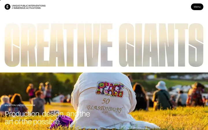
North star · Let oversized, tightly tracked typography and generous white space frame the work; keep interface colour and decoration almost invisible.
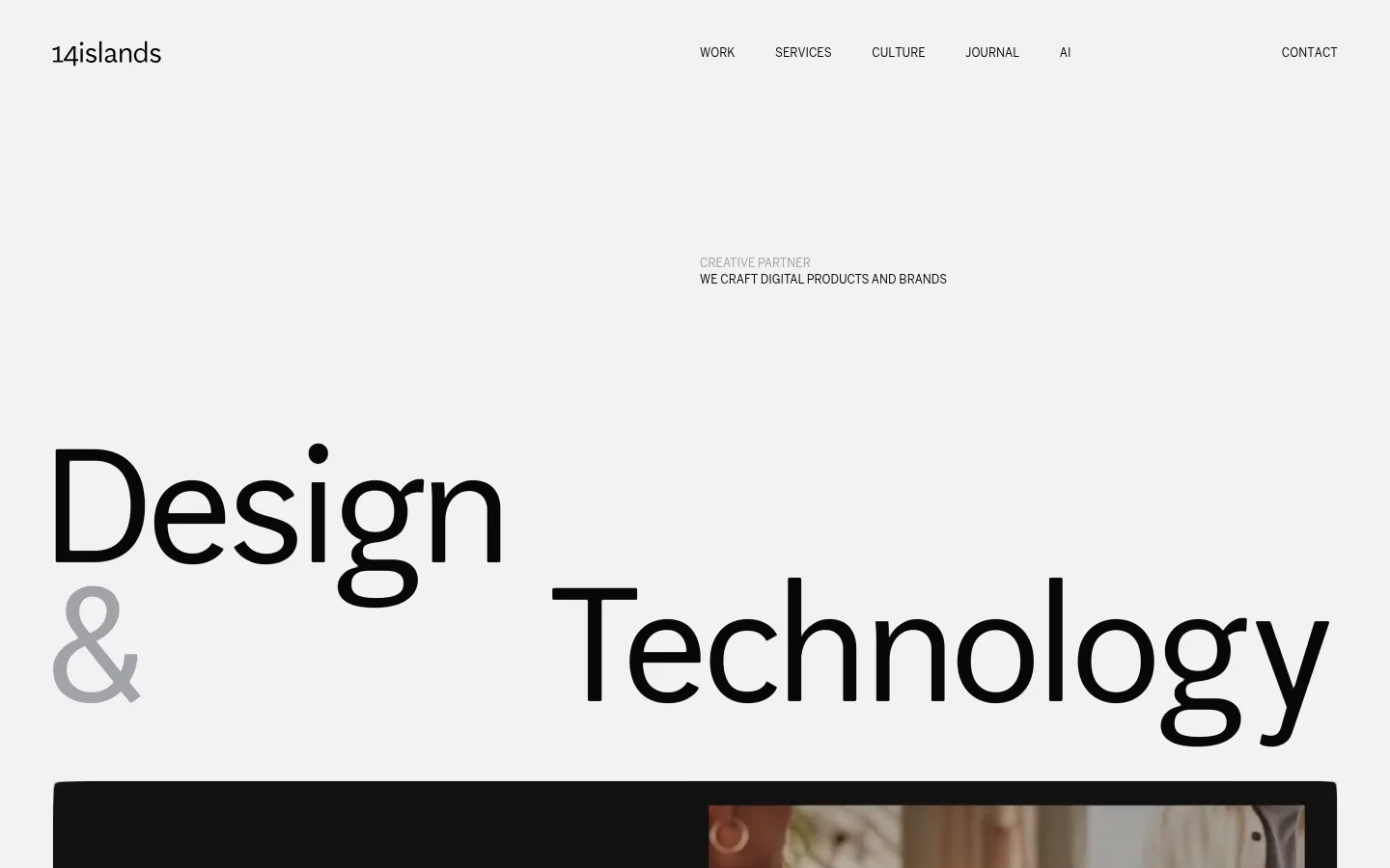
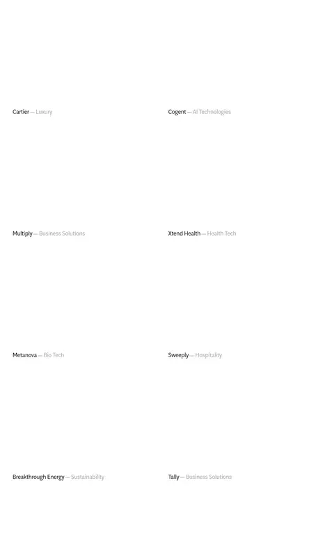
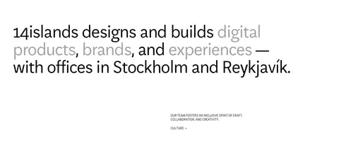
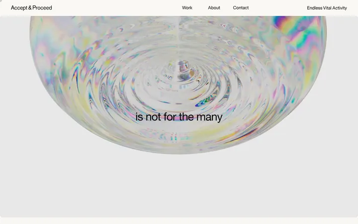
The page uses a deliberately narrow colour vocabulary: white carries most of the long portfolio canvas, pale grey marks the opening hero band, near-black anchors typography and navigation, and muted grey softens secondary copy. The palette creates hierarchy through contrast rather than coloured buttons or decorative accents. AftenScreen supplies the expressive large display and headline lettering, with tight negative tracking and regular weight; BentonSans handles compact uppercase navigation and captions. The opening hero uses a broad, asymmetrically placed two-line title, generous open space, and a media frame entering at the lower edge. Below it, text-led service and studio sections alternate with a long project sequence, then a split list of further work. Images and video provide the strongest colour, but remain project-specific rather than defining the brand palette. The page stays flat and spacious, relying on alignment, whitespace, and restrained hairlines instead of shadows or card chrome.
Display, headline, and body copy throughout the hero and editorial sections.
Aa 设计
BentonSans
网络字体 · 字重 400 · 占比 25%
免费替代:Barlow
Compact uppercase navigation and small caption labels.
角色
示例
字号
字重
行高
字距
特大标题
Oversized opening words and expressive hero typography.
14islands
100px
400
1
-0.04em
一级标题
Primary hero headline and prominent section statements.
14islands
75px
400
1
-0.04em
正文
Service, studio, and other large editorial copy.
The quick brown fox 敏捷的狐狸
26.5px
400
1.3
-0.04em
辅助文字
Small uppercase project and editorial labels.
The quick brown fox 敏捷的狐狸
12px
400
1.4
0
导航
Compact uppercase header navigation.
The quick brown fox 敏捷的狐狸
12px
400
1.4
0
间距与布局
基准单位 1px · 密度:宽松
100px版块间距
10px元素间距
—卡片内边距
1332px内容最大宽度
4px
10px
17px
20px
25px
42px
54px
100px
108px
160px
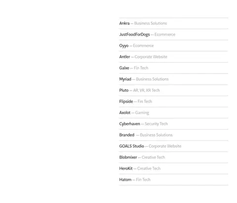
A spacious single-page editorial layout within a measured maximum width of 1332px. The hero begins on a pale-grey band with navigation at the top, a small statement offset to the right, and oversized staggered typography above a wide media frame. White sections follow with a two-column service introduction, a long single-column project showcase, and a later two-column project list. Large measured section gaps preserve a deliberately low-density rhythm.
圆角与层次
没有测到阴影:页面是扁平的,层次靠底色和描边区分。
The interface is predominantly flat: measured data reports no shadows and no defined border colour. Keep sections visually separated by white space and the opening pale-grey band, not elevated cards. Fine horizontal rules appear in the later project list as subtle separators; preserve restrained media framing without adding ornamental chrome.
组件
下面的预览按实测的按钮、输入框、徽标、卡片样式重建(字体用替代字体)。
Header navigation
Place the wordmark at the left and compact uppercase links across the top, with Contact separated toward the right. Use near-black text without filled controls.
Hero statement
Set a very large, regular-weight two-line title asymmetrically across the grey opening band; use muted grey selectively for the ampersand.
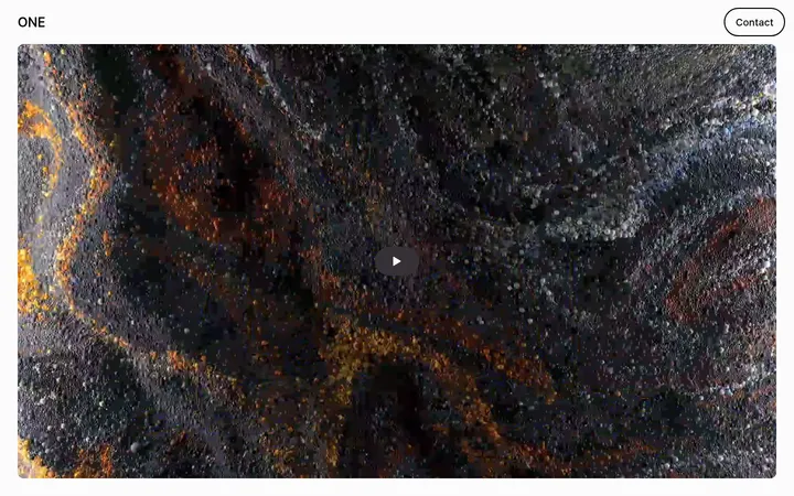
Hero video frame
Use a broad media frame below the headline, with the video’s own imagery supplying colour and contrast.
Service introduction
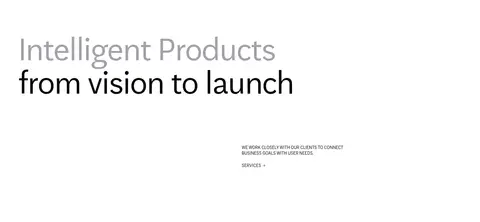
Pair a large editorial service statement with a smaller supporting paragraph and a plain text services link.
Featured project listing
Present projects as a spacious sequence on white, keeping project names dark and their categories muted.
Additional project list
Arrange further projects in two columns and separate the right-side list with delicate horizontal rules.
Contact footer
Use a large invitation and prominent email address, with compact copyright and social links along the bottom.
Imagery · A wide video frame closes the opening hero and introduces vivid project-specific imagery against the otherwise quiet canvas. Portfolio work is presented as visual evidence, with imagery and media allowed to retain their own colours rather than being forced into a brand treatment. The rest of the page relies heavily on restrained text listings and open space.
Use muted grey #a2a2a9 for secondary phrases and categories.
Make the hero title oversized and asymmetrically aligned.
Preserve generous whitespace between project entries.
Let project media retain its own colours.
✕ 不该做
Don’t introduce bright interface accent colours.
Don’t add shadows or raised-card styling.
Don’t turn every project into a boxed card.
Don’t center all hero typography into a conventional banner.
Don’t make secondary labels compete with headlines.
Don’t crowd the long portfolio with dense grids.
Don’t treat colours inside project imagery as brand palette.
给 AI 的提示词
想快速出一个同风格的新页面,把这段话连同 DESIGN.md 一起发给 AI。
Build a new page in the 14islands visual style: minimal, editorial, monochrome, and spacious. Use Gallery White (#ffffff) as the main canvas and Mist Canvas (#f2f2f2) for a distinct opening band. Set large, regular AftenScreen-like headlines in Near Ink (#070707), with tight tracking and occasional Soft Pewter (#a2a2a9) emphasis; use a restrained BentonSans-like uppercase style for small navigation and captions. Establish hierarchy through scale, asymmetrical alignment, and whitespace rather than coloured buttons, shadows, or cards. Let one broad media area carry vivid project imagery, then present work as spacious text-led listings with muted categories and subtle separators. Keep navigation compact, sections long and calm, and the contact close direct and prominent. Treat imagery colours as project-specific, not brand tokens.