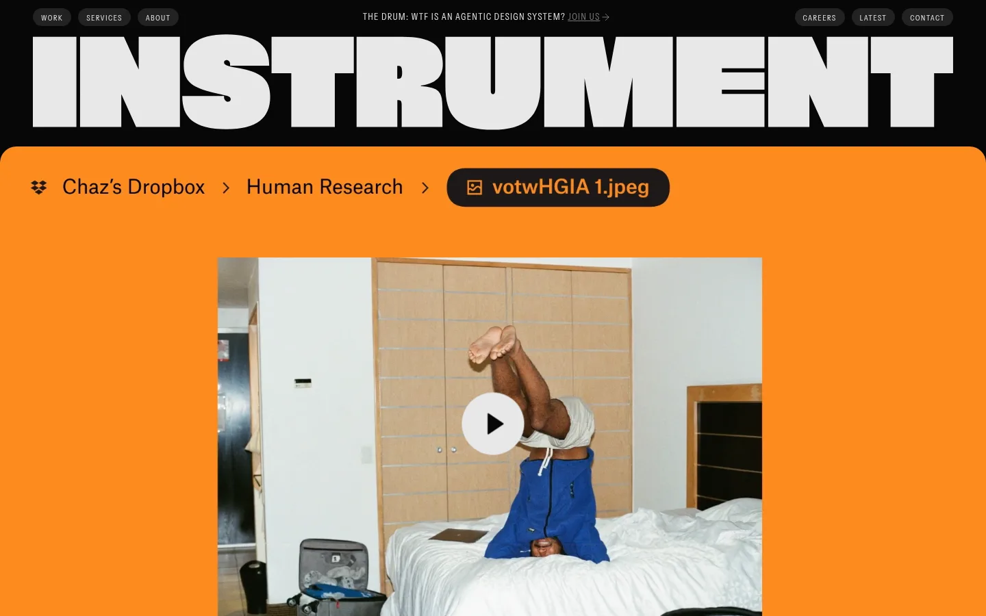
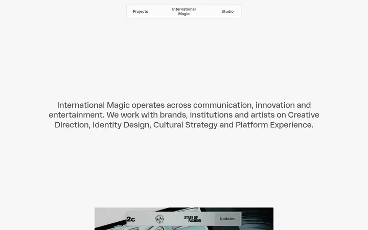
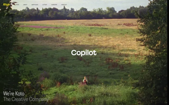
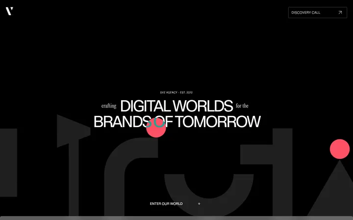
North star · Keep the interface nearly monochrome and let oversized type and project media provide the drama.
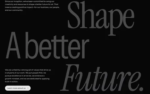
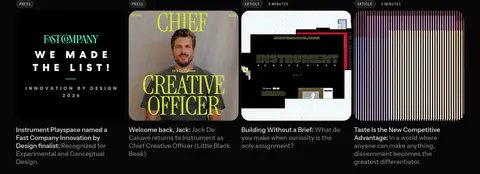
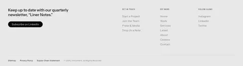
The page is built around a near-black canvas (#070708), with cool, pale text (#e8e8e9) carrying navigation, headings, and links. The palette stays deliberately quiet in the interface; vivid orange and other saturated tones belong to project imagery in the first viewport, not the measured brand palette. Oversized, tightly tracked sans-serif display lettering makes the opening feel like a studio masthead, while Instrument-Serif adds a distinct editorial voice to selected statements. Most content sits directly on the dark background, separated by generous vertical breathing room and subtle hairlines. Work and news are arranged as media-led grids, offset by spare text-led interludes. Rounded media frames and pill-like navigation or CTA treatments soften the otherwise sharp, flat composition. A single pale inverse footer gathers newsletter, contact, and site links into a clear closing band.
配色
点色块复制色值。用途说明来自对页面的实测位置(背景、文字、描边、按钮)与截图判读。
品牌色
表层色
中性色
功能色
页面底色 · Studio Black表层 · Gallery Chalk主文字 · Gallery Chalk次要文字 · Muted Gray弱文字 · Studio Black描边 · Graphite Line
文字
背景
对比度
WCAG
#e8e8e9 Gallery Chalk
#070708 Studio Black
16.44:1
AAA
#808080 Muted Gray
#070708 Studio Black
5.1:1
AA
#808080 Muted Gray
#e8e8e9 Gallery Chalk
3.23:1
AA-large
#070708 Studio Black
#e8e8e9 Gallery Chalk
16.44:1
AAA
字体
字号阶梯:Custom(比例约 1.856,正文 16px)。示例用免费替代字体渲染,数值为实测。
Aa 设计
Instrument-Sans
网络字体 · 字重 400 · 占比 97%
免费替代:Inter
Dominant family for navigation, display lettering, headings, body copy, and links.
Aa 设计
Instrument-Serif
网络字体 · 字重 400 · 占比 3%
免费替代:Cormorant Garamond
Editorial serif accents in selected large statements and featured messaging.
角色
示例
字号
字重
行高
字距
特大标题
Oversized wordmark-style hero lettering and visual masthead.
Instrument
352px
400
0.85
-0.05em
一级标题
Editorial lead statements and prominent page-level messaging.
Instrument
64px
400
1.13
-0.02em
二级标题
Major section headings and featured content titles.
Instrument
36px
400
1.11
-0.025em
三级标题
Secondary feature and editorial card headings.
Instrument
28px
400
1.14
-0.01em
四级标题
Smaller content headings and supporting feature labels.
The quick brown fox 敏捷的狐狸
23px
400
1.22
-0.005em
正文
Standard project descriptions, agency copy, and navigation content.
The quick brown fox 敏捷的狐狸
16px
400
1
0
辅助文字
Compact uppercase labels and metadata.
The quick brown fox 敏捷的狐狸
12px
400
1.33
0.11em
按钮
Pill CTA and action text.
The quick brown fox 敏捷的狐狸
16px
400
1
0
导航
Compact, uppercase primary navigation labels.
The quick brown fox 敏捷的狐狸
12px
400
1.33
0.11em
眉题
Section labels and small uppercase introductory markers.
The quick brown fox 敏捷的狐狸
12px
400
1.33
0.11em
间距与布局
基准单位 4px · 密度:适中
48px版块间距
8px元素间距
—卡片内边距
1344px内容最大宽度
2px
3px
4px
5px
6px
8px
10px
12px
16px
20px
24px
32px
48px
96px
The measured page uses a 1344px maximum content width with comfortable density and a 48px section-gap reference. The initial masthead spans the viewport; later sections alternate sparse full-width text moments with four-column work and news grids and a six-column offerings layout. Content is generally left aligned, with centered editorial moments used for emphasis. Large vertical intervals are part of the composition, not empty space to compress. The footer switches to a three-column light-on-light inverse arrangement.
圆角与层次
按钮 · 9999px
图片 · 24px
导航 · 9999px
没有测到阴影:页面是扁平的,层次靠底色和描边区分。
The interface is predominantly flat, with no measured shadow system. Use fine dark hairlines to divide sections and restrained borders for structure. Rounded media frames and pill-shaped navigation or CTA elements add softness, while the black canvas and pale footer create the primary layer contrast.
组件
下面的预览按实测的按钮、输入框、徽标、卡片样式重建(字体用替代字体)。
Primary navigation
Compact uppercase Instrument-Sans links sit in pill-like dark treatments at the top, with the measured navigation using a 999px radius.
Section eyebrow
Small uppercase labels with wide tracking introduce work, services, recognition, and news sections.
Text CTA
Pale rounded CTA treatments use regular Instrument-Sans; links elsewhere remain clean text without prominent boxes.
Work grid
A four-column project listing pairs media with compact uppercase category labels, project names, and brief descriptions.
Feature media
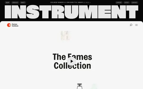
Large portfolio media sits in rounded frames, with play controls used where the preview implies motion.
Footer
A pale inverse band organizes newsletter, contact, and navigation links into three columns with subtle divider lines.
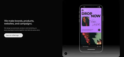
Imagery · Project imagery is the principal source of color and variation: photography, campaign artwork, interfaces, and media previews appear in broad rounded frames or compact editorial grids. Keep image crops confident and edge-clean, with minimal decorative framing. The bright orange visible in the first viewport belongs to project media, not the measured interface palette. Treat imagery as portfolio evidence rather than generic background decoration.
Keep generous vertical pauses between content blocks.
✕ 不该做
Do not introduce unmeasured accent colors into interface UI.
Do not turn every link into a filled button.
Do not compress the page into a dense dashboard.
Do not add decorative shadows to flat media cards.
Do not use serif typography for all body copy.
Do not mistake project-image colors for brand palette colors.
给 AI 的提示词
想快速出一个同风格的新页面,把这段话连同 DESIGN.md 一起发给 AI。
Build a new creative-agency page in Instrument’s visual language. Use Studio Black (#070708) as the main canvas and Gallery Chalk (#e8e8e9) for primary text; reserve Smoke Gradient (#777779), Muted Gray (#808080), Graphite Line (#222223), and Footer Silver (#cdcdce) for subdued text and fine dividers. Use a clean regular-weight sans for most content, with a selective editorial serif contrast. Make the hero typographic and oversized, then alternate spacious copy-led sections with media-rich project grids. Keep labels compact, uppercase, and widely tracked. Use rounded media frames and pill-like action treatments sparingly. Allow vivid color to come from portfolio images, not new interface accents. Finish with a pale inverse footer containing clear newsletter, contact, and navigation groups.