North star · Keep the storefront bright and evidence-led, using deep teal for focused content panels and mint green only for clear action or emphasis.
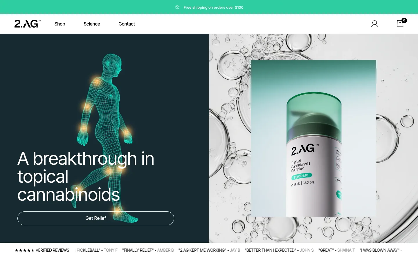
The visual strategy balances a white, uncluttered storefront with sharply defined dark teal moments. Bright mint green is reserved for high-salience actions and small signals, including the announcement strip, purchase button, and selected benefit tab. Black text carries most of the information hierarchy, while pale gray review cards provide quiet contrast without competing with product imagery. Inter Tight is used throughout, giving headings a clean, contemporary outline and keeping dense product and ingredient copy compact. Layout alternates between centered social-proof moments, split product or editorial panels, and broad full-width sections; generous white gaps keep the long page legible. The hero combines a dark teal text field and scientific body illustration with a bright, laboratory-like product image. Later sections use rounded statistic cards, ingredient tiles, a simple FAQ, and a full-bleed video, maintaining a restrained, evidence-first storefront rather than a decorative beauty aesthetic.
Site-wide headings, product and ingredient copy, navigation, buttons, and supporting text.
角色
示例
字号
字重
行高
字距
特大标题
Large hero or statement headings.
2.AG
62px
400
1
0
一级标题
Primary hero and page-level heading.
2.AG
45px
400
1.3
0
二级标题
Major section headings and product titles.
2.AG
36px
400
1
0
三级标题
Supporting feature and section headings.
2.AG
30px
400
1.6
0
四级标题
Smaller card or subsection headings.
The quick brown fox 敏捷的狐狸
24px
400
1.33
0
正文
Product descriptions, ingredient explanations, and general copy.
The quick brown fox 敏捷的狐狸
14px
400
1.6
0
辅助文字
Compact uppercase labels and supporting metadata.
The quick brown fox 敏捷的狐狸
12px
400
1.5
0.09em
按钮
Purchase and other prominent action labels.
2.AG
45px
400
1.6
0
链接
Navigation, review links, and inline actions.
The quick brown fox 敏捷的狐狸
16px
400
1.6
0
眉题
Small uppercase section labels, such as Proven Results.
The quick brown fox 敏捷的狐狸
12px
400
1.5
0.09em
间距与布局
基准单位 2px · 密度:适中
35px版块间距
16px元素间距
24px卡片内边距
1340px内容最大宽度
4px
8px
10px
12px
15px
16px
17px
18px
20px
24px
25px
28px
30px
32px
35px
40px
A long, comfortable-density storefront uses a measured maximum content width of 1340px and a recurring 16px element gap. The top navigation is a slim white row beneath the mint announcement strip. The hero is a two-column split; subsequent content alternates between product detail, centered reviews, three-up stats, editorial splits, full-width teal proof, ingredient tiles, and FAQ. Most sections remain white, so dark bands feel deliberate. Headings generally align left, while review content is centered. Use whitespace to separate modules rather than adding ornamental dividers.
圆角与层次
按钮 · 9999px
输入框 · 5px
卡片 · 12px
图片 · 20px
徽标 · 50%
链接 · 9999px
没有测到阴影:页面是扁平的,层次靠底色和描边区分。
The interface is mostly flat: white canvas sections, fine borders, and restrained rounded corners define structure instead of shadows. Product and review cards use soft backgrounds or subtle outlines. Dark teal cards stand apart through contrast, while media framing and pill-shaped controls provide the main dimensional cues.
组件
下面的预览按实测的按钮、输入框、徽标、卡片样式重建(字体用替代字体)。
Announcement and navigation
Mint shipping strip above a white header with the wordmark, Shop, Science, Contact, and compact account and bag icons.
Hero split
Deep teal copy panel with a large white heading and outlined pill action beside a bright, scientific product image.
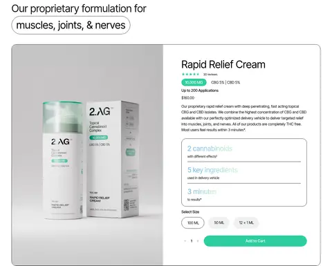
Product detail card
Outlined rounded panel pairs product photography with title, review count, potency details, short copy, expandable benefit rows, size choices, quantity, and mint purchase action.
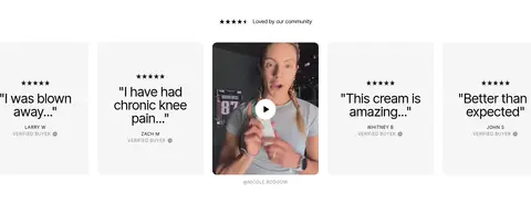
Review carousel
Centered community heading and review/video tiles; pale gray cards frame brief quotes, with customer video among the testimonials.
Proof statistic cards
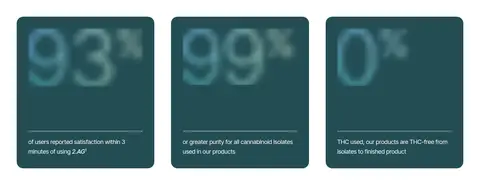
Three dark teal rounded cards present oversized numeric proof with compact explanatory copy along the lower edge.
Tabbed results panel
Full-width teal split panel combines a small eyebrow, heading, outlined body-area tabs, supporting copy, and large media.
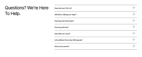
FAQ accordion
Two-column heading and a right-side list of questions separated by fine horizontal rules, each with a plus control.
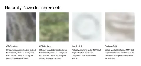
Ingredient tiles
Four aligned ingredient entries pair square imagery with concise titles and compact explanatory copy.
Imagery · Mix clean product photography with science-coded visuals: the hero pairs a glowing anatomical wireframe with a close product image against a bubble-like laboratory backdrop. Product packaging is shown in a bright, neutral setting. Later modules include customer video, ingredient imagery, a skin-focused detail image, and a full-bleed video panel. Keep imagery crisp and restrained; photographic colors inside assets should not redefine the interface palette.
Reserve mint for prominent actions and selected states.
Use deep teal for focused proof or hero panels.
Keep product copy compact and easy to scan.
Use real product and ingredient imagery.
Separate long sections with generous white space.
✕ 不该做
Do not turn every section into a dark band.
Do not use mint as a large decorative background.
Do not add heavy shadows to flat cards.
Do not let illustrations set the interface palette.
Do not crowd product information into a single text block.
Do not replace clear dividers with decorative effects.
给 AI 的提示词
想快速出一个同风格的新页面,把这段话连同 DESIGN.md 一起发给 AI。
Build a new health-commerce page in the 2.AG visual style. Use Gallery White (#ffffff) as the main canvas, Clinical Ink (#000000) for primary copy, and Therapeutic Teal (#244d54) for selected hero, results, or proof panels. Apply Relief Mint (#2ecea0) sparingly to primary actions and active states. Use Inter Tight throughout, with clean regular-weight headings and compact, legible supporting text. Structure content as spacious, mostly white sections with clear split layouts, product or ingredient photography, evidence-led cards, and fine dividers. Keep surfaces flat and shadows minimal; use rounded cards and pill actions only where they clarify component roles. Prioritize readable product details, authentic reviews, clear purchase controls, and an uncluttered FAQ. Do not introduce extra colors or visual effects that compete with the measured palette.