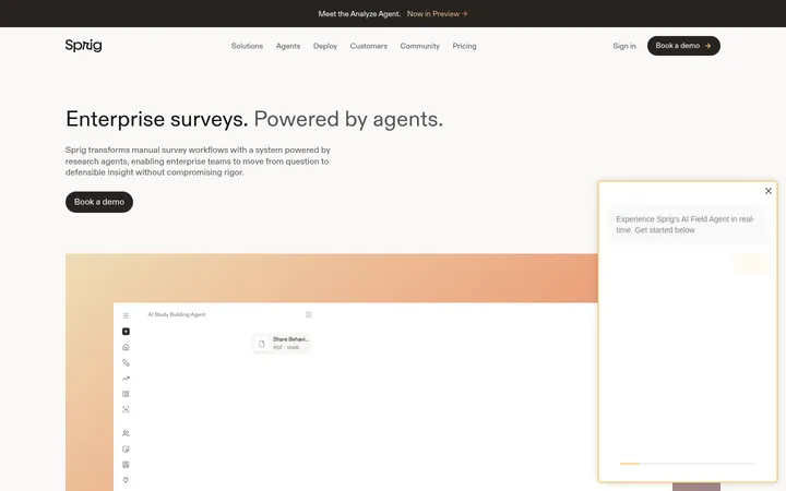
North star · Keep the canvas open and quiet, using evergreen contrast and vivid green only to direct attention toward the product and next action.
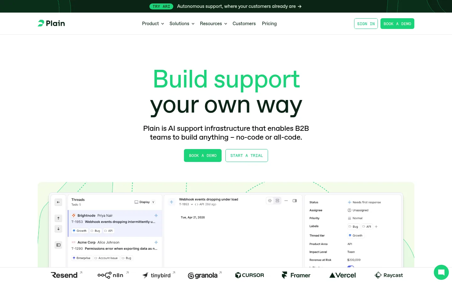
The page moves between expansive white sections and immersive deep-evergreen feature bands. Green is the key signal: it colors the first line of the hero headline, primary demo buttons, small product indicators, and fine details in interface visuals. Near-black green carries inverse sections and dark text, while warm off-white cards soften testimonial and product content. Typography uses ABC Favorit’s clean, rounded sans character: large, lightly weighted headlines sit close together, with compact uppercase mono labels providing a technical counterpoint. The layout favors centered introductions followed by broad product screenshots, logo rows, and modular feature cards. Generous gaps separate sections; cards use restrained rounding and little visible elevation. Interface imagery is crisp and mostly shown within pale, softly tinted frames. Occasional burgundy and pink accents belong to a case-study card and decorative treatments, not the main brand palette.
配色
点色块复制色值。用途说明来自对页面的实测位置(背景、文字、描边、按钮)与截图判读。
品牌色
强调色
表层色
中性色
功能色
页面底色 · Gallery White表层 · Evergreen Ink表层 2 · Warm Paper表层 3 · Pale Leaf表层 4 · Case Burgundy主文字 · True Black次要文字 · Pale Leaf弱文字 · Evergreen Ink强调 · Signal Green强调 2 · Blush Pink强调 3 · Muted Rose
Headlines, body copy, and captions throughout the page.
Aa 设计
ABC Favorit Medium
网络字体 · 字重 500 · 占比 9%
免费替代:Inter
Medium emphasis in compact interface and navigation text.
Aa 设计
Geist Mono
网络字体 · 字重 500 · 占比 5%
免费替代:IBM Plex Mono
Uppercase navigation links, CTAs, and technical labels.
角色
示例
字号
字重
行高
字距
特大标题
Oversized hero or section headline when a single message needs emphasis.
Plain
80px
400
1
-0.02em
一级标题
Primary hero headline and major section titles.
Plain
48px
400
1.04
-0.02em
二级标题
Feature headings, testimonial titles, and secondary section headings.
The quick brown fox 敏捷的狐狸
24px
400
1.17
-0.02em
正文
Hero description and explanatory product or feature copy.
The quick brown fox 敏捷的狐狸
18px
400
1.33
-0.01em
辅助文字
Supporting card copy, interface captions, and small descriptive text.
The quick brown fox 敏捷的狐狸
15px
400
1.33
-0.01em
链接
Compact uppercase navigation and action links.
The quick brown fox 敏捷的狐狸
13px
500
1.46
0.015em
代码
Technical labels and mono-style interface or product annotations.
const style = 1;
13px
500
1.46
0.015em
间距与布局
基准单位 4px · 密度:适中
80px版块间距
24px元素间距
24px卡片内边距
1200px内容最大宽度
4px
8px
10px
11px
12px
16px
20px
24px
40px
80px
120px
Use a centered content area with a measured maximum width of 1200px. The hero is centered, with a narrow text measure, two adjacent actions, and a wide product image below. Alternate broad white content areas with full-width evergreen bands. Organize feature content into modular cards and image-led splits, keeping alignment clean and section spacing generous. The measured rhythm uses an 80px section gap and 24px element gap; overall density is comfortable rather than packed.
圆角与层次
按钮 · 6px
卡片 · 9px
图片 · 6px
链接 · 6px
sm · other
sm · other
md · card
Keep most sections and cards visually flat, using color blocks and whitespace instead of strong shadows. Cards have measured 9px rounding, while buttons and media use 6px rounding. Where depth appears, it is restrained and limited to subtle soft shadows or layered interface screenshots; avoid heavy borders and dramatic floating effects.
组件
下面的预览按实测的按钮、输入框、徽标、卡片样式重建(字体用替代字体)。
Primary CTA
Vivid green fill (#1ad379), blue measured text (#0000ee), and 6px rounding; appears as the prominent BOOK A DEMO action.
Secondary CTA
Outlined treatment beside the filled hero action, preserving the white canvas and green-accented control language.
Product interface showcase
Wide, detailed support UI screenshot placed beneath centered hero copy, framed by a pale green product backdrop.
Feature card
Modular product feature panel with a restrained 9px radius, 24px measured padding, and interface imagery or concise copy.
Customer logo row
Compact horizontal customer marks between content blocks, providing proof without competing with the headline.
Case-study card
A distinctive deep burgundy (#360003) testimonial surface with customer quote and supporting image; use as an isolated exception.
Imagery · Treat product UI as the main visual asset: show crisp, detailed support-workflow screenshots inside pale green or warm off-white framing. Pair screenshots with small diagrams and interface tiles rather than relying on decorative photography. The page also uses a photographic monitor visual in a dark feature section and customer imagery in case-study content; frame these as supporting evidence, not the primary brand signature.
Use white as the default canvas and preserve generous open space.
Reserve #1ad379 for primary actions and selective product emphasis.
Use #0a2414 for dark bands and strong headline contrast.
Set hero copy centrally above a wide product interface visual.
Use pale and warm card surfaces to distinguish modular content.
Pair large Favorit-style sans headlines with compact uppercase mono labels.
✕ 不该做
Do not make every section a dark or saturated color block.
Do not use vivid green as a large page background.
Do not crowd the hero with dense copy or controls.
Do not add heavy shadows, thick borders, or sharp card corners.
Do not treat burgundy and pink as core brand colors.
Do not let decorative imagery overpower product UI.
给 AI 的提示词
想快速出一个同风格的新页面,把这段话连同 DESIGN.md 一起发给 AI。
Build a new B2B SaaS page in Plain’s visual style. Use Gallery White (#ffffff) as the spacious default canvas, Evergreen Ink (#0a2414) for selective full-width inverse sections and dark text, and Signal Green (#1ad379) for the main CTA and restrained emphasis. Keep headlines clean and lightly weighted, with ABC Favorit or an Inter-like substitute; use compact uppercase mono labels for navigation and technical annotations. Center the hero message over a wide, detailed product interface visual. Organize following content into comfortable, clearly separated sections with pale green or warm off-white modular cards, simple customer proof, and image-led feature blocks. Keep cards subtly rounded and nearly flat. Use burgundy or pink only as isolated illustration or case-study accents, never as the dominant palette.