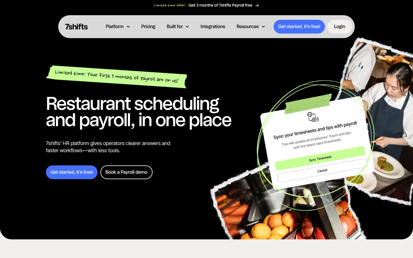
网站以沉浸式黑色首屏搭配温暖的浅色产品内容,形成鲜明对比。亮蓝按钮、荧光绿手写点缀和餐厅实景图片,让产品介绍既实用又有人情味。
North star · Keep the product story legible by alternating bold black proof moments with warm, spacious sections and using blue only for clear actions.
7shifts builds a distinctive rhythm from a black, full-bleed opening into broad warm off-white product sections, white comparison and content areas, and a second black proof section. Blue is reserved for primary actions and selected product panels, so conversion cues remain immediately legible; orange appears sparingly in proof metrics and supporting details. Lime accents, including handwritten promotional strips, add a playful human note rather than replacing the core palette. Headings use a compact, rounded modern sans with confident scale and tight leading; body copy stays clean and readable, with occasional handwritten labels for contrast. The layout alternates centered introductions with two-column feature cards and image-led product panels. Restaurant scenes and UI mockups are treated as overlapping collage elements in the hero, while later sections use contained cards and simple logos. Generous section spacing lets dense product information breathe, and rounded pills soften the otherwise high-contrast geometry.
配色 点色块复制色值。用途说明来自对页面的实测位置(背景、文字、描边、按钮)与截图判读。
品牌色
Kitchen Ink
#000000
Hero and proof-section canvas, primary text, and dark comparison panel.
强调色
Shift Blue
#4570ff
Primary pill CTAs and vivid product panels; the main action color.
Signal Orange
#ff6808
Sparingly used accent in proof details and illustrated or product-card content.
Lime Note
#c6ff94
Handwritten promo strip and small playful illustration accents.
表层色
Clean Plate
#ffffff
Default canvas, feature-card surfaces, and reversed text on dark areas.
Warm Linen
#f1f0ec
Broad product-story bands, FAQ background, and muted button or footer surfaces.
中性色
Charcoal Copy
#404040
Muted supporting text against light surfaces.
功能色
Soft Divider
#d1d5dc
Subtle borders and hairlines, especially in supporting and footer content.
Mockup Gray
#7f7f7f
Secondary card or product-mockup detail, not a defining brand surface.
Lavender Tile
#dad8ff
Pastel timeline or product-card illustration detail, not a core page background.
Deep Teal
#244f47
Feature mockup panel imagery; treat as product illustration color.
文字 背景 对比度 WCAG #000000 Kitchen Ink#ffffff Clean Plate21:1 AAA #000000 Kitchen Ink#f1f0ec Warm Linen18.42:1 AAA #ffffff Clean Plate#f1f0ec Warm Linen1.14:1 不达标 #ffffff Clean Plate#000000 Kitchen Ink21:1 AAA #404040 Charcoal Copy#ffffff Clean Plate10.37:1 AAA #404040 Charcoal Copy#f1f0ec Warm Linen9.09:1 AAA
字体 字号阶梯:Perfect Fourth(比例约 1.32,正文 16px)。示例用免费替代字体渲染,数值为实测。
Aa 设计
interTight 网络字体 · 字重 400 / 700 · 占比 73%
免费替代:Inter
Body copy, captions, and text links
Aa 设计
medium 网络字体 · 字重 500 · 占比 22%
免费替代:DM Sans
Headings, navigation, and primary buttons
Aa 设计
nanumPenScript 网络字体 · 字重 400 / 500 · 占比 3%
免费替代:Caveat
Handwritten promotional strips and small expressive labels
Aa 设计
Universal Sans Display 系统字体 · 字重 400 / 500 · 占比 2%
免费替代:Manrope
Occasional feature heading display face
角色 示例 字号 字重 行高 字距 特大标题 Large, tightly set headline moments in hero or major brand statements.
7shifts
64px 500 0.9 -0.03em 一级标题 Primary hero headline and dominant page-level statement.
7shifts
52px 500 1.1 0 二级标题 Section titles introducing product, proof, FAQ, and resource content.
7shifts
48px 500 0.9 -0.03em 三级标题 Feature-card and prominent subsection headings.
7shifts
44px 500 1.1 0 四级标题 Smaller card or supporting section headings.
7shifts
36px 500 1.1 0 正文 Explanatory copy, feature descriptions, and FAQ answers.
The quick brown fox 敏捷的狐狸
16px 400 1.5 0 辅助文字 Compact labels, eyebrow text, and supporting metadata.
The quick brown fox 敏捷的狐狸
14px 400 1 -0.025em 按钮 Primary and secondary CTA labels.
The quick brown fox 敏捷的狐狸
16px 500 1.5 0 导航 Main navigation items and menu labels.
The quick brown fox 敏捷的狐狸
16px 500 1.5 0 链接 Inline actions, story links, and resource links.
The quick brown fox 敏捷的狐狸
16px 400 1.5 -0.02em
间距与布局 基准单位 4px · 密度:适中
80px 版块间距
12px 元素间距
40px 卡片内边距
1120px 内容最大宽度
4px
6px
8px
10px
12px
16px
20px
24px
28px
40px
60px
80px
The opening hero spans the viewport, then content settles into a measured central column, with the measured page max width at 1120px. Sections alternate centered introductions, two-column feature splits, card rows, and broad full-width proof or FAQ bands. The 80px section rhythm and 12px element rhythm create comfortable pacing. Feature cards pair product imagery with concise copy; later resource and footer areas become denser and more grid-like. Alignment shifts deliberately between centered calls to action and left-aligned informational content.
圆角与层次 Most surfaces are flat, with clear color-block separation doing the work of depth. Cards generally rely on white against warm linen rather than visible shadows, while fine gray hairlines separate supporting content. The floating pill navigation is a notable elevated element with a soft shadow; collage overlap and mockup layering add depth in the hero.
组件 下面的预览按实测的按钮、输入框、徽标、卡片样式重建(字体用替代字体)。
Announcement strip Narrow text-led offer above the main navigation; the hero also uses a lime handwritten promo strip.
Pill navigation Light rounded navigation capsule with dark links, a blue primary CTA, and a pale login action.
Primary CTA Bright blue (#4570ff) pill with white medium-weight text; repeated as the key conversion action.
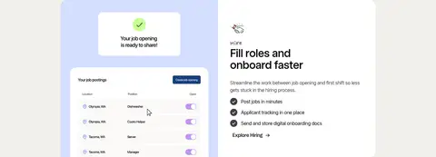
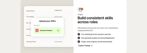
Feature split card Paired product UI visual and white copy panel with a short title, description, checklist, and text link.
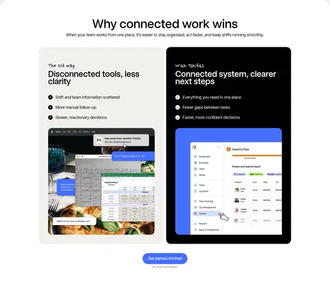
Comparison panels Side-by-side light and black panels contrast disconnected workflows with the unified 7shifts system.
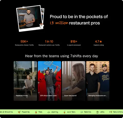
Proof band Black full-width section combining an audience statement, orange-highlighted metrics, and team testimonial imagery.
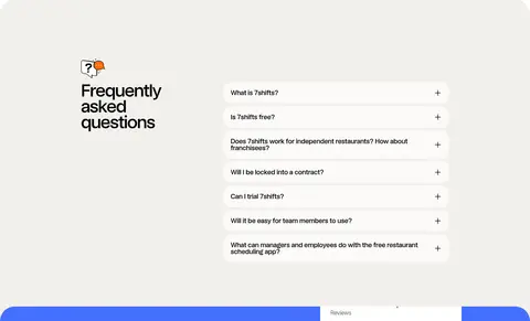
FAQ accordion Warm linen section with a prominent heading and stacked question rows, using compact plus controls.
Imagery · The hero combines restaurant photography, torn-paper edges, and an angled product-interface mockup, framed as a layered collage over black. Feature rows use crisp UI captures and illustrative colored panels rather than abstract decoration. Proof content relies on real team photographs and testimonial thumbnails. Keep images contained in purposeful cards or cutout compositions; avoid glossy 3D treatments or generic stock imagery.
页面版块 共 15 个版块,按页面从上到下排列,每个都标了类型、布局和交互套路。
该做与不该做 ✓ 该做 Anchor the first impression with a black hero. Use warm linen to distinguish the main product-story band. Reserve Shift Blue for prominent calls to action. Pair feature copy with actual product-interface imagery. Use Lime Note as a small handwritten accent. Alternate centered section openings with left-aligned detail. ✕ 不该做 Do not make every section black or blue. Do not turn orange or lime into large page backgrounds. Do not use generic gradients as a replacement for the palette. Do not crowd feature cards with long paragraphs. Do not use handwritten type for navigation or body copy. Do not add heavy shadows to every card. 给 AI 的提示词 想快速出一个同风格的新页面,把这段话连同 DESIGN.md 一起发给 AI。
复制 Build a new 7shifts-style SaaS page with a bold, human restaurant-operations feel. Start with a Kitchen Ink (#000000) hero and layered restaurant photography plus a product UI mockup; place a light pill navigation above the content and make the primary action Shift Blue (#4570ff) with white text. Use Warm Linen (#f1f0ec) for broad product sections, Clean Plate (#ffffff) for cards, and Charcoal Copy (#404040) for supporting text. Set confident, compact sans headings and clear Inter-like body copy; reserve handwritten lettering and Lime Note (#c6ff94) for small promo annotations. Alternate feature splits, comparison panels, proof metrics, FAQ, and resource grids with generous breathing room. Keep imagery authentic and product-specific, rely on flat color blocks and restrained borders, and avoid decorative effects that compete with the interface.
DESIGN.md Tailwind v4 CSS 变量 Design Tokens
---
title: "7shifts design system"
variant: extended
source: https://www.7shifts.com/
captured_at: 2026-10-12
theme: light
industry: saas
generator: Design DNA (https://four.wiralomi.com/style/7shifts-com)
ai_generated: true
ai_label: "本文件由 AI 辅助生成:数值取自公开网页的实测样式,命名、用途说明与建议为模型解读。商标归原所有者。 / AI-assisted content"
---
# 7shifts · Design System
> Restaurant operations, with a bold human touch
**Theme:** light · **Industry:** saas · **Source:** https://www.7shifts.com/ · **Captured:** 2026-10-12 (1440×900 desktop)
_AI-assisted content: values are measured from the public page at capture time; names, roles and guidance are model-written interpretations. Trademarks belong to their owners._
A high-contrast SaaS homepage that pairs an immersive black hero with warm, neutral product sections. Bright blue calls to action, expressive lime notes, and restaurant photography keep the practical product story lively and human.
## North star
Keep the product story legible by alternating bold black proof moments with warm, spacious sections and using blue only for clear actions.
## Overview
7shifts builds a distinctive rhythm from a black, full-bleed opening into broad warm off-white product sections, white comparison and content areas, and a second black proof section. Blue is reserved for primary actions and selected product panels, so conversion cues remain immediately legible; orange appears sparingly in proof metrics and supporting details. Lime accents, including handwritten promotional strips, add a playful human note rather than replacing the core palette. Headings use a compact, rounded modern sans with confident scale and tight leading; body copy stays clean and readable, with occasional handwritten labels for contrast. The layout alternates centered introductions with two-column feature cards and image-led product panels. Restaurant scenes and UI mockups are treated as overlapping collage elements in the hero, while later sections use contained cards and simple logos. Generous section spacing lets dense product information breathe, and rounded pills soften the otherwise high-contrast geometry.
## Colors
| Name | Hex | Token | Group | Role |
|---|---|---|---|---|
| Kitchen Ink | ` | `--color-kitchen-ink` | brand | Hero and proof-section canvas, primary text, and dark comparison panel. |
| Clean Plate | ` | `--color-clean-plate` | surface | Default canvas, feature-card surfaces, and reversed text on dark areas. |
| Warm Linen | ` | `--color-warm-linen` | surface | Broad product-story bands, FAQ background, and muted button or footer surfaces. |
| Shift Blue | ` | `--color-shift-blue` | accent | Primary pill CTAs and vivid product panels; the main action color. |
| Soft Divider | ` | `--color-soft-divider` | semantic | Subtle borders and hairlines, especially in supporting and footer content. |
| Charcoal Copy | ` | `--color-charcoal-copy` | neutral | Muted supporting text against light surfaces. |
| Mockup Gray | ` | `--color-mockup-gray` | semantic | Secondary card or product-mockup detail, not a defining brand surface. |
| Signal Orange | ` | `--color-signal-orange` | accent | Sparingly used accent in proof details and illustrated or product-card content. |
| Lavender Tile | ` | `--color-lavender-tile` | semantic | Pastel timeline or product-card illustration detail, not a core page background. |
| Deep Teal | ` | `--color-deep-teal` | semantic | Feature mockup panel imagery; treat as product illustration color. |
| Lime Note | ` | `--color-lime-note` | accent | Handwritten promo strip and small playful illustration accents. |
### Semantic aliases
`--color-canvas` → ` (Clean Plate) · `--color-surface` → ` (Warm Linen) · `--color-surface-2` → ` (Kitchen Ink) · `--color-text` → ` (Kitchen Ink) · `--color-text-muted` → ` (Clean Plate) · `--color-text-subtle` → ` (Charcoal Copy) · `--color-border` → ` (Soft Divider) · `--color-accent` → ` (Shift Blue) · `--color-accent-2` → ` (Signal Orange) · `--color-on-accent` → ` (Clean Plate)
### Contrast (WCAG 2.x)
| Text | Background | Ratio | Level |
|---|---|---|---|
| ` | ` | 21:1 | AAA |
| ` | ` | 18.42:1 | AAA |
| ` | ` | 1.14:1 | fail |
| ` | ` | 21:1 | AAA |
| ` | ` | 10.37:1 | AAA |
| ` | ` | 9.09:1 | AAA |
| ` | ` | 2.03:1 | fail |
| ` | ` | 4.19:1 | AA-large |
| ` | ` | 3.67:1 | AA-large |
| ` | ` | 5.01:1 | AA |
### Gradients
- `linear-gradient(oklab(0 0 0 / 0) 0%, oklab(0 0 0 / 0.8) 100%)`
## Typography
| Family | Token | Source | Weights | Role | Free substitute |
|---|---|---|---|---|---|
| interTight | `--font-body` | webfont | 400, 700 | Body copy, captions, and text links | Inter |
| medium | `--font-display` | webfont | 500 | Headings, navigation, and primary buttons | DM Sans |
| nanumPenScript | `--font-nanumpenscript` | webfont | 400, 500 | Handwritten promotional strips and small expressive labels | Caveat |
| Universal Sans Display | `--font-universal-sans-display` | system | 400, 500 | Occasional feature heading display face | Manrope |
- **interTight:** Regular weight keeps long copy clear; compact tracking and short line lengths support dense product details.
- **medium:** Medium weight gives display and heading text a rounded, assertive feel; use sentence case.
- **nanumPenScript:** Use sparingly for informal annotation-like emphasis, not functional or long-form text.
- **Universal Sans Display:** Medium-weight sans display styling; keep usage consistent with the compact, clean headline system.
### Type scale — Perfect Fourth (ratio ≈ 1.32, base 16px)
| Role | Size | Weight | Line height | Letter spacing | Case | Family | Used for |
|---|---|---|---|---|---|---|---|
| display | 64px | 500 | 0.9 | -0.03em | — | medium | Large, tightly set headline moments in hero or major brand statements. |
| h1 | 52px | 500 | 1.1 | 0 | — | medium | Primary hero headline and dominant page-level statement. |
| h2 | 48px | 500 | 0.9 | -0.03em | — | medium | Section titles introducing product, proof, FAQ, and resource content. |
| h3 | 44px | 500 | 1.1 | 0 | — | Universal Sans Display | Feature-card and prominent subsection headings. |
| h4 | 36px | 500 | 1.1 | 0 | — | medium | Smaller card or supporting section headings. |
| body | 16px | 400 | 1.5 | 0 | — | interTight | Explanatory copy, feature descriptions, and FAQ answers. |
| caption | 14px | 400 | 1 | -0.025em | — | interTight | Compact labels, eyebrow text, and supporting metadata. |
| button | 16px | 500 | 1.5 | 0 | — | medium | Primary and secondary CTA labels. |
| nav | 16px | 500 | 1.5 | 0 | — | medium | Main navigation items and menu labels. |
| link | 16px | 400 | 1.5 | -0.02em | — | interTight | Inline actions, story links, and resource links. |
## Spacing & layout
- Base unit **4px**, density **comfortable**.
- Scale (most used values): 4, 6, 8, 10, 12, 16, 20, 24, 28, 40, 60, 80 px.
- Section rhythm 80px · element gap 12px · card padding 40px · max content width 1120px.
The opening hero spans the viewport, then content settles into a measured central column, with the measured page max width at 1120px. Sections alternate centered introductions, two-column feature splits, card rows, and broad full-width proof or FAQ bands. The 80px section rhythm and 12px element rhythm create comfortable pacing. Feature cards pair product imagery with concise copy; later resource and footer areas become denser and more grid-like. Alignment shifts deliberately between centered calls to action and left-aligned informational content.
## Shape & elevation
- Radius: button `9999px` · card `12px` · media `50%` · nav `9999px` · link `9999px` · xs `4px` · sm `8px` · md `10px` · lg `12px` · xl `20px` · 2xl `40px` · pill `9999px`
- Shadow `md` (nav): `rgba(0, 0, 0, 0) 0px 0px 0px 0px, rgba(0, 0, 0, 0) 0px 0px 0px 0px, rgba(0, 0, 0, 0) 0px 0px 0px 0px, rgba(0, 0, 0, 0) 0px 0px 0px 0px, rgba(0, 0, 0, 0.1) 0px 4px 15px 0px`
- Motion: standard transition `0.15s cubic-bezier(0.4, 0, 0.2, 1)` on interactive elements.
Most surfaces are flat, with clear color-block separation doing the work of depth. Cards generally rely on white against warm linen rather than visible shadows, while fine gray hairlines separate supporting content. The floating pill navigation is a notable elevated element with a soft shadow; collage overlap and mockup layering add depth in the hero.
## Imagery
The hero combines restaurant photography, torn-paper edges, and an angled product-interface mockup, framed as a layered collage over black. Feature rows use crisp UI captures and illustrative colored panels rather than abstract decoration. Proof content relies on real team photographs and testimonial thumbnails. Keep images contained in purposeful cards or cutout compositions; avoid glossy 3D treatments or generic stock imagery.
## Components
### Announcement strip
Narrow text-led offer above the main navigation; the hero also uses a lime handwritten promo strip.
### Pill navigation
Light rounded navigation capsule with dark links, a blue primary CTA, and a pale login action.
### Primary CTA
Bright blue (### Feature split card
Paired product UI visual and white copy panel with a short title, description, checklist, and text link.
### Comparison panels
Side-by-side light and black panels contrast disconnected workflows with the unified 7shifts system.
### Proof band
Black full-width section combining an audience statement, orange-highlighted metrics, and team testimonial imagery.
### FAQ accordion
Warm linen section with a prominent heading and stacked question rows, using compact plus controls.
### Measured component styles
- **Primary button** (“Get started, it's free!”): background ## Do
- Anchor the first impression with a black hero.
- Use warm linen to distinguish the main product-story band.
- Reserve Shift Blue for prominent calls to action.
- Pair feature copy with actual product-interface imagery.
- Use Lime Note as a small handwritten accent.
- Alternate centered section openings with left-aligned detail.
## Don't
- Do not make every section black or blue.
- Do not turn orange or lime into large page backgrounds.
- Do not use generic gradients as a replacement for the palette.
- Do not crowd feature cards with long paragraphs.
- Do not use handwritten type for navigation or body copy.
- Do not add heavy shadows to every card.
## Agent prompt
Build a new 7shifts-style SaaS page with a bold, human restaurant-operations feel. Start with a Kitchen Ink (## Page sections (top to bottom)
| # | Type | Layout | UX patterns | UI patterns |
|---|---|---|---|---|
| 1 | hero | Full-bleed dark hero with centered pill navigation and a left-copy, right-collage composition. | announcement offer, primary and secondary CTA | black canvas, pill navigation, handwritten lime strip, layered product collage |
| 2 | logo-cloud | Six-column logo row across a warm linen band. | customer proof | muted brand marks, open horizontal row |
| 3 | feature-grid | Centered introduction and CTA followed by a vertically stacked two-column feature-card sequence. | feature navigation, explore links, checklist benefits | warm linen canvas, UI mockup panels, white copy cards |
| 4 | feature-split | Two-column product visual and copy panel in the continuing feature sequence. | feature explanation, benefit checklist | interface mockup, white information card |
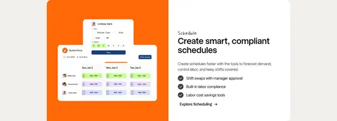
| 5 | feature-split | Two-column split with vivid schedule interface imagery beside concise copy. | feature explanation, explore link | orange illustration panel, schedule UI capture |
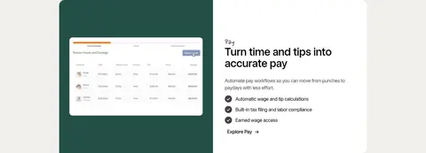
| 6 | feature-split | Product interface visual paired with a white copy panel. | feature explanation, benefit checklist | deep teal mockup panel, compact text link |
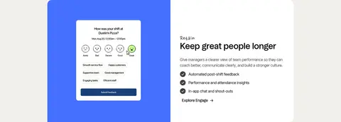
| 7 | feature-split | Blue-backed feedback interface paired with explanatory copy. | feature explanation, engagement benefits | blue product panel, white information card |
| 8 | comparison | Centered section heading above side-by-side old-way and connected-system panels. | before-and-after comparison, conversion CTA | light and black panels, checklist contrast, embedded product imagery |
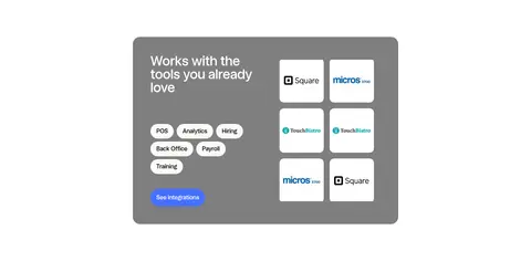
| 9 | integrations | Compact rounded integration panel with text and categories on the left and logo tiles on the right. | integration discovery, category selection | gray card, white logo tiles, blue link button |
| 10 | testimonials | Full-width black proof band with centered headline, metrics, and a row of testimonial thumbnails. | social proof, customer stories | orange metric highlights, photo cards, lime ticker |
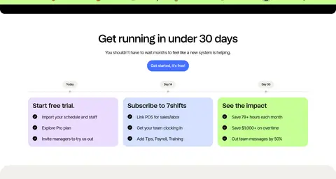
| 11 | timeline | Centered title and CTA above a horizontal three-step timeline with pastel cards. | onboarding timeline, progress milestones | three pastel cards, checklist rows |
| 12 | faq | Warm linen band with a left-aligned section title and stacked question rows. | expandable questions | accordion rows, plus icons, spacious background |
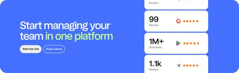
| 13 | cta | Two-column blue conversion banner with headline and actions on the left, review proof on the right. | free trial CTA, book a demo | blue rounded banner, stacked rating tiles |
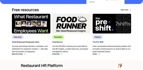
| 14 | content-feed | Three-column content-card grid with a section heading and view-more link. | resource discovery, read or listen links | editorial thumbnails, content labels, short descriptions |
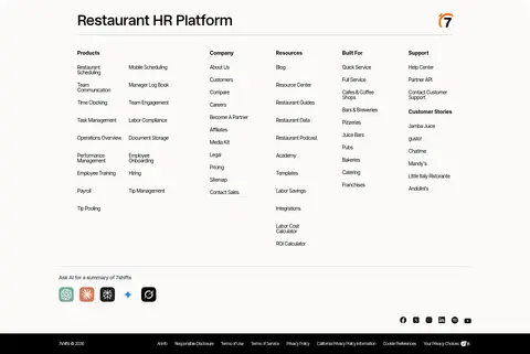
| 15 | footer | Multi-column link directory with brand mark, social tools, and a narrow black legal bar. | site navigation, social links | dense link columns, light footer surface, dark bottom strip |
## Source CSS custom properties (selected)
```css
--osano-clear-dialog-background: rgba(255,255,255,0);
--osano-button-border-color: #fff;
--osano-button-background-color: