North star · Keep the interface flat and spacious, using condensed uppercase headlines and carefully chosen project imagery to make the work—not decoration—the focus.
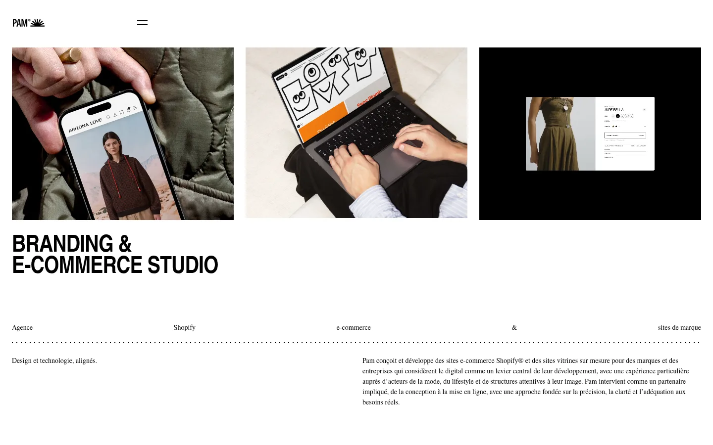
The page uses Gallery White (#ffffff) as its dominant canvas, leaving the first screen bright and uncluttered so project imagery and oversized headlines command attention. Ink (#000000) supplies the headline, navigation, and link contrast. Soft Butter (#fff3b8) appears as a full-width clients band and as light text against the footer; Dark Roast (#1b1512) anchors the closing section. Typography contrasts compact, uppercase TeX Gyre Heros Cn headings with the more literary TeX Gyre Termes used for copy and navigation. The hero moves from a three-image row into a large two-line studio statement and a dotted divider, then into concise explanatory copy. Selected project imagery is arranged in broad tiles, with little decorative framing. Spacious section breaks give way to a dense client list, then a dark footer with pale lettering and contact details. The overall effect is editorial and portfolio-led, not a conventional boxed agency template.
Body copy, project details, and understated navigation.
Aa 设计
TeX Gyre Heros Cn
网络字体 · 字重 700 / 800 / 400 · 占比 18%
免费替代:Roboto Condensed
Large headings, section titles, captions, and prominent actions.
角色
示例
字号
字重
行高
字距
一级标题
Large uppercase studio identity headline.
Pam
48px
700
0.9
-0.02em
二级标题
Uppercase section-level headings.
Pam
32px
700
0.9
-0.02em
三级标题
Compact uppercase tertiary headings.
The quick brown fox 敏捷的狐狸
20px
800
1.1
-0.02em
正文
Editorial service description and supporting copy.
The quick brown fox 敏捷的狐狸
14px
500
1.5
0
辅助文字
Small uppercase labels and project metadata.
The quick brown fox 敏捷的狐狸
11px
700
0.9
-0.02em
按钮
Strong uppercase contact action.
The quick brown fox 敏捷的狐狸
20px
800
1.1
-0.02em
导航
Quiet serif navigation and utility links.
The quick brown fox 敏捷的狐狸
14px
400
2
0
间距与布局
基准单位 4px · 密度:宽松
96px版块间距
12px元素间距
—卡片内边距
1392px内容最大宽度
4px
8px
12px
14px
20px
24px
96px
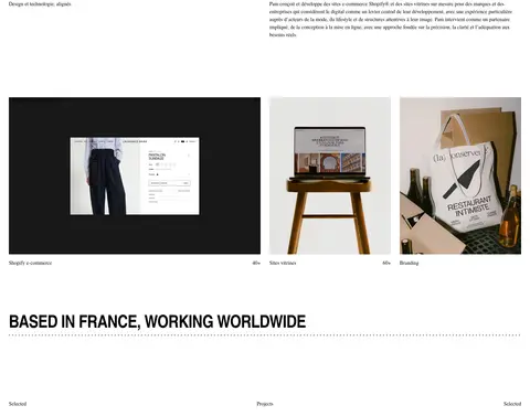
A spacious, wide desktop composition uses a measured page max width of 1392px and a four-pixel-based spacing scale. The top starts with a compact header and a three-column media row, followed by a large left-aligned headline. Short labels spread across the width above a dotted divider; supporting copy sits in two columns. Portfolio tiles and full-width selected-project imagery create a change of pace before the full-width clients and footer bands. Section gaps are generous, while the client directory itself is dense.
圆角与层次
没有测到阴影:页面是扁平的,层次靠底色和描边区分。
The interface is predominantly flat: measured data reports no shadows or gradients, and the components have no rounded treatment. Use whitespace, full-width color bands, image blocks, and fine dotted separators to establish hierarchy. Keep image previews in clean rectangular frames; avoid card-like elevation or unnecessary borders.
组件
下面的预览按实测的按钮、输入框、徽标、卡片样式重建(字体用替代字体)。
Compact header
Small black Pam wordmark at the left and a simple two-line menu mark on the white canvas.
Hero media row
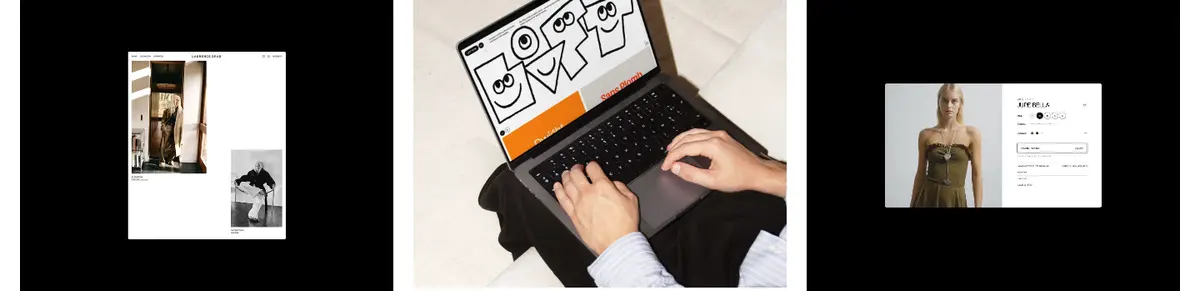
Three adjacent rectangular image or video previews introduce client commerce work before the studio headline.
Studio headline
Large, heavy, uppercase condensed display type, left aligned and broken into a compact two-line statement.
Dotted divider
Fine black dotted horizontal rule separating a row of short serif labels from the explanatory copy.
Selected projects
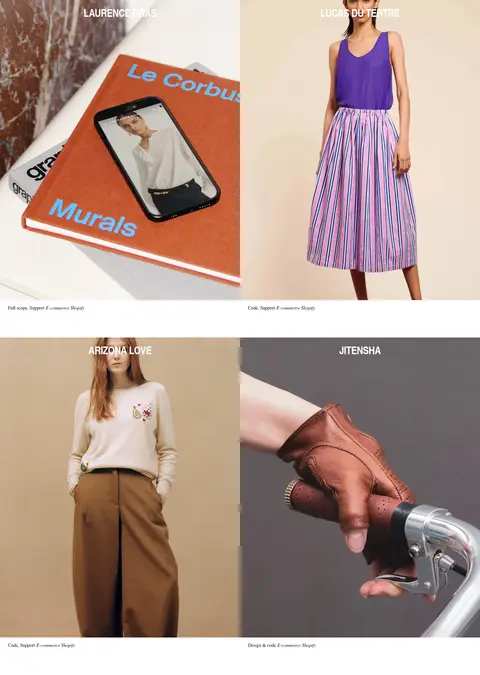
Large image-led portfolio tiles with restrained serif labels and compact project metadata.
Client directory
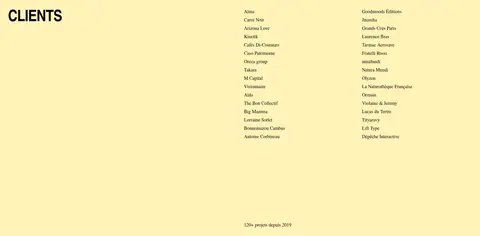
Full-width Soft Butter (#fff3b8) band with an uppercase heading and dense, multi-column client names and links.
Contact footer
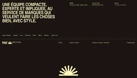
Dark Roast (#1b1512) closing band with pale text, a prominent condensed statement, contact details, utility links, and brand mark.
Imagery · The page relies on real brand and commerce photography, interface previews, and short video in the opening media row. Images are presented as broad rectangular tiles with minimal surrounding chrome; selected projects use large edge-to-edge visual panels. Apparel, product, and website imagery bring varied color and texture, while the page’s own interface stays neutral. Treat the imagery as portfolio content, not as a source for additional interface colors.
Use Gallery White (#ffffff) as the primary canvas.
Set display statements in bold, condensed uppercase type.
Let the project photography carry most visual variety.
Use Soft Butter (#fff3b8) for the client band and pale footer accents.
Reserve Dark Roast (#1b1512) for a strong closing footer surface.
Separate editorial rows with fine dotted rules and open space.
✕ 不该做
Do not introduce unmeasured interface colors.
Do not add gradients, shadows, or rounded card styling.
Do not crowd the hero headline with extra interface elements.
Do not turn project imagery into decorative thumbnails with heavy frames.
Do not use display typography for long body paragraphs.
Do not make the client list as visually dominant as the portfolio.
给 AI 的提示词
想快速出一个同风格的新页面,把这段话连同 DESIGN.md 一起发给 AI。
Build a new page in Pam’s editorial agency style. Use Gallery White (#ffffff) for the main canvas and Ink (#000000) for headline, navigation, and links. Set display headings in a bold condensed sans, uppercase and tightly tracked; use a literary serif for body copy, project notes, and quiet navigation. Compose broad image-led project panels with clean rectangular edges and generous whitespace, using the photography—not decorative UI—as the source of visual variety. Add fine dotted dividers where editorial rows need structure. Use Soft Butter (#fff3b8) as a purposeful full-width highlight band and Dark Roast (#1b1512) for a grounded footer with pale text and clear contact details. Keep the layout flat: no shadows, gradients, rounded cards, or invented palette colors. Balance open, spacious sections with a compact, legible directory or metadata area.