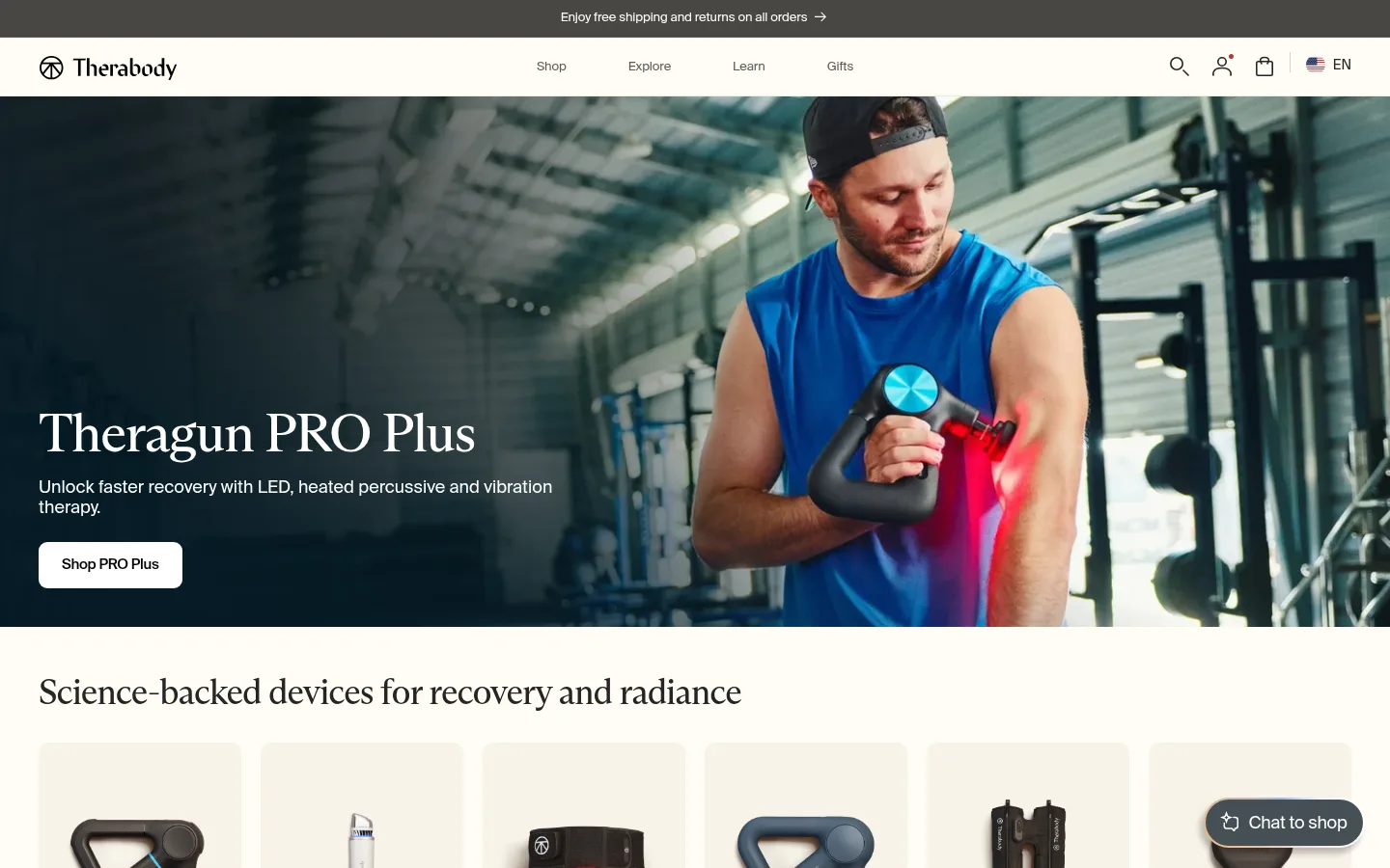
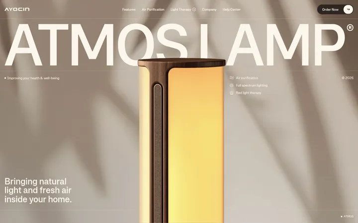
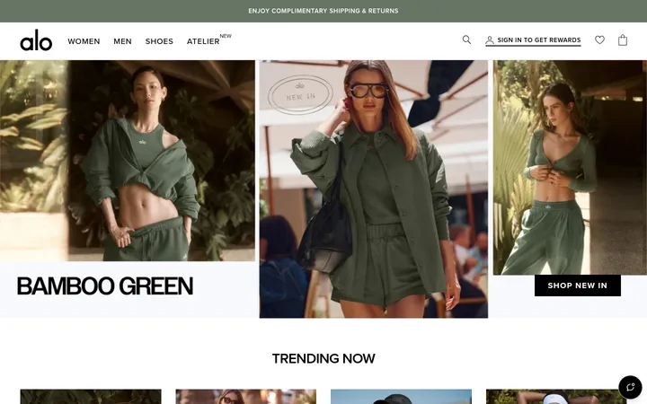
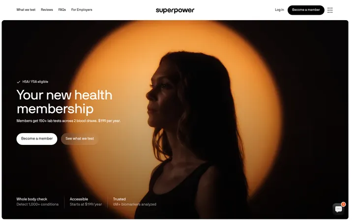
Therabody 首页以暖象牙色为底,搭配编辑感衬线标题、产品网格和沉浸式生活方式摄影。页面通过商品卡片、品牌故事、研究内容与深色行动按钮,在购物转化和健康科普之间保持平衡。
North star · Use a warm, editorial storefront where calm ivory space and precise product imagery make wellness technology feel approachable.
The visual system is built on a warm ivory canvas (#fffcf5), with pale oat cards (#f7f3e9) giving product photography a soft, consistent frame. Dark charcoal text (#252525) and muted gray copy keep the interface legible without a harsh black-and-white contrast; fine gray borders are reserved for structural separations. Serif display typography gives section headings a considered editorial character, while Suisse Int'l carries navigation, descriptions, labels, and buttons in compact, clean sans-serif forms. Layout alternates full-bleed campaign imagery with aligned product grids, split editorial panels, and compact content rows. Generous breathing room separates sections, while product areas remain information-dense enough for browsing. Photography leads: devices appear as clean cutouts against warm cards, while lifestyle imagery uses darker overlays where text sits on top. Accent colors are subdued and limited, rather than defining the overall page.
配色 点色块复制色值。用途说明来自对页面的实测位置(背景、文字、描边、按钮)与截图判读。
品牌色
Gallery Ivory
#fffcf5
Main page canvas, header, and open section backgrounds; the defining warm off-white.
Soft Charcoal
#252525
Primary headings, body text, footer copy, links, and product details.
强调色
Peach Glow
#f1c5ab
One stop in the measured multicolor button gradient; not a dominant page color.
Apricot Light
#ebb784
One stop in the measured multicolor button gradient; use sparingly.
Periwinkle Tint
#9cb9ee
One stop in the measured multicolor button gradient; not a section background.
Slate Gradient
#454f54
Dark base tone measured in the conic button gradient, not the core canvas.
Blush Tint
#f7d2d3
Pale gradient stop measured in button styling; keep to small accents.
表层色
Oat Card
#f7f3e9
Product cards, navigation surfaces, and soft blocks behind device cutouts.
Linen Band
#f0e9db
Warm contrast band behind the latest-news editorial section and footer details.
Warm Graphite
#7c7b78
Dark neutral card surface measured in a small number of cards.
Sandstone
#e7d5bf
Warm card surface used in limited product or promotional contexts.
中性色
Quiet Gray
#666666
Frequent muted copy, navigation text, headings, and secondary links.
Stone Copy
#5a5956
Secondary descriptions and footer or navigation text.
Muted Sand
#d3c3af
Supporting warm neutral measured in minor decorative or card details.
功能色
Mist Border
#d3d1cb
Hairline borders separating navigation, footer, and other structural areas.
Pebble Line
#cdc9c1
Subtle input and footer control borders.
文字 背景 对比度 WCAG #252525 Soft Charcoal#fffcf5 Gallery Ivory14.96:1 AAA #252525 Soft Charcoal#f7f3e9 Oat Card13.83:1 AAA #252525 Soft Charcoal#f0e9db Linen Band12.69:1 AAA #252525 Soft Charcoal#7c7b78 Warm Graphite3.62:1 AA-large #666666 Quiet Gray#fffcf5 Gallery Ivory5.6:1 AA #666666 Quiet Gray#f7f3e9 Oat Card5.18:1 AA
字体 字号阶梯:Perfect Fourth(比例约 1.339,正文 15px)。示例用免费替代字体渲染,数值为实测。
Aa 设计
Suisse Int'l 网络字体 · 字重 400 / 500 / 440 · 占比 89%
免费替代:Inter
Navigation, body copy, buttons, links, captions, labels, and product information.
Aa 设计
ABC Arizona Text Variable 网络字体 · 字重 440 / 400 · 占比 11%
免费替代:Lora
Editorial display headings and prominent campaign or section titles.
角色 示例 字号 字重 行高 字距 一级标题 Primary campaign headline, such as the homepage hero title.
Therabody
36px 440 1.1 -0.03em 二级标题 Major section headings for discovery, recovery, and editorial areas.
Therabody
32px 440 1.1 -0.02em 三级标题 Product and promotional card titles.
The quick brown fox 敏捷的狐狸
24px 440 1.2 -0.02em 正文 Descriptions, explanatory copy, and product details.
The quick brown fox 敏捷的狐狸
15px 400 1.3 -0.009em 辅助文字 Fine print, footnotes, and compact metadata.
The quick brown fox 敏捷的狐狸
11px 400 1.2 -0.01em 按钮 Short CTA labels across commerce and story panels.
The quick brown fox 敏捷的狐狸
13px 400 1.3 -0.011em 导航 Primary navigation links and menu labels.
The quick brown fox 敏捷的狐狸
15px 400 1.3 -0.02em 链接 Product links and secondary calls to action.
The quick brown fox 敏捷的狐狸
13px 500 1.3 -0.023em 眉题 Uppercase pre-headings and compact section labels.
The quick brown fox 敏捷的狐狸
10px 400 1.2 0.04em
间距与布局 基准单位 4px · 密度:适中
40px 版块间距
20px 元素间距
— 卡片内边距
1360px 内容最大宽度
1px
2px
4px
8px
10px
11px
12px
13px
15px
16px
18px
20px
24px
32px
40px
The page uses a centered, wide desktop storefront with content capped by the measured 1360px maximum width. A single-column full-bleed hero gives way to six-column product browsing, two-column feature stories, and smaller multi-column content grids. Most sections align headings to the left and use warm open space to distinguish one block from the next. The measured spacing scale is comfortable and modular, with a 40px section gap and 20px element gap. Cards repeat consistently, but layout density shifts from spacious storytelling to compact product and research rows.
圆角与层次 The system is mostly flat, relying on warm surface changes and thin gray borders rather than stacked shadows. Rounded product and editorial cards provide gentle containment, with measured 12px card and media radii and 8px button and input radii. Keep layering limited to image overlays and occasional floating chat UI; reserve the measured subtle shadow for small controls.
组件 下面的预览按实测的按钮、输入框、徽标、卡片样式重建(字体用替代字体)。
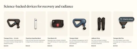
Product cards Pale #f7f3e9 surfaces hold clean device cutouts, compact product names, descriptions, badges, and prices in a repeatable grid.
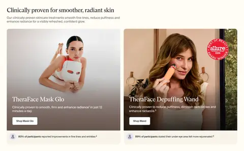
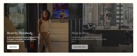
Editorial feature panels Large paired image cards place serif titles and concise copy over lifestyle photography, using a dark image treatment for readable overlays.
Primary CTA buttons Compact rounded buttons use clear short labels; dark fills with white text provide strong contrast, while some hero actions use a light fill.
Category navigation A short row of wellness category links combines small product imagery, category labels, and directional arrows.
Newsletter form A restrained email signup pairs an outlined input with a dark submit button and supporting consent copy.
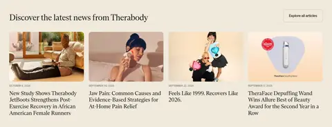
News cards A warm linen band contains image-led article cards with compact dates and editorial headlines.
Main navigation A clean light header uses a left-aligned logo, centered category links, and compact utility icons at the right.
Imagery · Photography is the primary visual asset: close product cutouts, people using devices, wellness settings, and ambassador stories. Product images sit on pale oat backgrounds, while campaign imagery fills wide panels with text anchored over darkened areas for contrast. Images are rectangular and often arranged in paired or multi-card rows. The page also includes promotional video panels and brand or research logos; avoid decorative illustration as a substitute for real product imagery.
页面版块 共 16 个版块,按页面从上到下排列,每个都标了类型、布局和交互套路。
该做与不该做 ✓ 该做 Keep the page canvas warm ivory rather than stark white. Use serif typography for prominent editorial headings. Use a clean sans-serif for navigation, controls, and product details. Give product photography soft oat-colored card backgrounds. Alternate product grids with wider editorial image panels. Use charcoal buttons and restrained, legible labels. Separate sections with whitespace and subtle warm surface changes. ✕ 不该做 Don't make bright accents the dominant page palette. Don't add heavy shadows to product cards. Don't use dense, continuous blocks of body copy. Don't force every section into the same grid or image ratio. Don't use decorative illustrations in place of device photography. Don't set overlay text on bright imagery without a contrast treatment. 给 AI 的提示词 想快速出一个同风格的新页面,把这段话连同 DESIGN.md 一起发给 AI。
复制 Build a new wellness-commerce page in Therabody’s visual language. Use Gallery Ivory (#fffcf5) as the main canvas, Oat Card (#f7f3e9) for product surfaces, Soft Charcoal (#252525) for primary text, and Quiet Gray (#666666) for secondary copy. Use a refined serif such as Lora for large editorial headings and Inter for navigation, labels, and product details. Structure the page as a wide, centered storefront with a full-bleed lifestyle hero, modular product grids, split image-and-copy stories, and a warm Linen Band (#f0e9db) for editorial content. Let real device and wellness photography lead; keep cards flat, corners gently rounded, and borders subtle. Use dark CTA buttons with concise labels, generous section breathing room, and compact supporting metadata. Avoid loud gradients, heavy shadows, and overly dense copy.
DESIGN.md Tailwind v4 CSS 变量 Design Tokens
---
title: "Therabody design system"
variant: extended
source: https://www.therabody.com/
captured_at: 2026-10-12
theme: light
industry: health
generator: Design DNA (https://four.wiralomi.com/style/therabody-com)
ai_generated: true
ai_label: "本文件由 AI 辅助生成:数值取自公开网页的实测样式,命名、用途说明与建议为模型解读。商标归原所有者。 / AI-assisted content"
---
# Therabody · Design System
> Science-led wellness in a calm, tactile storefront
**Theme:** light · **Industry:** health · **Source:** https://www.therabody.com/ · **Captured:** 2026-10-12 (1440×900 desktop)
_AI-assisted content: values are measured from the public page at capture time; names, roles and guidance are model-written interpretations. Trademarks belong to their owners._
Therabody’s homepage pairs a warm ivory storefront with editorial serif headlines, product-focused grids, and immersive lifestyle photography. The page balances commerce and wellness education through repeated product cards, promotional stories, research content, and a restrained dark CTA treatment.
## North star
Use a warm, editorial storefront where calm ivory space and precise product imagery make wellness technology feel approachable.
## Overview
The visual system is built on a warm ivory canvas (## Colors
| Name | Hex | Token | Group | Role |
|---|---|---|---|---|
| Gallery Ivory | ` | `--color-gallery-ivory` | brand | Main page canvas, header, and open section backgrounds; the defining warm off-white. |
| Oat Card | ` | `--color-oat-card` | surface | Product cards, navigation surfaces, and soft blocks behind device cutouts. |
| Quiet Gray | ` | `--color-quiet-gray` | neutral | Frequent muted copy, navigation text, headings, and secondary links. |
| Soft Charcoal | ` | `--color-soft-charcoal` | brand | Primary headings, body text, footer copy, links, and product details. |
| Mist Border | ` | `--color-mist-border` | semantic | Hairline borders separating navigation, footer, and other structural areas. |
| Linen Band | ` | `--color-linen-band` | surface | Warm contrast band behind the latest-news editorial section and footer details. |
| Stone Copy | ` | `--color-stone-copy` | neutral | Secondary descriptions and footer or navigation text. |
| Peach Glow | ` | `--color-peach-glow` | accent | One stop in the measured multicolor button gradient; not a dominant page color. |
| Apricot Light | ` | `--color-apricot-light` | accent | One stop in the measured multicolor button gradient; use sparingly. |
| Periwinkle Tint | ` | `--color-periwinkle-tint` | accent | One stop in the measured multicolor button gradient; not a section background. |
| Pebble Line | ` | `--color-pebble-line` | semantic | Subtle input and footer control borders. |
| Slate Gradient | ` | `--color-slate-gradient` | accent | Dark base tone measured in the conic button gradient, not the core canvas. |
| Blush Tint | ` | `--color-blush-tint` | accent | Pale gradient stop measured in button styling; keep to small accents. |
| Warm Graphite | ` | `--color-warm-graphite` | surface | Dark neutral card surface measured in a small number of cards. |
| Sandstone | ` | `--color-sandstone` | surface | Warm card surface used in limited product or promotional contexts. |
| Muted Sand | ` | `--color-muted-sand` | neutral | Supporting warm neutral measured in minor decorative or card details. |
### Semantic aliases
`--color-canvas` → ` (Gallery Ivory) · `--color-surface` → ` (Oat Card) · `--color-surface-2` → ` (Linen Band) · `--color-surface-3` → ` (Warm Graphite) · `--color-surface-4` → ` (Sandstone) · `--color-text` → ` (Soft Charcoal) · `--color-text-muted` → ` (Quiet Gray) · `--color-text-subtle` → ` (Stone Copy) · `--color-border` → ` (Mist Border) · `--color-accent` → ` (Peach Glow) · `--color-accent-2` → ` (Apricot Light) · `--color-accent-3` → ` (Periwinkle Tint)
### Contrast (WCAG 2.x)
| Text | Background | Ratio | Level |
|---|---|---|---|
| ` | ` | 14.96:1 | AAA |
| ` | ` | 13.83:1 | AAA |
| ` | ` | 12.69:1 | AAA |
| ` | ` | 3.62:1 | AA-large |
| ` | ` | 5.6:1 | AA |
| ` | ` | 5.18:1 | AA |
| ` | ` | 4.75:1 | AA |
| ` | ` | 1.36:1 | fail |
| ` | ` | 6.84:1 | AA |
| ` | ` | 6.32:1 | AA |
### Gradients
- `linear-gradient(rgb(69, 79, 84), rgb(69, 79, 84)), conic-gradient(from 265.008deg, rgb(247, 210, 211) 0%, rgb(241, 197, 171) 12.5%, rgb(235, 183, 132) 25%, rgb(195, 184, 185) 37.5%, rgb(156, 185, 238) 50%, rgb(189, 208, `
## Typography
| Family | Token | Source | Weights | Role | Free substitute |
|---|---|---|---|---|---|
| Suisse Int'l | `--font-body` | webfont | 400, 500, 440 | Navigation, body copy, buttons, links, captions, labels, and product information. | Inter |
| ABC Arizona Text Variable | `--font-display` | webfont | 440, 400 | Editorial display headings and prominent campaign or section titles. | Lora |
- **Suisse Int'l:** Compact sans-serif; mostly regular weights, with medium links. Eyebrows use uppercase and positive tracking.
- **ABC Arizona Text Variable:** Refined serif with regular variable weight; large headings use tight negative tracking and close line spacing.
### Type scale — Perfect Fourth (ratio ≈ 1.339, base 15px)
| Role | Size | Weight | Line height | Letter spacing | Case | Family | Used for |
|---|---|---|---|---|---|---|---|
| h1 | 36px | 440 | 1.1 | -0.03em | — | ABC Arizona Text Variable | Primary campaign headline, such as the homepage hero title. |
| h2 | 32px | 440 | 1.1 | -0.02em | — | ABC Arizona Text Variable | Major section headings for discovery, recovery, and editorial areas. |
| h3 | 24px | 440 | 1.2 | -0.02em | — | ABC Arizona Text Variable | Product and promotional card titles. |
| body | 15px | 400 | 1.3 | -0.009em | — | Suisse Int'l | Descriptions, explanatory copy, and product details. |
| caption | 11px | 400 | 1.2 | -0.01em | — | Suisse Int'l | Fine print, footnotes, and compact metadata. |
| button | 13px | 400 | 1.3 | -0.011em | — | Suisse Int'l | Short CTA labels across commerce and story panels. |
| nav | 15px | 400 | 1.3 | -0.02em | — | Suisse Int'l | Primary navigation links and menu labels. |
| link | 13px | 500 | 1.3 | -0.023em | — | Suisse Int'l | Product links and secondary calls to action. |
| eyebrow | 10px | 400 | 1.2 | 0.04em | uppercase | Suisse Int'l | Uppercase pre-headings and compact section labels. |
OpenType features in use: `"liga" 0` .
## Spacing & layout
- Base unit **4px**, density **comfortable**.
- Scale (most used values): 1, 2, 4, 8, 10, 11, 12, 13, 15, 16, 18, 20, 24, 32, 40 px.
- Section rhythm 40px · element gap 20px · card padding — · max content width 1360px.
The page uses a centered, wide desktop storefront with content capped by the measured 1360px maximum width. A single-column full-bleed hero gives way to six-column product browsing, two-column feature stories, and smaller multi-column content grids. Most sections align headings to the left and use warm open space to distinguish one block from the next. The measured spacing scale is comfortable and modular, with a 40px section gap and 20px element gap. Cards repeat consistently, but layout density shifts from spacious storytelling to compact product and research rows.
## Shape & elevation
- Radius: button `8px` · input `8px` · card `12px` · media `12px` · badge `4px` · nav `4px` · link `9px` · xs `4px` · sm `6px` · md `8px` · lg `9px` · xl `12px` · pill `9999px`
- Shadow `sm` (button): `rgba(0, 0, 0, 0.25) -4px 6px 6.5px 0px`
- Motion: standard transition `0.1s ease` on interactive elements.
The system is mostly flat, relying on warm surface changes and thin gray borders rather than stacked shadows. Rounded product and editorial cards provide gentle containment, with measured 12px card and media radii and 8px button and input radii. Keep layering limited to image overlays and occasional floating chat UI; reserve the measured subtle shadow for small controls.
## Imagery
Photography is the primary visual asset: close product cutouts, people using devices, wellness settings, and ambassador stories. Product images sit on pale oat backgrounds, while campaign imagery fills wide panels with text anchored over darkened areas for contrast. Images are rectangular and often arranged in paired or multi-card rows. The page also includes promotional video panels and brand or research logos; avoid decorative illustration as a substitute for real product imagery.
## Components
### Product cards
Pale ### Editorial feature panels
Large paired image cards place serif titles and concise copy over lifestyle photography, using a dark image treatment for readable overlays.
### Primary CTA buttons
Compact rounded buttons use clear short labels; dark fills with white text provide strong contrast, while some hero actions use a light fill.
### Category navigation
A short row of wellness category links combines small product imagery, category labels, and directional arrows.
### Newsletter form
A restrained email signup pairs an outlined input with a dark submit button and supporting consent copy.
### News cards
A warm linen band contains image-led article cards with compact dates and editorial headlines.
### Main navigation
A clean light header uses a left-aligned logo, centered category links, and compact utility icons at the right.
### Measured component styles
- **Primary button** (“Skip to content”): background ## Do
- Keep the page canvas warm ivory rather than stark white.
- Use serif typography for prominent editorial headings.
- Use a clean sans-serif for navigation, controls, and product details.
- Give product photography soft oat-colored card backgrounds.
- Alternate product grids with wider editorial image panels.
- Use charcoal buttons and restrained, legible labels.
- Separate sections with whitespace and subtle warm surface changes.
## Don't
- Don't make bright accents the dominant page palette.
- Don't add heavy shadows to product cards.
- Don't use dense, continuous blocks of body copy.
- Don't force every section into the same grid or image ratio.
- Don't use decorative illustrations in place of device photography.
- Don't set overlay text on bright imagery without a contrast treatment.
## Agent prompt
Build a new wellness-commerce page in Therabody’s visual language. Use Gallery Ivory (## Page sections (top to bottom)
| # | Type | Layout | UX patterns | UI patterns |
|---|---|---|---|---|
| 1 | hero | Full-bleed campaign image with left-aligned title, copy, and CTA. | product launch message, primary shop CTA | dark image overlay, serif headline, light CTA |
| 2 | product-grid | Left-aligned heading above a six-column product row. | browse products, compare prices | oat product cards, device cutouts, generation badges |
| 3 | feature-split | Introductory heading and copy above two side-by-side image features. | explore skincare, view product benefits | paired lifestyle cards, image overlay copy, proof notes |
| 4 | category-nav | Section heading followed by three horizontal category links. | shop by need | small product thumbnails, arrow links, soft backgrounds |
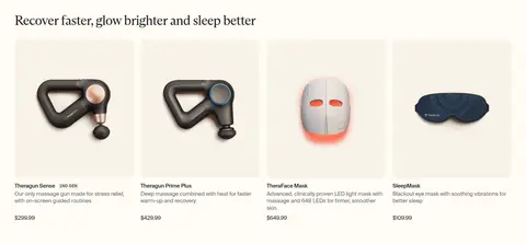
| 5 | product-grid | Heading above four product cards in a horizontal row. | browse bestsellers, compare products | product cutouts, short descriptions, price labels |
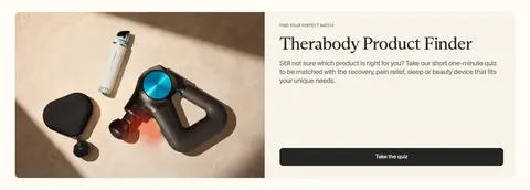
| 6 | feature-split | Two-column panel with product imagery on one side and quiz copy on the other. | guided product discovery, take the quiz | split image panel, eyebrow label, full-width CTA |
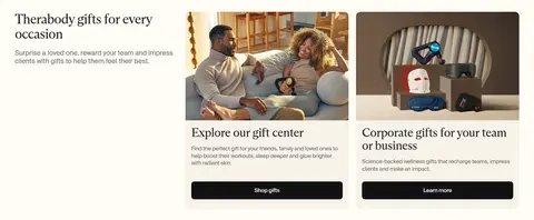
| 7 | feature-split | Introductory copy beside two stacked gift-story cards. | shop gifts, business gifting | editorial imagery, dark CTAs, serif card titles |
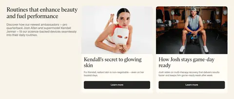
| 8 | feature-split | Introductory story column beside two image-led ambassador cards. | read ambassador stories, learn more | lifestyle photography, editorial card titles, dark buttons |
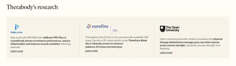
| 9 | logo-cloud | Heading above three equal research summary columns. | review evidence, learn more | institution logos, thin dividers, compact text |
| 10 | other | Three-column horizontal strip of purchase and payment information. | check payment options, find pickup details | brand marks, compact explanatory copy, separated columns |
| 11 | video | Two adjacent wide video or image panels with overlaid copy. | learn about spa, find a store | dark image overlays, paired panels, light CTAs |
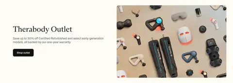
| 12 | feature-split | Left-side offer copy and CTA paired with a large product arrangement image. | shop outlet, view refurbished offers | split layout, device still life, dark CTA |
| 13 | content-feed | Warm band with heading and four article cards in a row. | browse articles, read research news | article thumbnails, date labels, serif headlines |
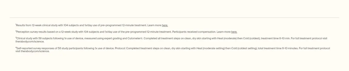
| 14 | other | Single-column fine-print area separated by a thin rule. | review study details | small text, hairline divider, open background |
| 15 | newsletter | Two-column signup area with copy and form beside app imagery. | enter email, sign up | outlined input, dark submit button, consent text |
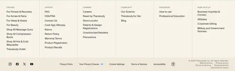
| 16 | footer | Multi-column link directory with a compact utility and legal row. | navigate support, browse company links | six link columns, thin separators, social icons |
## Source CSS custom properties (selected)
```css
--color-background: 255,252,245;
--gradient-background: