North star · Keep the canvas quiet and the typography clear; use pastel panels and product imagery to add warmth without crowding the content.
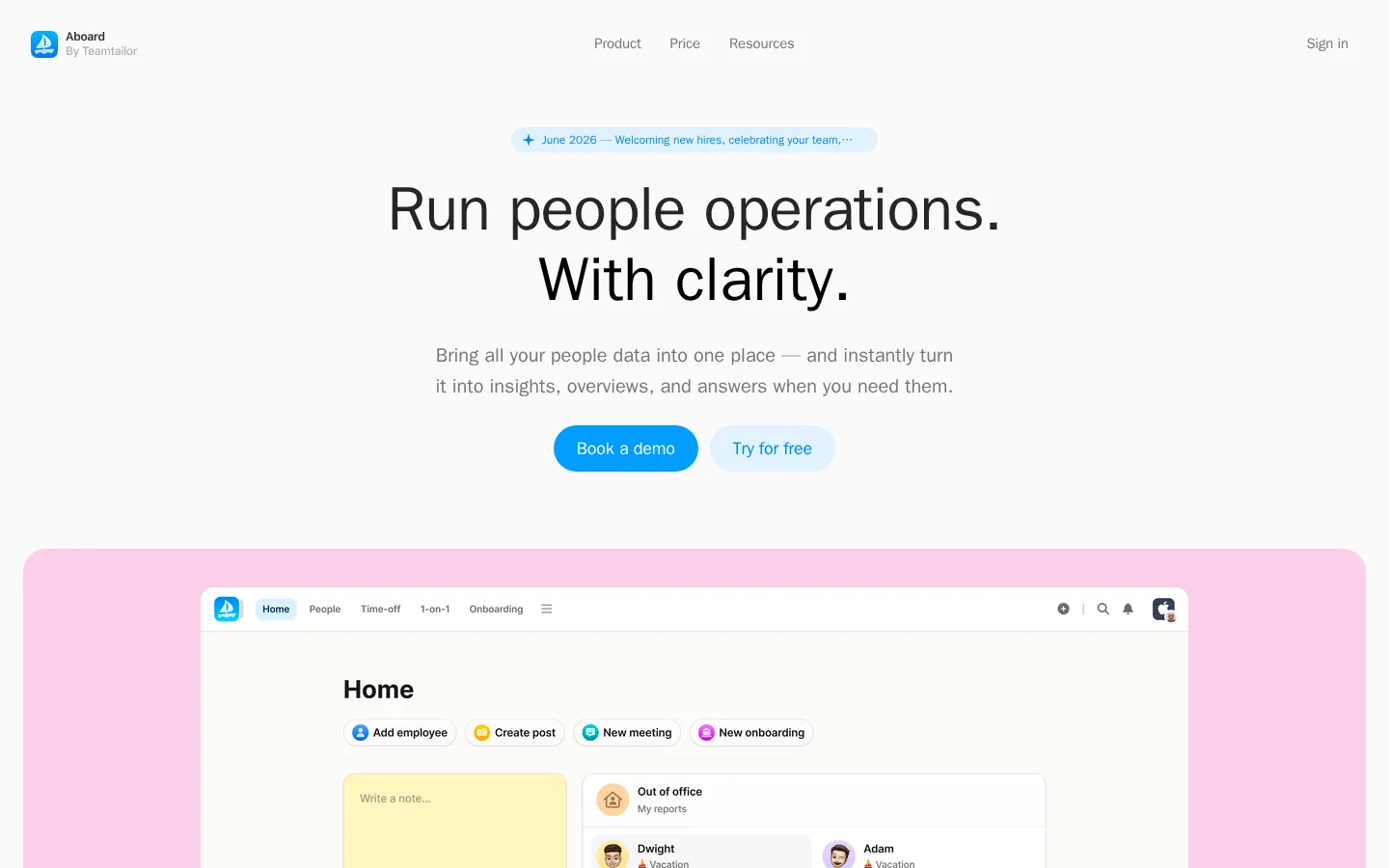
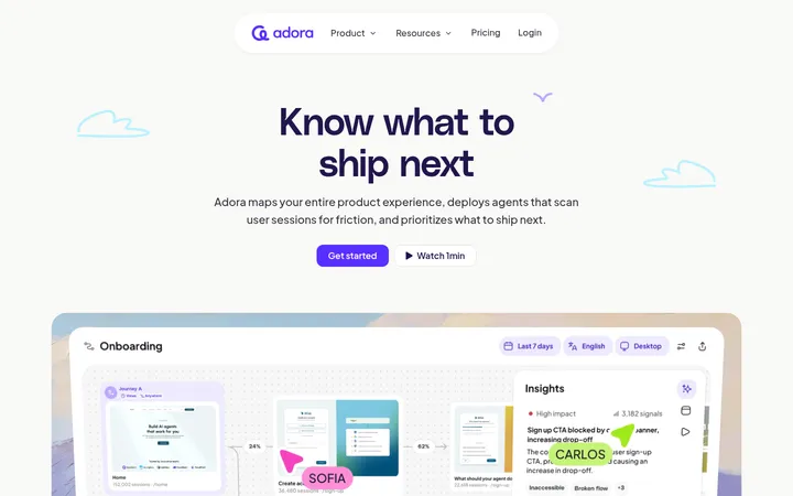
Aboard’s page is built around a quiet off-white canvas (#fafafa), with dark charcoal headlines (#262626) and muted gray supporting copy (#757577). Color arrives in soft, broad section panels—pink, lavender, aqua, and sky blue—rather than heavy interface chrome; a small yellow panel and blue or orange details add a cheerful accent. The headline-led hero is centered, followed by generous product screenshots that make the software itself the primary visual. System sans-serif typography stays clean and contemporary: large, tightly tracked headings contrast with readable, relaxed body copy. The long page alternates centered statements with left-aligned feature explanations and product visuals, using a narrow content column and ample breathing room. Rounded panels, pill-shaped actions, and softly elevated cards temper the functional subject matter with a friendly, approachable feel. Treat brighter colors inside screenshots as product imagery, not as a replacement for the site’s restrained brand palette.
All page text, from navigation and captions through feature copy and large headings.
角色
示例
字号
字重
行高
字距
特大标题
Large display statements and headline-led messaging.
Aboard
64px
600
1.1
-0.009em
一级标题
Primary hero heading and major page headline.
Aboard
56px
600
1
-0.005em
二级标题
Feature-section headings and prominent calls to action.
Aboard
44px
600
1.1
-0.006em
三级标题
Subsection titles and compact feature headings.
The quick brown fox 敏捷的狐狸
24px
600
1.4
0
正文
Feature descriptions, hero supporting copy, and explanatory text.
The quick brown fox 敏捷的狐狸
20px
500
1.6
0
辅助文字
Small labels and fine-print supporting details.
The quick brown fox 敏捷的狐狸
12px
400
1.4
0
导航
Top navigation links and menu items.
The quick brown fox 敏捷的狐狸
15px
500
2
-0.01em
链接
Inline links and secondary action labels.
The quick brown fox 敏捷的狐狸
16px
500
1.5
0
间距与布局
基准单位 4px · 密度:紧凑
40px版块间距
10px元素间距
—卡片内边距
976px内容最大宽度
4px
8px
10px
12px
16px
20px
24px
32px
40px
48px
Use a centered, narrow content frame with a measured max width of 976px, while allowing product-showcase panels to read as broader bands. The hero centers its announcement, large two-line headline, supporting copy, and paired actions; later sections alternate centered introductions with left-aligned feature copy and interface previews. Keep the page rhythm spacious despite compact feature lists. Use pastel backgrounds to mark product moments, not dense colored sectioning, and preserve generous separation between major content blocks.
圆角与层次
按钮 · 9999px
卡片 · 10px
图片 · 24px
导航 · 12px
链接 · 9999px
md · card
hairline · nav
inset · nav
lg · card
The page is mostly flat, with soft pastel panels providing the primary separation from the canvas. Product cards and overlapping interface previews use restrained, diffuse shadows rather than hard borders. Keep navigation and section boundaries subtle; layering should clarify product previews without making the layout feel heavy.
组件
下面的预览按实测的按钮、输入框、徽标、卡片样式重建(字体用替代字体)。
Centered hero
Pair a small sky-blue announcement pill with a large centered charcoal headline, muted supporting copy, and two rounded actions.
Pastel product showcase
Place a large UI screenshot inside a broad rounded pastel band; the first showcase uses Petal Pink (#fbcfe8).
Feature introduction
Combine a small colored category label, clear section heading, muted description, rounded Learn more action, and concise feature list.
Culture card grid
Mix bright product cards such as Sky Tint (#afe4ff) and Butter Yellow (#ffe77a) with a darkened lifestyle photo card.
Rounded CTA
Use pill-shaped actions with short labels; measured examples include blue-text actions on pale blue or near-white fills.
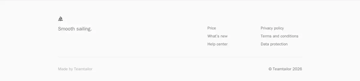
Quiet footer
Finish with a subtle divider, brief sign-off, compact link groups, and low-contrast copyright details on the neutral canvas.
Imagery · Product UI screenshots are the main visual asset, presented large inside softly colored, rounded showcase panels. Culture features combine colorful illustrated-style product cards with a lifestyle photograph of people outdoors. Keep screenshots crisp and naturally framed, and let their interface details carry their own brighter colors; avoid adding decorative imagery that competes with the product.
Use charcoal for primary headings and gray for supporting copy.
Reserve pastel colors for section panels and feature cards.
Center the hero message and keep its supporting copy concise.
Let product screenshots serve as the main visual proof.
Use rounded panels and pill-shaped actions consistently.
✕ 不该做
Do not turn the page into a dark or high-contrast theme.
Do not spread bright yellow or orange across large backgrounds.
Do not clutter the hero with extra content or competing imagery.
Do not treat screenshot colors as the global brand palette.
Do not use hard borders or pronounced shadows on every card.
Do not compress the sections into a dense dashboard-like layout.
给 AI 的提示词
想快速出一个同风格的新页面,把这段话连同 DESIGN.md 一起发给 AI。
Build a new Aboard-style SaaS page with a calm #fafafa canvas, #262626 headings, and #757577 supporting text. Use a centered hero with concise copy, a small announcement pill, and rounded actions. Introduce product sections with broad, softly rounded pastel surfaces such as Petal Pink (#fbcfe8), Lilac Haze (#e6dafb), Mint Mist (#c8edee), and Sky Tint (#afe4ff); keep Butter Yellow (#ffe77a) localized to feature cards. Use system-ui-style sans typography, large semibold tightly tracked headings, and relaxed body copy. Favor a narrow centered content frame, generous section breathing room, and clear alternation between text and large product UI previews. Keep shadows restrained and borders subtle. Bright accents such as Clear Blue (#008ae8) should be selective, not dominant.