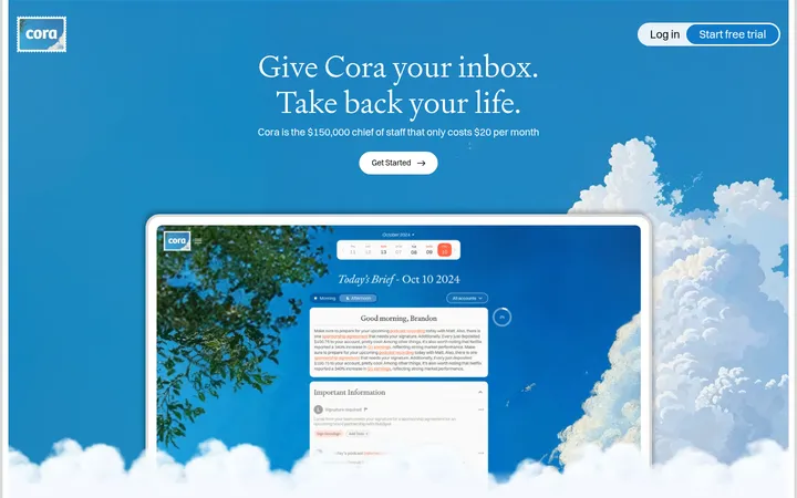
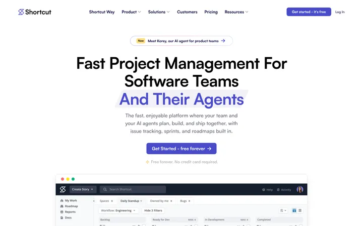
North star · Use deep navy for clear hierarchy, then let white space, cool blue accents, and rounded card grids make hiring information feel approachable.
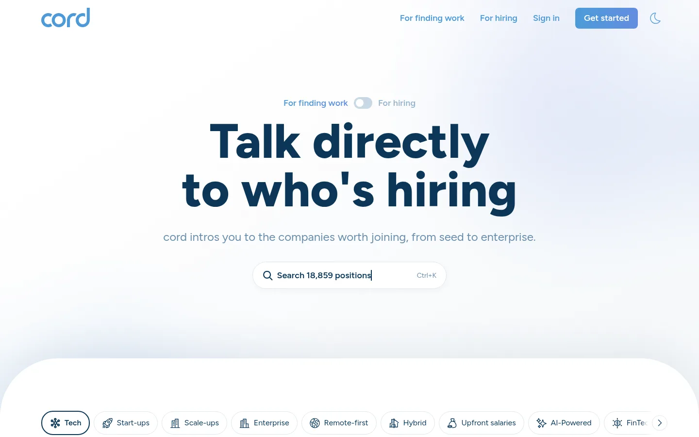
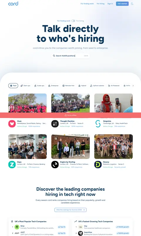
The visual identity is anchored by deep navy #0b3658 on a white canvas, with medium blue reserved for active navigation, links, and calls to action. Cool pale gradients introduce depth around the hero and selected feature areas without turning the page into a strongly coloured interface; the coral alert strip is a functional interruption rather than a core brand colour. Figtree gives the page a friendly geometric voice: oversized, heavy hero text contrasts with compact, readable body copy and small bold labels. The layout alternates open, centered headline sections with broad rounded panels and dense grids of company, feature, ranking, and testimonial cards. Photography of teams and workplaces makes the recruitment product feel tangible, while interface screenshots explain its tools. Borders and soft navy-tinted shadows define cards more than solid fills do. Consistent rounded controls and generous gaps soften the long, information-rich page.
All page typography, from oversized hero headings and navigation to card copy, controls, and footer text.
角色
示例
字号
字重
行高
字距
特大标题
Oversized, extra-bold hero headline treatment.
cord
100px
800
1
0
一级标题
Main hero heading and top-level page title.
cord
48px
700
1.1
-0.001em
二级标题
Section headings introducing company discovery and product features.
The quick brown fox 敏捷的狐狸
24px
400
1.3
-0.002em
三级标题
Card titles, testimonial names, and smaller feature headings.
The quick brown fox 敏捷的狐狸
22px
700
1.2
-0.002em
四级标题
Supporting subheads and secondary feature titles.
The quick brown fox 敏捷的狐狸
20px
400
1.3
-0.002em
正文
Descriptions, company details, and testimonial text.
The quick brown fox 敏捷的狐狸
16px
400
1.3
-0.003em
辅助文字
Compact labels, rankings, and metadata.
The quick brown fox 敏捷的狐狸
14px
700
1.3
-0.004em
按钮
Primary and secondary action labels.
The quick brown fox 敏捷的狐狸
16px
400
1.3
-0.003em
导航
Header links and category navigation labels.
The quick brown fox 敏捷的狐狸
18px
600
1.3
-0.003em
链接
Inline links and navigational card text.
The quick brown fox 敏捷的狐狸
16px
400
1.3
-0.003em
间距与布局
基准单位 4px · 密度:适中
50px版块间距
8px元素间距
29px卡片内边距
1270px内容最大宽度
2px
4px
5px
7px
8px
10px
12px
15px
16px
20px
24px
28px
32px
A centered hero sits beneath a slim top navigation, followed by a full-width rounded content panel and successive centered sections. The measured page maximum width is 1270px, with comfortable density and repeated multi-column grids for cards, rankings, features, and testimonials. Section gaps are generous; card interiors are more compact. Keep major headings centered, while product cards and text-heavy grids align content to the left.
圆角与层次
按钮 · 9999px
卡片 · 24px
图片 · 21px
导航 · 8px
链接 · 8px
lg · card, media
lg · card
md · button
xl · section
Use thin pale blue-gray borders to define cards and controls, paired with soft, low-contrast navy shadows on larger cards and search surfaces. Maintain mostly white faces and avoid heavy outlines. Layer cards over lightly tinted or gradient section backdrops, with large rounded panel edges providing the main structural separation.
组件
下面的预览按实测的按钮、输入框、徽标、卡片样式重建(字体用替代字体)。
Top navigation
A compact header with the cord wordmark, navy navigation links, blue active state, and a blue filled Get started action.
Hero search
Centered, bold two-line headline and muted supporting line above a pill-shaped search control with a subtle shadow and keyboard shortcut hint.
Category chips
Horizontally arranged outlined pill controls for job and company categories; selected Tech uses a stronger navy border and weight.
Company cards
Rounded, lightly bordered cards combining company photography, a logo, compact industry details, and small activity metadata.
Ranking panels
Side-by-side company ranking cards with compact rows, numbered positions, small logos, and pale blue growth or popularity badges.
Feature previews
Rounded product screenshots sit beside concise feature copy, presenting messaging, applications, and insights in a clean grid.
Testimonial cards
A multi-column set of white review cards with small avatars, bold names, compact copy, and supporting trust metrics.
Closing CTA
A wide, heavily rounded dark navy-to-ink panel with centered white heading, supporting copy, blue button, and small social proof.
Imagery · Use real team, workplace, and company photography in rounded rectangular previews, alongside crisp product-interface screenshots that show search, messaging, and application management. Keep image crops practical and documentary rather than decorative. Small logos and avatars add identity within cards; gradients and soft pale backdrops support imagery without competing with it.
Use #0b3658 for primary text and heading hierarchy.
Reserve #4e9ad9 for active states and high-priority actions.
Keep the main canvas white and use cool pale gradients sparingly.
Build information-heavy areas from rounded, lightly bordered cards.
Pair company imagery with compact logos and metadata.
Keep hero copy centered and card content easy to scan.
✕ 不该做
Do not use bright coral as a general brand accent.
Do not replace the white canvas with a saturated background.
Do not use heavy borders or dark card fills throughout.
Do not make every section dense; preserve open space around headings.
Do not use decorative imagery where product screenshots explain the feature.
Do not use inconsistent corner treatments across related cards and controls.
给 AI 的提示词
想快速出一个同风格的新页面,把这段话连同 DESIGN.md 一起发给 AI。
Build a recruitment SaaS page in cord’s clear, approachable style. Use Canvas White (#ffffff) as the main field and Hiring Navy (#0b3658) for headings, copy, and icons. Apply Action Blue (#4e9ad9) selectively to active navigation and primary actions; use Hairline Mist (#dde7ee) for quiet outlines and Frosted Wash (#f3f7f9) for subtle section tinting. Set all text in Figtree or a close sans-serif substitute, with strong oversized headings and compact, readable supporting details. Arrange centered introductory content above broad rounded panels and scannable card grids. Use documentary company photography and practical product screenshots, framed by soft shadows rather than heavy borders. Keep controls pill-shaped, card radii generous, section spacing open, and dense data confined to small structured cards.