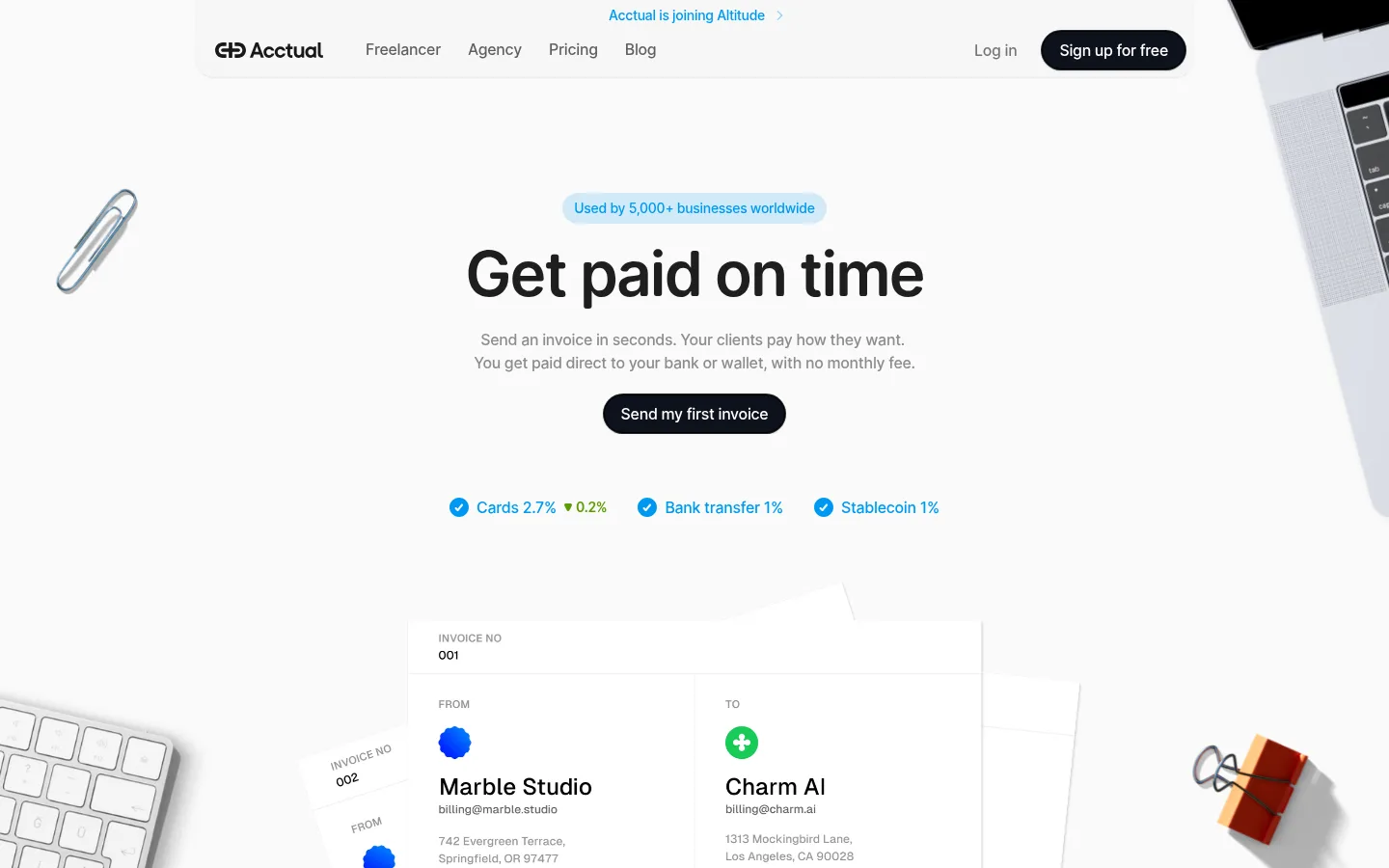
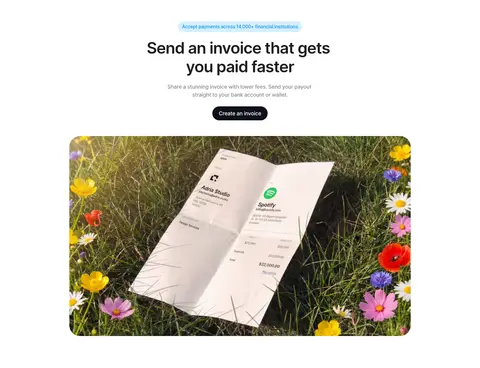
North star · Keep the interface quiet and spacious so dark type, blue payment cues, and real invoice imagery carry the story.
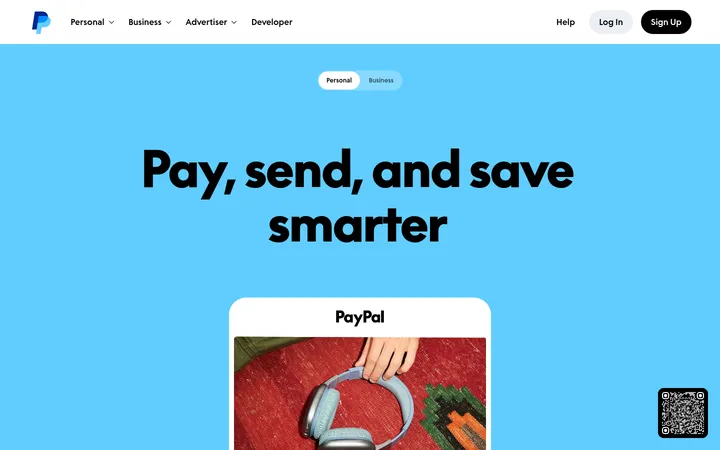
The page uses a near-white canvas as a quiet backdrop, with subtle pale surfaces separating content without turning the site into a stack of heavy cards. Dark, compact headings establish hierarchy; muted gray body copy keeps supporting explanations unobtrusive, while blue highlights payment methods, small labels, and key links. Open Runde drives a consistent, rounded typographic voice, with large centered hero messaging giving way to smaller left-aligned editorial content. A spacious single-column hero leads into alternating full-width and constrained content sections, grids, and long-form feature showcases. Rounded dark pill CTAs provide strong contrast without introducing a second loud accent. Photography is warm and tactile: invoices sit among desk objects, devices, and everyday scenes, framed with soft corners. Keep illustrations and product mockups distinct from the core palette; their vivid colors are supporting content, not the brand foundation.
Site-wide headings, body copy, navigation, links, and labels
Aa 设计
Caveat
网络字体 · 字重 600 · 占比 1%
免费替代:Caveat
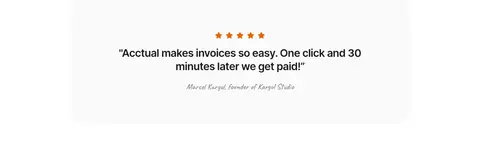
Occasional handwritten testimonial attribution and decorative annotation
角色
示例
字号
字重
行高
字距
特大标题
Oversized hero headline and rare high-impact page statements.
Acctual
64px
600
1.13
-0.03em
一级标题
Primary page and section headline, especially the hero message.
Acctual
48px
600
1.17
-0.03em
二级标题
Major feature-section headings and large content introductions.
Acctual
40px
600
1.2
-0.03em
三级标题
Subsection titles and prominent feature statements.
Acctual
32px
600
1.25
-0.03em
四级标题
Card headings and short supporting section titles.
The quick brown fox 敏捷的狐狸
24px
600
1.33
-0.03em
正文
Explanatory paragraphs, navigation, card copy, and supporting content.
The quick brown fox 敏捷的狐狸
14px
500
1.43
-0.02em
辅助文字
Compact uppercase labels, eyebrow text, and metadata.
The quick brown fox 敏捷的狐狸
11px
600
1.62
0.02em
链接
Inline navigation and contextual calls to action.
The quick brown fox 敏捷的狐狸
14px
500
1.43
-0.02em
间距与布局
基准单位 4px · 密度:宽松
96px版块间距
10px元素间距
24px卡片内边距
1024px内容最大宽度
4px
6px
8px
9px
10px
12px
13px
14px
16px
18px
20px
24px
28px
48px
64px
96px
The hero is centered within a single-column composition, with full-bleed desk photography around a central invoice preview. Below it, content alternates between centered introductions, three-column feature grids, two-column comparison or editorial rows, and long image-led showcases. The measured content max width is 1024px, with a spacious density and a 96px section gap. Keep text blocks controlled and align feature sections according to their role rather than forcing every section into the same centered template.
圆角与层次
按钮 · 9999px
卡片 · 16px
图片 · 50%
链接 · 16px
sm · other
hairline · button
md · card
hairline · other
Favor flat sections and subtle surface changes over prominent outlines. Cards use quiet shadows or a slight tonal contrast, with measured card rounding of 16px and payment-method panels at 20px. Dark pill CTAs provide the strongest visual separation; avoid stacking heavy shadows and borders.
组件
下面的预览按实测的按钮、输入框、徽标、卡片样式重建(字体用替代字体)。
Primary CTA
Dark, fully pill-shaped button with concise action text; used for starting an invoice or signing up.
Hero payment cues
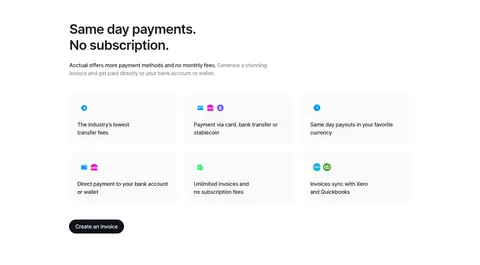
A horizontal row of blue check icons and payment-method labels beneath the hero CTA, with brief fee details.
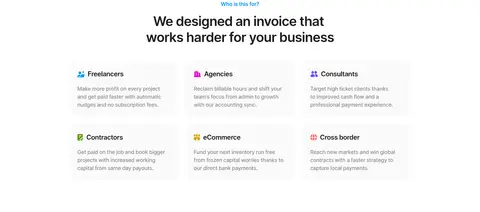
Audience cards
Three-column grid of pale cards with small colorful icons, short audience labels, and compact explanatory copy.
Feature comparison
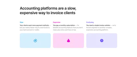
Three-column comparison with short problem labels, restrained copy, and pastel icon panels.
Editorial feature showcase
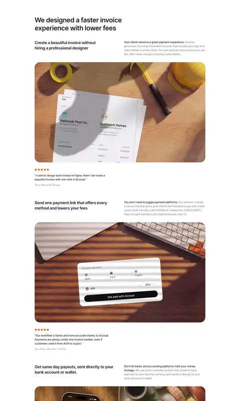
Alternating text and large rounded photography that demonstrates invoice creation, payment choice, payouts, and reminders.
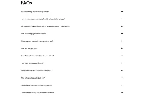
FAQ list
Single-column question rows with concise labels and a plus affordance, separated by subtle hairlines.
Integration panel
Pale inset surface with a small blue eyebrow, concise sync headline, supporting copy, and recognizable accounting-platform marks.
Imagery · Use warm, natural product photography featuring invoices on desks, screens, and familiar work objects. Hero imagery can extend beyond the main content area, while later images sit in rounded, contained frames. Product mockups should feel like useful demonstrations, not abstract decoration. Small colorful icons and payment graphics may appear inside cards, but keep the overall page palette restrained.
Reserve Payment Blue for payment cues and small emphasis.
Set headings in rounded, semibold Open Runde or a close substitute.
Give major sections generous vertical breathing room.
Use real invoice-context photography with soft rounded framing.
Make primary actions dark, compact, and pill-shaped.
✕ 不该做
Do not make every section a bordered card.
Do not use blue as a full-page background or oversized decoration.
Do not crowd the hero with competing headlines or controls.
Do not let vivid illustration colors define the brand palette.
Do not add heavy shadows to ordinary content blocks.
Do not force editorial feature sections into identical layouts.
给 AI 的提示词
想快速出一个同风格的新页面,把这段话连同 DESIGN.md 一起发给 AI。
Build a new Acctual-style fintech page around a quiet, spacious canvas. Use Gallery White (#ffffff) for the main background and Cloud Surface (#f7fafc) for occasional subtle panels. Set strong headings in rounded semibold Open Runde, or Nunito Sans if unavailable, using Ink Black (#1e1e1e); use Soft Graphite (#8d8d8d) for supporting copy. Apply Payment Blue (#0098f2) selectively to payment indicators and small labels. Create a clear centered hero, followed by varied grids and editorial feature sections rather than repeating one template. Use warm, realistic invoice photography with soft rounded corners. Keep cards mostly flat, with gentle separation and restrained shadows. Make primary CTAs dark and pill-shaped. Preserve generous whitespace, concise copy, and a clear path from product explanation to action.