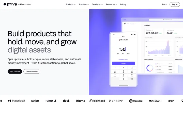
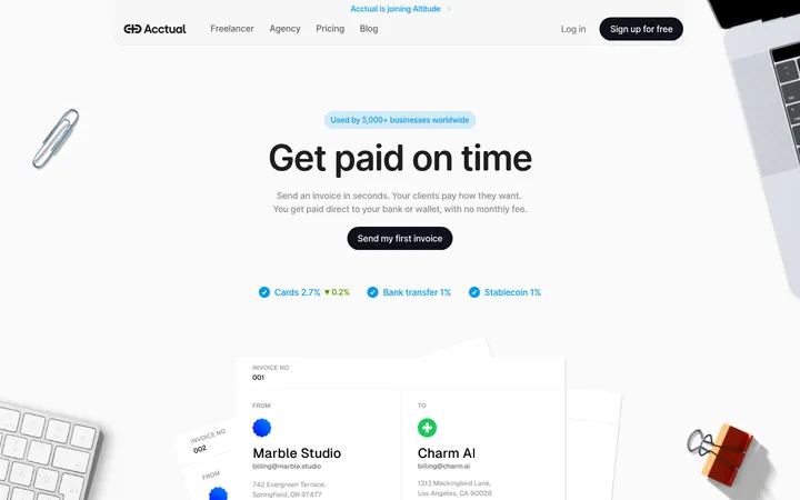
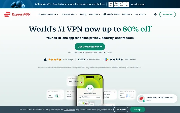
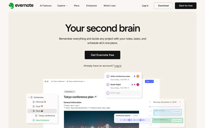
North star · Keep the near-black interface calm and structured, using violet glow only to direct attention toward product capability.
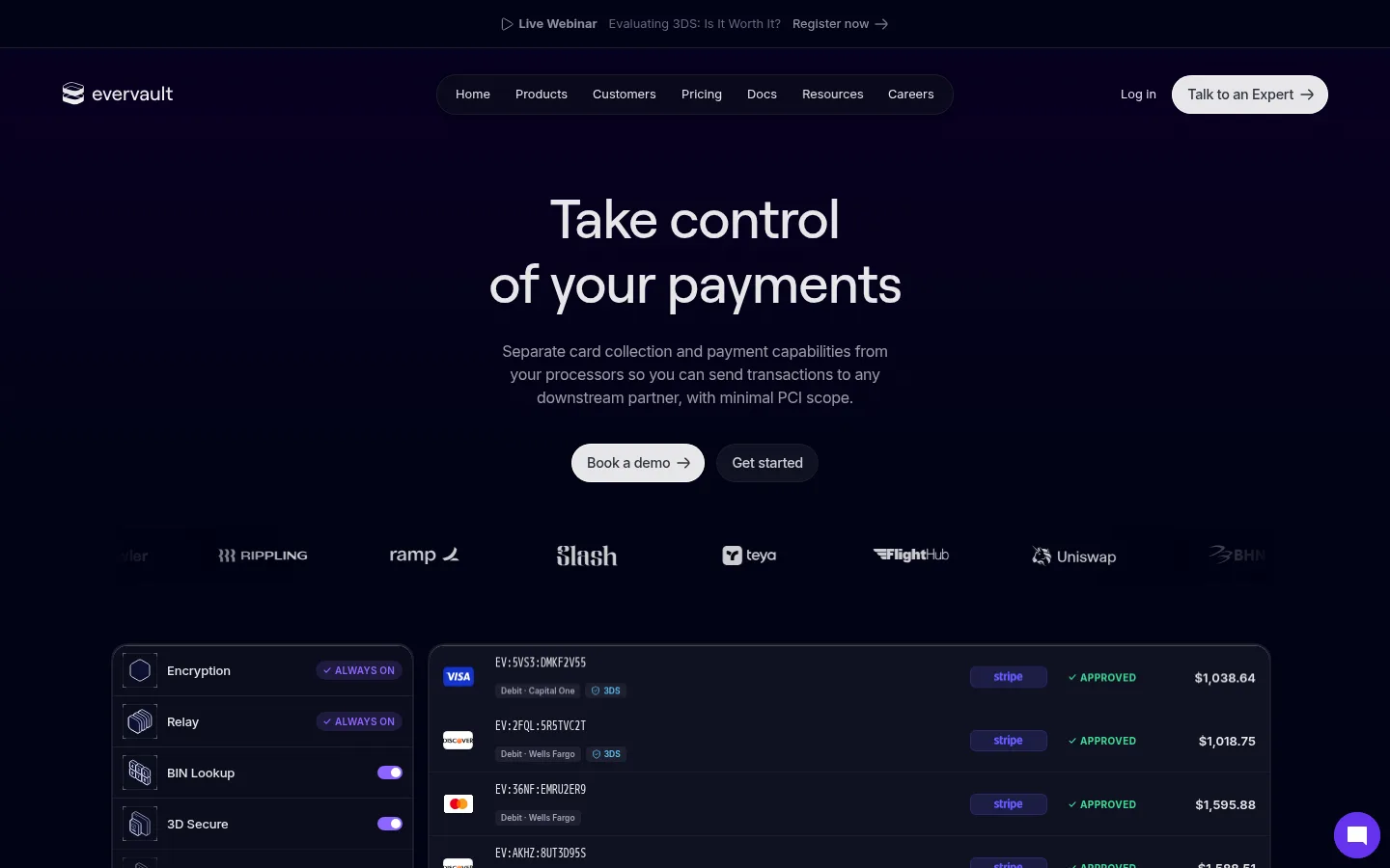
The page is built around a near-black, blue-tinted canvas, with fine cool borders dividing broad content bands. Violet gradients provide the main visual energy: they glow behind product areas and cards rather than turning the whole interface into a saturated field. White headings stay crisp, while muted gray supporting copy recedes; green is reserved for small approval and status signals. Roobert Medium gives display and heading text a compact, controlled shape, with Inter carrying readable body copy and IBM Plex Mono marking technical labels. The hero centers a short headline, supporting statement, and paired pill CTAs above customer logos and a large payments dashboard. Below, modular feature groups, framed explanatory panels, testimonials, and use-case cards create a long, deliberate scroll. Product imagery is primarily interface illustration—dark cards, encryption diagrams, and dashboard details—with violet glow used as depth and emphasis. Hairline borders and restrained shadows keep the interface structured without adding visual heaviness.
配色
点色块复制色值。用途说明来自对页面的实测位置(背景、文字、描边、按钮)与截图判读。
强调色
表层色
中性色
功能色
页面底色 · Gallery White表层 · Midnight Ink表层 2 · Night Panel主文字 · True Black次要文字 · Gallery White弱文字 · Quiet Gray描边 · Slate Hairline强调 · Electric Violet强调 2 · Deep Violet强调 3 · Status Green
Body copy, captions, buttons, and much of the interface text
Aa 设计
Roobert Medium
网络字体 · 字重 500 · 占比 12%
免费替代:DM Sans
Display headlines and section headings
Aa 设计
IBM Plex Mono
网络字体 · 字重 400 / 300 / 500 · 占比 9%
免费替代:IBM Plex Mono
Eyebrows and technical micro-labels
Aa 设计
ui-monospace
系统字体 · 字重 400 · 占比 2%
免费替代:IBM Plex Mono
System fallback for compact code-like interface details
Aa 设计
Roobert SemiBold
网络字体 · 字重 600 · 占比 1%
免费替代:DM Sans
Occasional stronger heading or emphasis
角色
示例
字号
字重
行高
字距
特大标题
Centered hero headline and prominent campaign statements.
Evervault
56px
500
1.2
-0.02em
一级标题
Primary page or major section heading.
Evervault
40px
500
1.2
-0.01em
二级标题
Section titles for product capabilities and use cases.
Evervault
29.5px
500
1.2
0
三级标题
Feature names and card-level headings.
The quick brown fox 敏捷的狐狸
20px
500
1.3
-0.01em
正文
Supporting descriptions, navigation, and explanatory copy.
The quick brown fox 敏捷的狐狸
16px
400
1.5
-0.02em
辅助文字
Compact dashboard details and secondary card text.
The quick brown fox 敏捷的狐狸
13px
400
1.4
0
眉题
Uppercase technical labels above or within sections.
The quick brown fox 敏捷的狐狸
10px
400
1.6
0.61em
代码
Small monospaced technical markers and interface labels.
const style = 1;
10px
400
1.6
0.61em
间距与布局
基准单位 2px · 密度:适中
48px版块间距
10px元素间距
—卡片内边距
1200px内容最大宽度
2px
3px
4px
5px
6px
7px
8px
10px
12px
14px
16px
18px
20px
22px
24px
32px
A centered, wide content frame organizes the page into stacked dark bands, with measured maximum width of 1200px. The hero is center-aligned; product dashboards and feature groups shift into multi-column arrangements below. Hairline vertical and horizontal rules frame selected sections, creating a measured grid without crowding the content. Spacing follows a comfortable rhythm: generous gaps around major sections, tighter intervals within cards and interface mockups. The page alternates dense product detail with quieter testimonial and CTA moments.
圆角与层次
按钮 · 9999px
输入框 · 6px
卡片 · 16px
图片 · 8px
链接 · 9999px
lg · other
inset · card
sm · other
xl · card
The system relies on thin borders and contrast between closely related dark surfaces more than on floating shadows. Product panels use fine cool outlines, with selective inset edges and restrained shadow depth to separate layered UI. Violet glow gives key cards and showcase regions atmosphere without making every surface appear elevated.
组件
下面的预览按实测的按钮、输入框、徽标、卡片样式重建(字体用替代字体)。
Header navigation
Slim brand and navigation row over the dark canvas, with a centered pill-shaped nav and a pale expert-contact CTA.
Hero CTAs
Centered pair of rounded actions beneath the hero copy; use a bright primary button and a subdued dark secondary action.
Payments dashboard
Wide, dark bordered product mockup with transaction rows, status indicators, card controls, and compact interface typography.
Feature columns
Three grouped capability columns with uppercase mono labels, short descriptions, fine separators, and compact icon-led items.
Framed feature panel
Large outlined content area with a section heading, violet-gradient product illustration, and concise supporting benefit columns.
Use-case cards
Three dark cards with short titles, muted explanatory copy, and interface imagery highlighted by violet light.
Newsletter form
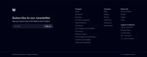
Footer signup module pairing a short heading and supporting sentence with a compact email field and pill action.
Imagery · Imagery is product-led rather than photographic: payment dashboards, encryption panels, payment cards, code-like screens, and compact partner marks. Mockups sit in dark framed surfaces and use violet glow or gradient light to distinguish key areas. Keep interface illustrations legible at a glance, with realistic data density and restrained highlights; green appears as a small status cue.
Use a near-black blue-tinted base for the main page canvas.
Reserve violet gradients for product highlights and focused calls to action.
Keep major headings centered and concise in the hero.
Separate dark panels with fine, low-contrast borders.
Use mono uppercase labels for technical section markers.
Show product capability through detailed interface mockups.
Keep success green to small status indicators.
✕ 不该做
Do not turn the page into a bright white layout.
Do not spread violet glow across every section.
Do not use heavy shadows in place of panel borders.
Do not let supporting copy compete with the headline.
Do not use large photographic hero imagery.
Do not make dashboard details look like generic decorative cards.
给 AI 的提示词
想快速出一个同风格的新页面,把这段话连同 DESIGN.md 一起发给 AI。
Build a new Evervault-style page as a dark, technical fintech experience. Use Midnight Ink (#010314) as the primary surface, with Night Panel (#101222) and Card Midnight (#0b0d1c) for layered UI, separated by Slate Hairline (#1d1f2e). Keep Gallery White (#ffffff) and Frosted Gray (#e8e8e9) for clear text hierarchy, with Quiet Gray (#999aa1) for supporting copy. Use Electric Violet (#8e64ff) and Deep Violet (#6633ee) selectively in soft gradients and focused controls; Status Green (#3ddc97) should only signal success. Set display headings in a Roobert-like sans, body in Inter, and technical eyebrows in IBM Plex Mono. Compose a centered hero, pill CTAs, realistic payment or encryption UI, modular feature sections, and a restrained footer. Favor thin borders, generous section breathing room, and crisp product detail over decorative effects.