North star · Let whitespace and precise product UI explain the finance platform, using contrast sparingly to guide attention.
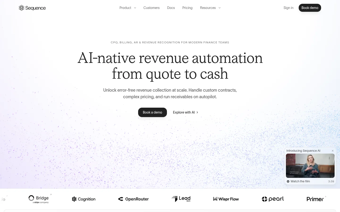
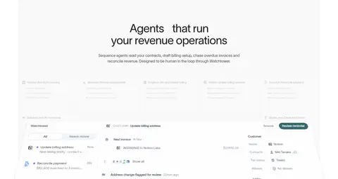
The page is built on a white canvas, with #f9f9f9 bands separating selected proof and content areas. Near-black headings and CTA buttons provide the strongest contrast; secondary copy sits in several measured grays, while hairline borders keep cards and divisions subtle. The first viewport centers a large, refined headline over a pale particle-like gradient, then transitions into a compact customer logo row. TWK Lausanne is used across the interface, giving navigation, body copy, and product labels a consistent sans-serif voice; headings are light-weight and carefully tracked, while the hero uses an elegant serif-like display treatment in the screenshot. The layout favors spacious, centered introductions followed by narrow text columns, side navigation, and broad product panels. Product UI is shown in soft, low-contrast cards rather than glossy device mockups. A dark enterprise panel and occasional lavender-blue gradients provide contrast without changing the restrained overall palette.
Site-wide interface, navigation, body copy, buttons, labels, and most headings.
角色
示例
字号
字重
行高
字距
一级标题
Hero headline and primary page-level statement.
Sequence
32px
300
1.3
-0.015em
二级标题
Major section headings introducing product capabilities and stories.
Sequence
30px
300
1.2
-0.01em
三级标题
Feature titles and subsection headings.
The quick brown fox 敏捷的狐狸
22px
400
1.45
0
四级标题
Compact card and supporting feature headings.
The quick brown fox 敏捷的狐狸
21px
400
1.25
-0.01em
正文
Explanatory copy, customer stories, and FAQ answers.
The quick brown fox 敏捷的狐狸
16px
400
1.55
0
辅助文字
Small product UI labels, footnotes, and metadata.
The quick brown fox 敏捷的狐狸
11px
400
1.35
0
按钮
Primary and secondary CTA labels.
The quick brown fox 敏捷的狐狸
13px
400
1.5
0
导航
Header navigation and menu items.
The quick brown fox 敏捷的狐狸
14px
400
1
0
链接
Inline links, customer-story actions, and connector exploration.
The quick brown fox 敏捷的狐狸
14px
400
1.43
0
间距与布局
基准单位 4px · 密度:宽松
96px版块间距
8px元素间距
16px卡片内边距
848px内容最大宽度
1px
2px
3px
4px
5px
6px
8px
10px
12px
16px
32px
40px
The header spans the top of the page, while the hero and several introductory blocks align centrally. The measured content max width is 848px, with spacious section gaps and modest internal card padding. Feature areas alternate between one-column product showcases and two-column text-and-interface compositions; a slim category rail anchors some product sections. Broad pale bands separate proof sections from the white canvas. Keep the density low, preserve generous vertical breathing room, and allow product panels to read as large calm surfaces rather than tightly packed dashboards.
圆角与层次
按钮 · 8px
卡片 · 12px
图片 · 16px
徽标 · 6px
导航 · 14px
链接 · 12px
md · other, card
hairline · card, text
hairline · card, link
inset · other, card
Most surfaces are flat, with thin gray hairlines defining cards and boundaries. Product cards may use a very restrained edge shadow and slight lift, but broad sections remain unraised. Layering is used selectively for the floating video preview, stacked workflow mockups, and the dark enterprise panel; avoid pronounced drop shadows or heavy outlines.
组件
下面的预览按实测的按钮、输入框、徽标、卡片样式重建(字体用替代字体)。
Header navigation
Light, single-row header with the Sequence mark, muted text links, and a compact dark Book demo pill aligned at the far right.
Primary CTA
Near-black button with white 14px Lausanne text and a rounded pill-like silhouette; used for Book demo actions.
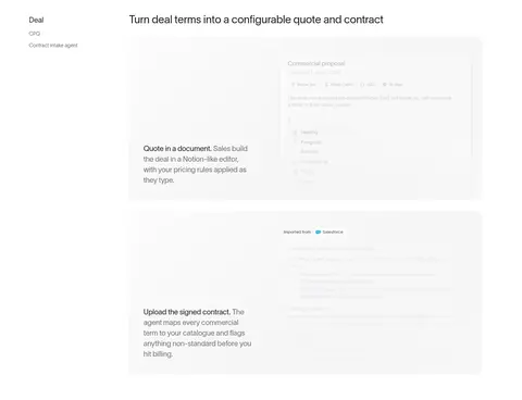
Product feature panel
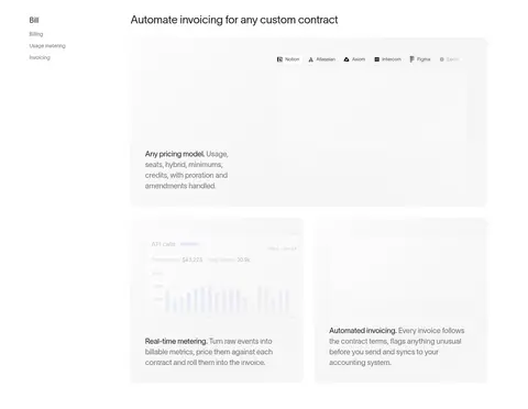
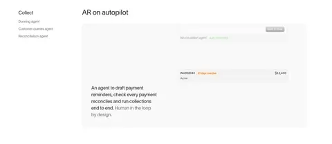
Large pale product mockup paired with concise explanatory copy, sometimes arranged as a broad panel beside a narrow feature rail.
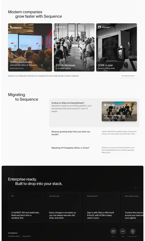
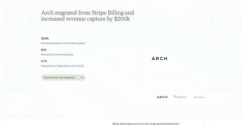
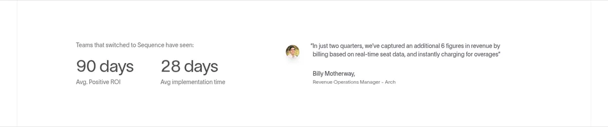
Customer proof card
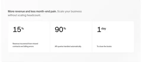
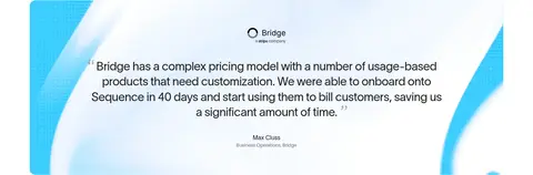
Compact photographic story card with customer mark, outcome metric, and subdued supporting caption.
Status badge
Small rounded status label in product UI; success state uses a pale green fill with green text.
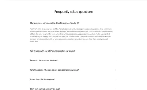
FAQ accordion
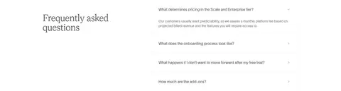
Centered FAQ heading followed by restrained question rows, subtle dividers, and a small disclosure indicator.
Enterprise feature panel
Dark #171717 section with a light heading and a row of fine-bordered capability cards.
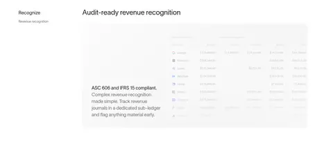
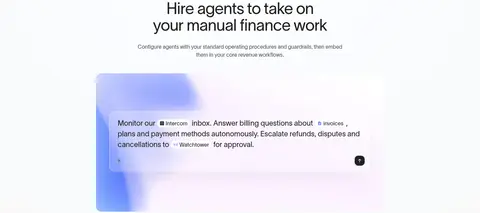
Imagery · Imagery is led by product-interface mockups: invoices, workflow steps, and finance dashboards presented in pale, soft-edged panels. The hero uses a faint particle or grain-like field over a near-white lavender-blue wash. Customer proof includes real-world photography in compact story cards, while an embedded video preview appears as a small floating feature. Avoid glossy device frames; keep interface detail subdued and let screenshots support the explanatory copy.
Keep the primary canvas white and section bands very pale.
Use near-black text and CTAs for clear focal contrast.
Give hero and section introductions generous whitespace.
Pair concise feature copy with quiet product-interface panels.
Use thin gray borders instead of strong card outlines.
Reserve gradients for subtle atmospheric or illustrative treatments.
✕ 不该做
Do not make decorative colors the dominant brand palette.
Do not use dense, dashboard-like layouts for marketing sections.
Do not add heavy shadows or thick borders to cards.
Do not use saturated CTA colors in place of the dark button.
Do not crowd headings, copy, and product imagery together.
Do not treat illustration-only status colors as global accents.
给 AI 的提示词
想快速出一个同风格的新页面,把这段话连同 DESIGN.md 一起发给 AI。
Build a new Sequence-style SaaS page with a Gallery White (#ffffff) canvas, Cloud Veil (#f9f9f9) section bands, and Soft Ink (#202120) headings and primary CTAs. Use TWK Lausanne or Inter, with restrained weights, compact navigation, and generous whitespace. Center key introductions, then explain capabilities through concise copy beside quiet, pale product-interface panels. Keep the content rhythm spacious and use fine Mist Line (#efefef) borders rather than prominent shadows. Let real customer photography appear in small proof cards; use gradients sparingly, with Lavender Haze (#f6f3ff) only as a soft decorative wash. If a dark feature block is needed, use Night Panel (#171717) and fine dividers. Keep secondary copy muted and the overall UI calm, precise, and product-led.