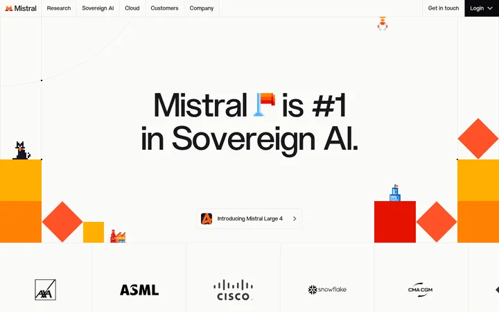
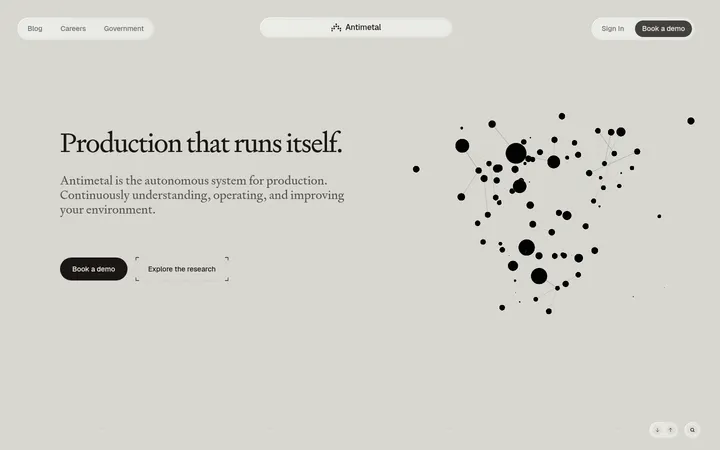
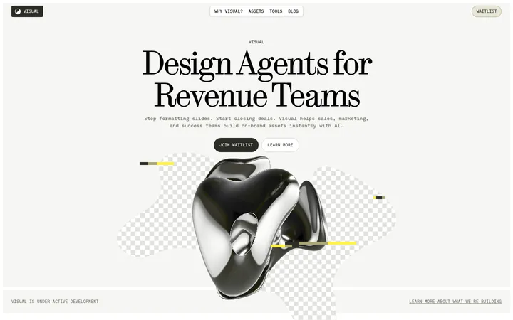
North star · Keep the page quiet and editorial in its structure, letting oversized type and vivid product media provide the contrast.
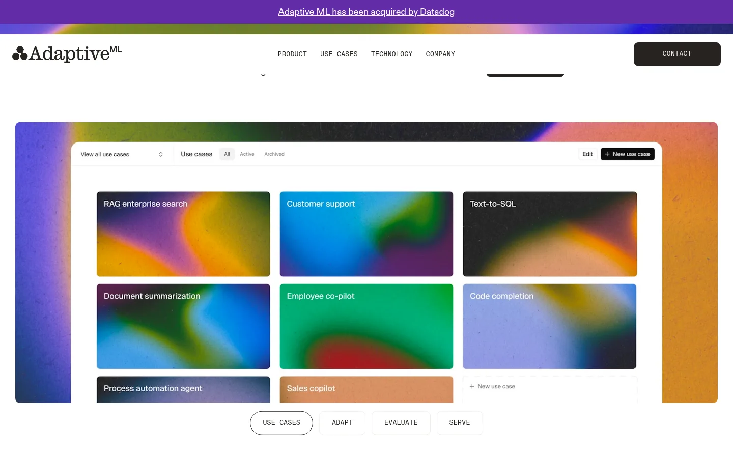
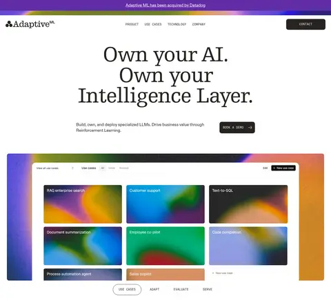
The page is anchored by a white canvas, dark charcoal typography, and broad areas of open space. Large, tightly tracked serif display headlines lend an editorial character, while sans-serif body copy keeps product descriptions direct and readable. Small uppercase mono labels organize navigation, categories, and metadata. The layout alternates centered headline-led sections with left-aligned editorial blocks and two-column feature areas, using a spacious vertical rhythm rather than dense UI. Product cards and interface previews sit within thin pale borders, while colorful blurred gradients appear primarily inside product imagery and media—not as a replacement for the restrained site palette. A muted warm-gray content-feed band and dark charcoal information/footer bands create clear transitions. A violet announcement strip is a small, high-contrast brand cue. Overall, the page balances quiet typography and structure with vivid demonstrations of AI use cases.
Navigation, body copy, links, and sans-serif headings
Aa 设计
Egyptienne F LT
网络字体 · 字重 400 / 500 · 占比 16%
免费替代:Roboto Slab
Display and main editorial headlines
Aa 设计
Diatype Mono
网络字体 · 字重 400 · 占比 15%
免费替代:IBM Plex Mono
Navigation, eyebrows, captions, and metadata
角色
示例
字号
字重
行高
字距
特大标题
Oversized serif headline in the homepage hero and editorial moments.
Adaptive ML
94px
500
0.9
-0.028em
一级标题
Primary hero headline and main page-level statement.
Adaptive ML
77px
500
1
-0.028em
二级标题
Major platform and section headlines.
Adaptive ML
72px
500
1
-0.03em
三级标题
Feature titles and prominent content headings.
Adaptive ML
48px
500
1
-0.03em
四级标题
Card titles and supporting feature headings.
Adaptive ML
32px
400
1.2
-0.03em
正文
Product descriptions and explanatory paragraphs.
The quick brown fox 敏捷的狐狸
18px
400
1.3
0
辅助文字
Compact uppercase metadata and category labels.
The quick brown fox 敏捷的狐狸
13px
400
1
0.03em
导航
Small uppercase primary navigation labels.
The quick brown fox 敏捷的狐狸
13px
400
1
0.03em
链接
Inline calls to action and content links.
The quick brown fox 敏捷的狐狸
15px
400
1.4
0
眉题
Short uppercase labels introducing sections or features.
The quick brown fox 敏捷的狐狸
13px
400
1
0.03em
代码
Mono-styled technical or compact metadata labels.
const style = 1;
13px
400
1
0.03em
间距与布局
基准单位 8px · 密度:宽松
136px版块间距
24px元素间距
—卡片内边距
1380px内容最大宽度
4px
6px
8px
9px
10px
12px
16px
20px
24px
32px
56px
64px
80px
136px
Use a spacious, centered page structure with a measured maximum width of 1380px. The homepage mixes centered headline-led sections with asymmetric two-column feature blocks, a multi-column product showcase, and compact editorial content. Keep generous vertical separation between major sections, with a measured section gap of 136px and element gap of 24px. White dominates the opening sections; warm gray and charcoal bands distinguish the lower content. Maintain low density and let product media occupy broad visual areas.
圆角与层次
按钮 · 9px
卡片 · 9px
导航 · 9px
链接 · 9px
md · card
The interface is mostly flat: rely on white space, section background changes, and thin pale borders to establish structure. Product cards use subtle rounding and may carry a restrained soft shadow. Avoid stacked card effects or prominent drop shadows; dark footer bands and the warm-gray feed band provide the strongest depth cues.
组件
下面的预览按实测的按钮、输入框、徽标、卡片样式重建(字体用替代字体)。
Announcement strip
A narrow violet band at the top with a centered, underlined acquisition announcement.
Primary navigation
Brand mark on the left, compact uppercase mono navigation near center, and a dark rounded contact button on the right.
Product showcase
Broad product interface preview surrounded by vivid gradient imagery, with a compact row of pill-like category controls below.
Feature card
Light card with a thin #e1e0e0 border, approximately 9px rounding, dark text, and restrained soft shadow where needed.
Use-case split
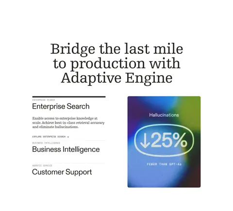
Editorial heading and stacked use-case descriptions paired with a colorful product metric visual.
Content feed
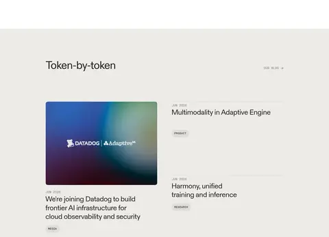
Warm-gray band with a section heading, image-led lead story, and compact linked article list.
Dark information footer
Charcoal bands with light copy, a centered brand mark, and a multi-column sitemap.
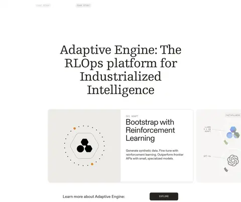
Imagery · Use product UI previews, interface cards, and abstract gradient artwork as the main visual material. The gradients are vivid and often blurred, but belong inside product mockups and media rather than the page-wide interface palette. Frame product content cleanly against white, with rounded card edges and ample surrounding space. Treat the logo cloud and product diagrams as supporting elements, not decorative clutter.
Use serif display type for the largest editorial headlines.
Use uppercase mono labels for navigation and metadata.
Give major sections generous vertical breathing room.
Use vivid gradients within product imagery, not as generic page decoration.
Use thin pale borders and restrained card elevation.
Reserve violet for a small, high-visibility announcement accent.
✕ 不该做
Do not make every section a card or boxed panel.
Do not spread gradient fills across the white page canvas.
Do not use oversized body copy in place of display headlines.
Do not crowd navigation, cards, or section transitions.
Do not replace the dark footer with a bright accent band.
Do not use heavy shadows or strong outlines as the primary structure.
给 AI 的提示词
想快速出一个同风格的新页面,把这段话连同 DESIGN.md 一起发给 AI。
Build a new Adaptive ML page with an editorial, spacious AI-platform aesthetic. Use Gallery White (#ffffff) as the dominant canvas and Warm Ink (#272421) for primary text, navigation, and dark information bands. Use Oat Mist (#edebe8) for a restrained content-feed section, Soft Rule (#e1e0e0) for fine card borders, and Signal Violet (#632ca6) only for a small announcement accent. Set prominent headlines in a tightly tracked serif similar to Roboto Slab; use an Inter-like sans for body and feature copy, and IBM Plex Mono-like uppercase labels for navigation and metadata. Alternate centered headline sections with two-column feature layouts. Showcase colorful, blurred gradients inside product visuals, leaving the surrounding interface clean. Keep cards lightly rounded, mostly flat, and separated by generous whitespace.