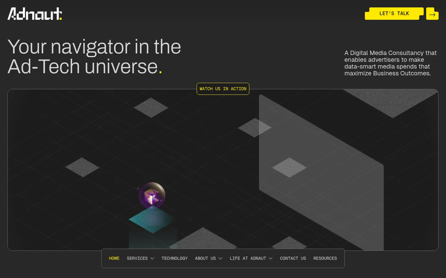
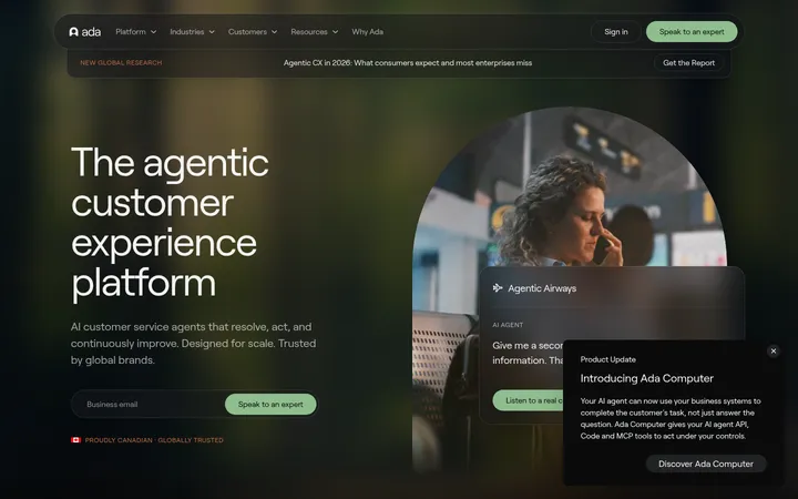
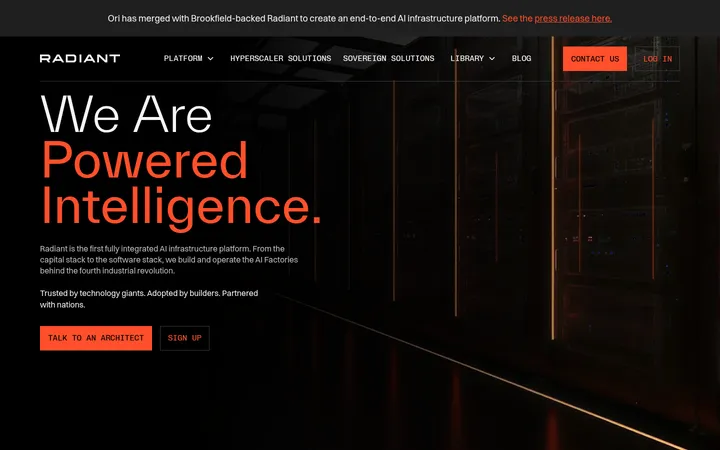
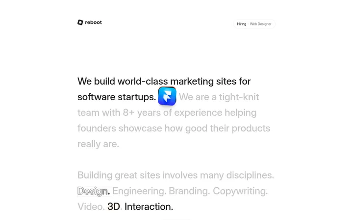
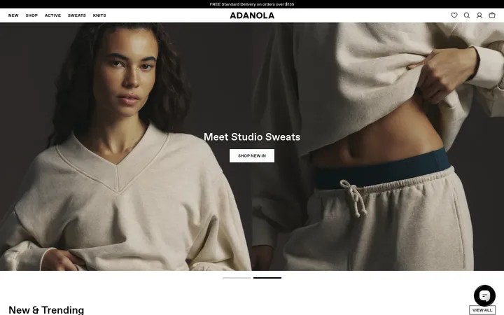
Adnaut 首页以深炭灰为底,搭配醒目的荧光黄和克制轻盈的文字。轨道式 3D 视觉、细描边与模块化分区,共同呈现数字媒体导航系统般的品牌气质。
North star · Treat the dark canvas as an orbital stage and use yellow sparingly to direct attention, motion and action.
The page is built around a charcoal field, with #282828 carrying most content sections and #222222 grounding cards and media frames. Signal yellow #ffe900 is reserved for the logo detail, calls to action, directional arrows and selected emphasis; it reads as a navigational cue rather than a broad decorative fill. Large, light Archivo headlines sit beside compact Geist body copy, while Geistmono uppercase labels lend navigation and small controls a technical, instrument-panel quality. The layout alternates wide framed media with split content blocks, card groupings and horizontal client marks, maintaining generous separation between sections. Imagery is predominantly dark, cinematic 3D artwork: glowing orbs, geometric forms and yellow light beams create depth without competing with the copy. Thin grey outlines define cards and media edges; rounded corners remain modest, and the interface avoids prominent shadows. Green or other bright hues appear selectively in imagery or sustainability details, not as the core brand palette.
Body copy, captions, links and most interface text.
Aa 设计
Archivo
网络字体 · 字重 300 / 100 / 400 · 占比 17%
免费替代:Archivo
Display headlines and section headings.
Aa 设计
Geistmono
网络字体 · 字重 400 / 600 · 占比 14%
免费替代:Space Mono
Uppercase navigation, labels and technical microcopy.
角色
示例
字号
字重
行高
字距
特大标题
Large, light-weight headline moments, especially hero-scale messaging.
Adnaut
64px
300
1
0
一级标题
Primary hero headline and top-level page statement.
Adnaut
56px
300
1
0
二级标题
Major section headings and prominent content titles.
Adnaut
48px
300
1
0
三级标题
Secondary feature titles and compact card headings.
Adnaut
32px
100
1
0
四级标题
Smaller card, quote, and sub-section headings.
The quick brown fox 敏捷的狐狸
24px
300
1
0
正文
Paragraphs, service descriptions, and testimonial copy.
The quick brown fox 敏捷的狐狸
16px
400
1.5
0
辅助文字
Compact metadata, labels, and supporting annotations.
The quick brown fox 敏捷的狐狸
14px
500
1.5
0
导航
Uppercase primary navigation and technical menu labels.
The quick brown fox 敏捷的狐狸
16px
600
1
0
链接
Inline links and supporting calls to action.
The quick brown fox 敏捷的狐狸
14px
400
1.5
0
代码
Uppercase technical or instrument-panel style microcopy.
const style = 1;
16px
400
1.5
0
间距与布局
基准单位 8px · 密度:宽松
64px版块间距
32px元素间距
67px卡片内边距
1392px内容最大宽度
6px
8px
11px
12px
16px
20px
24px
28px
32px
40px
48px
50px
54px
64px
70px
80px
The measured content max width is 1392px, with a spacious rhythm based on an 8px unit and a 64px section gap. The page alternates a single-column hero with two-column feature splits, multi-column process content and horizontal logo rows. Headings align mostly to the start, with the process heading centered. Large framed media blocks anchor sections; smaller cards and CTA strips sit alongside or below them. Preserve generous breathing room rather than compressing the long scroll into dense stacks.
圆角与层次
按钮 · 4px
卡片 · 8px
链接 · 16px
没有测到阴影:页面是扁平的,层次靠底色和描边区分。
The interface is mostly flat: no measured shadows define the system. Thin grey borders separate dark cards and media panels, while imagery and overlapping frames supply depth. Use modest rounded corners on interface panels and CTAs; keep layers controlled and avoid glossy elevation effects.
组件
下面的预览按实测的按钮、输入框、徽标、卡片样式重建(字体用替代字体)。
Header and navigation
Place the wordmark at the left, a yellow LET'S TALK action at the right, and a compact uppercase mono navigation strip that can overlap the hero media edge.
Hero media frame
Pair a large light Archivo headline with short supporting copy and a wide, dark framed visual; place a small outlined mono watch-action label near its top edge.
Feature cards
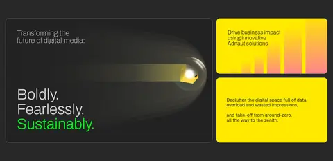
Use charcoal panels with fine grey outlines and restrained corner rounding; combine a large editorial headline, supporting copy and visual storytelling.
Process showcase
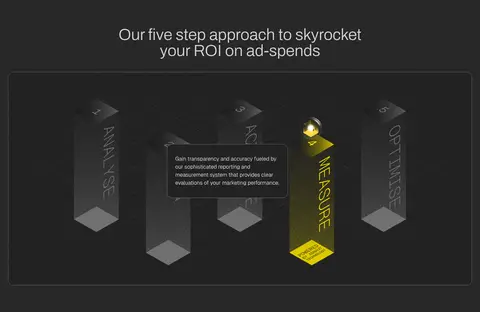
Present the five-step ROI approach as a prominent framed visual with a centered section heading and selectively highlighted yellow step.
Service links
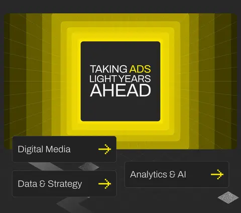
Show services as large outlined link panels with light text and a clear yellow directional arrow, arranged around a bold media feature.
Testimonial carousel
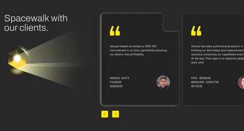
Use dark quote cards with large yellow quotation marks, compact client copy, attribution and small profile imagery; include visible yellow navigation controls.
Primary CTA
Use a yellow filled button with dark text, a fine yellow border and a separate or adjacent arrow control; keep the corner treatment modest.
Footer
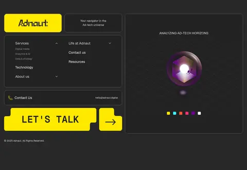
Group navigation and contact details in bordered dark panels, alongside the yellow wordmark, a prominent LET'S TALK action and a separate animated or illustrated visual.
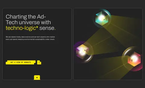
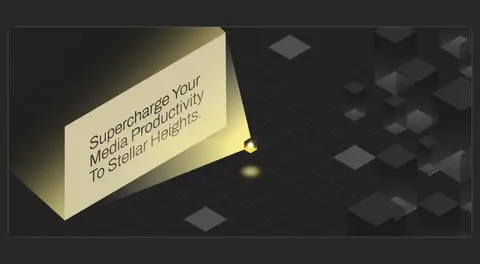
Imagery · Use cinematic 3D illustration and motion-led media rather than conventional stock photography. Frame dark scenes with geometric platforms, orbital forms, luminous spheres and focused yellow beams. Keep images inside outlined, softly rounded panels or let a large visual span a section. Bright colour inside the artwork can include incidental greens, pinks and cyan, but the surrounding interface stays charcoal and yellow.
Keep the main canvas charcoal and consistent across long sections.
Use signal yellow for actions, arrows and deliberate points of emphasis.
Set major headings in a light, large editorial sans.
Use uppercase monospace for navigation and technical labels.
Frame cards and media with fine grey outlines.
Give large visuals and section transitions ample breathing room.
✕ 不该做
Do not spread bright yellow across every surface.
Do not replace the dark palette with generic white sections.
Do not use heavy shadows to create card hierarchy.
Do not crowd the layout with dense, uniformly sized cards.
Do not treat illustration-only accent colours as core brand colours.
Do not make headlines bold and tightly compressed.
给 AI 的提示词
想快速出一个同风格的新页面,把这段话连同 DESIGN.md 一起发给 AI。
Build a new page in Adnaut’s dark, cinematic visual language. Use Charcoal Field (#282828) as the continuous canvas and Orbit Black (#222222) for selected cards and media surfaces. Set headlines in light Archivo, supporting copy in Geist, and uppercase utility navigation in Geistmono. Reserve Signal Yellow (#ffe900) for primary actions, arrows, logo details and a few deliberate text accents. Organize content into spacious split layouts, framed media panels and clear section bands; use the measured 1392px maximum content width and 64px section rhythm where applicable. Create depth through dark 3D orbital imagery, glowing forms and restrained overlaps, not heavy shadows. Outline panels with Graphite Line (#707070), keep corners modest, and make every action easy to distinguish. Keep incidental illustration colours secondary to the interface palette.