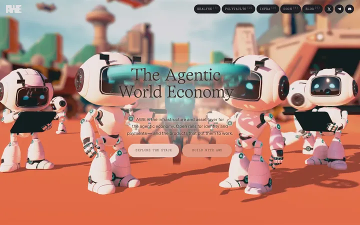
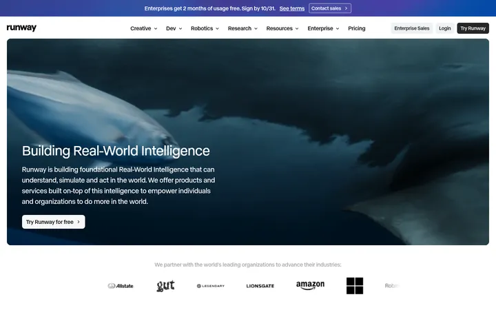
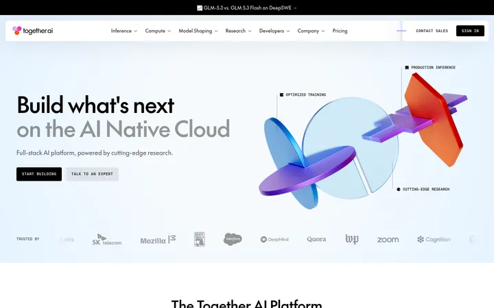
Radiant 以电影感黑色画布、醒目的橙色强调和鲜明的编辑式排版,呈现 AI 基础设施平台。技术图像与克制的信息区块交替铺陈,让页面既有规模感,也通过常见问题和新闻内容提供实用信息。
North star · Use a black editorial canvas, orange only for meaningful signals, and crisp off-white blocks to organize technical content.
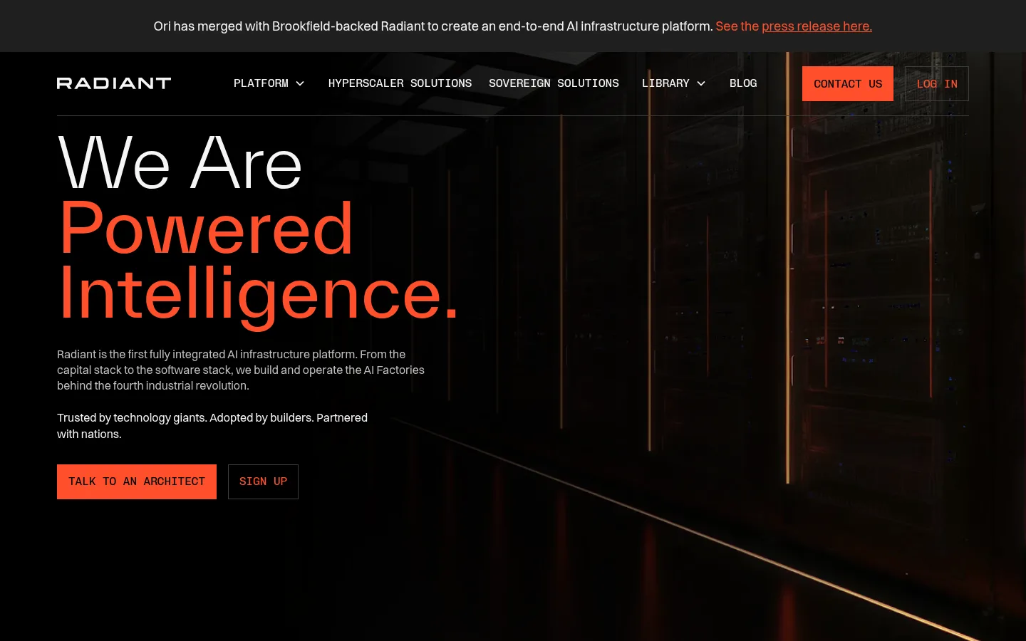
The visual strategy is built around a near-black canvas (#000000) that lets the facility imagery and orange accents read with force. The warm orange (#ff4f2b) is reserved for the hero’s emphasized words, primary actions, section interlude, and select links rather than used as general decoration. Pale off-white (#f5f5f5) creates a decisive contrast in the FAQ and feature title bands; muted gray supports secondary copy and hairlines. Large, light TWK Everett headings establish an editorial voice, while Switzer keeps paragraphs clear and Chivo Mono gives navigation, labels, and calls to action a technical, uppercase register. The page alternates a two-column hero and capability sections with full-width image treatments, then shifts into a light FAQ before returning to a dark news feed and footer. Spacious section breaks coexist with dense, carefully aligned content. Realistic infrastructure, chips, and interface imagery carry the story; the visual system itself stays flat and restrained.
配色
点色块复制色值。用途说明来自对页面的实测位置(背景、文字、描边、按钮)与截图判读。
品牌色
强调色
表层色
中性色
功能色
页面底色 · Foundry Black表层 · Signal Chalk主文字 · Signal Chalk次要文字 · Foundry Black弱文字 · Quiet Alloy描边 · Quiet Alloy强调 · Signal Orange
Paragraphs, general interface text, and standard links.
Aa 设计
TWK Everett
网络字体 · 字重 400 / 300 / 700 · 占比 12%
免费替代:Inter
Display headlines and section headings.
Aa 设计
Chivo Mono
网络字体 · 字重 400 · 占比 10%
免费替代:IBM Plex Mono
Navigation, labels, code-like details, and primary action text.
角色
示例
字号
字重
行高
字距
特大标题
Oversized hero or statement headline.
Radiant
96px
400
0.95
0
一级标题
Primary hero headline.
Radiant
72px
300
1
0
二级标题
Major section headings, including FAQ and news.
Radiant
60px
400
1
0
三级标题
Feature or subsection headings.
Radiant
48px
400
1.1
0
四级标题
Smaller feature and editorial headings.
Radiant
36px
400
1.2
-0.011em
正文
Main descriptive paragraphs and explanatory copy.
The quick brown fox 敏捷的狐狸
18px
400
1.4
0
辅助文字
Compact supporting labels and secondary text.
The quick brown fox 敏捷的狐狸
16px
400
1.4
0
导航
Uppercase navigation items and utility links.
The quick brown fox 敏捷的狐狸
16px
400
1.4
0
代码
Uppercase technical labels and mono interface details.
const style = 1;
16px
400
1.4
0
间距与布局
基准单位 8px · 密度:适中
80px版块间距
16px元素间距
—卡片内边距
1280px内容最大宽度
4px
5px
8px
16px
20px
24px
30px
32px
40px
48px
64px
80px
The desktop page uses a wide, centered content area with a measured maximum width of 1280px and a comfortable density. The hero is a two-column composition with text aligned left over dark facility imagery. Capability content alternates numbered off-white title bands with two-column image-and-copy sections. An orange full-width interlude breaks the dark sequence. The FAQ shifts to a light two-column layout; news uses three columns, and the footer organizes links and subscription content into columns. Section spacing is generous, with consistent alignment and thin rules.
圆角与层次
sm · footer
The interface is mostly flat: rely on large color fields, image contrast, and hairline dividers rather than cards with visible depth. Borders are thin and subdued on black, and the FAQ uses rules to separate answers. The measured small footer shadow is incidental; avoid introducing prominent shadows or rounded card treatments.
组件
下面的预览按实测的按钮、输入框、徽标、卡片样式重建(字体用替代字体)。
Announcement and navigation
A slim merger announcement sits above a dark horizontal navigation bar. Set the announcement in clear sans-serif text with an orange linked phrase; use uppercase mono labels for primary navigation.
Hero
Pair an oversized, left-aligned statement with concise supporting paragraphs and two compact actions over a dark industrial image. Use orange to emphasize selected headline words and the primary action.
Orange statement band
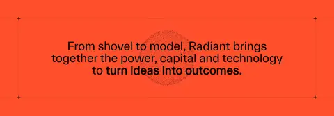
A full-width orange break carries a centered dark statement, framed with minimal rules and small plus/minus-style details.
Numbered capability sections
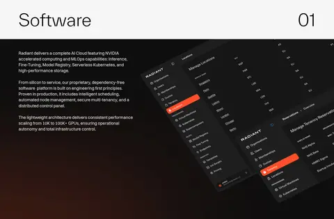
Each capability pairs a pale title strip and right-aligned two-digit index with dark, two-column explanatory content and a large technical image.
FAQ
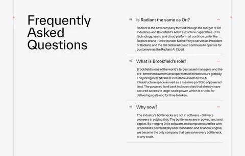
A pale two-column section places a large heading opposite numbered questions and compact answers, separated by fine horizontal rules.
News feed
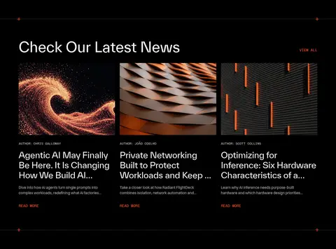
A dark section presents a heading and orange mono view-all link above three image-led article columns with concise metadata and excerpts.
Newsletter footer
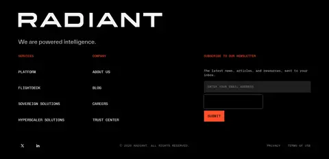
A dark multi-column footer combines a prominent wordmark, grouped navigation links, social links, and a compact form with dark inputs and an orange submit button.
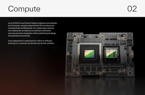
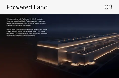
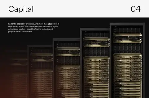
Imagery · Use cinematic, realistic infrastructure imagery: dark data-center interiors, server equipment, chips, and clean product-interface captures. Feature visuals occupy generous areas alongside explanatory copy, with warm amber reflections and deep shadows that sit naturally against the black canvas. News thumbnails add more varied textures and close-up subjects. Avoid decorative illustration as the main visual language; the measured orange-heavy palette and screenshot colors inside imagery should not be mistaken for additional brand colors.
Reserve Signal Orange (#ff4f2b) for meaningful emphasis and actions.
Use Signal Chalk (#f5f5f5) for clear inverse section surfaces and text.
Pair editorial display headlines with readable sans-serif body copy.
Set navigation and technical labels in uppercase mono styling.
Give infrastructure imagery generous space and deep, natural contrast.
Use thin rules and broad section bands to structure long content.
✕ 不该做
Do not turn orange into a general-purpose background color across every section.
Do not use rounded, elevated cards as the dominant layout treatment.
Do not add gradients or decorative effects absent from the measured style.
Do not let secondary gray copy compete with the headline or CTA.
Do not replace realistic technical imagery with playful illustration.
Do not make every heading uppercase or monospaced.
Do not compress the page into tightly stacked, dense blocks.
给 AI 的提示词
想快速出一个同风格的新页面,把这段话连同 DESIGN.md 一起发给 AI。
Build a new Radiant-style page with a cinematic, technical editorial feel. Use Foundry Black (#000000) as the main canvas, Signal Chalk (#f5f5f5) for contrast sections and primary text, Quiet Alloy (#bfbfbf) for muted copy, and Signal Orange (#ff4f2b) only for selected emphasis, links, and primary actions. Create large light-weight TWK Everett-like headlines, readable Switzer-like paragraphs, and uppercase Chivo Mono-like navigation and labels. Organize content in a wide centered grid with a left-aligned hero, generous section breaks, alternating image-and-copy feature areas, and occasional pale or orange full-width bands. Favor realistic data-center, compute, and product imagery. Keep components flat, use delicate dividers, and avoid decorative shadows or excessive rounded cards.