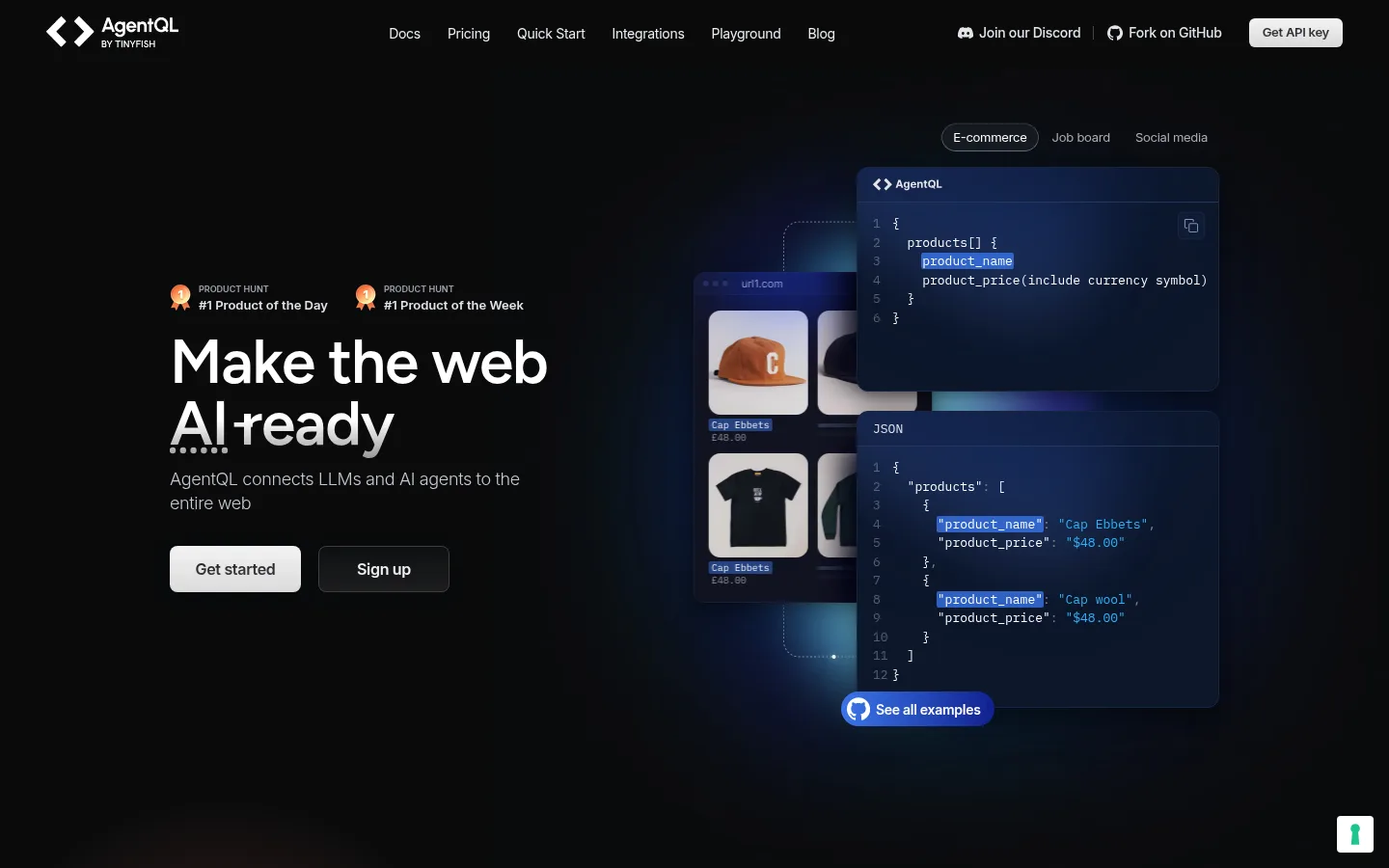
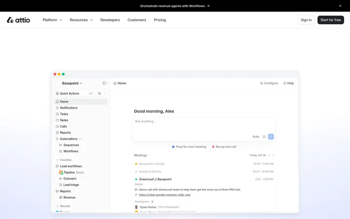
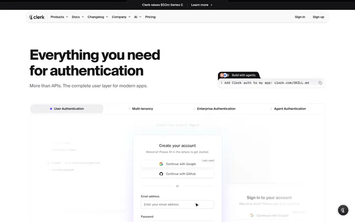
North star · Keep the page nearly black and let precise typography and luminous product UI—not decorative colour—create the focus.
The page is anchored by a near-black canvas (#0a0b0c), with restrained dark surfaces that let product imagery and code samples carry the colour. White headings establish clear hierarchy; two muted grey tones handle supporting copy and navigation. Blue shades appear primarily in interface demonstrations, badges, and subtle atmospheric glows, rather than as broad, saturated section fills. Figtree gives display headings a clean, slightly condensed feel through medium weights and tight tracking; Inter handles most interface and body text, while IBM Plex Mono signals code and small technical labels. The layout uses a centered content frame and switches between split product storytelling, card grids, and centered section introductions. Generous dark intervals keep the long page from feeling crowded, despite its compact text and multiple demonstrations. Cards rely on dark fills, fine blue-toned borders, and layered shadows; rounded corners are present but avoid a soft, consumer-app feel.
配色
点色块复制色值。用途说明来自对页面的实测位置(背景、文字、描边、按钮)与截图判读。
品牌色
强调色
表层色
中性色
功能色
页面底色 · Obsidian Canvas表层 · Night Panel表层 2 · Deep Interface Navy表层 3 · Electric Navy表层 4 · Soft Signal Blue主文字 · Clean White次要文字 · Slate Mist弱文字 · Pale Graphite描边 · Blue Graphite Line强调 · Electric Navy强调 2 · Soft Signal Blue强调 3 · Signal Blue
Body copy, navigation, links, buttons, and interface labels.
Aa 设计
IBM Plex Mono
网络字体 · 字重 400 · 占比 12%
免费替代:IBM Plex Mono
Code samples, technical captions, and compact monospace labels.
Aa 设计
Figtree
网络字体 · 字重 500 / 600 · 占比 7%
免费替代:Inter
Display headings and prominent section titles.
角色
示例
字号
字重
行高
字距
特大标题
Large lead headlines, including the hero statement.
AgentQL
64px
500
1
-0.02em
一级标题
Primary page or major section headline.
AgentQL
48px
500
1
-0.02em
二级标题
Section titles above feature, pricing, and testimonial content.
AgentQL
44px
500
1.13
-0.02em
三级标题
Feature and product-card headings.
AgentQL
36px
500
1.13
-0.02em
四级标题
Smaller card or subsection headings.
AgentQL
28px
500
1.13
-0.02em
正文
Explanatory copy, supporting descriptions, and card text.
The quick brown fox 敏捷的狐狸
14px
300
1.38
-0.02em
辅助文字
Compact technical captions and interface annotations.
The quick brown fox 敏捷的狐狸
13px
400
1.25
0
按钮
Prominent primary action labels.
The quick brown fox 敏捷的狐狸
20px
400
1.25
-0.02em
导航
Top-level navigation and utility links.
The quick brown fox 敏捷的狐狸
14px
400
1
-0.02em
链接
Inline documentation and supporting links.
The quick brown fox 敏捷的狐狸
16px
400
1.5
0
代码
Code snippets and monospace interface samples.
const style = 1;
13px
400
1.25
0
间距与布局
基准单位 4px · 密度:紧凑
32px版块间距
6px元素间距
—卡片内边距
1152px内容最大宽度
1px
2px
4px
6px
8px
10px
12px
16px
18px
20px
24px
26px
28px
32px
40px
Use a centered content frame capped at the measured 1152px maximum width. The page alternates between a two-column hero and feature split, a one-column integration banner, multi-column feature and pricing cards, and centered section introductions. Keep alignment intentional: hero copy begins at the left, while feature, pricing, testimonial, and closing sections center their titles. Section spacing follows the measured 32px rhythm, with compact internal gaps and ample dark negative space around visual showcases. The overall density is compact rather than sparse.
圆角与层次
按钮 · 4px
卡片 · 12px
图片 · 50%
徽标 · 2px
导航 · 9999px
链接 · 8px
md · link
lg · card
lg · card, media
md · other
Most content sits flat against the dark canvas, with fine blue-charcoal borders separating cards and controls. Product screenshots gain depth from layered panels and broad, dark shadows; keep shadows subtle outside these showcases. Reserve stronger glow and overlap for interface imagery, avoiding raised surfaces on every content block.
组件
下面的预览按实测的按钮、输入框、徽标、卡片样式重建(字体用替代字体)。
Top navigation
White brand mark and compact Inter links on the dark canvas, with utility links and a pale, rounded Get API key action.
Hero action pair
Prominent light primary action beside a dark outlined secondary button; keep labels concise and high-contrast.
Product interface showcase
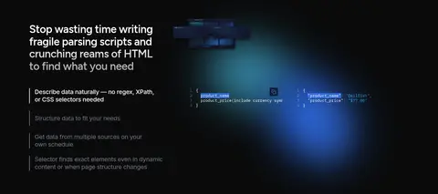
Layer overlapping dark code and result panels with blue interface highlights and soft surrounding glow.
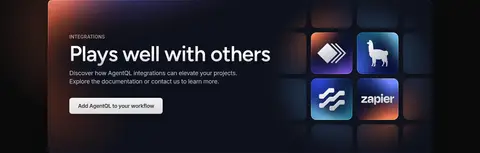
Integration banner
Wide dark panel with left-aligned title and copy, action button, and a compact grid of integration marks.
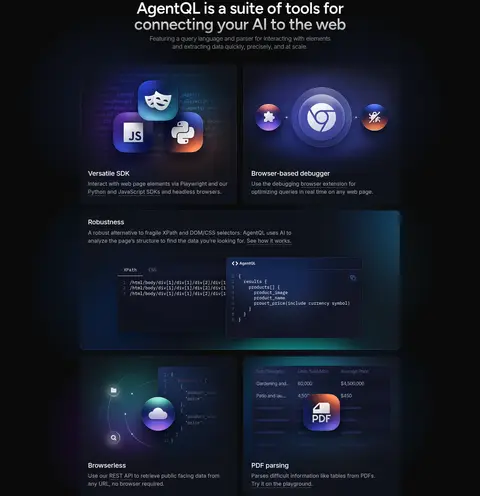
Feature cards
Dark rounded cards combine a product illustration, concise heading, and muted descriptive copy.
Pricing cards
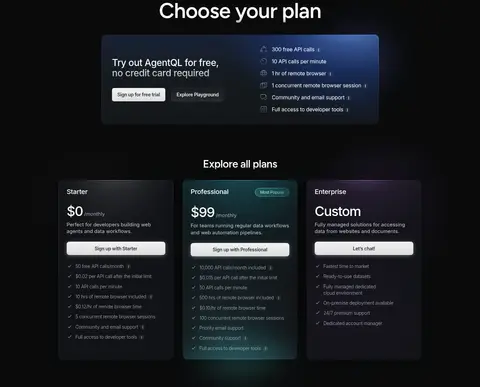
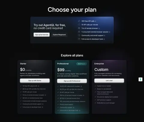
Three dark plan panels with clear price hierarchy, short feature lists, and light CTA buttons.
Testimonial cards
Compact quote panels use muted copy, small author portraits, and subtle blue or violet visual accents.
Imagery · Prioritize product UI over lifestyle photography: code editors, structured data, browser results, integrations, and developer-tool illustrations. Frame these as layered dark interface panels with blue and cyan light around edges or behind the panels. Use small logos and icon-led diagrams in feature cards; keep human photography limited to testimonial portraits. Glows and gradients belong to the visual demonstrations, not as replacements for the dark canvas.
Use white for prominent headings and primary control labels.
Set supporting navigation and copy in muted grey.
Use blue as a product-interface accent, not a dominant page fill.
Use Figtree for large headings and Inter for interface text.
Reserve IBM Plex Mono for code and technical annotations.
✕ 不该做
Do not introduce bright full-width colour bands.
Do not turn product imagery into lifestyle photography.
Do not use blue accents as the default text colour.
Do not make every card visibly elevated.
Do not use oversized, decorative display typography throughout.
Do not crowd dark sections with dense copy or excessive ornament.
给 AI 的提示词
想快速出一个同风格的新页面,把这段话连同 DESIGN.md 一起发给 AI。
Build a new AgentQL-style page on a near-black #0a0b0c canvas. Use #ffffff for clear headings and key actions, with #abaebb and #c7c9d1 for secondary navigation and explanatory text. Keep blue tones such as #12244f, #1b346e, #85a6e9, and #2862d7 concentrated in product UI, code highlights, and soft local glows. Set prominent headings in medium Figtree with tight tracking; use Inter for body copy and controls, and IBM Plex Mono for code. Organize content in a centered frame, alternating split showcases with compact card grids and centered section headings. Use dark surfaces, fine blue-charcoal borders, restrained shadows, and rounded panels. Make the product itself the visual focus; avoid decorative colour bands and lifestyle imagery.