North star · Let a near-black cinematic opening lead into clean, spacious white storytelling, using Apollo orange only to mark the next action.
The page opens with a near-black hero, white centered headline, quiet supporting copy, and a subtle network-like visual that gives the technical message atmosphere. The rest of the page shifts into white and pale-gray content areas, with black or deep blue-gray text and thin gray dividers. Apollo orange is reserved for high-intent actions and small emphasis rather than broad colour fields; the closing CTA introduces a light cyan-to-warm gradient, while brighter cyan and orange hues also occur in diagrams. Aeonik supplies the characteristic rounded, clean display and body voice, supported by Inter for navigation, buttons, and captions. Content alternates centered statements with two-column product explanations, cards, proof points, and testimonial panels. Generous section breaks and restrained borders create a clear reading sequence, while product screenshots and diagrams provide the visual colour and technical specificity.
Display, headings, body copy, and prominent content links.
Aa 设计
__Inter_69d019
网络字体 · 字重 400 / 500 / 700 / 600 / 900 · 占比 11%
免费替代:Inter
Navigation, buttons, captions, and uppercase eyebrow labels.
角色
示例
字号
字重
行高
字距
特大标题
Large hero and high-impact campaign headline.
Apollo GraphQL
60px
400
1.05
-0.025em
一级标题
Primary page title or major section headline.
Apollo GraphQL
42px
400
1.25
-0.025em
二级标题
Main section headings, often centered.
Apollo GraphQL
36px
400
1.25
-0.025em
三级标题
Product and feature subsection headings.
Apollo GraphQL
32px
400
1.15
-0.025em
四级标题
Smaller card or supporting content headings.
The quick brown fox 敏捷的狐狸
24px
400
1.33
0
正文
Explanatory paragraphs and product descriptions.
The quick brown fox 敏捷的狐狸
16px
400
1.5
0
辅助文字
Small labels, captions, and supporting metadata.
The quick brown fox 敏捷的狐狸
14px
400
1.43
0
按钮
CTA labels and other actionable control text.
The quick brown fox 敏捷的狐狸
15px
500
1.5
-0.01em
导航
Top-level navigation and site controls.
The quick brown fox 敏捷的狐狸
15px
500
1.5
-0.01em
眉题
Uppercase section labels and short pre-headings.
The quick brown fox 敏捷的狐狸
18px
500
1.25
0.08em
代码
Technical labels or code-oriented interface text.
const style = 1;
14px
400
1.43
0.05em
间距与布局
基准单位 8px · 密度:紧凑
32px版块间距
8px元素间距
32px卡片内边距
1376px内容最大宽度
4px
5px
6px
8px
12px
13px
16px
24px
32px
40px
48px
60px
64px
72px
80px
96px
The opening is a full-width, centered hero beneath announcement and navigation bars. Main content uses a measured page max width of 1376px, with frequent two-column product and explanatory sections, centered section introductions, and occasional three-column content. White is the dominant canvas; pale and dark bands distinguish specific moments rather than every section. Section spacing follows a compact measured system with a 32px section gap and 8px element gap, while product cards use 32px padding. Thin rules and consistent alignment keep the long page easy to scan.
圆角与层次
按钮 · 9999px
卡片 · 16px
导航 · 8px
链接 · 9999px
lg · button
The overall treatment is flat and editorial: white sections, fine gray borders, and minimal card separation. Cards have measured 16px radii and 32px padding, while navigation and CTA shapes use their own measured rounded treatments. A complex colored shadow was measured on a button, but the screenshots favour restrained outlines and subtle glow accents rather than broad elevation.
组件
下面的预览按实测的按钮、输入框、徽标、卡片样式重建(字体用替代字体)。
Top announcement
Slim dark livestream strip above the main navigation, with compact event messaging, a light pill action, and a close control.
Navigation bar
Dark horizontal header with Apollo mark, compact Inter navigation, search, outlined Contact Us action, and orange Start for free pill.
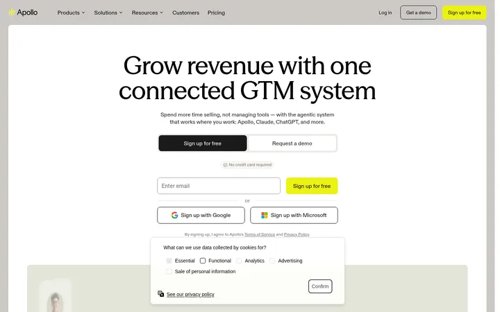
Hero actions
Centered hero copy paired with two rounded actions: an orange-accent Talk to Apollo link and a quiet outlined secondary action.
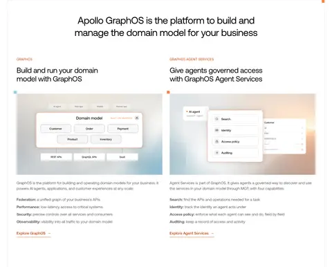
Product feature cards
Two-column GraphOS feature presentation with eyebrow labels, Aeonik headings, product imagery, concise descriptions, and text links.
Customer testimonial card
White quote card with a thin #d1d1d1 outline, 16px radius, 32px padding, attribution, and customer logo.
Primary CTA
Strong orange, fully rounded action; lower-page CTA sits over a cyan-to-warm gradient background.
Footer link columns
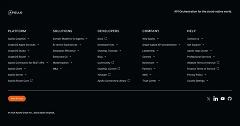
Near-black footer with Apollo identity, multiple grouped link columns, thin divider, and compact social and legal details.
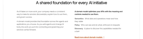
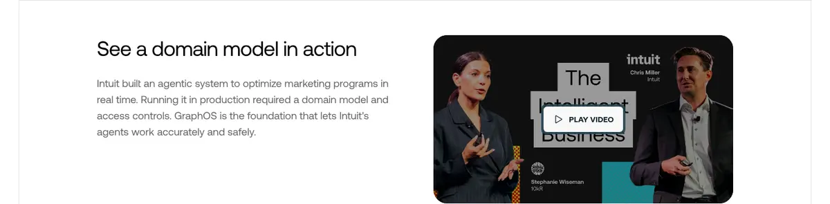
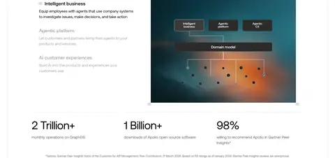
Imagery · The hero uses a dark, atmospheric network visual behind centered text, with customer logos arranged beneath. Product sections use interface screenshots, diagrams, and a video thumbnail, typically paired with explanatory copy rather than filling the viewport. A later architecture graphic carries cyan, teal, and warm orange hues; treat those as illustration colours, not the main site palette. Testimonial cards rely on text, attribution, and customer marks.
Open with a near-black hero and high-contrast centered message.
Use Apollo Orange #e75e15 for primary actions, not large content panels.
Pair product explanations with interface imagery or diagrams.
Keep section headings crisp, regular-weight, and generously separated.
Use thin neutral borders to define cards and content transitions.
Reserve bright cyan and warm gradients for graphics and the closing CTA.
✕ 不该做
Don't turn the mostly white content body into a sequence of coloured bands.
Don't use orange as the default text or paragraph colour.
Don't crowd the hero with extra elements around its central message.
Don't add heavy drop shadows to ordinary cards.
Don't treat illustration colours as the core brand palette.
Don't replace product diagrams with unrelated lifestyle photography.
给 AI 的提示词
想快速出一个同风格的新页面,把这段话连同 DESIGN.md 一起发给 AI。
Build a new Apollo-style SaaS page with a cinematic #02060a hero, white headline and quiet supporting copy, then transition into spacious white editorial sections. Use Gallery White #ffffff as the main canvas, Cloud Surface #f8f8f8 for occasional muted areas, and Apollo Orange #e75e15 only for primary actions. Use Rust Link #c74100 for text links and Rule Gray #d1d1d1 for fine borders. Set headings and body in a clean Aeonik-like sans, with Inter-like navigation, captions, and controls. Arrange product stories in centered introductions and two-column layouts, pairing concise copy with interface screenshots or diagrams. Keep cards lightly outlined, use rounded pill CTAs, and finish with a near-black multi-column footer. Bright cyan and warm gradient colours belong in graphics or the closing CTA, not everywhere.