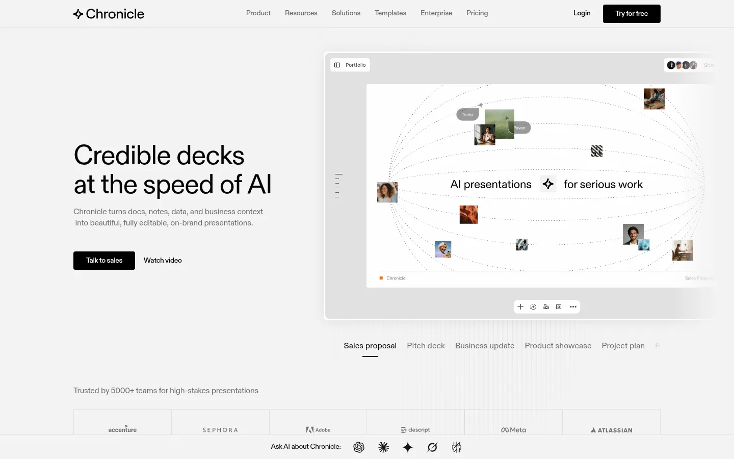
Chronicle 首页以克制的黑白灰界面,衬托 AI 演示文稿产品的大幅预览。编辑式排版、充足留白和清晰分区,让访客聚焦演示效果及其商务应用。
North star · Keep the interface nearly monochrome and spacious, letting polished presentation previews provide the visual color and proof.
The page uses a soft light-gray canvas (#f3f3f3) throughout, keeping its long product story visually continuous rather than dividing it into strongly colored bands. Black (#000000) anchors headlines, navigation, and primary buttons; gray text provides quieter supporting copy. White cards and pale gray frames separate product previews, logos, testimonials, and template examples without adding visual clutter. Diatype is used across the page in a restrained, modern editorial voice: large regular-weight headlines, compact navigation, and readable supporting text, with slightly tight tracking in most roles. A wide central content area supports alternating split layouts, feature grids, and horizontal showcases. Spacing is comfortable and sections have room to breathe. Product imagery supplies the color: screenshots, charts, templates, and occasional photography sit inside clean neutral frames. Subtle borders and restrained shadows distinguish layered media from the flat page surface.
Used throughout for headlines, body copy, navigation, captions, and buttons.
角色
示例
字号
字重
行高
字距
一级标题
Hero headline and primary page-level statement.
Chronicle
54px
400
1.05
-0.03em
二级标题
Major section headings for features, templates, and testimonials.
Chronicle
48px
400
1.05
-0.03em
三级标题
Feature titles and secondary content headings.
Chronicle
32px
400
1.1
-0.03em
四级标题
Compact card headings and smaller section labels.
The quick brown fox 敏捷的狐狸
20px
400
1.2
-0.02em
正文
Supporting descriptions, explanatory copy, and testimonial text.
The quick brown fox 敏捷的狐狸
16px
400
1.4
-0.02em
辅助文字
Small labels, metadata, and compact image or card annotations.
The quick brown fox 敏捷的狐狸
14px
500
1.4
-0.02em
按钮
Primary CTA labels and other actionable controls.
The quick brown fox 敏捷的狐狸
16px
400
1.4
0
导航
Header navigation and footer navigation links.
The quick brown fox 敏捷的狐狸
16px
400
1.4
-0.02em
间距与布局
基准单位 4px · 密度:适中
90px版块间距
8px元素间距
3px卡片内边距
1152px内容最大宽度
2px
3px
4px
8px
10px
12px
16px
20px
24px
30px
32px
48px
58px
60px
128px
A wide, centered content area is organized into clear sections, with a measured page max width of 1152px. The hero uses a two-column composition: left-aligned copy and actions beside a large product preview. Subsequent sections alternate split layouts, multi-column feature grids, and horizontal showcases. Headlines align to the start of their content blocks, while the closing CTA centers above the footer. Comfortable spacing and a measured section gap of 90px create a calm, low-density rhythm.
圆角与层次
按钮 · 2px
卡片 · 4px
图片 · 4px
导航 · 8px
链接 · 4px
lg · media, other
md · card
lg · media
The overall page remains flat, with light hairlines and pale media framing doing most of the separation. White cards and product previews sit just above the canvas, sometimes with measured soft shadows. Use shadows selectively on prominent media or cards; avoid heavy outlines, layered effects, or colored glows.
组件
下面的预览按实测的按钮、输入框、徽标、卡片样式重建(字体用替代字体)。
Top navigation
Compact, light header with the Chronicle mark, centered links, login text, and a black filled Try for free button.
Hero copy and actions
Large left-aligned headline, muted explanatory text, a black Talk to sales CTA, and a simple Watch video action.
Hero product preview
Large presentation editor mockup shown in a pale gray frame, paired with selectable deck-type labels beneath.
Feature panel
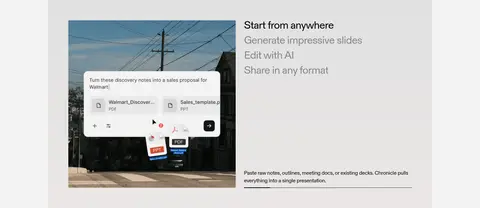
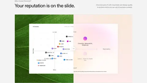
Neutral product showcase with a media preview beside a short list of workflow stages and supporting copy.
Business feature grid
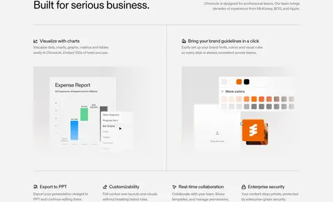
Thin dividers organize concise business capabilities and larger interface examples on an otherwise open canvas.
Template carousel
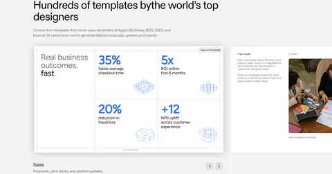
Wide deck examples and compact category labels form a horizontally browsable product showcase.
Testimonial cards
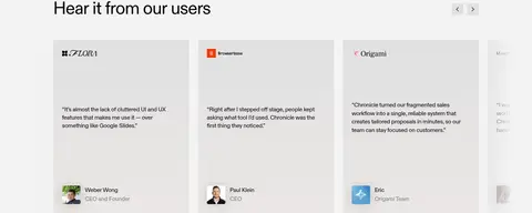
Pale neutral cards use small customer marks, brief quotes, and compact profile details.
Footer link columns
A restrained brand signature sits beside grouped product, company, and social links.
Imagery · Product imagery is the page’s main source of visual variety: presentation screenshots, interface previews, chart examples, templates, and brand-guideline demonstrations. Large media is framed in light neutral panels with clean edges, while the template and testimonial areas use horizontal collections of examples or cards. A few photographic images appear inside product mockups; treat them as content within the presentation rather than as the website’s main art direction.
Let product previews supply most of the page’s visual variety.
Keep section layouts spacious, structured, and easy to scan.
Use restrained gray hairlines around media and cards.
Keep typography regular-weight and naturally cased.
✕ 不该做
Do not introduce bright brand colors into the surrounding interface.
Do not turn each section into a strongly colored background band.
Do not crowd the hero or feature sections with dense copy.
Do not use heavy borders or dramatic shadows on every card.
Do not make headlines bold, condensed, or all caps.
Do not treat mockup photography as the primary website imagery.
给 AI 的提示词
想快速出一个同风格的新页面,把这段话连同 DESIGN.md 一起发给 AI。
Build a new Chronicle-style SaaS page with a quiet monochrome interface and product-led storytelling. Use Soft Canvas (#f3f3f3) as the continuous background, Pitch Black (#000000) for headings and primary CTAs, Quiet Gray (#6b6b6b) for supporting text, Divider Gray (#e2e2e2) for hairlines, and Gallery White (#ffffff) inside cards and product previews. Use a Diatype-like sans serif such as Inter, regular weights, natural casing, and restrained tight tracking on large headings. Set a wide centered content area, with an editorial split hero, spacious alternating feature layouts, and selective grids or horizontal examples. Make polished product screenshots the visual focus. Keep the elevation subtle, using pale frames, thin dividers, and soft shadows only where media needs depth. Preserve generous whitespace and concise copy.