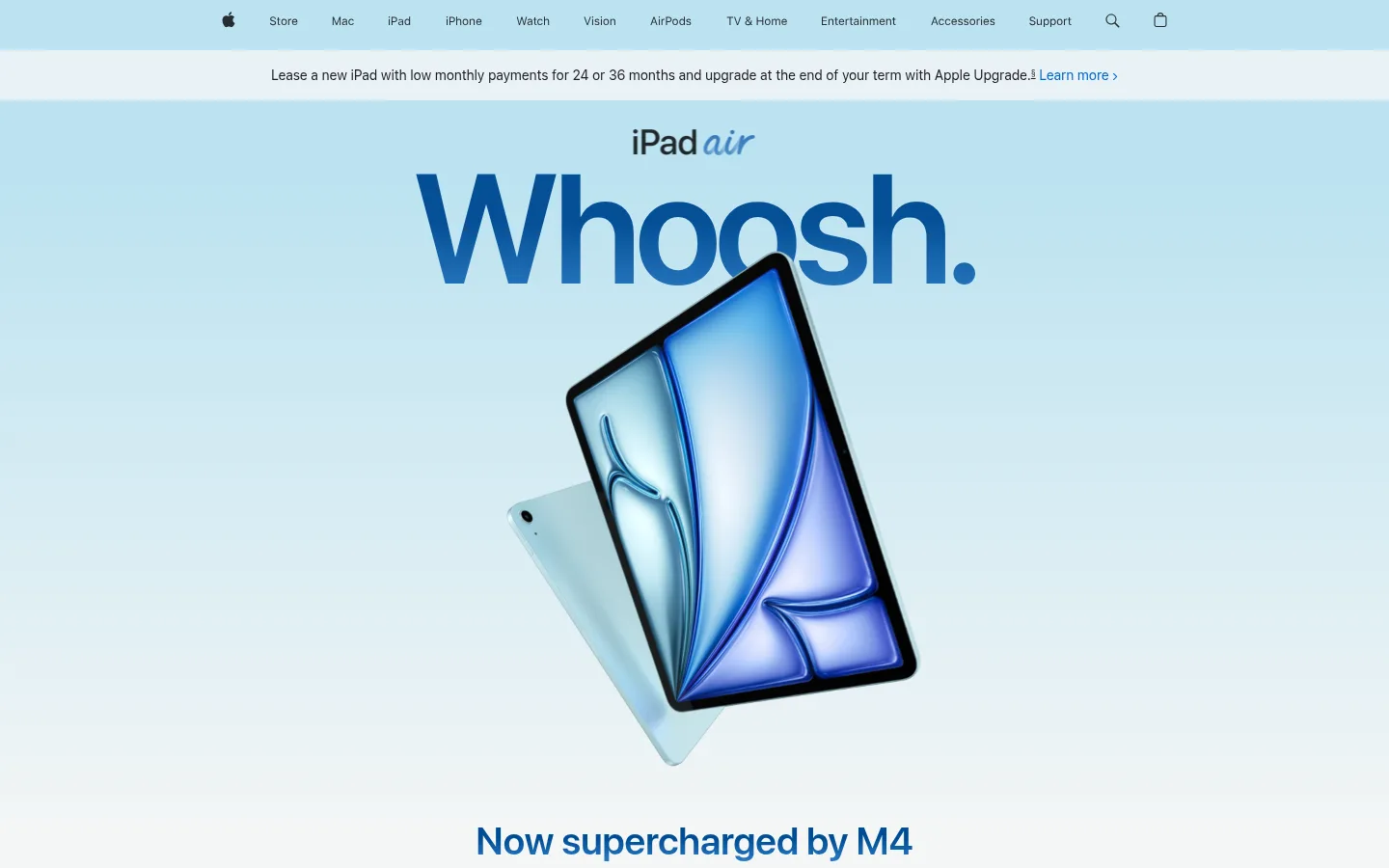
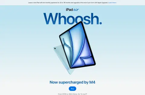
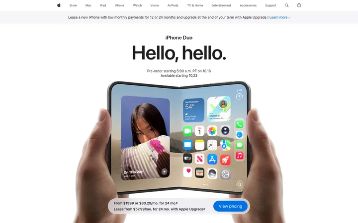
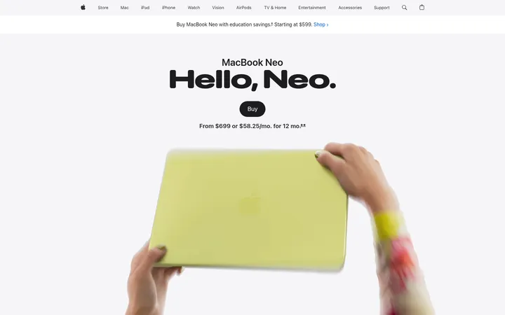
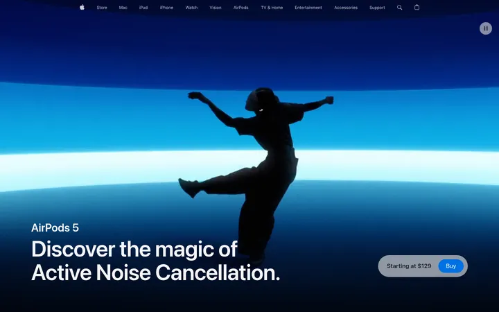
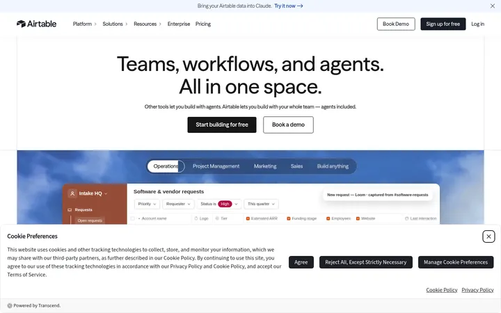
这是一张篇幅开阔的 iPad Air 产品发布页,用醒目的大标题、悬浮产品视觉和充足留白展开叙事。冷调浅色画布与克制的蓝色强调贯穿页面,产品界面和视频则直观呈现功能。
North star · Let oversized product imagery and crisp, spacious typography carry the story, with blue used sparingly to guide attention.
The page is built on a cool, very pale gray-green canvas (#f3f6f6), with white surfaces reserved for clean contrast rather than heavy section banding. Black and muted gray carry most copy; saturated blues mark purchase actions, links, and selected headline treatments. Pale cyan and blue gradients appear prominently in the hero and selected feature headings, but much of this color belongs to product artwork and should not be applied as a universal background. SF Pro Display gives headlines a bold, compact, editorial presence, while SF Pro Text handles navigation, copy, and controls. The layout alternates oversized centered product moments with quieter explanatory passages, using generous vertical gaps and broad media compositions. Product renders, device screens, and video are the main visual material; text remains concise and subordinate to them. Rounded CTA pills and occasional softly rounded white cards add gentle containment without introducing a dense border system.
配色
点色块复制色值。用途说明来自对页面的实测位置(背景、文字、描边、按钮)与截图判读。
品牌色
强调色
表层色
中性色
功能色
页面底色 · Air Mist表层 · Gallery White主文字 · Display Ink次要文字 · Quiet Graphite强调 · Action Blue强调 2 · Deep Current强调 3 · Clearwater Blue
Oversized hero and section headlines, display statements, and prominent feature links.
Aa 设计
SF Pro Text
网络字体 · 字重 400 / 600 · 占比 14%
免费替代:Inter
Navigation, body copy, captions, button labels, and small supporting information.
角色
示例
字号
字重
行高
字距
特大标题
Oversized hero wordmark-style headline, such as “Whoosh.”
Apple
160px
600
0.88
-0.04em
一级标题
Primary product or feature headline at the start of a story.
Apple
80px
600
1.05
-0.015em
二级标题
Major feature section headings and prominent statements.
Apple
56px
600
1.07
-0.005em
三级标题
Supporting feature headlines and compact display messages.
Apple
40px
600
1.1
0
四级标题
Smaller secondary headings within feature storytelling.
Apple
34px
600
1.47
-0.011em
正文
Concise explanatory product copy and supporting details.
The quick brown fox 敏捷的狐狸
14px
400
1.43
-0.016em
辅助文字
Small image captions, footnotes, and interface labels.
The quick brown fox 敏捷的狐狸
12px
400
1
-0.01em
按钮
Purchase CTA text and prominent interactive controls.
The quick brown fox 敏捷的狐狸
17px
400
1.24
-0.022em
导航
Global navigation labels and compact utility text.
The quick brown fox 敏捷的狐狸
12px
400
1
-0.01em
链接
Prominent feature links and secondary calls to learn more.
The quick brown fox 敏捷的狐狸
21px
600
1.38
0.011em
间距与布局
基准单位 4px · 密度:适中
70px版块间距
20px元素间距
—卡片内边距
1260px内容最大宽度
4px
6px
8px
10px
15px
16px
20px
21px
22px
28px
30px
40px
70px
72px
90px
100px
Use a centered, wide content frame with a measured maximum width of 1260px and a comfortable density. The page keeps a single pale canvas across long sections, varying alignment between centered headline-and-product compositions and structured feature layouts. Sections breathe with a measured 70px section gap and elements with a 20px gap; larger vertical pauses are especially noticeable around media. Product imagery can span broadly or sit in asymmetric editorial arrangements, while text blocks stay comparatively narrow.
圆角与层次
按钮 · 9999px
卡片 · 28px
lg · card
The system is mostly flat: pale canvas, strong type, and media provide hierarchy rather than outlines. White feature cards are occasional islands, with large corner rounding and a very soft, broad shadow. Avoid relying on hairlines or stacked panel borders; use spacing and overlapping device renders to establish depth.
组件
下面的预览按实测的按钮、输入框、徽标、卡片样式重建(字体用替代字体)。
Global navigation
Compact horizontal Apple navigation over the pale page top, with restrained dark labels and utility icons.
Announcement strip
A slim centered financing message with a muted text treatment and blue Learn more link.
Product purchase CTA
Blue pill-shaped Buy control with white SF Pro Text; the primary purchase action is visually distinct but compact.
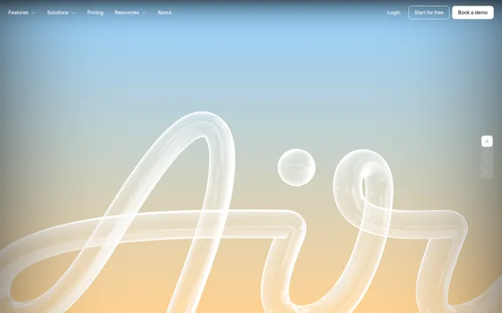
Hero product stage
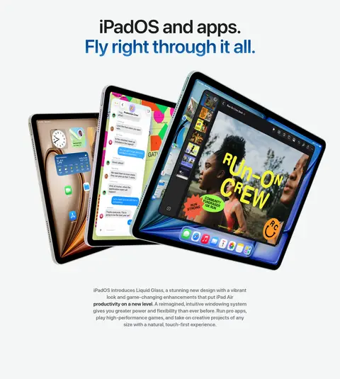
Large blue-toned headline above overlapping iPad renders, followed by a centered feature statement and purchase details.
Feature media card
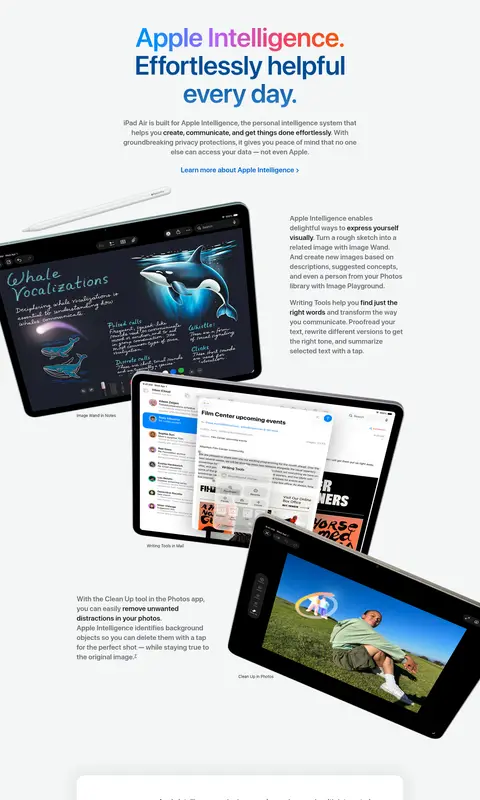
Broad video or image presentation with softly rounded corners; overlay concise explanatory text where appropriate.
Feature storytelling
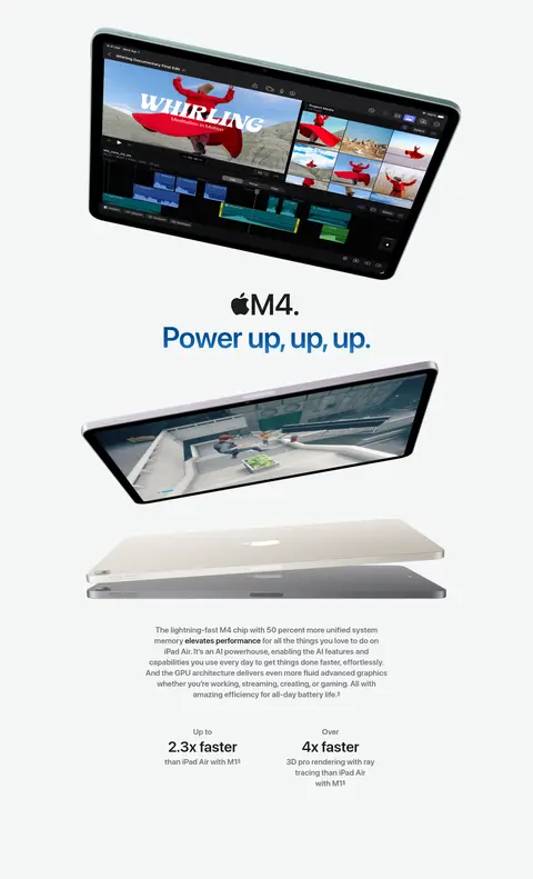
Centered display heading paired with a large device composition and short supporting copy.
Privacy callout
White rounded card with a soft diffuse shadow, colorful Apple Intelligence icon, and compact explanatory text.
Model selector
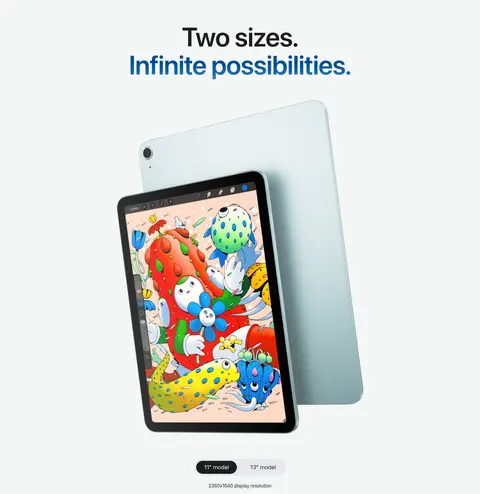
Compact controls below product imagery distinguish the 11-inch and 13-inch model options.
Imagery · Lead with polished 3D product renders, often isolated against pale space or layered at expressive angles. Use device screens and interface mockups to make software features tangible, and incorporate video as an in-context demonstration. Keep hardware silhouettes crisp, shadows soft, and screen imagery vivid; colorful content inside the screens is illustrative and should not redefine the site palette.
Give each feature section generous breathing room.
Use large, tightly tracked display headlines.
Let device imagery dominate its story beat.
Reserve Action Blue for clear interaction cues.
Use gradients selectively for product storytelling.
✕ 不该做
Do not add unmeasured colors or decorative borders.
Do not turn every section into a white card.
Do not fill open space with extra copy.
Do not use gradients as a universal page background.
Do not treat colorful screen content as brand UI color.
Do not crowd product renders with controls.
给 AI 的提示词
想快速出一个同风格的新页面,把这段话连同 DESIGN.md 一起发给 AI。
Build a new product-story page in Apple’s iPad Air visual style. Use Air Mist (#f3f6f6) as the continuous canvas, Display Ink (#1d1d1f) for primary text, and Quiet Graphite (#6e6e73) for supporting copy. Use Action Blue (#0071e3) for the main CTA and Link Blue (#0066cc) for inline links. Set display headlines in SF Pro Display or a close Inter substitute, with bold weight and tight tracking; use SF Pro Text or Inter for navigation and body copy. Create spacious, editorial sections that alternate centered headlines, carefully composed product imagery, and concise explanations. Keep gradients such as Glacier Tint (#c6e6f1) and Sky Glass (#bbe2f0) localized to appropriate visual moments. Favor clean, mostly flat surfaces, pill CTAs, and occasional softly rounded white cards. Treat screen artwork as imagery, not interface palette.