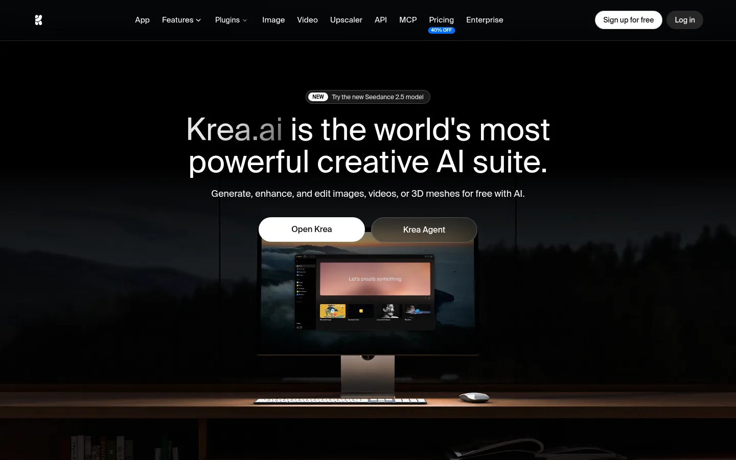
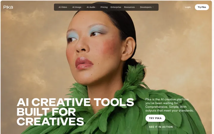
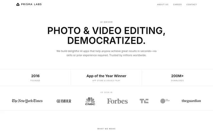
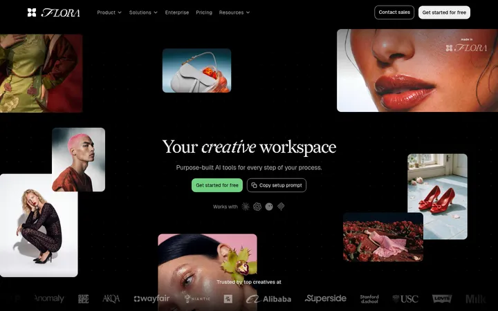
Krea 首页以近乎纯黑的界面,突出介绍其创意 AI 工具套件。柔和暗调的桌面产品场景构成首屏焦点,白色文字与按钮保持克制,让用户专注于产品信息和演示。
North star · Treat deep black as the stage, then use centered white typography and one atmospheric product image to direct attention.
The visual identity is defined by a near-black, full-bleed hero rather than by the crawler’s nominal white canvas: the screenshot shows a black header and dark landscape image filling the first viewport. White is reserved for the logo, navigation, headline, supporting copy, and the prominent Open Krea pill, creating crisp contrast without a vivid accent palette. Suisse Intl keeps the large centered headline clean and contemporary; supporting text and compact navigation remain subordinate. A slim hairline separates navigation from the hero. The hero stacks a small announcement chip, a two-line headline, a short explanatory sentence, and paired actions above a wide desktop-on-desk product image. The image’s warm wood and subdued screen colors are photographic content, not core brand colors. Generous vertical breathing room and full-bleed media give the sparse interface a cinematic, premium feel; rounded controls and quiet borders soften the otherwise flat black surfaces.
配色
点色块复制色值。用途说明来自对页面的实测位置(背景、文字、描边、按钮)与截图判读。
表层色
中性色
功能色
页面底色 · Studio White表层 · Night Slate表层 2 · Deep Stage表层 3 · Mist Gray表层 4 · Charcoal Edge主文字 · Soft Graphite次要文字 · Studio White弱文字 · Pale Signal描边 · Charcoal Edge
All interface typography, including the display headline, navigation, body copy, links, and buttons.
角色
示例
字号
字重
行高
字距
特大标题
Large centered hero headline.
Krea
60px
400
1.05
0
一级标题
Prominent page heading or section heading.
Krea
30px
500
1.25
-0.015em
二级标题
Supporting hero sentence and secondary section copy.
The quick brown fox 敏捷的狐狸
18px
400
1.56
0
正文
General interface and explanatory text.
The quick brown fox 敏捷的狐狸
14px
400
1.43
0
辅助文字
Compact labels and minor supporting details.
The quick brown fox 敏捷的狐狸
12px
400
1.33
0
按钮
Primary and secondary action labels.
The quick brown fox 敏捷的狐狸
14px
450
1.43
0
导航
Top-level navigation items.
The quick brown fox 敏捷的狐狸
14px
400
1.43
0
链接
Small announcement and supporting links.
The quick brown fox 敏捷的狐狸
12px
400
1.33
0
眉题
Short uppercase section or status label.
The quick brown fox 敏捷的狐狸
12px
500
1.33
0.1em
间距与布局
基准单位 4px · 密度:宽松
108px版块间距
8px元素间距
—卡片内边距
1312px内容最大宽度
2px
4px
8px
10px
12px
16px
18px
20px
24px
28px
32px
40px
44px
The first viewport uses a full-width dark canvas with a slim horizontal navigation row and a centered hero beneath it. The hero content is deliberately narrow relative to the screen: announcement, headline, description, and paired actions align on the center axis, followed by a wide, full-bleed product photograph. Measured page max width is 1312px, with a spacious density and a pronounced section gap. Keep the composition open and avoid adding dense card grids to this introductory block.
圆角与层次
按钮 · 9999px
徽标 · 9999px
导航 · 8px
链接 · 9999px
inset · button
The interface is predominantly flat, with no pronounced card shadows. Thin, low-contrast borders define the navigation edge and dark announcement pill, while rounded controls provide the clearest component separation. Use layering mainly in the hero media, where image detail emerges gradually from the black background.
组件
下面的预览按实测的按钮、输入框、徽标、卡片样式重建(字体用替代字体)。
Top navigation
Single horizontal row on black, with a compact white mark, white text links, and right-aligned pill actions; a fine divider separates it from the hero.
Announcement pill
Small dark rounded link with a subtle outline, a white NEW badge, and concise model-update text.
Hero headline
Large, regular-weight white Suisse Intl text centered and broken into two balanced lines.
Primary action
White rounded Open Krea button with black text; it is the strongest interface control by contrast.
Secondary action
Dark translucent Krea Agent pill placed beside the primary action, visually quieter against the image.
Product showcase image
Wide, dark desktop scene below the hero actions, showing a monitor with the Krea interface and blending into the surrounding black.
Imagery · A large cinematic photograph shows a desktop monitor on a desk against a dim landscape-like backdrop. The monitor displays the product interface, making the image a real product demonstration rather than decorative illustration. Keep the frame wide, dark, and softly blended into the black canvas; warm desk tones remain inside the image and should not become interface accents.
Place a single atmospheric product demo below the hero actions.
Keep navigation compact and horizontally aligned.
Use rounded pills with restrained outlines.
✕ 不该做
Do not introduce a bright accent color.
Do not turn photographic colors into interface tokens.
Avoid card-heavy layouts in the hero.
Do not add conspicuous shadows or gradients to controls.
Avoid left-aligning the central hero message.
Do not crowd the first viewport with extra copy.
给 AI 的提示词
想快速出一个同风格的新页面,把这段话连同 DESIGN.md 一起发给 AI。
Build a new page in Krea’s visual style using a near-black Deep Stage (#000000) canvas and a quiet Night Slate (#0b0f15) range for dark surfaces. Use Studio White (#ffffff) for the main headline, navigation, and primary CTA; secondary copy may use Pale Signal (#eaeaea). Set all text in a clean Suisse Intl-like sans serif, using restrained weights and clear hierarchy. Create a compact horizontal navigation with a subtle charcoal divider, then a spacious centered hero with a small outlined announcement pill, concise headline, short description, and paired rounded actions. Place one wide, atmospheric product photograph beneath the actions, blending its dark edges into the canvas. Keep borders subtle, shadows minimal, and the composition open rather than card-heavy.