North star · Make finance feel calm and tangible: let oversized editorial type introduce each idea, then show the real interface on a warm, spacious canvas.
The page is built around a warm off-white canvas (#f7f5f2), with soft gray-beige section bands (#eeebe8) and restrained white product surfaces. Dark plum ink (#241e2b) gives headings and primary actions a strong but gentle contrast; muted gray-purple supports secondary copy. Lavender and mint appear as compact highlights, section labels and details inside product screens, with coral and lime used sparingly for labeled accents rather than as broad backgrounds. Saans VF provides a clean, contemporary sans-serif voice, pairing very large, tightly tracked display headlines with lighter, readable body text. The layout alternates editorial text-and-product compositions with broad, quiet section bands. Screenshots are large and crisp, often framed like application windows, while a cinematic lifestyle video anchors the opening. Generous vertical breathing room keeps the long page from feeling like a dense financial dashboard.
All page typography, from display headlines and navigation to body copy, labels and buttons.
角色
示例
字号
字重
行高
字距
特大标题
Oversized section and hero headlines.
Era
56px
500
1.06
-0.025em
一级标题
Supporting primary heading or lead statement.
The quick brown fox 敏捷的狐狸
24px
400
1.35
-0.015em
正文
Introductory and explanatory paragraphs.
The quick brown fox 敏捷的狐狸
16px
380
1.55
0
辅助文字
Compact labels, notes and helper copy.
The quick brown fox 敏捷的狐狸
12px
400
1.55
0
按钮
Primary and secondary CTA labels.
The quick brown fox 敏捷的狐狸
13px
500
1.55
0
导航
Navigation links and compact menu labels.
The quick brown fox 敏捷的狐狸
13px
500
1.4
0
链接
Inline text links and supporting actions.
The quick brown fox 敏捷的狐狸
14px
380
1.2
0
间距与布局
基准单位 8px · 密度:适中
64px版块间距
12px元素间距
—卡片内边距
1320px内容最大宽度
4px
8px
12px
16px
20px
24px
Use a centered content area with a measured maximum width of 1320px and comfortable density. The opening pairs a large lifestyle-media banner with compact navigation rows, followed by an editorial hero with left-aligned copy and a large product interface to the right. Subsequent feature sections repeat text-and-screenshot compositions, sometimes over a softly contrasting band. Keep the section rhythm generous, with a measured 64px section gap and smaller 12px element gaps. Align headings consistently to the content column and let product screenshots occupy substantial visual area.
圆角与层次
按钮 · 6px
卡片 · 10px
图片 · 2px
链接 · 5px
xl · card
hairline · other
lg · card
hairline · text, badge
The overall system is quiet and mostly flat, using fine measured borders to define section edges and product surfaces. Large application mockups gain separation through soft, broad shadows rather than heavy outlines. Cards use gently rounded corners, while small media and controls keep their edges comparatively restrained.
组件
下面的预览按实测的按钮、输入框、徽标、卡片样式重建(字体用替代字体)。
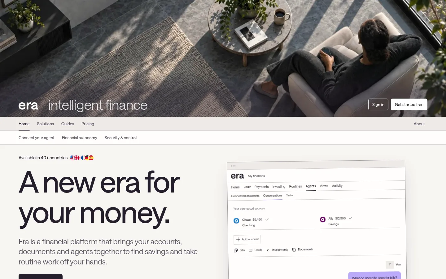
Opening media banner
Full-bleed lifestyle video on a near-black band, overlaid with the Era wordmark and compact sign-in and primary-action buttons.
Two-row navigation
A pale horizontal navigation row sits below the media banner, followed by a second row of in-page product links; use muted text and fine separators.
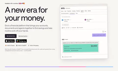
Editorial hero
Place a large dark headline and supporting copy beside a prominent financial dashboard screenshot, with a dark primary CTA and understated text link.
Feature section label
Use a compact lavender, mint, coral or lime label to identify a feature; keep the color local and pair it with dark text.
Product window
Show detailed white dashboard mockups with a fine border and soft shadow, giving the financial UI enough scale to read as the evidence for the feature.
Primary CTA
Use a #241e2b fill with #f7f5f2 text, a 6px radius and medium Saans VF lettering; keep secondary links visually quieter.
Imagery · A cinematic, full-bleed lifestyle video opens the page, showing a relaxed person in a home setting. The rest of the page relies on crisp, large product screenshots presented as browser-like financial dashboards. Keep these mockups bright and legible, with gentle shadows and subtle borders; use accent color mainly within the interface rather than adding decorative illustration or 3D imagery.
Set headlines in large, tightly tracked dark Plum Ink (#241e2b).
Pair feature copy with a substantial product screenshot.
Use Soft Putty (#eeebe8) to distinguish selected section bands.
Reserve lavender, mint, coral and lime for small accents.
Keep generous vertical breathing room between feature blocks.
✕ 不该做
Do not turn accent colors into large dominant backgrounds.
Do not crowd the page with dense dashboard-like content.
Do not use heavy borders around product screenshots.
Do not make secondary navigation compete with the headline.
Do not replace the warm neutral palette with stark pure white.
Do not add decorative gradients or unsupported color effects.
给 AI 的提示词
想快速出一个同风格的新页面,把这段话连同 DESIGN.md 一起发给 AI。
Build a new page in Era’s calm, editorial fintech style. Use Warm Paper (#f7f5f2) for the primary canvas, Soft Putty (#eeebe8) for selected section bands, and Plum Ink (#241e2b) for headings, body text and the primary CTA. Use Saans VF or a close sans-serif substitute, with oversized tightly tracked headlines and lighter readable paragraph copy. Keep navigation compact and muted. Structure the page as spacious editorial sections that pair concise text with large, crisp financial product screenshots. Give screenshots subtle borders and soft shadows rather than heavy framing. Use Soft Lavender (#bbaaf9), Mint Signal (#77dac1), Peach Note (#ffb28d) and Lime Note (#d9eb68) only for compact labels or interface details. Maintain generous vertical breathing room and a calm, legible hierarchy.