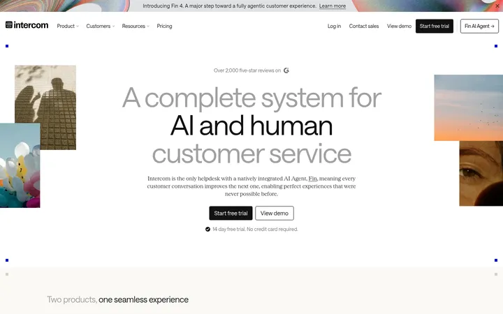
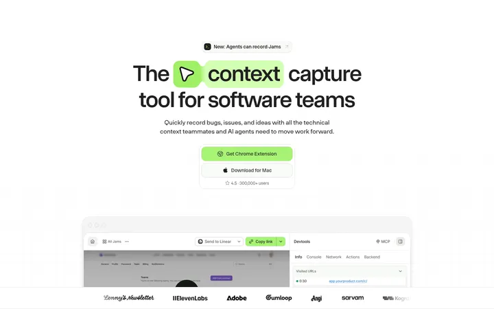
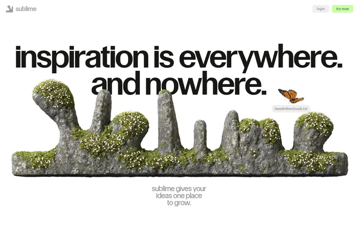
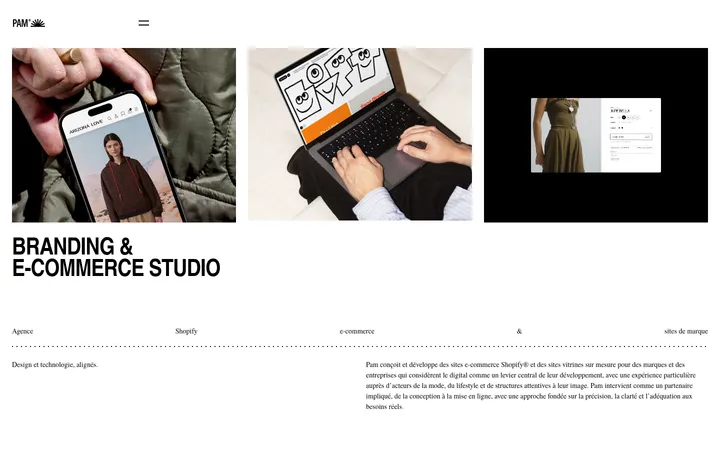
North star · Use a quiet, spacious editorial canvas and let dark imagery and lime CTAs provide the page’s few high-impact contrasts.
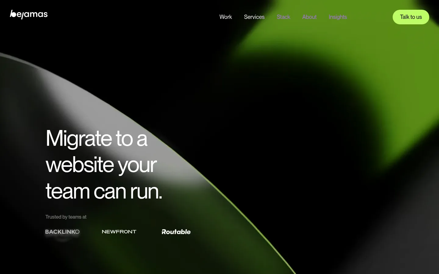
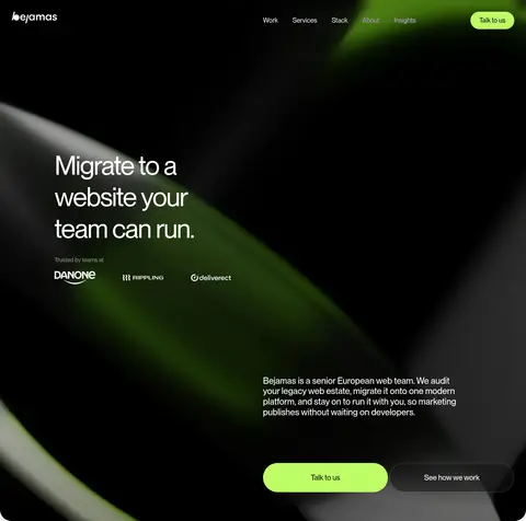
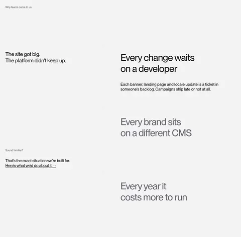
The visual system contrasts a near-black opening with a soft cool-gray canvas for most of the page. Bright lime is reserved for the primary “Talk to us” action, so it reads clearly without competing with the content. Use NeueMontreal throughout: large, lightly weighted headlines with tight negative tracking establish an editorial voice, while body copy and compact labels stay understated. The opening hero layers white type and navigation over abstract, blurred black-and-green imagery; later sections return to clean, mostly flat surfaces. Content is arranged in broad two-column compositions with generous vertical pauses: service explanations, an asymmetric project gallery, a dark testimonial panel, and a centered closing CTA. Project cards bring their own photography and colors, but remain contained within the neutral page system. Fine gray rules and softly rounded cards structure content without relying on shadows. Keep the page airy, direct, and focused on a small number of strong visual contrasts.
Site-wide type for display headings, body copy, navigation, labels, links, and buttons.
角色
示例
字号
字重
行高
字距
特大标题
Large hero statement and standout campaign-style messaging.
Bejamas
72px
400
1.2
-0.035em
一级标题
Primary page headline and prominent closing statement.
Bejamas
56px
500
1.18
-0.025em
二级标题
Major section titles and large content statements.
Bejamas
32px
500
1.18
-0.02em
三级标题
Feature or subsection headings.
Bejamas
30px
500
1.5
0
四级标题
Compact card and supporting section headings.
The quick brown fox 敏捷的狐狸
24px
500
1.2
0
正文
Paragraphs, service explanations, and testimonial copy.
The quick brown fox 敏捷的狐狸
16px
500
1.5
0
辅助文字
Small project metadata and subdued supporting labels.
The quick brown fox 敏捷的狐狸
14px
400
1.43
0
按钮
Primary CTA labels such as “Talk to us.”
The quick brown fox 敏捷的狐狸
20px
500
1.4
0
导航
Header navigation links over the hero.
The quick brown fox 敏捷的狐狸
18px
400
1.56
0
链接
Large service links and prominent text actions.
The quick brown fox 敏捷的狐狸
24px
500
1.2
-0.015em
间距与布局
基准单位 8px · 密度:宽松
128px版块间距
4px元素间距
—卡片内边距
608px内容最大宽度
2px
4px
5px
6px
8px
10px
16px
20px
24px
32px
40px
46px
48px
64px
80px
105px
The page uses a spacious, centered content system with a measured 608px page maximum and broad two-column arrangements. The hero is full-bleed, while the light sections align content to consistent edges. The service list and project gallery use split layouts; project cards vary in visual size and imagery. Large section gaps create deliberate pauses, and the density stays low outside the case-study gallery and footer link groups. Align headings and copy to the start, reserving centered alignment for the closing CTA.
圆角与层次
按钮 · 9999px
卡片 · 18px
导航 · 9999px
链接 · 18px
没有测到阴影:页面是扁平的,层次靠底色和描边区分。
The interface is predominantly flat, with no measured shadow system. Use surface contrast and fine pale borders to separate content rather than floating panels. Cards have softly rounded corners, while the lime CTA is pill-shaped. The hero and testimonial create depth through dark media, overlays, and white text, not conventional drop shadows.
组件
下面的预览按实测的按钮、输入框、徽标、卡片样式重建(字体用替代字体)。
Primary CTA
Pill-shaped Signal Lime (#befc65) button with Soft Black (#131314) NeueMontreal text; the recurring label is “Talk to us.”
Hero navigation
Logo and compact links sit directly over the dark hero media; links use light text for contrast and the CTA remains lime.
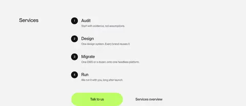
Service steps
Four numbered entries—Audit, Design, Migrate, Run—pair concise headings with smaller explanatory copy and a simple list structure.
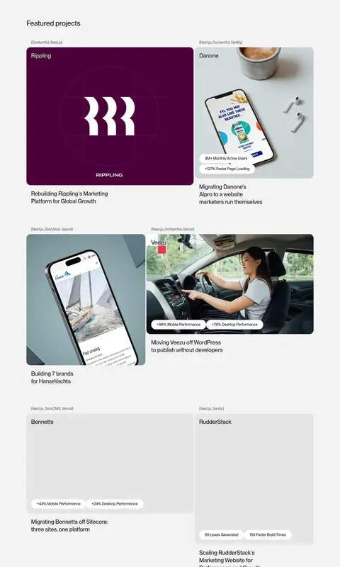
Project cards
Rounded case-study media cards combine client or platform metadata, imagery, and brief results or project descriptions.
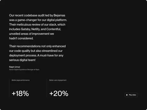
Testimonial panel
A broad dark section combines client quotation, attribution, performance figures, and a video control in a two-column composition.
Closing CTA
Centered statement on the pale canvas followed by a small lime pill button, separated from surrounding content by generous whitespace.
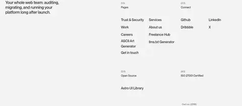
Footer
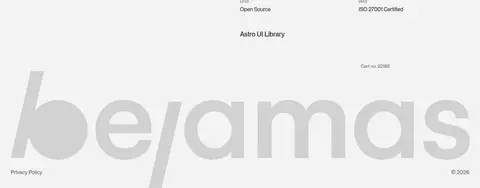
Pale two-column footer pairs a short positioning statement with grouped navigation links and an oversized, pale brand wordmark.
Imagery · The hero uses full-bleed abstract, blurred black, gray, and green media behind the navigation and headline. Project cards contain varied client imagery, including device mockups and photography; treat these as case-study assets rather than brand palette references. A testimonial uses dark video-led framing. Keep imagery cropped within rounded card boundaries and avoid adding decorative illustrations unsupported by the page.
Keep the main canvas cool and light outside dark media sections.
Reserve Signal Lime (#befc65) for the primary action.
Use Soft Black (#131314) for strong text and dark panels.
Give headings tight tracking and clear editorial hierarchy.
Use generous vertical pauses between major content blocks.
Contain client imagery within the project gallery.
✕ 不该做
Do not turn the whole page into a dark interface.
Do not use lime as a large decorative background.
Do not add shadows to otherwise flat cards.
Do not force every project image into the brand palette.
Do not crowd the content with extra labels or controls.
Do not use centered alignment for every section.
给 AI 的提示词
想快速出一个同风格的新页面,把这段话连同 DESIGN.md 一起发给 AI。
Build a new Bejamas-style agency page with NeueMontreal or Inter, using an airy editorial hierarchy and spacious two-column sections. Set the main canvas to Cool Canvas (#f3f3f4), use Soft Black (#131314) for key text and occasional dark panels, and reserve Signal Lime (#befc65) for pill-shaped primary CTAs with dark labels. Begin with a full-bleed abstract dark hero and legible light navigation. Keep later sections mostly flat, using subtle gray separators and rounded project cards rather than shadows. Mix concise service steps, a varied client case-study gallery, and a dark testimonial block with a centered closing CTA. Treat client imagery as independent content, not as a source for the site palette. Preserve generous whitespace and align most copy to the left.