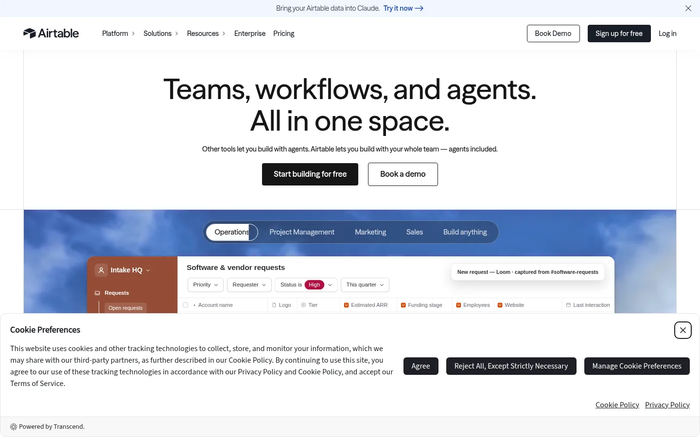
Airtable 首页以大面积白色画布和居中的文字主视觉开场,再用醒目的产品界面展示补足信息。黑色 CTA、模块化客户案例与深绿色产品区块,共同串联品牌主张和产品证明。
North star · Keep the interface calm and white, then let authentic product UI and a single deep-green showcase band provide the visual drama.
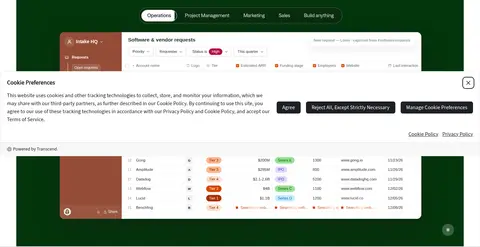
The page is built on a predominantly white canvas, with ink-dark typography and restrained gray supporting text. The hero is centered and spacious: a large, two-line headline sits above concise copy and paired black-filled and outlined CTAs. ATSeasonSans gives the main message a distinctive, rounded sans-serif voice; the overall type treatment stays clean and unornamented. A deep-green, full-width product-showcase band creates the strongest change of mood, framing a dense, realistic Airtable interface against saturated imagery. Below it, narrow logo proof and a broad customer-story area use thin dividers and carefully separated content zones to restore a quieter rhythm. Orange accents appear in product data and highlighted details rather than defining the page’s main interface palette. The footer returns to white and organizes many links into compact columns. Spacing alternates between open hero and customer-story areas and denser interface and footer regions, keeping the long page legible without relying on heavy decoration.
配色 点色块复制色值。用途说明来自对页面的实测位置(背景、文字、描边、按钮)与截图判读。
品牌色
Airtable Ink
#1d1f25
Primary text, navigation, dark controls, and strong footer or UI details.
强调色
Signal Orange
#d54401
Accent in interface details and gradient; use sparingly rather than as a dominant CTA color.
Apricot Detail
#ffb68e
Small badge or illustration accent, not a defining background.
表层色
Cloud Mist
#f6f8fc
Pale navigation, card, and footer surface variation where a break from white is needed.
Forest Stage
#03330b
Deep-green full-width product showcase band, setting off the interface demonstration.
Night Panel
#08090b
Dark card or contrast surface in product-led content; use selectively alongside the green showcase.
中性色
Gallery White
#ffffff
Main page canvas, hero, customer-story areas, cards, and white type on dark controls.
Quiet Gray
#5b5b5b
Muted body copy and secondary text against the white canvas.
功能色
Rust Badge
#7a2000
Badge-only palette color; treat as product or data illustration detail, not a page-wide brand surface.
Violet Badge
#6231ae
Badge and status-detail color inside interface examples; not a defining page color.
Burnt Badge
#aa2d00
Badge color in measured product-like content; keep it confined to data or illustration details.
Status Green
#006400
Sparse green badge text or status detail within product-like content.
Teal Detail
#0e6c63
Rare badge, border, or illustrative detail; not a primary page surface.
Clay Detail
#8c4934
Occasional badge or interface detail, including warm-toned mockup content.
Pale Green
#9ae095
Small status or illustration highlight; avoid using it as a general surface.
Plum Detail
#743861
Sparse badge or data-visualization detail within the product presentation.
Slate Blue
#2b4683
Small badge or interface detail; the hero media’s blue imagery is not the core brand palette.
Blue Badge
#0f68a2
Rare badge color in measured content; keep localized to illustrative data details.
文字 背景 对比度 WCAG #1d1f25 Airtable Ink#ffffff Gallery White16.47:1 AAA #1d1f25 Airtable Ink#f6f8fc Cloud Mist15.49:1 AAA #1d1f25 Airtable Ink#03330b Forest Stage1.16:1 不达标 #1d1f25 Airtable Ink#08090b Night Panel1.21:1 不达标 #ffffff Gallery White#f6f8fc Cloud Mist1.06:1 不达标 #ffffff Gallery White#03330b Forest Stage14.17:1 AAA
字体 字号阶梯:Custom(比例约 1.778,正文 18px)。示例用免费替代字体渲染,数值为实测。
Aa 设计
SF Pro Text 系统字体 · 字重 550 / 400 / 500 / 600 / 700 · 占比 63%
免费替代:Inter
Interface labels, product mockup text, compact captions, and supporting UI copy.
Aa 设计
ATSeasonSans 网络字体 · 字重 550 / 500 / 650 / 400 / 600 · 占比 36%
免费替代:DM Sans
Primary brand voice for hero headline, body copy, navigation, and CTA labels.
Aa 设计
SF Pro Display 系统字体 · 字重 700 / 600 / 400 · 占比 1%
免费替代:Inter
Limited display role for larger headings where the system display face appears.
角色 示例 字号 字重 行高 字距 一级标题 Centered two-line homepage promise above explanatory copy and paired CTAs.
Airtable
32px 500 1.25 0 正文 Hero explanation and customer-story descriptions.
The quick brown fox 敏捷的狐狸
18px 500 1.35 0 辅助文字 Compact interface labels, fine print, and secondary UI details.
The quick brown fox 敏捷的狐狸
10px 550 1.45 0
间距与布局 基准单位 2px · 密度:适中
48px 版块间距
6px 元素间距
9px 卡片内边距
1344px 内容最大宽度
2px
3px
4px
5px
6px
7px
8px
9px
10px
12px
14px
16px
18px
20px
24px
40px
The page uses a wide, centered composition with measured max width of 1344px. The hero aligns its headline, supporting sentence, and CTAs on the center axis, while product media spans a much broader area. A full-width green band interrupts the white canvas; following sections shift to split customer proof and compact logo rows. The footer organizes navigation into multiple columns. Section spacing is generous in the hero and customer proof, while product UI and footer links are denser. Thin dividers distinguish content groups without heavy boxes.
圆角与层次 sm · button
sm · card, other
hairline · media
sm · text
The page is mostly flat: white canvas, restrained hairlines, and clear section changes do most of the work. Product mockups and floating UI elements gain subtle layered shadows, with slightly stronger elevation reserved for overlays. Cards remain understated, using delicate edges and modest rounding rather than large, soft shadow fields.
组件 下面的预览按实测的按钮、输入框、徽标、卡片样式重建(字体用替代字体)。
Announcement strip A compact, pale top banner contains a short product message, linked action, and close control.
Primary and secondary CTAs Pair a dark filled button with a white outlined alternative; measured button corners are compactly rounded, with clear text contrast.
Product showcase A wide, deep-green stage contains a tab-like category selector and a large, detailed Airtable interface mockup.
Customer proof row A restrained horizontal band of customer logos acts as a transition into customer-story content.
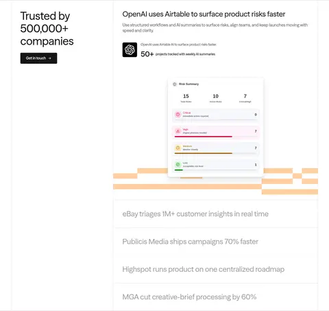
Customer story Use a split layout with a trust statement and contact action beside a customer-specific case study and dashboard visual.
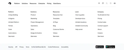
Footer navigation Return to a light surface; group numerous links into compact columns, with a narrow utility and legal row below.
Imagery · Product interfaces are the main visual asset: realistic table views, controls, badges, and dashboards presented as layered product media. The showcase uses saturated blue-toned imagery behind a white interface in the viewport, while the full-page view shows a deep-green band. Customer stories pair brand marks with interface or dashboard visuals. Treat these as product evidence, not decorative stock imagery; keep crops broad and interface details legible.
页面版块 共 5 个版块,按页面从上到下排列,每个都标了类型、布局和交互套路。
该做与不该做 ✓ 该做 Lead with a centered, concise headline on white. Keep primary actions dark with high-contrast labels. Use Forest Stage (#03330b) as a focused product showcase surface. Show realistic product interfaces as evidence. Separate customer proof with subtle dividers. Maintain clear contrast between headline and muted supporting copy. ✕ 不该做 Do not turn the badge palette into broad page backgrounds. Do not use orange as the dominant CTA color. Do not crowd the hero with product details. Do not add heavy shadows to ordinary content sections. Do not make every section a boxed card. Do not rely on decorative imagery where product UI should explain the feature. 给 AI 的提示词 想快速出一个同风格的新页面,把这段话连同 DESIGN.md 一起发给 AI。
复制 Build a new page in Airtable’s visual style using Gallery White (#ffffff) as the main canvas and Airtable Ink (#1d1f25) for primary text and dark actions. Use ATSeasonSans or a close sans-serif substitute for the hero and navigation, with restrained gray supporting copy in Quiet Gray (#5b5b5b). Keep the hero centered, open, and typographic, with a short explanation and paired filled and outlined CTAs. Create one deliberate product showcase stage in Forest Stage (#03330b), featuring authentic-looking interface UI rather than generic illustration. Keep other sections modular and mostly flat, using light dividers, occasional Cloud Mist (#f6f8fc) surfaces, and subdued elevation only for floating media. Use orange and status hues only for localized interface details. Finish with a clean, multi-column link footer.
DESIGN.md Tailwind v4 CSS 变量 Design Tokens
---
title: "Airtable design system"
variant: extended
source: https://www.airtable.com/
captured_at: 2026-10-12
theme: light
industry: saas
generator: Design DNA (https://four.wiralomi.com/style/airtable-com)
ai_generated: true
ai_label: "本文件由 AI 辅助生成:数值取自公开网页的实测样式,命名、用途说明与建议为模型解读。商标归原所有者。 / AI-assisted content"
---
# Airtable · Design System
> A bright workspace, anchored by bold product storytelling
**Theme:** light · **Industry:** saas · **Source:** https://www.airtable.com/ · **Captured:** 2026-10-12 (1440×900 desktop)
_AI-assisted content: values are measured from the public page at capture time; names, roles and guidance are model-written interpretations. Trademarks belong to their owners._
Airtable’s homepage pairs an expansive white canvas and centered, typographic hero with vivid product-interface showcases. Restrained black CTAs, modular proof points, and a deep-green product band carry the page from promise to evidence.
## North star
Keep the interface calm and white, then let authentic product UI and a single deep-green showcase band provide the visual drama.
## Overview
The page is built on a predominantly white canvas, with ink-dark typography and restrained gray supporting text. The hero is centered and spacious: a large, two-line headline sits above concise copy and paired black-filled and outlined CTAs. ATSeasonSans gives the main message a distinctive, rounded sans-serif voice; the overall type treatment stays clean and unornamented. A deep-green, full-width product-showcase band creates the strongest change of mood, framing a dense, realistic Airtable interface against saturated imagery. Below it, narrow logo proof and a broad customer-story area use thin dividers and carefully separated content zones to restore a quieter rhythm. Orange accents appear in product data and highlighted details rather than defining the page’s main interface palette. The footer returns to white and organizes many links into compact columns. Spacing alternates between open hero and customer-story areas and denser interface and footer regions, keeping the long page legible without relying on heavy decoration.
## Colors
| Name | Hex | Token | Group | Role |
|---|---|---|---|---|
| Gallery White | ` | `--color-gallery-white` | neutral | Main page canvas, hero, customer-story areas, cards, and white type on dark controls. |
| Rust Badge | ` | `--color-rust-badge` | semantic | Badge-only palette color; treat as product or data illustration detail, not a page-wide brand surface. |
| Violet Badge | ` | `--color-violet-badge` | semantic | Badge and status-detail color inside interface examples; not a defining page color. |
| Signal Orange | ` | `--color-signal-orange` | accent | Accent in interface details and gradient; use sparingly rather than as a dominant CTA color. |
| Burnt Badge | ` | `--color-burnt-badge` | semantic | Badge color in measured product-like content; keep it confined to data or illustration details. |
| Cloud Mist | ` | `--color-cloud-mist` | surface | Pale navigation, card, and footer surface variation where a break from white is needed. |
| Apricot Detail | ` | `--color-apricot-detail` | accent | Small badge or illustration accent, not a defining background. |
| Status Green | ` | `--color-status-green` | semantic | Sparse green badge text or status detail within product-like content. |
| Teal Detail | ` | `--color-teal-detail` | semantic | Rare badge, border, or illustrative detail; not a primary page surface. |
| Clay Detail | ` | `--color-clay-detail` | semantic | Occasional badge or interface detail, including warm-toned mockup content. |
| Pale Green | ` | `--color-pale-green` | semantic | Small status or illustration highlight; avoid using it as a general surface. |
| Plum Detail | ` | `--color-plum-detail` | semantic | Sparse badge or data-visualization detail within the product presentation. |
| Slate Blue | ` | `--color-slate-blue` | semantic | Small badge or interface detail; the hero media’s blue imagery is not the core brand palette. |
| Airtable Ink | ` | `--color-airtable-ink` | brand | Primary text, navigation, dark controls, and strong footer or UI details. |
| Forest Stage | ` | `--color-forest-stage` | surface | Deep-green full-width product showcase band, setting off the interface demonstration. |
| Blue Badge | ` | `--color-blue-badge` | semantic | Rare badge color in measured content; keep localized to illustrative data details. |
| Quiet Gray | ` | `--color-quiet-gray` | neutral | Muted body copy and secondary text against the white canvas. |
| Night Panel | ` | `--color-night-panel` | surface | Dark card or contrast surface in product-led content; use selectively alongside the green showcase. |
### Semantic aliases
`--color-canvas` → ` (Gallery White) · `--color-surface` → ` (Cloud Mist) · `--color-surface-2` → ` (Forest Stage) · `--color-surface-3` → ` (Night Panel) · `--color-surface-4` → ` · `--color-text` → ` (Airtable Ink) · `--color-text-muted` → ` (Gallery White) · `--color-text-subtle` → ` (Quiet Gray) · `--color-border` → ` · `--color-accent` → ` (Signal Orange) · `--color-accent-2` → ` · `--color-accent-3` → `
### Contrast (WCAG 2.x)
| Text | Background | Ratio | Level |
|---|---|---|---|
| ` | ` | 16.47:1 | AAA |
| ` | ` | 15.49:1 | AAA |
| ` | ` | 1.16:1 | fail |
| ` | ` | 1.21:1 | fail |
| ` | ` | 1.06:1 | fail |
| ` | ` | 14.17:1 | AAA |
| ` | ` | 19.92:1 | AAA |
| ` | ` | 6.79:1 | AA |
| ` | ` | 6.39:1 | AA |
| ` | ` | 2.09:1 | fail |
### Gradients
- `linear-gradient(100deg, rgb(213, 68, 1) 38%, rgb(255, 205, 179) 50%, rgb(213, 68, 1) 62%)`
## Typography
| Family | Token | Source | Weights | Role | Free substitute |
|---|---|---|---|---|---|
| SF Pro Text | `--font-sf-pro-text` | system | 550, 400, 500, 600, 700 | Interface labels, product mockup text, compact captions, and supporting UI copy. | Inter |
| ATSeasonSans | `--font-body` | webfont | 550, 500, 650, 400, 600 | Primary brand voice for hero headline, body copy, navigation, and CTA labels. | DM Sans |
| SF Pro Display | `--font-sf-pro-display` | system | 700, 600, 400 | Limited display role for larger headings where the system display face appears. | Inter |
- **SF Pro Text:** Use measured regular through bold weights for crisp, compact UI; keep casing natural and avoid decorative tracking.
- **ATSeasonSans:** Use medium-to-semibold weights with clean, rounded sans forms; sentence case and neutral tracking dominate.
- **SF Pro Display:** Reserve bold or semibold weights for display emphasis; use natural case and avoid added letter spacing.
### Type scale — Custom (ratio ≈ 1.778, base 18px)
| Role | Size | Weight | Line height | Letter spacing | Case | Family | Used for |
|---|---|---|---|---|---|---|---|
| h1 | 32px | 500 | 1.25 | 0 | — | ATSeasonSans | Centered two-line homepage promise above explanatory copy and paired CTAs. |
| body | 18px | 500 | 1.35 | 0 | — | ATSeasonSans | Hero explanation and customer-story descriptions. |
| caption | 10px | 550 | 1.45 | 0 | — | SF Pro Text | Compact interface labels, fine print, and secondary UI details. |
## Spacing & layout
- Base unit **2px**, density **comfortable**.
- Scale (most used values): 2, 3, 4, 5, 6, 7, 8, 9, 10, 12, 14, 16, 18, 20, 24, 40 px.
- Section rhythm 48px · element gap 6px · card padding 9px · max content width 1344px.
The page uses a wide, centered composition with measured max width of 1344px. The hero aligns its headline, supporting sentence, and CTAs on the center axis, while product media spans a much broader area. A full-width green band interrupts the white canvas; following sections shift to split customer proof and compact logo rows. The footer organizes navigation into multiple columns. Section spacing is generous in the hero and customer proof, while product UI and footer links are denser. Thin dividers distinguish content groups without heavy boxes.
## Shape & elevation
- Radius: button `50%` · card `5px` · media `50%` · badge `9999px` · nav `9999px` · xs `2px` · sm `3px` · md `4px` · lg `5px` · xl `6px` · 2xl `7px` · pill `9999px`
- Shadow `sm` (button): `rgba(0, 0, 0, 0.32) 0px 0px 0.5px 0px, rgba(0, 0, 0, 0.08) 0px 0px 1px 0px, rgba(0, 0, 0, 0.08) 0px 1px 1.5px 0px`
- Shadow `sm-2` (card, other): `rgba(0, 0, 0, 0.32) 0px 0px 0.8px 0px, rgba(0, 0, 0, 0.08) 0px 0px 1.6px 0px, rgba(0, 0, 0, 0.08) 0px 0.8px 2.4px 0px`
- Shadow `hairline` (media): `rgba(0, 0, 0, 0.2) 0px 1px 1.5px 0px`
- Shadow `sm-3` (text): `rgba(0, 0, 0, 0.32) 0px 0px 0.5px 0px, rgba(0, 0, 0, 0.08) 0px 0px 1px 0px, rgba(0, 0, 0, 0.08) 0px 1px 1.5px 0px, rgba(0, 0, 0, 0.06) 0px 0px 0px 0.5px`
- Shadow `lg` (other): `rgba(0, 0, 0, 0.24) 0px 0px 0.5px 0px, rgba(0, 0, 0, 0.08) 0px 0px 1px 0px, rgba(0, 0, 0, 0.08) 0px 2px 2px 0px, rgba(22, 22, 22, 0.22) 0px 18px 44px 0px`
- Shadow `sm-4` (other, card): `rgba(0, 0, 0, 0.32) 0px 0px 0.44px 0px, rgba(0, 0, 0, 0.08) 0px 0px 0.87px 0px, rgba(0, 0, 0, 0.08) 0px 0.87px 1.3px 0px`
- Motion: standard transition `0.15s ease-in` on interactive elements.
The page is mostly flat: white canvas, restrained hairlines, and clear section changes do most of the work. Product mockups and floating UI elements gain subtle layered shadows, with slightly stronger elevation reserved for overlays. Cards remain understated, using delicate edges and modest rounding rather than large, soft shadow fields.
## Imagery
Product interfaces are the main visual asset: realistic table views, controls, badges, and dashboards presented as layered product media. The showcase uses saturated blue-toned imagery behind a white interface in the viewport, while the full-page view shows a deep-green band. Customer stories pair brand marks with interface or dashboard visuals. Treat these as product evidence, not decorative stock imagery; keep crops broad and interface details legible.
## Components
### Announcement strip
A compact, pale top banner contains a short product message, linked action, and close control.
### Primary and secondary CTAs
Pair a dark filled button with a white outlined alternative; measured button corners are compactly rounded, with clear text contrast.
### Product showcase
A wide, deep-green stage contains a tab-like category selector and a large, detailed Airtable interface mockup.
### Customer proof row
A restrained horizontal band of customer logos acts as a transition into customer-story content.
### Customer story
Use a split layout with a trust statement and contact action beside a customer-specific case study and dashboard visual.
### Footer navigation
Return to a light surface; group numerous links into compact columns, with a narrow utility and legal row below.
### Measured component styles
- **Primary button** (“Sign up for free”): background ## Do
- Lead with a centered, concise headline on white.
- Keep primary actions dark with high-contrast labels.
- Use Forest Stage (## Don't
- Do not turn the badge palette into broad page backgrounds.
- Do not use orange as the dominant CTA color.
- Do not crowd the hero with product details.
- Do not add heavy shadows to ordinary content sections.
- Do not make every section a boxed card.
- Do not rely on decorative imagery where product UI should explain the feature.
## Agent prompt
Build a new page in Airtable’s visual style using Gallery White (## Page sections (top to bottom)
| # | Type | Layout | UX patterns | UI patterns |
|---|---|---|---|---|
| 1 | hero | Centered headline, supporting copy, and paired CTAs within a broad white hero. | clear value proposition, primary and secondary action | large centered headline, dark filled CTA, outlined CTA, open white canvas |
| 2 | product-showcase | Wide product interface and category tabs on a contrasting full-width stage. | switchable use-case categories, show product in context | deep-green band, tab-like selector, large interface mockup, floating UI details |
| 3 | logo-cloud | A narrow centered transition band followed by a single horizontal row of customer marks. | social proof, brand recognition | centered bridge message, logo strip, light dividers |
| 4 | feature-split | Split proof section with trust statement on one side and customer story and product visual on the other. | customer proof, contact action, case-study storytelling | split columns, customer marks, dashboard visual, stacked story rows |
| 5 | footer | Multi-column link directory with a compact brand and utility row above legal links. | category-based navigation, legal and support access | column link groups, thin divider, social icons, utility row |
## Source CSS custom properties (selected)
```css
--theme_background: