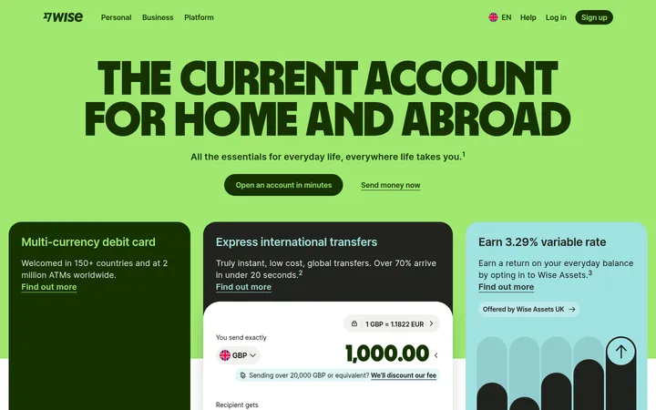
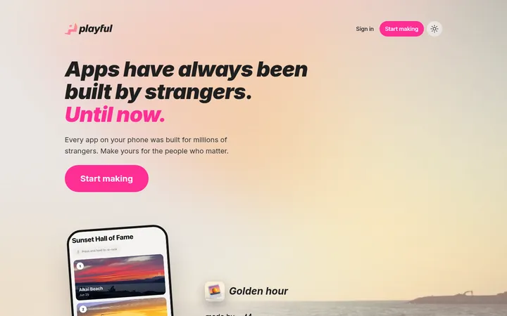
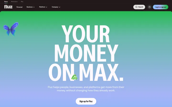
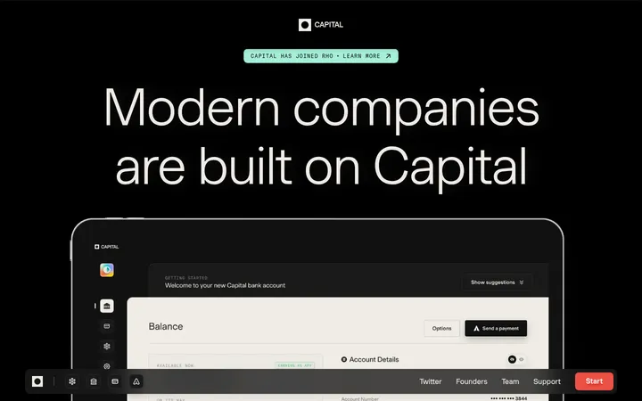
North star · Keep the experience bright and calm: reserve deep green for meaningful actions, use whitespace to pace the story, and let product visuals stay soft and human.
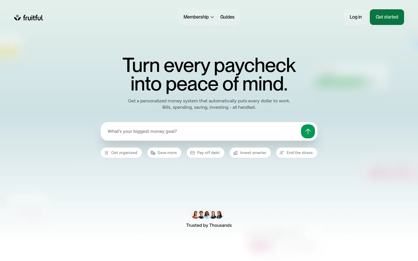
The page opens with a pale, atmospheric green-blue gradient that fades into white, while the rest of the long homepage stays predominantly white and generously spaced. Black headlines provide strong contrast; muted gray copy keeps supporting information quiet, and deep green anchors the primary actions. The pastel pink and green accents appear mainly in product diagrams and finance illustrations, so treat them as supporting visual cues rather than dominant brand fields. PP Neue Montreal gives display headings and navigation a clean, compact presence; Figtree Variable carries most body copy and interface details. Content alternates between centered statements, two-column feature storytelling, visual product cards, and a wide testimonial arrangement. Rounded input and CTA shapes soften the interface, while fine borders and restrained shadows separate cards without making the page feel heavy. Real member portraits and testimonial video tiles add human warmth among crisp, lightweight product mockups.
Primary body copy, captions, links, card text, and interface details.
Aa 设计
PP Neue Montreal
网络字体 · 字重 500 / 600 · 占比 6%
免费替代:DM Sans
Display headings, navigation, and prominent CTA labels.
Aa 设计
Figtree
系统字体 · 字重 500 / 600 · 占比 3%
免费替代:Figtree
Eyebrows and compact uppercase labels.
角色
示例
字号
字重
行高
字距
一级标题
Large centered hero headline and primary page statement.
Fruitful
52px
500
1
-0.01em
二级标题
Major section titles introducing features, products, or the closing offer.
Fruitful
40px
500
1.1
-0.01em
三级标题
Feature and testimonial group headings.
Fruitful
28px
500
1.1
-0.01em
四级标题
Card-level headings and compact feature titles.
The quick brown fox 敏捷的狐狸
24px
600
1.1
-0.01em
正文
Supporting explanations, testimonial copy, and interface text.
The quick brown fox 敏捷的狐狸
14px
500
1.38
-0.005em
辅助文字
Fine print, review context, and small supporting labels.
The quick brown fox 敏捷的狐狸
12px
500
1.38
-0.005em
导航
Header navigation and primary navigation actions.
The quick brown fox 敏捷的狐狸
16px
500
1.38
-0.004em
链接
Inline links and text-based actions.
The quick brown fox 敏捷的狐狸
14px
500
1.38
-0.005em
眉题
Small uppercase labels and compact trust or product metadata.
The quick brown fox 敏捷的狐狸
10px
600
1.6
0.05em
间距与布局
基准单位 4px · 密度:适中
72px版块间距
8px元素间距
—卡片内边距
1296px内容最大宽度
3px
4px
5px
6px
7px
8px
9px
10px
12px
16px
18px
20px
21px
24px
32px
48px
The page uses a centered content frame measured at a 1296px maximum width, with roomy section pauses and comfortable content density. The hero centers the headline, explanation, wide rounded prompt, and suggested goals over a full-width gradient wash. Below, the layout alternates centered logo and trust bands, two-column feature storytelling, paired cards, and a three-column testimonial gallery. The final offer returns to a centered heading and checklist before the FAQ. Keep alignment intentional and let wide white intervals separate sections.
圆角与层次
按钮 · 12px
输入框 · 24px
卡片 · 20px
图片 · 12px
徽标 · 3px
导航 · 8px
xl · card
lg · nav, card
md · button
lg · card
Most sections remain flat against white. Use a fine Mist Line border or a restrained, diffuse shadow to lift selected cards and the floating navigation; avoid heavy outlines and dark drop shadows. Layer the hero gradient beneath the interface, while keeping form fields and product cards visually crisp.
组件
下面的预览按实测的按钮、输入框、徽标、卡片样式重建(字体用替代字体)。
Hero navigation
Light, spacious header with dark membership and guide links, login text, and a Forest Action rounded Get started button.
Goal prompt
Wide white pill-shaped input with muted prompt text and a compact green circular arrow action; suggested goals sit in small white chips below.
Trust marks
Centered Trustpilot and award recognition arranged as a compact logo row on white, followed by subdued review context.
Feature cards
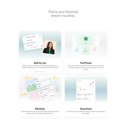
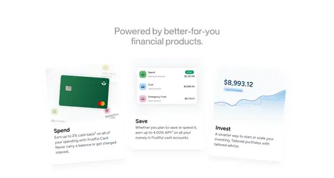
Soft pale cards pairing product imagery with short headings and concise explanations; use generous breathing room and gentle separation.
How-it-works steps
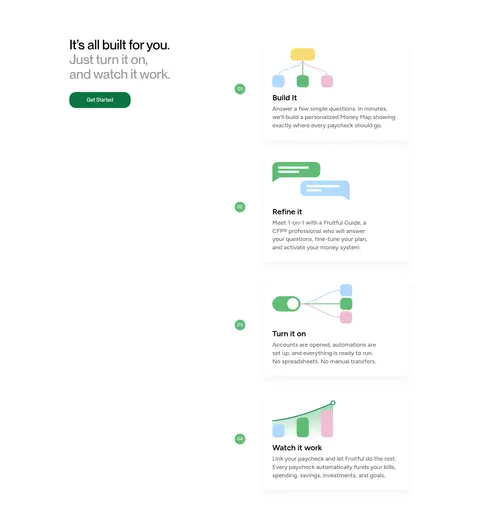
A two-column story with an introductory CTA at left and a vertically sequenced set of numbered process cards at right.
Member testimonials
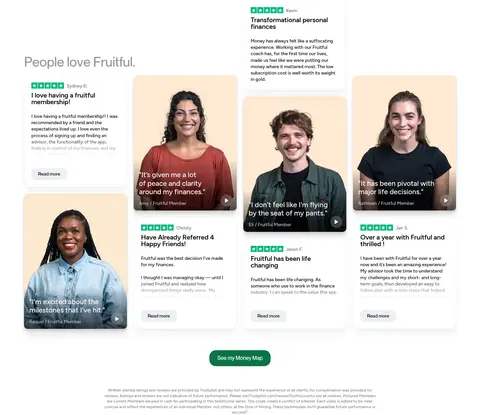
Editorial gallery combining portrait video tiles and review cards with names, ratings, concise quotations, and quiet read-more actions.
Closing Money Map CTA
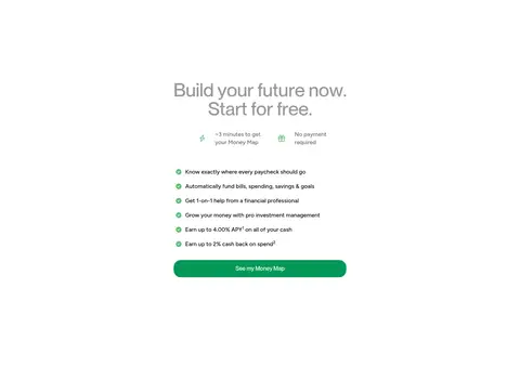
Centered offer heading, short benefit checklist, and a prominent green rounded action button on an uncluttered white field.
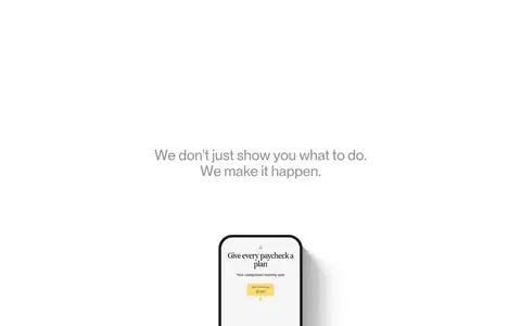
Imagery · Use soft, polished product mockups and finance diagrams with restrained green, blue, pink, and yellow details. Product illustrations sit in quiet, pale cards and often show simplified dashboards or money flows. Testimonial sections rely on real member portraits and video tiles with rounded framing. Trust marks and press logos remain small, monochrome, and secondary. The hero itself is mostly typography and atmospheric color rather than a dominant photograph.
Use the pale green-blue wash chiefly for the hero atmosphere.
Reserve deep green for primary actions.
Set display headings in PP Neue Montreal or a close substitute.
Use Figtree for readable supporting and interface text.
Pair product mockups with concise explanations.
Use member portraits to make testimonials feel personal.
✕ 不该做
Do not turn pastel illustration colors into dominant page backgrounds.
Do not crowd the hero with extra content.
Do not use heavy borders or dark, dramatic shadows.
Do not make every section a centered card grid.
Do not use saturated colors for ordinary body text.
Do not let testimonial imagery overpower the offer and its actions.
给 AI 的提示词
想快速出一个同风格的新页面,把这段话连同 DESIGN.md 一起发给 AI。
Build a new Fruitful-style fintech page with a bright white canvas (#ffffff), crisp black typography (#000000), and very restrained card edges (#eceff4). Create a soft green-blue atmospheric wash near the hero using Dew Green (#e6f2ec), Pale Tide (#cde0e4), and white, then let it fade out. Use Forest Action (#0b7443) for the primary CTA and Fresh Action (#039855) only where a secondary green action is appropriate. Keep Petal Pink (#eebed4) and Leaf Green (#61bc76) to small product-illustration details. Set display headings in PP Neue Montreal or DM Sans, with Figtree for body and interface copy. Alternate centered statements, two-column feature sections, product cards, and human testimonial media. Favor rounded controls, quiet borders, soft shadows, and generous white intervals; keep interactions and primary actions easy to spot.