North star · Let warm editorial calm frame bold, full-bleed campaign moments, with unmistakable contrast around every action.
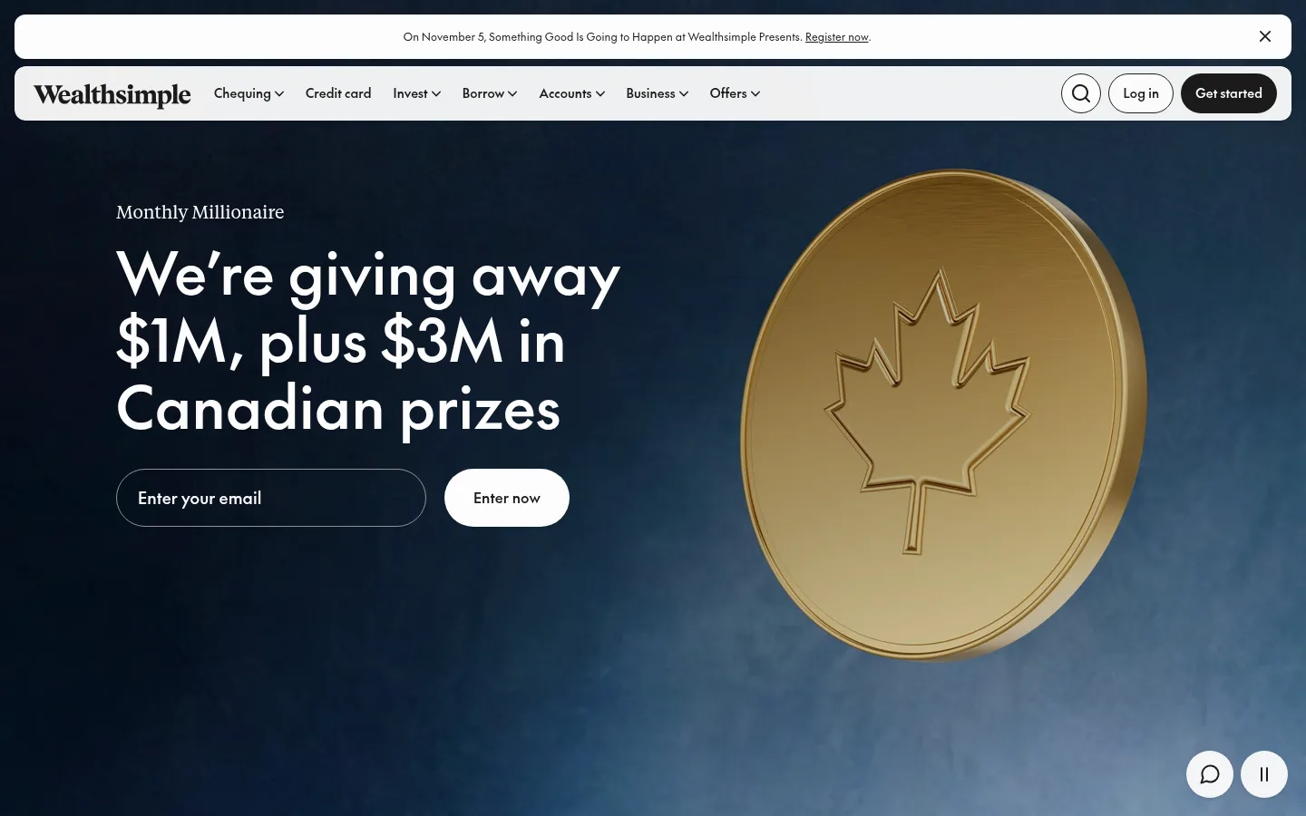
The page balances a soft, warm canvas (#f5f3ef) with strong shifts into full-bleed dark and saturated section bands. In the first viewport, a deep blue-black campaign image fills the background; the oversized Canadian coin is campaign artwork, not a core interface colour. The pale navigation and announcement bars sit above it as rounded, high-contrast strips. Near-black text and restrained muted tones keep utility content legible, while white pill buttons provide clear actions. Typography pairs the bespoke geometric sans-serif the-future with the more literary tiempos display face; headings are large and open, with compact sans-serif utility text. The layout uses wide single-column sections, generous vertical breathing room, and occasional centered content blocks. Full-bleed image and video sections interrupt quieter editorial areas, using dark green, slate, and brown bands. Borders are subtle, surfaces mostly flat, and rounded controls soften the otherwise confident, spacious composition.
Primary interface sans for headings, body, buttons, navigation, and links.
Aa 设计
tiempos
网络字体 · 字重 400 · 占比 5%
免费替代:Bodoni Moda
Expressive display serif for occasional campaign or editorial display moments.
角色
示例
字号
字重
行高
字距
特大标题
Oversized editorial or campaign statements.
Wealthsimple
128px
400
1.16
-0.01em
一级标题
Primary page headline or hero message.
Wealthsimple
64px
500
1.16
0.005em
二级标题
Large feature-section headings.
Wealthsimple
58px
400
1
0
三级标题
Secondary feature and editorial headings.
Wealthsimple
56px
400
1.16
0.005em
四级标题
Smaller section titles and content headings.
Wealthsimple
48px
500
1.16
0.005em
正文
Supporting paragraphs and explanatory copy.
The quick brown fox 敏捷的狐狸
14px
400
1.4
0.005em
辅助文字
Fine print, labels, and compact annotations.
The quick brown fox 敏捷的狐狸
12px
400
1.4
0.005em
按钮
Primary and secondary action labels.
The quick brown fox 敏捷的狐狸
14px
500
1.4
0.005em
导航
Top-level product navigation labels.
The quick brown fox 敏捷的狐狸
18px
400
1.4
0.005em
链接
Inline and secondary navigation links.
The quick brown fox 敏捷的狐狸
14px
400
1.4
0.005em
间距与布局
基准单位 4px · 密度:宽松
160px版块间距
8px元素间距
—卡片内边距
1184px内容最大宽度
2px
4px
6px
8px
12px
14px
16px
20px
24px
32px
40px
64px
160px
Use a spacious, predominantly single-column section flow with a measured page max width of 1184px for contained content. The opening viewport layers announcement and navigation bars over a full-bleed campaign hero. Alternate broad image-led bands with quieter warm-canvas editorial sections; reserve centered alignment for newsletter and trust prompts. Keep content density low, use generous section separation, and let full-bleed media provide visual rhythm rather than adding many cards.
圆角与层次
按钮 · 12px
输入框 · 9999px
导航 · 12px
链接 · 9999px
sm · button, other
The interface is largely flat, with contrast created by section colour and media rather than stacked cards. Use subtle outlines for fields and only restrained button shadow where needed. Rounded announcement and navigation strips sit visibly above the hero; avoid heavy borders or layered dashboard-style surfaces.
组件
下面的预览按实测的按钮、输入框、徽标、卡片样式重建(字体用替代字体)。
Announcement bar
Pale rounded strip above navigation with centered compact event copy, an inline registration link, and a dismiss control.
Primary navigation
Light rounded bar with wordmark, product links, search and login controls, plus a dark Get started pill.
Campaign hero
Full-bleed dark media field with large white headline, small serif kicker, outlined email input, and white Enter now action.
Pill CTA
High-contrast rounded action using near-black with white text, or white with near-black text on dark imagery.
Feature bands
Full-bleed media-led sections on forest, slate-violet, brown, or light surfaces; keep copy and controls clearly contrasted.
Newsletter CTA
Centered TLDR content on the warm canvas, paired with a pale warm pill link to read the latest newsletter.
Footer
Wide, multi-column warm-canvas footer with grouped company and legal links, compact text, and supporting brand marks.
Imagery · Use cinematic, full-bleed campaign imagery and video as the major visual punctuation. The first hero shows a large dimensional gold Canadian coin against a moody blue-black scene; it is campaign-specific artwork, not a recurring brand palette. Other feature bands pair media with solid colour fields. Keep subjects large and legible, with generous breathing room around overlaid copy and controls.
Use Warm Canvas (#f5f3ef) for broad calm content areas.
Set campaign media edge-to-edge when it leads a section.
Keep primary actions high contrast and pill-shaped.
Pair large sans-serif statements with compact utility copy.
Alternate media-led bands with quieter editorial sections.
Treat gradient colours as atmospheric accents, not default UI fills.
✕ 不该做
Do not make every section dark or image-led.
Do not reuse campaign coin artwork as a generic brand motif.
Do not introduce unmeasured palette colours.
Do not crowd the generous single-column section flow.
Do not rely on heavy card shadows or thick outlines.
Do not make muted text compete with primary headings.
给 AI 的提示词
想快速出一个同风格的新页面,把这段话连同 DESIGN.md 一起发给 AI。
Build a new Wealthsimple-style page with a calm, spacious editorial structure. Use Warm Canvas (#f5f3ef) for broad content areas, Soft Ink (#1c1b1b) for primary text, and Paper White (#fcfcfc) for light surfaces and reversed text. Use Midnight Band (#080f16), Forest Band (#0c330d), Slate Violet (#5f5974), or Earth Umber (#564c47) selectively for full-bleed feature moments. Set headlines in a large, clean geometric sans, with a restrained serif accent for editorial display. Place a pale rounded announcement strip and compact rounded navigation above a cinematic hero. Keep the hero headline legible over media, with a clear pill CTA and understated outlined input. Alternate immersive media sections with quiet copy-led areas; use generous vertical breathing room, subtle borders, and minimal elevation. Avoid copying the campaign coin literally.