North star · Keep the surrounding interface nearly black and understated so the work itself, not the portfolio chrome, commands attention.
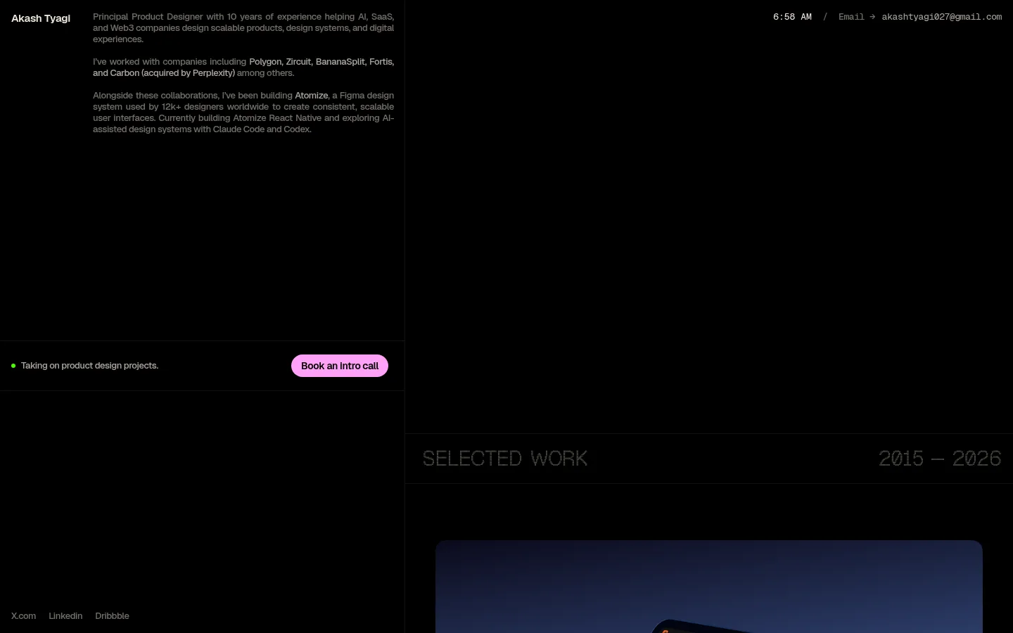
The page uses near-total black as an uninterrupted canvas, giving the long portfolio a quiet, gallery-like feel. Muted gray-beige text carries the biography, links, and small labels, while vivid pink is reserved for the pill-shaped booking button and occasional expressive pixel details. Geist provides compact, readable interface and body text; Geist Pixel Triangle makes the portfolio heading and section labels feel deliberately digital, and Geist Mono adds a technical accent to contact information. The layout is asymmetrical and spacious: a narrow text-led introduction sits beside a large empty field, while project imagery occupies a separate column and unfolds vertically with substantial gaps. Project artwork keeps its own colors and backgrounds, so it reads as content rather than as the site palette. Hairline dividers and flat surfaces maintain the minimal structure without competing with the imagery.
Compact biography copy, links, and general interface text.
Aa 设计
Geist Pixel Triangle
网络字体 · 字重 400 · 占比 21%
免费替代:Silkscreen
Pixelated display headings, including the portfolio and selected-work labels.
Aa 设计
Geist Mono
网络字体 · 字重 400 / 500 · 占比 6%
免费替代:IBM Plex Mono
Monospaced contact details and technical-style text.
角色
示例
字号
字重
行高
字距
一级标题
Pixel-display identity and prominent portfolio headings.
Akash Tyagi
30px
400
1.33
-0.033em
正文
Compact introductory biography and supporting descriptions.
The quick brown fox 敏捷的狐狸
13px
500
1.23
-0.031em
链接
Social links, contact links, and navigation-like text.
The quick brown fox 敏捷的狐狸
13px
500
1.23
-0.031em
代码
Monospaced contact details and technical-looking labels.
const style = 1;
13px
500
1.23
-0.031em
间距与布局
基准单位 8px · 密度:宽松
200px版块间距
8px元素间距
—卡片内边距
—内容最大宽度
2px
4px
8px
10px
12px
16px
18px
20px
24px
104px
200px
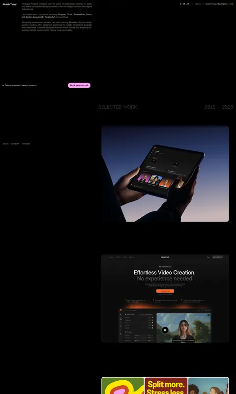
The page is a tall, single-section portfolio with a strongly asymmetrical two-column composition. A narrow text area introduces the designer on the left, while a large open black field and right-side project column create deliberate imbalance. Social links sit low on the left; the selected-work label spans the gallery column above a vertically ordered stream of project images. The measured data gives no maximum width, so preserve the screenshot’s broad canvas rather than inventing a fixed container. Generous section rhythm and sparse text keep the page airy despite its long gallery.
圆角与层次
按钮 · 9999px
没有测到阴影:页面是扁平的,层次靠底色和描边区分。
The interface is predominantly flat, with no measured shadow system and no card-heavy framing. Fine dark dividers separate portions of the composition, while black negative space provides the main sense of layering. Rounded treatment is clearest on the pink booking button; project image framing belongs to the media and should not be applied indiscriminately to interface elements.
组件
下面的预览按实测的按钮、输入框、徽标、卡片样式重建(字体用替代字体)。
Identity and introduction
Small designer name beside compact, muted biography copy in the upper-left portion of the page.
Contact details
Top-aligned time and email details use subdued text, with monospaced styling for the email treatment.
Availability and booking
A slim availability row pairs a small green status dot and muted copy with a pink pill CTA labeled “Book an Intro call.”
Social links
Low-key X.com, LinkedIn, and Dribbble links sit near the lower-left edge of the introductory area.
Selected-work heading
Pixel-style section label and date range sit above the project column, bounded by subtle horizontal rules.
Project gallery
A long vertical sequence of product and campaign images, spaced widely against the black canvas.
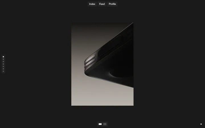
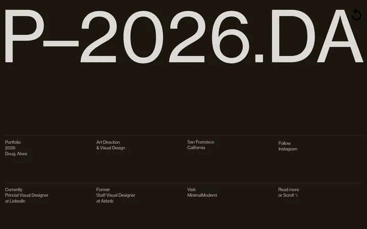
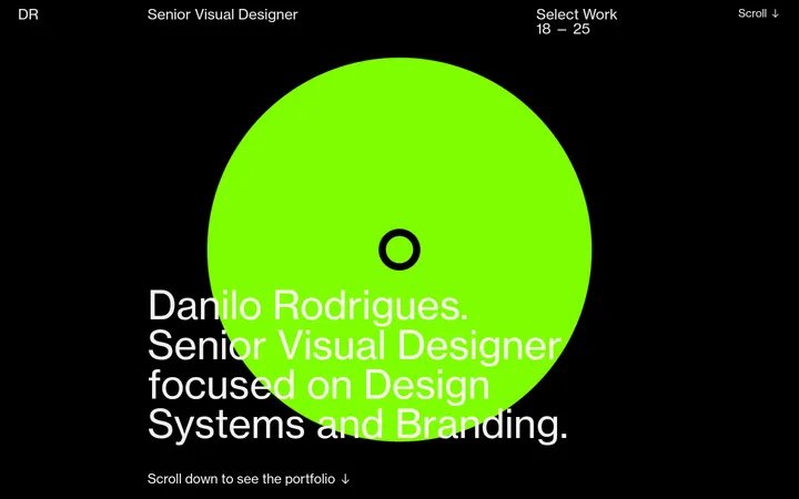
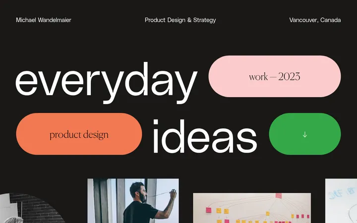
Imagery · Project imagery is the main visual content: product interfaces, mobile screens, campaign graphics, and device mockups appear as a vertical portfolio sequence. Keep each image in its original color and presentation rather than recoloring it to match the site palette. Frames are generally clean and rectangular, with some rounded media corners visible in the work itself. Sparse pixel-like decorative details reinforce the digital character without replacing the product-focused visuals.
Use black as the dominant uninterrupted page canvas.
Keep supporting copy compact and visually subdued.
Reserve Pixel Pink for a small number of high-priority accents.
Use pixel-display typography for standout portfolio headings.
Give project media generous surrounding negative space.
Let project artwork retain its own color palette.
✕ 不该做
Do not add colorful section backgrounds to the site chrome.
Do not turn the portfolio into a dense card grid.
Do not use the accent pink for large decorative surfaces.
Do not add heavy shadows or prominent borders.
Do not apply pixel typography to all body copy.
Do not force project images into a uniform branded treatment.
给 AI 的提示词
想快速出一个同风格的新页面,把这段话连同 DESIGN.md 一起发给 AI。
Build a new portfolio page in the same restrained, gallery-like style. Use Gallery Black (#000000) as the dominant canvas, with Quiet Taupe (#726e67), Soft Putty (#aca69c), Faded Umber (#605c56), and Warm Porcelain (#efe6d8) for restrained text hierarchy. Reserve Pixel Pink (#ffa1f7) for one prominent pill-shaped CTA and small expressive details. Use a clean Geist-like sans for compact copy, pixel-display typography for key headings, and monospaced text sparingly for contact details. Compose the page asymmetrically, pairing a narrow introduction with a separate, vertically paced project-media column. Keep surfaces flat, dividers subtle, and negative space generous. Preserve the original colors of portfolio artwork; avoid adding a generic card system, elaborate shadows, or decorative color bands.