North star · Let oversized near-black typography and precise horizontal rules lead, while warm neutral surfaces keep every section calm and editorial.
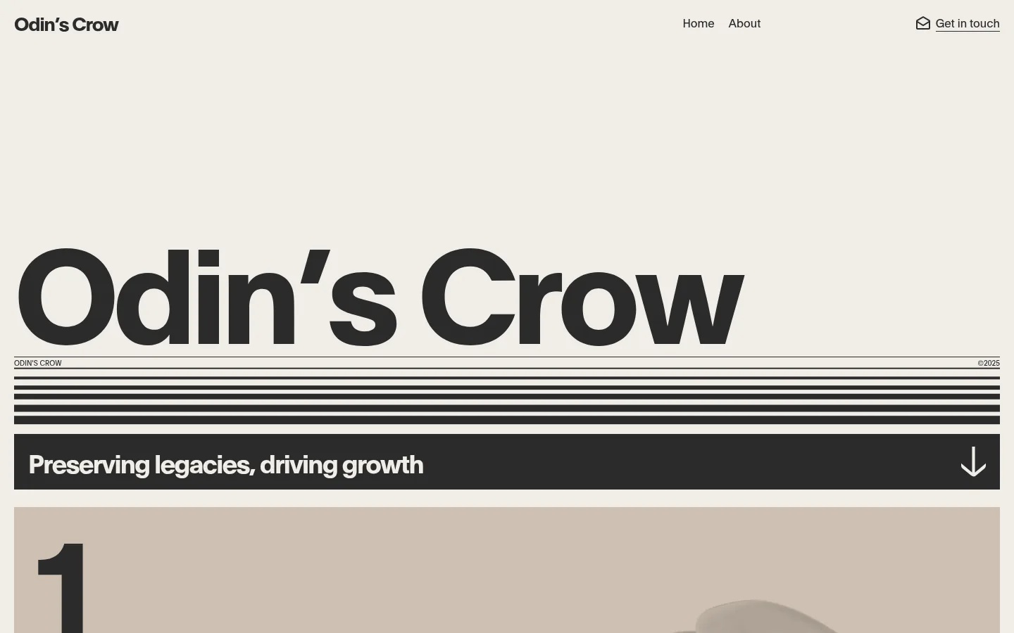
The visual identity is built around a warm off-white canvas (#f1ede8), near-black typography (#2b2b2b), and muted stone and taupe section surfaces. The opening screen uses an exceptionally large, tightly tracked wordmark as the main visual event; thin rules and stacked dark bands turn the typography into a graphic system rather than decoration. Plain, a measured sans-serif family, supports both oversized display text and compact navigation, with a clear shift from heavy headlines to regular-weight body copy. Layouts are broad and editorial, using generous empty space around the hero and more structured two- and three-column arrangements in explanatory sections. A dark horizontal statement band creates a strong contrast before the warm, subdued content blocks. Imagery is secondary to type and layout, with video and image-led material appearing within the longer page. Keep surfaces flat, use fine dark dividers, and avoid introducing bright colours, gradients, or ornamental effects.
Sole measured typeface for display, headings, body copy, navigation, and captions.
角色
示例
字号
字重
行高
字距
特大标题
Oversized opening wordmark and primary typographic statement.
Odin's Crow
187px
700
1
0
一级标题
Major section headline, set bold with tight negative tracking.
Odin's Crow
60px
700
1
-0.05em
二级标题
Prominent section titles such as 'What we do'.
Odin's Crow
42px
700
1
0
三级标题
Subsection headings in explanatory and comparison content.
Odin's Crow
36px
700
1.11
-0.05em
四级标题
Smaller content headings and card titles.
The quick brown fox 敏捷的狐狸
27px
700
1.5
-0.05em
正文
Main explanatory paragraphs and editorial copy.
The quick brown fox 敏捷的狐狸
20px
400
1.4
0
辅助文字
Compact uppercase labels, dates, and section markers.
The quick brown fox 敏捷的狐狸
10px
400
1.5
0
导航
Header links for Home, About, and Get in touch.
The quick brown fox 敏捷的狐狸
16px
400
1.5
0
间距与布局
基准单位 4px · 密度:适中
36px版块间距
—元素间距
—卡片内边距
1400px内容最大宽度
2px
4px
8px
10px
14px
16px
18px
20px
24px
36px
40px
47px
160px
Use a broad editorial canvas, with the measured page max width of 1400px as the desktop content boundary. Keep the header minimal and horizontally distributed, then give the hero substantial open space before the oversized wordmark. Align major content to a consistent edge and use full-width rules or bands as graphic anchors. The page moves from a single-column introduction into two-column explanatory content and three-column comparison or process sections. Maintain comfortable density and clearly separated section rhythms; do not invent fixed card padding or corner radii.
圆角与层次
没有测到阴影:页面是扁平的,层次靠底色和描边区分。
The design reads as flat: measured cards have square corners, no shadow, and no extra padding values. Separate regions with tonal surface changes and dark hairlines instead of raised panels. The stacked hero rules and solid dark statement band provide the strongest visual layering; keep any imagery integrated into the page rather than floating above it.
组件
下面的预览按实测的按钮、输入框、徽标、卡片样式重建(字体用替代字体)。
Header navigation
Minimal horizontal header on the warm canvas: bold brand wordmark at left, Home and About near the center-right, and an underlined contact link with an outline icon at the far right.
Oversized wordmark hero
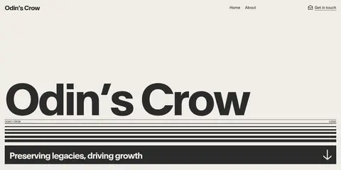
A very large bold 'Odin's Crow' display sits low in a spacious first screen, followed by a fine label-and-date line and multiple near-black horizontal rules.
Dark statement band
Full-width near-black strip with bold light text, 'Preserving legacies, driving growth,' and a downward arrow aligned to the right.
Numbered introduction
Warm taupe-toned section begins with a large numeral and pairs the editorial introduction with video or other restrained media.
Editorial content sections
Explanatory sections use broad whitespace and shift from two-column copy to three-column comparison and process layouts.
Process cards
A three-column sequence presents response, offer, and closing milestones; one measured card uses #82887c with near-black text.
Portfolio area
A later three-column portfolio section combines platform names and acquisition status with video-led material and compact graphic elements.
Imagery · Typography and graphic rules dominate the first viewport, while imagery remains secondary within later content. The measured page includes video in the introduction and portfolio area, with image and SVG elements in comparison and process sections. Use restrained, contextual media rather than decorative stock imagery, and let warm neutrals frame it without filters or saturated overlays.
Use Warm Parchment (#f1ede8) as the dominant page canvas.
Make Crow Ink (#2b2b2b) the main text and graphic-rule colour.
Let oversized bold typography anchor the opening viewport.
Use warm grey and taupe surfaces to distinguish selected sections.
Build hierarchy with spacing, columns, and crisp horizontal rules.
Keep navigation small, restrained, and aligned along one horizontal line.
✕ 不该做
Don't add bright accent colours absent from the measured palette.
Don't use gradients or ornamental decorative effects.
Don't give cards rounded corners or drop shadows.
Don't make imagery more prominent than the page typography.
Don't crowd the hero; preserve its expansive empty space.
Don't treat the single sage card colour as a site-wide accent.
给 AI 的提示词
想快速出一个同风格的新页面,把这段话连同 DESIGN.md 一起发给 AI。
Build a new page in the Odin's Crow visual style. Use Warm Parchment (#f1ede8) as the main canvas and Crow Ink (#2b2b2b) for typography, navigation, and graphic rules. Use Plain, or a close sans-serif substitute such as Inter, with bold oversized display headlines and regular-weight body copy. Keep the header sparse and horizontal. Create strong editorial hierarchy through open space, large type, fine dividers, and occasional dark bands; use muted stone and taupe surfaces such as Soft Stone (#c9c8c9) or Taupe Linen (#cdc0b1) for selected sections. Favor broad alignments and simple two- or three-column content layouts. Keep panels flat and square, with no shadows or gradients. Treat media as supporting content, not decoration, and reserve Sage Slate (#82887c) for a small local card use rather than a global accent.