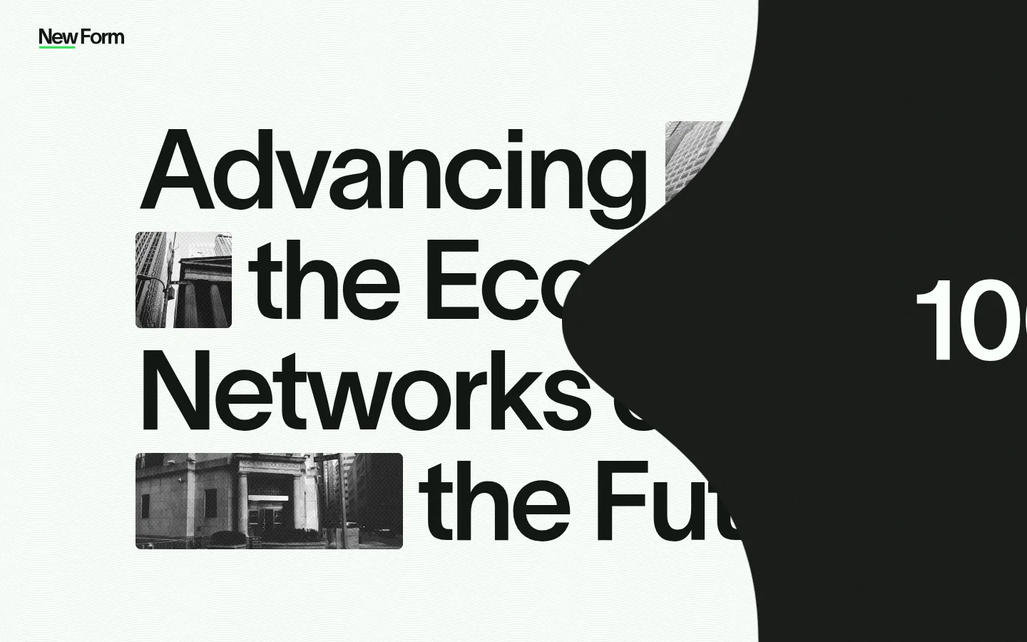
New Form 以高对比字体搭配黑白城市摄影,呈现其对数字金融领域的投资方向。页面留白充足、视觉克制,仅用鲜绿色点缀导航与行动按钮。
North star · Let monumental, tightly composed typography lead; use monochrome city imagery and green only as a precise accent.
The page is built around a restrained palette: white and near-black establish broad, high-contrast fields, while muted green-gray supports secondary text. Vivid green is reserved for small navigational marks and the portfolio CTA, so it reads as a deliberate signal rather than a decorative color. Oversized, tightly tracked headlines dominate the composition; a contemporary sans serif handles practical text, while a softer editorial serif and a characterful display face add contrast to the type system. The hero treats its headline as the main visual object, interrupting the lines with small black-and-white urban photographs. Navigation and supporting details remain compact against generous open space. The measured system is spacious, but the available screenshots show only the opening hero clearly; avoid inferring unseen section designs. Keep controls crisp and mostly flat, with subtle depth reserved for the green CTA.
配色
点色块复制色值。用途说明来自对页面的实测位置(背景、文字、描边、按钮)与截图判读。
强调色
表层色
中性色
功能色
页面底色 · Gallery White表层 · Forest Ink主文字 · Forest Ink次要文字 · Moss Gray弱文字 · Gallery White强调 · Signal Green
文字
背景
对比度
WCAG
#121613 Forest Ink
#ffffff Gallery White
18.26:1
AAA
#516254 Moss Gray
#ffffff Gallery White
6.51:1
AA
#516254 Moss Gray
#121613 Forest Ink
2.8:1
不达标
#ffffff Gallery White
#121613 Forest Ink
18.26:1
AAA
#2bee4b Signal Green
#ffffff Gallery White
1.56:1
不达标
#2bee4b Signal Green
#121613 Forest Ink
11.68:1
AAA
字体
字号阶梯:Custom(比例约 1.84,正文 14px)。示例用免费替代字体渲染,数值为实测。
Aa 设计
TWK Lausanne
网络字体 · 字重 350 / 200 / 550 · 占比 81%
免费替代:Inter
Primary sans serif for body copy, navigation, captions, and some headings
Aa 设计
Editorial New
网络字体 · 字重 300 · 占比 11%
免费替代:Cormorant Garamond
Light editorial display headings
Aa 设计
PP Mondwest
网络字体 · 字重 400 · 占比 8%
免费替代:Bodoni Moda
Distinctive display headlines
角色
示例
字号
字重
行高
字距
特大标题
Oversized, characterful headline or display text
New Form
295px
400
0.9
-0.04em
一级标题
Primary hero headline in a light editorial face
New Form
240px
300
0.9
-0.01em
二级标题
Large secondary display heading
New Form
165px
400
0.9
-0.04em
三级标题
Prominent sans-serif heading
New Form
155px
550
1
-0.04em
四级标题
Light editorial subheading
New Form
140px
300
0.9
-0.02em
正文
Compact supporting paragraphs
The quick brown fox 敏捷的狐狸
14px
350
1.1
0.01em
辅助文字
Small uppercase labels and metadata
The quick brown fox 敏捷的狐狸
11px
550
1.1
0
导航
Compact menu and navigation labels
The quick brown fox 敏捷的狐狸
16px
550
1.4
0.01em
间距与布局
基准单位 2px · 密度:宽松
50px版块间距
50px元素间距
—卡片内边距
—内容最大宽度
4px
8px
10px
15px
20px
25px
30px
32px
35px
40px
45px
50px
55px
60px
120px
130px
The visible hero uses a wide canvas with a compact brand mark at the upper left and a small menu control opposite it. A large headline occupies the main field, broken into tightly stacked lines and interleaved with photographic inserts. The screenshot shows a substantial dark, curved overlay entering from the right, so preserve its dramatic asymmetry rather than forcing a conventional centered grid. Measurements indicate spacious rhythm, but no maximum width is recorded. Keep supporting elements sparse and let the open background frame the headline.
圆角与层次
按钮 · 5px
图片 · 50%
md · button
md · button
The overall treatment is flat and graphic, with no measured border color or gradient. Keep panels and text areas clean, relying on contrast and overlap rather than outlines. The measured green CTA has a soft, offset green shadow; reserve that depth for the primary action instead of applying it broadly.
组件
下面的预览按实测的按钮、输入框、徽标、卡片样式重建(字体用替代字体)。
Brand mark
Small New Form wordmark anchored at the upper-left of the hero, with a fine green accent beneath it.
Menu control
Compact upper-right navigation affordance with a menu label and thin green marks.
Hero headline
Oversized, tightly stacked headline with alternating photographic inserts and near-black lettering.
Image inserts
Grayscale architectural and street photographs cropped into small rounded rectangles within headline lines.
Portfolio CTA
Uppercase VIEW PORTFOLIO action using #2bee4b, black text, a small radius, and a soft green shadow.
Inverse section
Near-black #121613 section or card surface with contrasting light text, as indicated by measured surface data.
Imagery · Use documentary-style urban photography in monochrome: buildings, streets, and architectural details. Images appear as small horizontal or near-square inserts embedded within the headline, with tight crops and subtle corner rounding. Their grayscale treatment supports the black-and-white palette rather than introducing competing color. The first viewport also shows a large dark organic shape overlapping the text; treat it as a strong compositional layer, not as a photographic asset.
该做与不该做
✓ 该做
Make the headline the dominant hero element.
Use black-and-white urban photography as inline composition.
Keep the canvas bright and the dark fields sharply defined.
Reserve #2bee4b for a few high-value actions or marks.
Use compact uppercase styling for small labels.
Preserve generous open space around the hero.
✕ 不该做
Do not introduce unmeasured palette colors.
Do not turn the hero into a conventional centered card.
Do not let colorful photography compete with the typography.
Do not apply green broadly to large backgrounds.
Do not add decorative borders across the page.
Do not apply CTA shadows to every component.
给 AI 的提示词
想快速出一个同风格的新页面,把这段话连同 DESIGN.md 一起发给 AI。
Build a new page in New Form’s restrained editorial style. Use Gallery White (#ffffff) as the principal canvas and Forest Ink (#121613) for dominant text and inverse fields; keep Moss Gray (#516254) secondary and use Signal Green (#2bee4b) only for a small control or primary action with black lettering. Set an oversized, tightly tracked headline as the main composition, combining a contemporary sans serif with light editorial and distinctive display faces. Weave tightly cropped grayscale urban photographs into the headline rather than placing them in a conventional card grid. Keep navigation compact at the top, preserve broad open space, and use deliberate asymmetry or a bold overlapping shape where appropriate. Keep surfaces flat and crisp; reserve a subtle green shadow for the primary CTA. Do not invent palette values or unseen page sections.