North star · Let oversized, precise typography and a muted sage canvas frame the album art without competing with it.
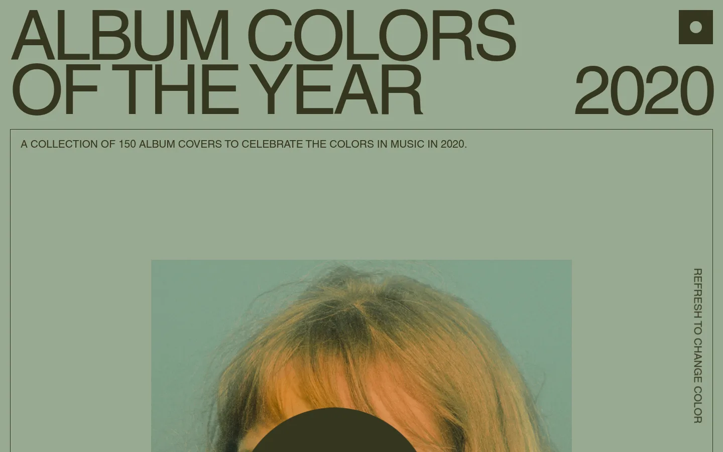
The page uses a restrained three-colour system: a muted sage canvas fills the background, dark olive ink carries the typography and fine outlines, and a softer green identifies the image-area surface. The palette feels intentionally quiet, letting the changing album artwork supply the stronger and more varied colours. A very large, lightweight uppercase title dominates the top of the page, with the year aligned as a separate counterpoint on the right. Smaller uppercase copy sits inside a thin rectangular frame below. The central cover is presented as a large, straightforward image rather than a card with decorative effects; a vertical refresh link runs along the frame’s right edge. Spacing is open and the composition is asymmetric but orderly, with clear contrast between the title, framed gallery area, and artwork. Keep the page flat, typographic, and image-led.
Build a full-bleed canvas with a compact page inset and no visible navigation bar. The title occupies the upper left in two tightly stacked lines; the year sits on the right as a separate large element. A thin outlined gallery frame begins directly below the heading and spans nearly the full page width. Place the artwork centrally within that open area, leaving substantial breathing room around it. Keep the density low and the alignment deliberately asymmetric; the refresh link tracks vertically along the frame’s right side.
圆角与层次
没有测到阴影:页面是扁平的,层次靠底色和描边区分。
Keep the interface flat: no measured shadows, gradients, or rounded component treatments. Use dark olive hairline borders to define the gallery frame and let the image sit directly within the canvas. Preserve clear layering through scale and placement rather than depth effects.
组件
下面的预览按实测的按钮、输入框、徽标、卡片样式重建(字体用替代字体)。
Oversized title
Large, regular-weight uppercase display text on two compact lines, aligned to the upper left in Olive Ink (#35361e).
Year marker
A prominent four-digit year set apart on the right side of the title area.
Framed gallery
A broad, thin Olive Ink (#35361e) outline containing uppercase introductory copy and the featured cover.
Album cover
A large central artwork image; its changing photographic colours remain distinct from the fixed page palette.
Refresh control
An uppercase text link reading “REFRESH TO CHANGE COLOR,” set vertically along the gallery frame’s right edge.
Imagery · Use album-cover artwork as the central focal point, framed as a direct, large image rather than a decorative card. The screenshot shows a photographic portrait with warm hair and a dark graphic shape against a cool green cover field. Artwork colours can vary and should be treated as content, not as additions to the fixed brand palette.
该做与不该做
✓ 该做
Use Sage Canvas (#99aa91) as the dominant page field.
Set headings and frame lines in Olive Ink (#35361e).
Let the cover artwork provide the strongest colour variation.
Keep the headline large, uppercase, and tightly stacked.
Use open space around the central artwork.
Keep controls text-led and visually integrated with the frame.
✕ 不该做
Do not add gradients or drop shadows.
Do not introduce rounded cards or pill controls.
Do not turn the page into a dense navigation-led layout.
Do not use the cover’s incidental colours as fixed brand colours.
Do not compete with the artwork using extra decoration.
Do not replace the flat canvas with a white page.
给 AI 的提示词
想快速出一个同风格的新页面,把这段话连同 DESIGN.md 一起发给 AI。
Create a new editorial gallery page in the Album Colors visual style. Use Sage Canvas (#99aa91) as a full-page background and Olive Ink (#35361e) for typography, links, and fine outlines; use Moss Surface (#809f89) only as a restrained image-area surface where appropriate. Set text in a clean Helvetica-like sans serif, with a very large regular-weight uppercase headline, tight display leading, and compact uppercase supporting copy. Arrange the heading asymmetrically, reserve a large outlined area for one prominent piece of artwork, and place a simple text control at its edge. Keep spacing open, components flat, and the image visually dominant. Avoid shadows, gradients, rounded cards, and decorative UI. Artwork colours may vary independently of the fixed palette.