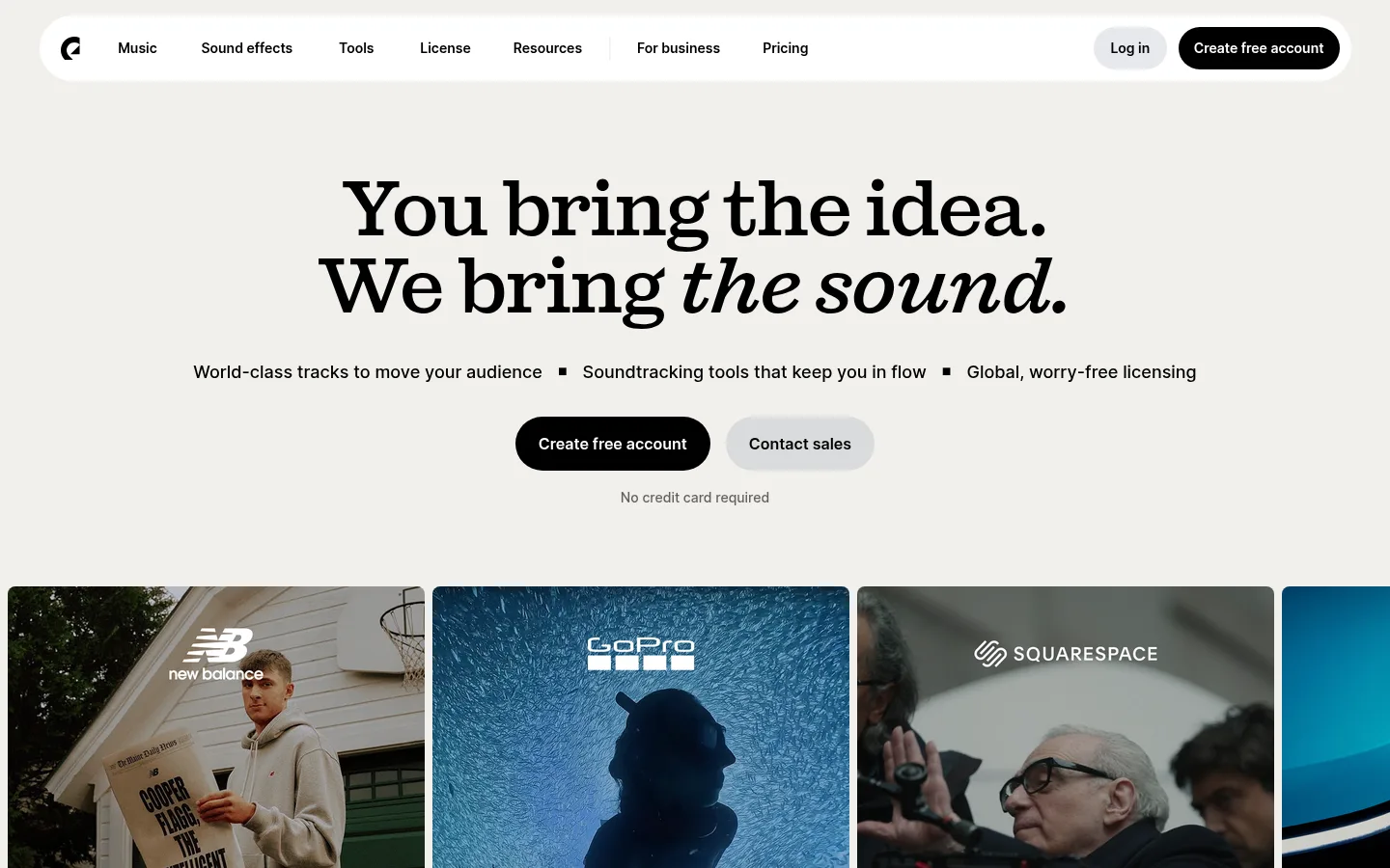
Epidemic Sound 首页以醒目的编辑式大标题搭配温暖中性色画布,并用鲜亮色块突出产品功能。视频案例与深色音乐分类展示,让内容既有表现力,也便于浏览。
North star · Let editorial serif headlines and the warm neutral canvas frame vivid, media-led color moments without adding visual clutter.
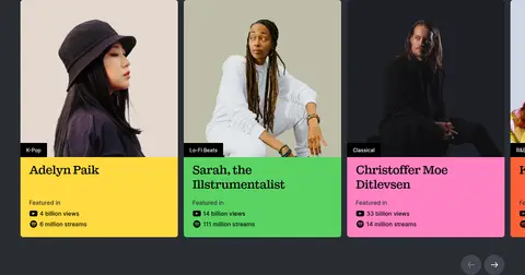
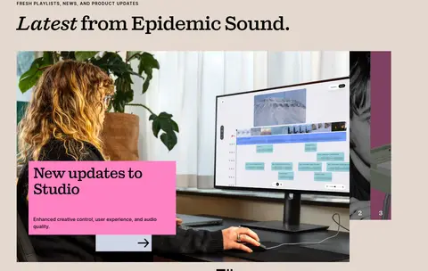
The page establishes a warm, quiet base with Gallery Canvas (#f1f0eb), letting large black Sebenta headlines carry the opening message. Inter supports navigation, body copy, metadata, and controls with compact, clear hierarchy; display headlines use tight tracking and occasional italic emphasis for an editorial cadence. Full-width feature bands in Signal Blue (#20afff), Pop Pink (#ff82c2), and Golden Yellow (#ffda40) interrupt the neutral flow with distinct product moments. A muted warm beige section supports the app and news imagery, while a continuous charcoal catalog area creates contrast for colorful category tiles and artist cards. The composition alternates centered feature statements with left-aligned editorial sections and media grids. Wide video thumbnails and artist photography provide real-world context rather than decorative illustration. Buttons are black pills with white text; cards and most content surfaces stay flat, with restrained rounding and hairline separators instead of shadow-heavy elevation.
配色 点色块复制色值。用途说明来自对页面的实测位置(背景、文字、描边、按钮)与截图判读。
强调色
Pop Pink
#ff82c2
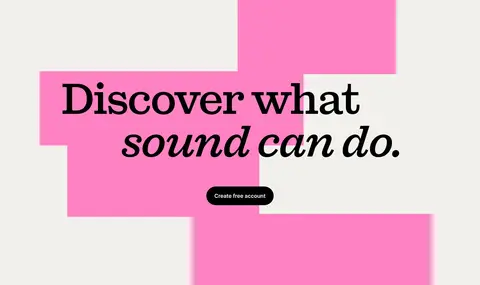
Full-width plugin feature band, product cards, and graphic blocks behind the closing CTA.
Golden Yellow
#ffda40
Find Similar feature band and selected artist-card information panels.
Signal Blue
#20afff
Full-bleed Studio feature band and occasional feature-link highlight.
Sky Blue
#22aaf7
Minor variation within the blue feature or media treatment; keep subordinate to Signal Blue.
Artist Green
#5ad363
Bright artist-card panel within the exclusive tracks gallery, not a global surface.
Vivid Coral
#ff6138
Small accent observed in a link or media detail; use sparingly, not as a section color.
表层色
Gallery Canvas
#f1f0eb
Main warm off-white page canvas behind the hero, video rail, feature sections, FAQ, and footer.
Midnight Slate
#292c33
Large dark catalog and exclusive-track area, with light text and colorful media cards.
Clean White
#ffffff
Navigation capsule, white text on black controls, and occasional light content surfaces.
Hazy Periwinkle
#cfd6e5
Muted blue-lavender app-section media background; supporting imagery, not a core interface color.
中性色
Ink
#000000
Primary headline and body text, navigation, inverse surface, and black primary CTA background.
Soft Graphite
#60605e
Muted supporting copy, captions, footer details, and secondary text on light sections.
Pale Fog
#e7e7e4
Subtle text, navigation, and button detail on light or contrasting surfaces.
功能色
Quiet Divider
#deddd9
Hairline borders and subtle section, media, and control surfaces.
Slate Shadow
#363941
Minor dark media detail within the dark catalog treatment, not a primary page surface.
Muted Khaki
#bfbda8
Appears within media imagery only; do not use as a defining interface color.
文字 背景 对比度 WCAG #000000 Ink#f1f0eb Gallery Canvas18.4:1 AAA #000000 Ink#292c33 Midnight Slate1.5:1 不达标 #000000 Ink#deddd9 Quiet Divider15.45:1 AAA #000000 Ink#ffffff Clean White21:1 AAA #60605e Soft Graphite#f1f0eb Gallery Canvas5.52:1 AA #60605e Soft Graphite#292c33 Midnight Slate2.22:1 不达标
字体 字号阶梯:Augmented Fourth(比例约 1.38,正文 16px)。示例用免费替代字体渲染,数值为实测。
Aa 设计
Inter 网络字体 · 字重 500 / 600 / 400 / 700 · 占比 89%
免费替代:Inter
Navigation, body copy, buttons, captions, links, and uppercase eyebrows.
Aa 设计
Sebenta 网络字体 · 字重 500 · 占比 11%
免费替代:DM Serif Display
Display headlines and section headings throughout the page.
角色 示例 字号 字重 行高 字距 特大标题 Oversized editorial hero or campaign headline.
Epidemic Sound
80px 500 1 -0.03em 一级标题 Primary page headline and major top-level statements.
Epidemic Sound
64px 500 1.06 -0.03em 二级标题 Feature, category, editorial, and CTA section headings.
Epidemic Sound
48px 500 1.13 -0.03em 三级标题 Secondary content headings and grouped feature titles.
Epidemic Sound
40px 500 1.2 -0.03em 四级标题 Smaller card and subsection headings.
Epidemic Sound
32px 500 1.25 -0.03em 正文 Main explanatory copy and supporting paragraph text.
The quick brown fox 敏捷的狐狸
16px 500 1.5 0 辅助文字 Media credits, song details, and compact supporting labels.
The quick brown fox 敏捷的狐狸
14px 500 1.71 0 按钮 Primary and secondary action labels.
The quick brown fox 敏捷的狐狸
16px 600 1.5 0 导航 Main navigation and compact utility links.
The quick brown fox 敏捷的狐狸
14px 600 1.71 0 链接 Inline actions and content links.
The quick brown fox 敏捷的狐狸
16px 500 1.5 0 眉题 Uppercase section labels above editorial headlines.
The quick brown fox 敏捷的狐狸
14px 600 1.71 0.1em
间距与布局 基准单位 8px · 密度:适中
56px 版块间距
8px 元素间距
24px 卡片内边距
1328px 内容最大宽度
4px
5px
6px
8px
10px
12px
16px
24px
48px
56px
Use the measured 1328px page maximum as the wide-screen content boundary, with a comfortable density and a consistent 8px base spacing rhythm. The hero is centered and spacious, followed by a horizontally browsable video-card rail. Alternate full-bleed colored feature bands with quieter canvas sections, then use a four-column category grid and six-column artist gallery at wide widths. Editorial and FAQ sections return to left alignment. Preserve generous section breathing room and use responsive stacking rather than compressing text or media.
圆角与层次 没有测到阴影:页面是扁平的,层次靠底色和描边区分。
The visual system is predominantly flat: no measured shadows, with contrast created by solid section bands, photography, and the dark catalog surface. Use thin #deddd9 separators and light control fills where needed. Buttons are rounded pills; content cards are mostly square-edged or subtly rounded, with layering reserved for image overlays and CTA color blocks.
组件 下面的预览按实测的按钮、输入框、徽标、卡片样式重建(字体用替代字体)。
Primary CTA Black pill with white 16px Inter semibold label; pair with a lighter secondary action when both account creation and sales contact are offered.
Navigation capsule White rounded navigation bar on the warm canvas, with compact Inter links and separated account actions at the right.
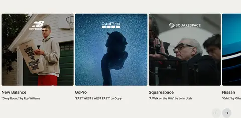
Video case-study rail Horizontal row of cinematic thumbnails with brand and track-credit labels; allow partial next-card visibility and carousel controls.
Color feature band Full-bleed solid blue, pink, or yellow section with a serif feature heading, concise Inter copy, and product media.
Artist feature card Portrait media above a vivid color information panel containing artist name, genre, and compact performance metrics.
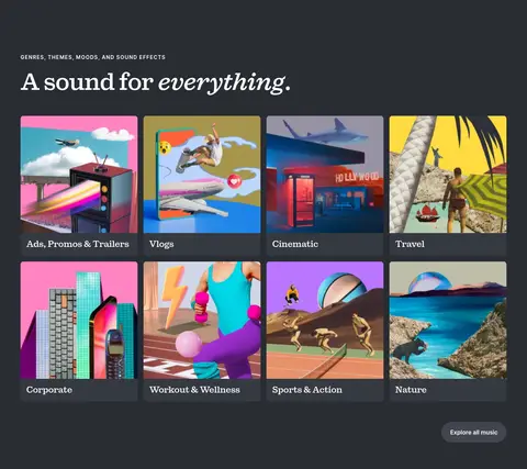
Category tile grid Four-column image-led genre and use-case tiles on the charcoal surface, with clear labels and a compact browse action.
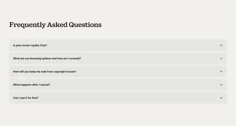
FAQ accordion Left-aligned serif heading followed by full-width pale rows, concise questions, and trailing disclosure chevrons.
Imagery · Use broad cinematic video stills for brand examples, with darkened or naturally toned footage and visible client identity overlays where appropriate. Category cards rely on colorful, varied campaign imagery; artist cards use portrait photography paired with vivid flat-color information panels. Product and app sections can use clean interface imagery. Keep media rectangular with restrained corner rounding, and avoid adding decorative 3D effects.
页面版块 共 14 个版块,按页面从上到下排列,每个都标了类型、布局和交互套路。
该做与不该做 ✓ 该做 Use Gallery Canvas (#f1f0eb) as the default page background. Set prominent headlines in Sebenta or a close editorial serif substitute. Use Inter for all navigation, body copy, buttons, and metadata. Reserve Signal Blue, Pop Pink, and Golden Yellow for bold feature moments. Use black pill buttons with white labels for primary actions. Let photography and video carry the colorful detail in media galleries. ✕ 不该做 Don't turn every section into a saturated color block. Don't use heavy shadows or layered glass effects. Don't replace the editorial serif headlines with generic geometric sans. Don't use bright artist-card colors as the default page background. Don't over-round cards or media; reserve pill radii for controls. Don't let product mock-up colors redefine the core brand palette. 给 AI 的提示词 想快速出一个同风格的新页面,把这段话连同 DESIGN.md 一起发给 AI。
复制 Build a new Epidemic Sound-style page using a warm Gallery Canvas (#f1f0eb) foundation and a clear editorial hierarchy. Use Sebenta-style serif display headlines with tight tracking and occasional italic emphasis; use Inter for navigation, body copy, captions, and controls. Keep the top navigation as a white capsule and primary actions as black pills with white labels. Structure content in spacious, clear sections: centered intro, media-led horizontal case studies, alternating full-bleed Signal Blue (#20afff), Pop Pink (#ff82c2), or Golden Yellow (#ffda40) feature bands, then a Midnight Slate (#292c33) catalog gallery. Use authentic cinematic stills and artist portraits, flat surfaces, restrained rounding, and subtle dividers. Preserve responsive grids and readable alignment; avoid shadow-heavy decoration or unrelated gradients.
DESIGN.md Tailwind v4 CSS 变量 Design Tokens
---
title: "Epidemic Sound design system"
variant: extended
source: https://www.epidemicsound.com/
captured_at: 2026-10-12
theme: light
industry: media
generator: Design DNA (https://four.wiralomi.com/style/epidemicsound-com)
ai_generated: true
ai_label: "本文件由 AI 辅助生成:数值取自公开网页的实测样式,命名、用途说明与建议为模型解读。商标归原所有者。 / AI-assisted content"
---
# Epidemic Sound · Design System
> Editorial typography meets vivid sound in motion.
**Theme:** light · **Industry:** media · **Source:** https://www.epidemicsound.com/ · **Captured:** 2026-10-12 (1440×900 desktop)
_AI-assisted content: values are measured from the public page at capture time; names, roles and guidance are model-written interpretations. Trademarks belong to their owners._
Epidemic Sound’s homepage pairs oversized editorial headlines with a warm neutral canvas and vivid feature bands. Video-led case studies and a dark catalog gallery make the music library feel both expressive and easy to explore.
## North star
Let editorial serif headlines and the warm neutral canvas frame vivid, media-led color moments without adding visual clutter.
## Overview
The page establishes a warm, quiet base with Gallery Canvas (## Colors
| Name | Hex | Token | Group | Role |
|---|---|---|---|---|
| Ink | ` | `--color-ink` | neutral | Primary headline and body text, navigation, inverse surface, and black primary CTA background. |
| Soft Graphite | ` | `--color-soft-graphite` | neutral | Muted supporting copy, captions, footer details, and secondary text on light sections. |
| Gallery Canvas | ` | `--color-gallery-canvas` | surface | Main warm off-white page canvas behind the hero, video rail, feature sections, FAQ, and footer. |
| Quiet Divider | ` | `--color-quiet-divider` | semantic | Hairline borders and subtle section, media, and control surfaces. |
| Midnight Slate | ` | `--color-midnight-slate` | surface | Large dark catalog and exclusive-track area, with light text and colorful media cards. |
| Clean White | ` | `--color-clean-white` | surface | Navigation capsule, white text on black controls, and occasional light content surfaces. |
| Pop Pink | ` | `--color-pop-pink` | accent | Full-width plugin feature band, product cards, and graphic blocks behind the closing CTA. |
| Golden Yellow | ` | `--color-golden-yellow` | accent | Find Similar feature band and selected artist-card information panels. |
| Hazy Periwinkle | ` | `--color-hazy-periwinkle` | surface | Muted blue-lavender app-section media background; supporting imagery, not a core interface color. |
| Slate Shadow | ` | `--color-slate-shadow` | semantic | Minor dark media detail within the dark catalog treatment, not a primary page surface. |
| Signal Blue | ` | `--color-signal-blue` | accent | Full-bleed Studio feature band and occasional feature-link highlight. |
| Sky Blue | ` | `--color-sky-blue` | accent | Minor variation within the blue feature or media treatment; keep subordinate to Signal Blue. |
| Pale Fog | ` | `--color-pale-fog` | neutral | Subtle text, navigation, and button detail on light or contrasting surfaces. |
| Muted Khaki | ` | `--color-muted-khaki` | semantic | Appears within media imagery only; do not use as a defining interface color. |
| Artist Green | ` | `--color-artist-green` | accent | Bright artist-card panel within the exclusive tracks gallery, not a global surface. |
| Vivid Coral | ` | `--color-vivid-coral` | accent | Small accent observed in a link or media detail; use sparingly, not as a section color. |
### Semantic aliases
`--color-canvas` → ` (Gallery Canvas) · `--color-surface` → ` (Midnight Slate) · `--color-surface-2` → ` (Quiet Divider) · `--color-surface-3` → ` (Clean White) · `--color-surface-4` → ` (Ink) · `--color-text` → ` (Ink) · `--color-text-muted` → ` (Soft Graphite) · `--color-text-subtle` → ` (Clean White) · `--color-border` → ` (Quiet Divider) · `--color-accent` → ` (Pop Pink) · `--color-accent-2` → ` (Golden Yellow) · `--color-accent-3` → ` (Signal Blue)
### Contrast (WCAG 2.x)
| Text | Background | Ratio | Level |
|---|---|---|---|
| ` | ` | 18.4:1 | AAA |
| ` | ` | 1.5:1 | fail |
| ` | ` | 15.45:1 | AAA |
| ` | ` | 21:1 | AAA |
| ` | ` | 5.52:1 | AA |
| ` | ` | 2.22:1 | fail |
| ` | ` | 4.64:1 | AA |
| ` | ` | 6.3:1 | AA |
| ` | ` | 1.14:1 | fail |
| ` | ` | 13.98:1 | AAA |
## Typography
| Family | Token | Source | Weights | Role | Free substitute |
|---|---|---|---|---|---|
| Inter | `--font-body` | webfont | 500, 600, 400, 700 | Navigation, body copy, buttons, captions, links, and uppercase eyebrows. | Inter |
| Sebenta | `--font-display` | webfont | 500 | Display headlines and section headings throughout the page. | DM Serif Display |
- **Inter:** Use measured weights 400–700; headlines are not Inter. Keep UI copy clean and restrained; eyebrows are uppercase with expanded tracking.
- **Sebenta:** Use medium-weight editorial serif forms, tight negative tracking, and occasional italic emphasis within headlines.
### Type scale — Augmented Fourth (ratio ≈ 1.38, base 16px)
| Role | Size | Weight | Line height | Letter spacing | Case | Family | Used for |
|---|---|---|---|---|---|---|---|
| display | 80px | 500 | 1 | -0.03em | — | Sebenta | Oversized editorial hero or campaign headline. |
| h1 | 64px | 500 | 1.06 | -0.03em | — | Sebenta | Primary page headline and major top-level statements. |
| h2 | 48px | 500 | 1.13 | -0.03em | — | Sebenta | Feature, category, editorial, and CTA section headings. |
| h3 | 40px | 500 | 1.2 | -0.03em | — | Sebenta | Secondary content headings and grouped feature titles. |
| h4 | 32px | 500 | 1.25 | -0.03em | — | Sebenta | Smaller card and subsection headings. |
| body | 16px | 500 | 1.5 | 0 | — | Inter | Main explanatory copy and supporting paragraph text. |
| caption | 14px | 500 | 1.71 | 0 | — | Inter | Media credits, song details, and compact supporting labels. |
| button | 16px | 600 | 1.5 | 0 | — | Inter | Primary and secondary action labels. |
| nav | 14px | 600 | 1.71 | 0 | — | Inter | Main navigation and compact utility links. |
| link | 16px | 500 | 1.5 | 0 | — | Inter | Inline actions and content links. |
| eyebrow | 14px | 600 | 1.71 | 0.1em | uppercase | Inter | Uppercase section labels above editorial headlines. |
## Spacing & layout
- Base unit **8px**, density **comfortable**.
- Scale (most used values): 4, 5, 6, 8, 10, 12, 16, 24, 48, 56 px.
- Section rhythm 56px · element gap 8px · card padding 24px · max content width 1328px.
Use the measured 1328px page maximum as the wide-screen content boundary, with a comfortable density and a consistent 8px base spacing rhythm. The hero is centered and spacious, followed by a horizontally browsable video-card rail. Alternate full-bleed colored feature bands with quieter canvas sections, then use a four-column category grid and six-column artist gallery at wide widths. Editorial and FAQ sections return to left alignment. Preserve generous section breathing room and use responsive stacking rather than compressing text or media.
## Shape & elevation
- Radius: button `9999px` · nav `9999px` · link `8px` · xs `8px` · pill `9999px`
- No box shadows measured: the page is flat.
- Motion: standard transition `0.15s cubic-bezier(0.4, 0, 0.2, 1)` on interactive elements.
The visual system is predominantly flat: no measured shadows, with contrast created by solid section bands, photography, and the dark catalog surface. Use thin ## Imagery
Use broad cinematic video stills for brand examples, with darkened or naturally toned footage and visible client identity overlays where appropriate. Category cards rely on colorful, varied campaign imagery; artist cards use portrait photography paired with vivid flat-color information panels. Product and app sections can use clean interface imagery. Keep media rectangular with restrained corner rounding, and avoid adding decorative 3D effects.
## Components
### Primary CTA
Black pill with white 16px Inter semibold label; pair with a lighter secondary action when both account creation and sales contact are offered.
### Navigation capsule
White rounded navigation bar on the warm canvas, with compact Inter links and separated account actions at the right.
### Video case-study rail
Horizontal row of cinematic thumbnails with brand and track-credit labels; allow partial next-card visibility and carousel controls.
### Color feature band
Full-bleed solid blue, pink, or yellow section with a serif feature heading, concise Inter copy, and product media.
### Artist feature card
Portrait media above a vivid color information panel containing artist name, genre, and compact performance metrics.
### Category tile grid
Four-column image-led genre and use-case tiles on the charcoal surface, with clear labels and a compact browse action.
### FAQ accordion
Left-aligned serif heading followed by full-width pale rows, concise questions, and trailing disclosure chevrons.
### Measured component styles
- **Primary button** (“Create free account”): background ## Do
- Use Gallery Canvas (## Don't
- Don't turn every section into a saturated color block.
- Don't use heavy shadows or layered glass effects.
- Don't replace the editorial serif headlines with generic geometric sans.
- Don't use bright artist-card colors as the default page background.
- Don't over-round cards or media; reserve pill radii for controls.
- Don't let product mock-up colors redefine the core brand palette.
## Agent prompt
Build a new Epidemic Sound-style page using a warm Gallery Canvas (## Page sections (top to bottom)
| # | Type | Layout | UX patterns | UI patterns |
|---|---|---|---|---|
| 1 | hero | Centered headline and supporting points with paired actions on a warm canvas. | primary and secondary CTA, reassurance note | large serif headline, pill buttons, centered copy |
| 2 | gallery | Horizontal, multi-column video rail with a partial next card visible. | carousel browsing, track and brand credits | cinematic thumbnails, compact captions, carousel arrows |
| 3 | feature-split | Full-bleed blue feature area with product content arranged across the section. | learn-more link, product feature introduction | Signal Blue band, pink information card, product media |
| 4 | integrations | Centered integration announcement within a full-width pink band. | integration awareness | Pop Pink background, centered serif heading, software icons |
| 5 | video | Centered eyebrow, heading, and description on a warm neutral surface. | feature explanation | small uppercase label, serif headline, video media |
| 6 | video | Centered content on a full-width yellow band. | feature explanation | Golden Yellow background, uppercase eyebrow, serif heading |
| 7 | product-showcase | Two-column app promotion with centered headline and product imagery. | app store links, mobile discovery | warm beige surface, device or app imagery, download links |
| 8 | category-nav | Four-column category grid on a large charcoal section. | browse by use case, explore all music | dark surface, image tiles, serif section heading |
| 9 | other | Left-aligned eyebrow and headline within the continuing dark area. | section introduction | uppercase eyebrow, light serif heading, charcoal background |
| 10 | product-grid | Six-column horizontal card gallery with carousel controls. | artist discovery, carousel browsing | portrait cards, vivid information panels, dark surround |
| 11 | content-feed | Editorial introduction above a three-column media-led news area. | news discovery, carousel pagination | warm beige background, large feature image, pink story card |
| 12 | cta | Large left-aligned statement over layered pink graphic blocks on the warm canvas. | account creation CTA | oversized serif headline, pink geometric blocks, black pill button |
| 13 | faq | Left-aligned heading above a single-column list of full-width accordion rows. | expandable answers, licensing reassurance | serif heading, pale rows, trailing chevrons |
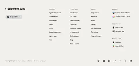
| 14 | footer | Four-column link directory with brand and locale controls, followed by a compact legal row. | multi-category navigation, language selector, social links | warm canvas, small Inter links, brand mark |
## Source CSS custom properties (selected)
```css
--color-brand-white: #fff;
--color-brand-black: #000;
--animation-duration: 600ms;
--es-i-text-font-family: Inter, "Inter Fallback: Arial", "Inter Fallback: Helvetica Neue", Arial, "Helvetica Neue";
```
---
本文件由 AI 辅助生成:数值取自公开网页的实测样式,命名、用途说明与建议为模型解读。商标归原所有者。
Generated by Design DNA · https://four.wiralomi.com/style/epidemicsound-com