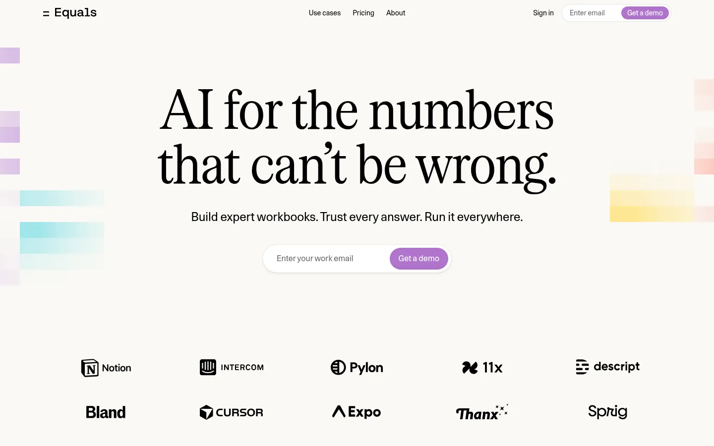
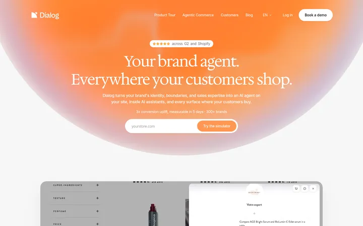
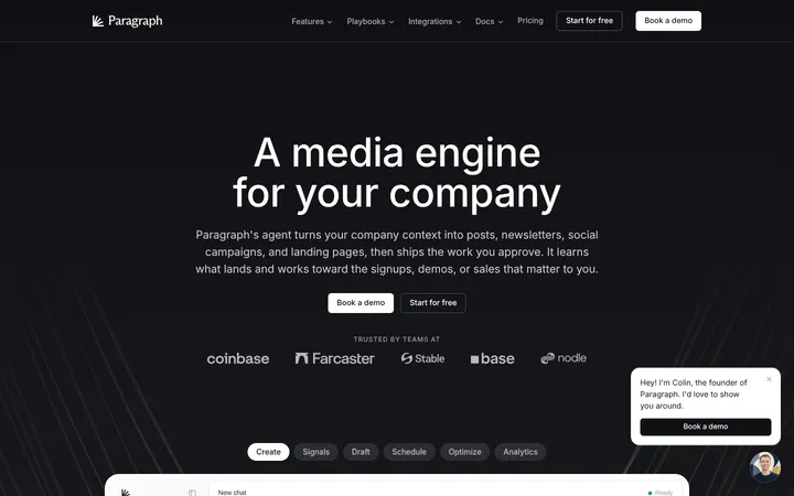
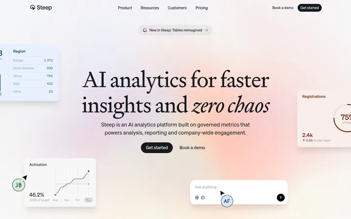
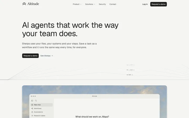
Equals以温润的纸感底色搭配醒目的编辑风标题,并用克制的兰紫色突出行动入口。产品界面与客户证言承载主要内容,充足留白让复杂的数据分析产品显得清晰易懂。
North star · Keep the canvas warm and quiet so editorial headlines, real product interfaces, and small orchid CTAs do the talking.
The page is anchored by a warm off-white canvas (#faf9f5), with subtle gray surface bands and white product cards that keep the overall experience light rather than stark. Black is reserved for high-contrast headlines, navigation, and primary text; muted grays establish hierarchy without competing with the content. Orchid purple (#b074ce) appears sparingly on demo buttons, while brighter colors mostly belong to product UI and decorative edge fragments, not the core brand system. Oversized condensed serif headlines create an editorial contrast with Unica77’s clean, compact sans-serif body and navigation text. The layout alternates centered hero messaging with left-aligned feature narratives and broad product demonstrations. Customer logos and testimonials add evidence between product sections. Softly rounded cards, fine borders, and restrained shadows distinguish interface examples from the open canvas. Whitespace and a comfortable vertical rhythm make the long page feel considered, not crowded.
配色 点色块复制色值。用途说明来自对页面的实测位置(背景、文字、描边、按钮)与截图判读。
品牌色
Paper Canvas
#faf9f5
Dominant page canvas across the hero, feature sections, testimonials, and footer transition.
True Ink
#000000
Primary headings, navigation, logos, and high-contrast body text.
强调色
Orchid Action
#b074ce
Primary demo CTA fill, paired with white button text.
表层色
Soft Divider
#edece9
Pale surface and border tone for quiet section separation and interface framing.
Card White
#ffffff
Product cards, form surfaces, and white panels against the warm canvas.
Stone Panel
#e1e0dd
Gray section band and subdued product or media backgrounds.
中性色
Graphite Text
#262626
Secondary interface and supporting text where pure black would feel too strong.
Muted Graphite
#646462
Muted navigation, footer, and supporting copy.
UI Gray
#737373
Small labels and badge text; a minor interface tone rather than a defining brand color.
Card Hairline
#e5e5e5
Thin outlines on compact data cards and interface details.
Warm Border
#d7d5d0
Subtle card and component outlines within pale interface areas.
Label Gray
#8d8d8d
Low-emphasis integration labels and supporting interface copy.
功能色
Violet Artifact
#6d28d9
Minor badge-level product UI color; not a defining page brand accent.
Alert Red
#d93025
Small status or data emphasis inside text and product UI, not a general CTA color.
文字 背景 对比度 WCAG #000000 True Ink#faf9f5 Paper Canvas19.93:1 AAA #000000 True Ink#edece9 Soft Divider17.78:1 AAA #000000 True Ink#ffffff Card White21:1 AAA #000000 True Ink#e1e0dd Stone Panel15.91:1 AAA #262626 Graphite Text#faf9f5 Paper Canvas14.37:1 AAA #262626 Graphite Text#edece9 Soft Divider12.81:1 AAA
字体 字号阶梯:Golden Ratio(比例约 1.633,正文 18px)。示例用免费替代字体渲染,数值为实测。
Aa 设计
Unica77 网络字体 · 字重 400 / 500 · 占比 81%
免费替代:Inter
Primary sans for body copy, navigation, buttons, and interface text.
Aa 设计
Serrif Condensed 网络字体 · 字重 400 · 占比 7%
免费替代:Bodoni Moda
Display serif for the hero and large section headlines.
Aa 设计
Inter 网络字体 · 字重 500 / 400 / 600 · 占比 5%
免费替代:Inter
Minor supporting interface and fallback text.
Aa 设计
Anthropic Sans 网络字体 · 字重 400 · 占比 4%
免费替代:Inter
Product mockup and analytics card text.
Aa 设计
Anthropic Serif 网络字体 · 字重 400 · 占比 2%
免费替代:Source Serif 4
Occasional minor serif text in embedded or supporting content.
Aa 设计
Lato 网络字体 · 字重 400 / 700 / 500 / 600 · 占比 1%
免费替代:Lato
Tiny application badge and compact labels.
角色 示例 字号 字重 行高 字距 一级标题 Oversized centered hero headline and major conversion headline.
Equals
48px 400 1.04 -0.01em 二级标题 Feature section headings paired with subdued follow-up lines.
The quick brown fox 敏捷的狐狸
24px 400 1.33 -0.004em 正文 Hero support copy, feature descriptions, and testimonial text.
The quick brown fox 敏捷的狐狸
18px 400 1.33 -0.005em 辅助文字 Small section numbers, labels, and interface annotations.
The quick brown fox 敏捷的狐狸
12px 400 1.33 -0.007em 导航 Header links and compact product navigation.
The quick brown fox 敏捷的狐狸
14px 400 1.43 -0.006em
间距与布局 基准单位 4px · 密度:适中
64px 版块间距
4px 元素间距
— 卡片内边距
1266px 内容最大宽度
2px
4px
5px
6px
7px
8px
10px
11px
12px
14px
16px
18px
20px
A broad centered page frame uses a measured maximum width of 1266px, with comfortable density and generous vertical gaps. The hero is centered, with its headline and email CTA above a multi-row customer logo cloud. Subsequent sections shift to left-aligned editorial headings and large product demonstrations; some feature content uses multiple columns, while testimonials use repeated horizontal rows. A pale gray band marks a video section. Preserve the long, measured section rhythm and let content breathe rather than compressing the page.
圆角与层次 hairline · card
md · other
sm · card
hairline · nav
The page is mostly flat, relying on whitespace and subtle surface contrast instead of strong shadows. Product cards use fine neutral outlines and soft, restrained shadows to lift them from the warm canvas. Rounded white panels layer interface elements, while pale section bands and thin separators provide structure without heavy borders.
组件 下面的预览按实测的按钮、输入框、徽标、卡片样式重建(字体用替代字体)。
Top navigation Minimal header with Equals mark, centered primary links, sign-in text, email field, and a compact orchid demo button.
Email demo form Pill-shaped white input group with muted placeholder text and an orchid CTA with white label.
Customer logo cloud Several rows of monochrome customer logos, centered beneath the hero form with ample separation.
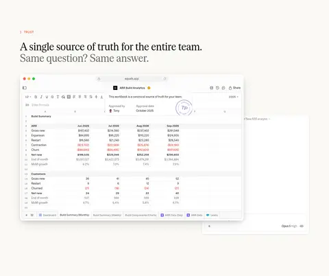
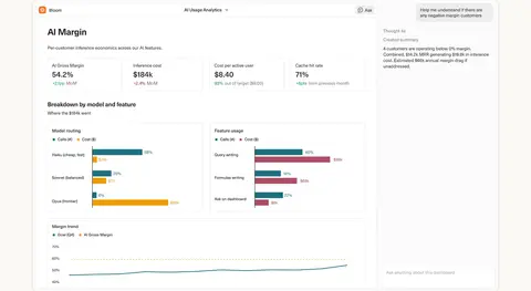
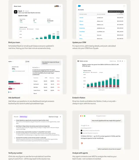
Product showcase card Large white analytics or workbook interface with fine gray outlines, restrained shadow, and rounded corners.
Feature narrative Small numbered eyebrow, editorial serif heading, secondary gray line, and a broad product image or interface.
Testimonial row Customer quote on the left, compact portrait and role details to the right, with delicate horizontal separators.
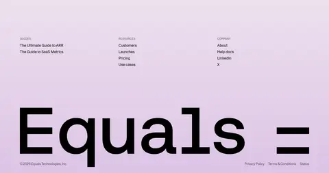
Footer Three compact link columns above an oversized Equals wordmark on a softly tinted closing area.
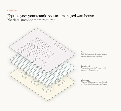
Imagery · Product UI screenshots and workbook-style mockups are the main visual assets, shown large enough to read as real software rather than decorative thumbnails. Customer logos and small portrait photos support trust sections. A layered warehouse illustration explains the platform foundations, while a full-bleed video section adds variety. Edge graphics around the hero and closing CTA use soft, translucent color rather than competing with content.
页面版块 共 23 个版块,按页面从上到下排列,每个都标了类型、布局和交互套路。
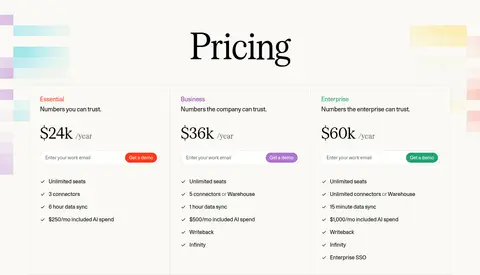
价格方案 套餐定价
Centered serif page title above three equal-width plan cards in a single row; pastel decorative bars frame the cards.
品牌墙 客户品牌
A centered trust statement sits above six customer logos arranged in one horizontal row.
对比表 套餐对比
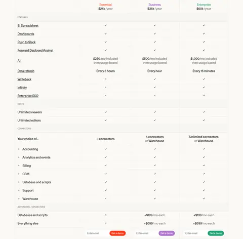
A wide, vertically stacked comparison table places feature labels in a left column and three plan columns to the right.
用户评价 客户评价
A spacious two-column testimonial row places a quote on the left and customer identity, portrait, and logo on the right.
用户评价 客户评价
A spacious two-column testimonial row places a quote on the left and customer identity, portrait, and logo on the right.
用户评价 客户评价
A spacious two-column testimonial row places a quote on the left and customer identity, portrait, and logo on the right.
用户评价 客户评价
A spacious two-column testimonial row places a quote on the left and customer identity, portrait, and logo on the right.
用户评价 客户评价
A spacious two-column testimonial row places a quote on the left and customer identity, portrait, and logo on the right.
常见问题 常见问题
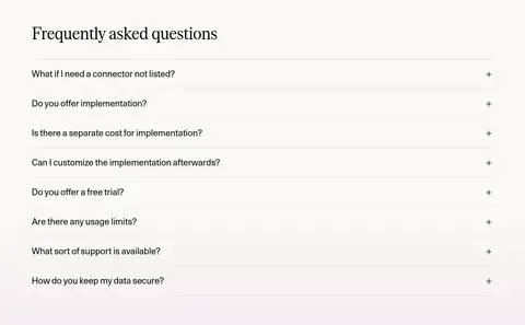
A left-aligned section heading sits above a full-width stack of eight single-line accordion rows.
行动号召 预约演示
A centered headline and compact email form sit within a full-width pastel-gradient banner with decorative edge graphics.
页脚 页脚导航
Three link columns sit above an oversized Equals wordmark, with legal and copyright details along the bottom edge.
该做与不该做 ✓ 该做 Use the warm canvas as the dominant background. Set major headlines in the measured condensed serif style. Keep demo CTAs orchid with white text. Show product interfaces as substantial, carefully framed panels. Use muted gray for secondary copy and labels. Preserve generous gaps between major page sections. ✕ 不该做 Do not turn the page into a dark interface. Do not use saturated accents as broad section fills. Do not replace the editorial display type with generic bold sans. Do not crowd the hero with product details. Do not add heavy shadows to every surface. Do not treat colors inside product mockups as brand palette colors. 给 AI 的提示词 想快速出一个同风格的新页面,把这段话连同 DESIGN.md 一起发给 AI。
复制 Build a new Equals-style SaaS page on a warm Paper Canvas (#faf9f5), using True Ink (#000000) for navigation and key text, Graphite Text (#262626) and Muted Graphite (#646462) for secondary hierarchy, and Card White (#ffffff) for product panels. Use a large condensed editorial serif for the main headline and a restrained sans such as Unica77 or Inter for body copy and controls. Keep Orchid Action (#b074ce) limited to primary pill-shaped CTAs. Center the opening message and email form, then organize content into spacious, left-aligned feature narratives with large, realistic analytics UI panels. Use customer proof, thin rules, subtle borders, and only gentle shadows. Maintain broad margins, comfortable section spacing, and a calm visual hierarchy; do not borrow product-mockup colors as page accents.
DESIGN.md Tailwind v4 CSS 变量 Design Tokens
---
title: "Equals design system"
variant: extended
source: https://equals.com/
captured_at: 2026-10-12
theme: light
industry: ai
generator: Design DNA (https://four.wiralomi.com/style/equals-com)
ai_generated: true
ai_label: "本文件由 AI 辅助生成:数值取自公开网页的实测样式,命名、用途说明与建议为模型解读。商标归原所有者。 / AI-assisted content"
---
# Equals · Design System
> Warm editorial calm meets precise AI analytics.
**Theme:** light · **Industry:** ai · **Source:** https://equals.com/ · **Captured:** 2026-10-12 (1440×900 desktop)
_AI-assisted content: values are measured from the public page at capture time; names, roles and guidance are model-written interpretations. Trademarks belong to their owners._
Equals pairs a warm, paper-like canvas with oversized editorial headlines and restrained orchid accents. Product interfaces and customer proof carry the story, with generous whitespace keeping a complex analytics product approachable.
## North star
Keep the canvas warm and quiet so editorial headlines, real product interfaces, and small orchid CTAs do the talking.
## Overview
The page is anchored by a warm off-white canvas (## Colors
| Name | Hex | Token | Group | Role |
|---|---|---|---|---|
| Paper Canvas | ` | `--color-paper-canvas` | brand | Dominant page canvas across the hero, feature sections, testimonials, and footer transition. |
| Soft Divider | ` | `--color-soft-divider` | surface | Pale surface and border tone for quiet section separation and interface framing. |
| True Ink | ` | `--color-true-ink` | brand | Primary headings, navigation, logos, and high-contrast body text. |
| Graphite Text | ` | `--color-graphite-text` | neutral | Secondary interface and supporting text where pure black would feel too strong. |
| Card White | ` | `--color-card-white` | surface | Product cards, form surfaces, and white panels against the warm canvas. |
| Orchid Action | ` | `--color-orchid-action` | accent | Primary demo CTA fill, paired with white button text. |
| Muted Graphite | ` | `--color-muted-graphite` | neutral | Muted navigation, footer, and supporting copy. |
| UI Gray | ` | `--color-ui-gray` | neutral | Small labels and badge text; a minor interface tone rather than a defining brand color. |
| Stone Panel | ` | `--color-stone-panel` | surface | Gray section band and subdued product or media backgrounds. |
| Card Hairline | ` | `--color-card-hairline` | neutral | Thin outlines on compact data cards and interface details. |
| Violet Artifact | ` | `--color-violet-artifact` | semantic | Minor badge-level product UI color; not a defining page brand accent. |
| Warm Border | ` | `--color-warm-border` | neutral | Subtle card and component outlines within pale interface areas. |
| Label Gray | ` | `--color-label-gray` | neutral | Low-emphasis integration labels and supporting interface copy. |
| Alert Red | ` | `--color-alert-red` | semantic | Small status or data emphasis inside text and product UI, not a general CTA color. |
### Semantic aliases
`--color-canvas` → ` (Paper Canvas) · `--color-surface` → ` (Soft Divider) · `--color-surface-2` → ` (Card White) · `--color-surface-3` → ` (Stone Panel) · `--color-text` → ` (True Ink) · `--color-text-muted` → ` (Graphite Text) · `--color-text-subtle` → ` (Muted Graphite) · `--color-border` → ` (Soft Divider) · `--color-accent` → ` (Orchid Action) · `--color-accent-2` → ` (Alert Red) · `--color-on-accent` → ` (Card White)
### Contrast (WCAG 2.x)
| Text | Background | Ratio | Level |
|---|---|---|---|
| ` | ` | 19.93:1 | AAA |
| ` | ` | 17.78:1 | AAA |
| ` | ` | 21:1 | AAA |
| ` | ` | 15.91:1 | AAA |
| ` | ` | 14.37:1 | AAA |
| ` | ` | 12.81:1 | AAA |
| ` | ` | 15.13:1 | AAA |
| ` | ` | 11.46:1 | AAA |
| ` | ` | 5.63:1 | AA |
| ` | ` | 5.02:1 | AA |
### Gradients
- `linear-gradient(rgba(0, 0, 0, 0) 75%, rgba(0, 0, 0, 0.04) 100%)`
## Typography
| Family | Token | Source | Weights | Role | Free substitute |
|---|---|---|---|---|---|
| Unica77 | `--font-body` | webfont | 400, 500 | Primary sans for body copy, navigation, buttons, and interface text. | Inter |
| Serrif Condensed | `--font-display` | webfont | 400 | Display serif for the hero and large section headlines. | Bodoni Moda |
| Inter | `--font-inter` | webfont | 500, 400, 600 | Minor supporting interface and fallback text. | Inter |
| Anthropic Sans | `--font-anthropic-sans` | webfont | 400 | Product mockup and analytics card text. | Inter |
| Anthropic Serif | `--font-anthropic-serif` | webfont | 400 | Occasional minor serif text in embedded or supporting content. | Source Serif 4 |
| Lato | `--font-lato` | webfont | 400, 700, 500, 600 | Tiny application badge and compact labels. | Lato |
- **Unica77:** Mostly regular weight; compact tracking and sentence case keep utility text unobtrusive.
- **Serrif Condensed:** Regular weight, large scale, tight leading, and slight negative tracking create editorial emphasis.
- **Inter:** Measured at low share; use regular to semibold only for compact utility text.
- **Anthropic Sans:** Appears mainly within embedded product UI; keep it legible and neutral.
- **Anthropic Serif:** Low-share usage; do not let it replace the primary condensed display face.
- **Lato:** Small, crisp utility use; measured badge uses a semibold weight.
### Type scale — Golden Ratio (ratio ≈ 1.633, base 18px)
| Role | Size | Weight | Line height | Letter spacing | Case | Family | Used for |
|---|---|---|---|---|---|---|---|
| h1 | 48px | 400 | 1.04 | -0.01em | — | Serrif Condensed | Oversized centered hero headline and major conversion headline. |
| h2 | 24px | 400 | 1.33 | -0.004em | — | Unica77 | Feature section headings paired with subdued follow-up lines. |
| body | 18px | 400 | 1.33 | -0.005em | — | Unica77 | Hero support copy, feature descriptions, and testimonial text. |
| caption | 12px | 400 | 1.33 | -0.007em | — | Unica77 | Small section numbers, labels, and interface annotations. |
| nav | 14px | 400 | 1.43 | -0.006em | — | Unica77 | Header links and compact product navigation. |
OpenType features in use: `"lnum", "pnum"` , `"lnum", "salt", "tnum"` , `"lnum", "tnum"` , `"salt"` .
## Spacing & layout
- Base unit **4px**, density **comfortable**.
- Scale (most used values): 2, 4, 5, 6, 7, 8, 10, 11, 12, 14, 16, 18, 20 px.
- Section rhythm 64px · element gap 4px · card padding — · max content width 1266px.
A broad centered page frame uses a measured maximum width of 1266px, with comfortable density and generous vertical gaps. The hero is centered, with its headline and email CTA above a multi-row customer logo cloud. Subsequent sections shift to left-aligned editorial headings and large product demonstrations; some feature content uses multiple columns, while testimonials use repeated horizontal rows. A pale gray band marks a video section. Preserve the long, measured section rhythm and let content breathe rather than compressing the page.
## Shape & elevation
- Radius: button `9999px` · card `12px` · media `3px` · badge `6px` · nav `6px` · xs `2px` · sm `3px` · md `4px` · lg `5px` · xl `6px` · 2xl `8px` · pill `9999px`
- Shadow `hairline` (card): `rgba(38, 38, 38, 0.12) 0px 0px 0px 0.5px`
- Shadow `md` (other): `rgba(0, 0, 0, 0.1) 0px 0px 0px 0.5px, rgba(0, 0, 0, 0.05) 0px 2px 8px -2px, rgba(0, 0, 0, 0.14) 0px 2px 10px -4px`
- Shadow `sm` (card): `rgba(38, 38, 38, 0.08) 0px 0px 0px 1px, rgba(0, 0, 0, 0.2) 0px 2px 8px -4px`
- Shadow `hairline-2` (nav): `rgba(0, 0, 0, 0.18) 0px 0px 0px 0.5px`
- Shadow `xl` (card): `rgba(38, 38, 38, 0.08) 0px 0px 0px 1px, rgba(0, 0, 0, 0.16) 0px 8px 24px -6px, rgba(0, 0, 0, 0.14) 0px 18px 48px -12px`
- Shadow `sm-2` (other): `rgba(0, 0, 0, 0.2) 0px 2px 8px -4px`
- Motion: standard transition `0.1s ease-out` on interactive elements.
The page is mostly flat, relying on whitespace and subtle surface contrast instead of strong shadows. Product cards use fine neutral outlines and soft, restrained shadows to lift them from the warm canvas. Rounded white panels layer interface elements, while pale section bands and thin separators provide structure without heavy borders.
## Imagery
Product UI screenshots and workbook-style mockups are the main visual assets, shown large enough to read as real software rather than decorative thumbnails. Customer logos and small portrait photos support trust sections. A layered warehouse illustration explains the platform foundations, while a full-bleed video section adds variety. Edge graphics around the hero and closing CTA use soft, translucent color rather than competing with content.
## Components
### Top navigation
Minimal header with Equals mark, centered primary links, sign-in text, email field, and a compact orchid demo button.
### Email demo form
Pill-shaped white input group with muted placeholder text and an orchid CTA with white label.
### Customer logo cloud
Several rows of monochrome customer logos, centered beneath the hero form with ample separation.
### Product showcase card
Large white analytics or workbook interface with fine gray outlines, restrained shadow, and rounded corners.
### Feature narrative
Small numbered eyebrow, editorial serif heading, secondary gray line, and a broad product image or interface.
### Testimonial row
Customer quote on the left, compact portrait and role details to the right, with delicate horizontal separators.
### Footer
Three compact link columns above an oversized Equals wordmark on a softly tinted closing area.
### Measured component styles
- **Primary button** (“Get a demo”): background ## Do
- Use the warm canvas as the dominant background.
- Set major headlines in the measured condensed serif style.
- Keep demo CTAs orchid with white text.
- Show product interfaces as substantial, carefully framed panels.
- Use muted gray for secondary copy and labels.
- Preserve generous gaps between major page sections.
## Don't
- Do not turn the page into a dark interface.
- Do not use saturated accents as broad section fills.
- Do not replace the editorial display type with generic bold sans.
- Do not crowd the hero with product details.
- Do not add heavy shadows to every surface.
- Do not treat colors inside product mockups as brand palette colors.
## Agent prompt
Build a new Equals-style SaaS page on a warm Paper Canvas (## Page sections (top to bottom)
| # | Type | Layout | UX patterns | UI patterns |
|---|---|---|---|---|
| 1 | hero | Centered headline and supporting copy above an email demo form; customer logos fill the lower portion. | email capture, demo conversion, customer proof | oversized serif headline, pill CTA, logo cloud, soft edge graphics |
| 2 | product-showcase | Left-aligned section heading followed by a large workbook interface demonstration. | trust narrative, product demonstration | numbered eyebrow, serif heading, layered workbook UI |
| 3 | feature-grid | Three use-case prompts sit above a broad analytics interface demonstration. | use-case discovery, workflow examples | three-column prompts, analytics mockup, subtle card framing |
| 4 | video | Full-bleed video section set on a pale gray band. | watch product demo | full-width media, muted surface band |
| 5 | product-showcase | Multiple product examples arranged in a broad multi-column grid. | workflow exploration, product proof | repeated UI cards, dashboard previews, light borders |
| 6 | feature-split | Editorial heading above a two-column explanation with layered illustration and supporting labels. | platform explanation, concept clarification | layered warehouse illustration, three-part labels |
| 7 | testimonials | A horizontal customer quote row with quote copy and a compact attribution area. | social proof, customer attribution | testimonial row, portrait, thin separator |
| 8 | testimonials | Repeated horizontal quote-and-attribution row. | social proof, customer attribution | testimonial row, portrait, thin separator |
| 9 | testimonials | Repeated horizontal quote-and-attribution row. | social proof, outcome proof | testimonial row, portrait, customer logo |
| 10 | testimonials | Final horizontal quote-and-attribution row in the testimonial sequence. | social proof, customer attribution | testimonial row, portrait, customer logo |
| 11 | cta | Centered closing headline and email form over a softly tinted full-bleed background. | email capture, demo conversion | centered serif headline, pill input group, soft gradient |
| 12 | footer | Three link columns above a large brand wordmark and compact legal links. | site navigation, legal information | link columns, oversized wordmark, soft tinted ground |
## Source CSS custom properties (selected)
```css
--font-sans-serif: "Aeonik Pro",sans-serif;
--font-serif-condensed: "Serrif Condensed",serif;
--font-unica: "Unica77",sans-serif;
--font-fono: "Aeonik Fono",sans-serif;
--font-lato: "Lato",sans-serif;
--font-hubspot: "HubSpot Sans",sans-serif;
--font-inter: "Inter",sans-serif;
--font-anthropic-sans: "Anthropic Sans",sans-serif;
--font-anthropic-serif: "Anthropic Serif",Georgia,serif;
--brand-black: