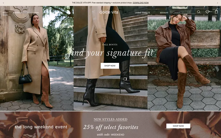
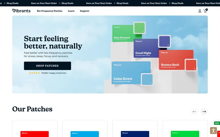
North star · Keep the interface quiet and spacious so editorial typography and vivid, full-bleed drink photography lead every moment.
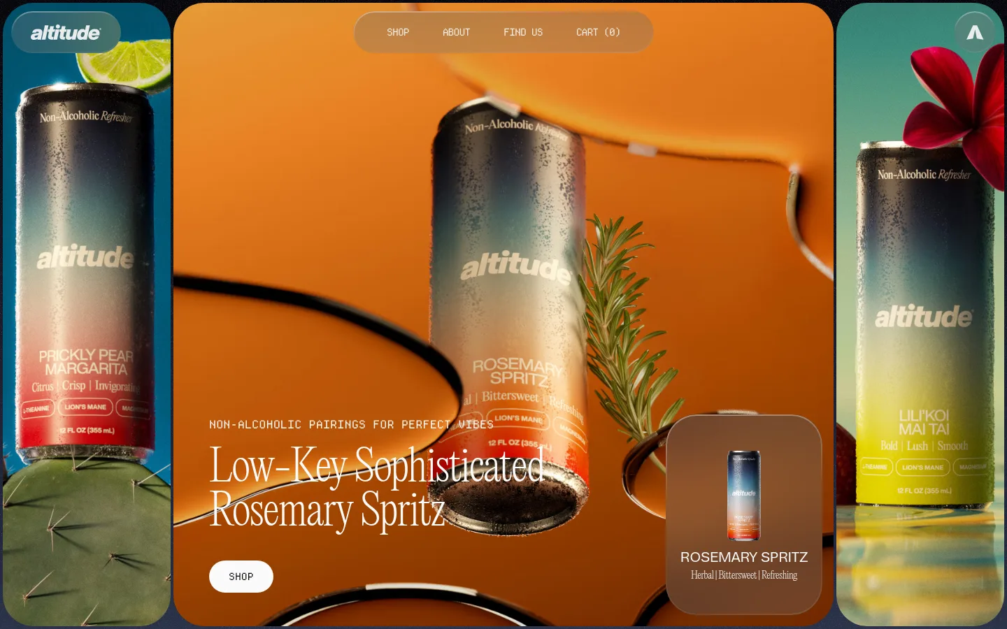
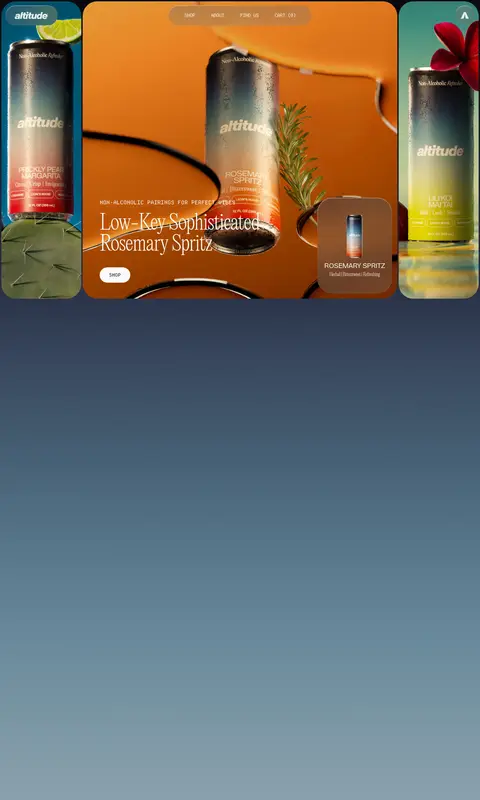
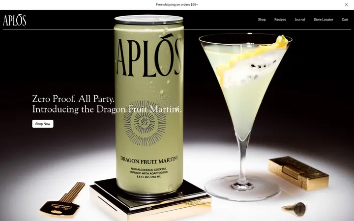
The page balances a clean white canvas with image-led bursts of saturated color. The opening composition places oversized, rounded product photographs around a central scene in orange and botanical tones; the measured screenshot colors there belong largely to photography, not a flat brand palette. EditorialNew supplies the delicate, high-contrast feel of the large headline and supporting copy, while DepartureMono makes navigation, labels, and actions feel precise and technical. HelveticaNowDisplay handles compact captions and the oversized footer statement. Layout is intentionally spacious: a long blue-gray gradient occupies much of the scroll before the compact three-card product display, followed by a wide photographic newsletter panel and a loose three-column footer. Soft pill navigation and rounded cards contrast with the fine typography. Keep surfaces largely flat, use restrained gray for product-card backdrops, and let photography—not decorative UI—provide the strongest color.
Large hero headline and refined supporting editorial copy.
Aa 设计
DepartureMono
网络字体 · 字重 400 · 占比 32%
免费替代:Space Mono
Uppercase navigation, buttons, product labels, and compact utility text.
Aa 设计
HelveticaNowDisplay
网络字体 · 字重 500 / 400 / 800 · 占比 27%
免费替代:Inter
Captions and bold oversized display lettering, especially the footer statement.
角色
示例
字号
字重
行高
字距
特大标题
Oversized bold footer statement and prominent display moments.
Altitude Beverages
160px
800
1
-0.05em
一级标题
Large, light editorial hero headline.
Altitude Beverages
60px
200
1.06
-0.025em
二级标题
Editorial section headings and prominent product messaging.
Altitude Beverages
40px
200
1.06
-0.025em
正文
Light-weight product and supporting descriptive copy.
The quick brown fox 敏捷的狐狸
16px
200
1.06
-0.025em
辅助文字
Compact uppercase labels and small supporting captions.
The quick brown fox 敏捷的狐狸
11px
400
1
-0.05em
按钮
Uppercase monospaced CTA labels.
The quick brown fox 敏捷的狐狸
14px
400
1
0
导航
Uppercase monospaced links in the floating navigation.
The quick brown fox 敏捷的狐狸
14px
400
1.43
-0.071em
代码
Utility-style monospaced text where technical details appear.
const style = 1;
14px
400
1.43
0
间距与布局
基准单位 4px · 密度:宽松
360px版块间距
6px元素间距
64px卡片内边距
1432px内容最大宽度
2px
4px
6px
7px
8px
9px
12px
16px
17px
20px
24px
28px
36px
56px
64px
Use a spacious, full-width composition with the measured page max width of 1432px. The hero is a central image framed by narrow product panels, with navigation floating over the imagery. Preserve the unusually long gradient-led interval before the product showcase. Set product cards in a three-item row, then use a full-bleed newsletter image and a three-column footer. Keep section rhythm generous (measured section gap 360px), align text with its image or card, and avoid dense content clusters.
圆角与层次
按钮 · 9999px
卡片 · 44px
导航 · 9999px
链接 · 44px
没有测到阴影:页面是扁平的,层次靠底色和描边区分。
The measured system has no shadows, so rely on image contrast and overlapping composition rather than drop-shadow effects. Keep card surfaces flat and rounded, with 44px card corners and pill-shaped navigation or buttons. The hero’s layered photographs and floating text panels create depth; fine borders are secondary and should not become a repeated decorative motif.
组件
下面的预览按实测的按钮、输入框、徽标、卡片样式重建(字体用替代字体)。
Floating navigation
A translucent, pill-shaped control over the hero image with uppercase DepartureMono links for Shop, About, Find Us, and Cart.
Hero composition
A large central lifestyle photograph flanked by tall product-image panels; overlay a light EditorialNew headline, small monospaced kicker, and white pill Shop button.
Product cards
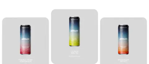
Three rounded gray cards featuring individual cans and compact product names and flavor descriptions; measured card radius is 44px.
Newsletter panel
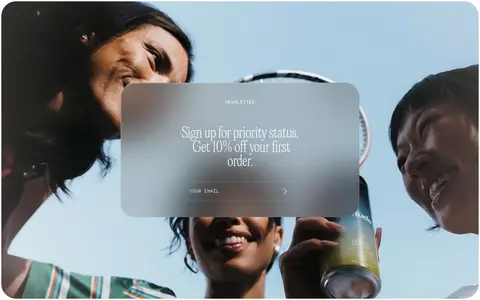
A full-width lifestyle photograph with a softly translucent centered panel, short signup message, and a minimal uppercase email field.
Footer
A loose three-column layout for contact, social, policy, and account links, finished with a very large bold display statement.
Pill CTA
Compact uppercase monospaced action text in a fully rounded button; Shop uses a pale background and near-black lettering.
Imagery · Use high-quality lifestyle and product photography as the visual anchor: close views of cans, citrus, botanicals, and people sharing drinks. The hero uses tall side panels framing a larger central scene, with rounded corners and visible can detail. Product cards isolate each can against pale gray. The newsletter returns to a wide photographic scene with a translucent central overlay. Avoid illustration-led substitutes.
Let product photography supply the strongest color.
Keep the canvas white and the interface visually quiet.
Use EditorialNew for expressive, light editorial headlines.
Set navigation and control labels in uppercase mono.
Use rounded image panels and pill-shaped controls.
Preserve generous whitespace and long section transitions.
✕ 不该做
Do not turn the hero’s orange photography into a flat site-wide brand color.
Do not add shadows absent from the measured system.
Do not crowd the page with dense grids or excessive copy.
Do not replace the product photography with generic illustrations.
Do not make every text style bold or oversized.
Do not use decorative borders as a substitute for image-led depth.
给 AI 的提示词
想快速出一个同风格的新页面,把这段话连同 DESIGN.md 一起发给 AI。
Build a new Altitude Beverages page with a quiet white canvas (#ffffff, Gallery White) and generous breathing room. Use EditorialNew or a close light editorial serif for large headlines, DepartureMono or Space Mono for uppercase navigation and actions, and HelveticaNowDisplay or Inter for captions and bold display text. Let rich product photography dominate; treat vivid orange and botanical tones as image content rather than interface colors. Use Mist Gray (#d9d9d9) for restrained product-card surfaces and the measured blue-gray gradient sequence from Night Ink (#07060b) through Frost Blue (#adbec6) only for atmospheric transitions. Favor rounded image panels, pill controls, flat surfaces, and layered photography without shadows. Keep content sparse, arrange products in a three-card row, and close with a wide photographic signup panel and airy footer.